5 ways to optimize your ecommerce website for Voice Search

Voice search is at its peak in popularity among millions of users. According to an OC&C Strategy Consultants market research, Voice Shopping is projected grow to be a $40 billion plus segment in next two years. Numbers alone are a proof that voice assisted interactions are no longer exclusive to accessibility.

Your customers are now speaking more to Google assistant and Siri than to your website’s chatbots for their product queries.

In such a scenario, voice search will help your customers to visit your website, look for their product, and make the purchase (if only it was that easy). But you can make it easy for your visitors.

Google’s insight says a lot about the current consumer mind set about shopping and smart speaker.

According to Google, almost half of the people who own a smart speaker are willing to receive information related to deals, promotions and sales from brands

People are willing to share and receive information via these devices. Now the question is, how to optimize your ecommerce website for voice search? Scroll down to find the answer to this question.

Here are 5 actionable tips to optimize your ecommerce for voice search-

1. Prioritize Long-tail, Contextual Keywords
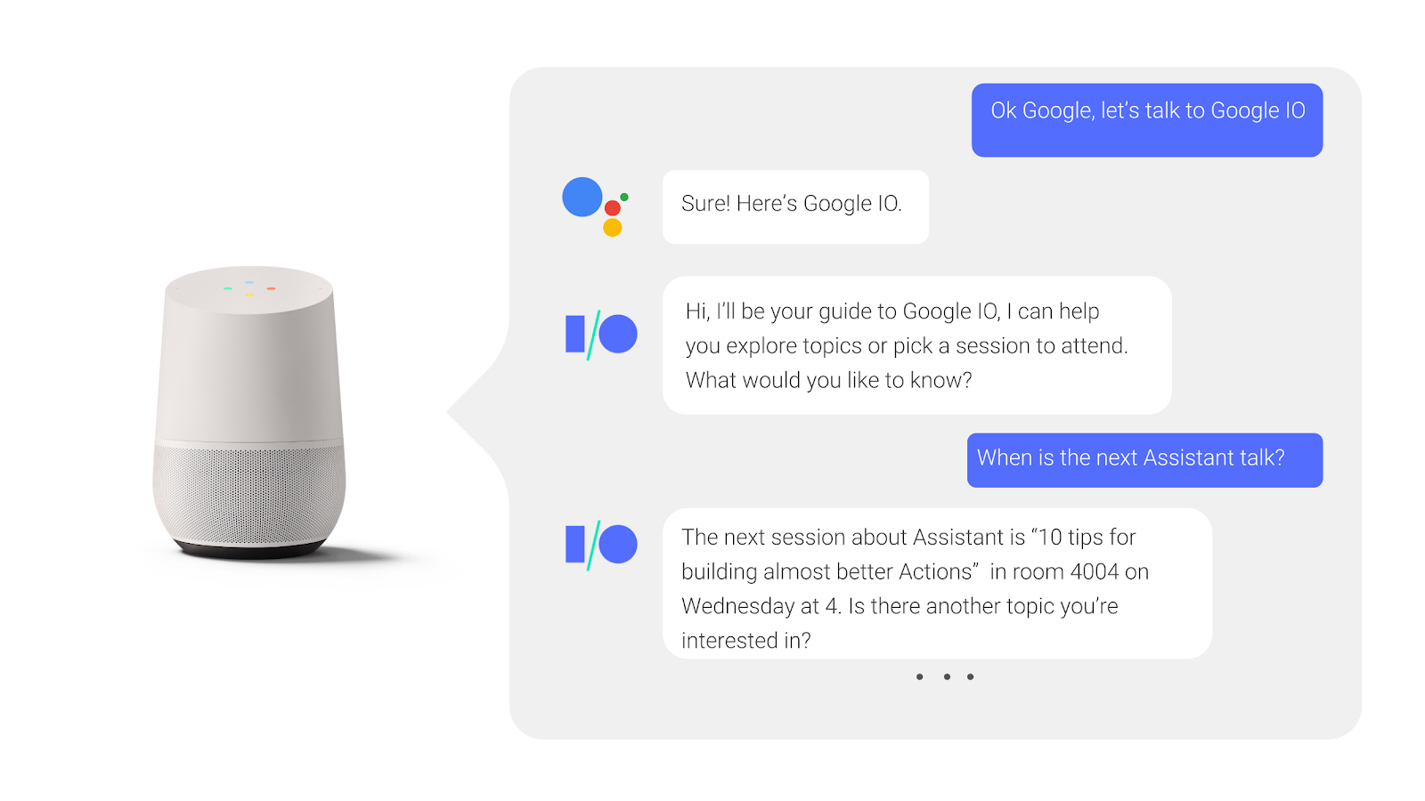
Image showcasing a conversation with google home smart speaker

In voice search the keywords are not just 2-3 words, instead it’s a complete sentence. The reason being, when we ‘speak’ to our devices, we are considering it to be an actual life conversation and therefore frame the queries accordingly.

Your visitors have a high probability of saying, “Siri, where can I find toys for my 5 year old child?”. When a person types the same query, it goes something like, “Toys for 5 year old”.

Voice search revolves around the illusion of having a conversation with your search assistant or search engine. Additionally the typing effort is absent here, so a person subconsciously speaks more as compared to typing the same query. Thus, long tail and contextual keywords come into the spotlight here.

2. Decrease your website’s load time across platforms

Computer painted on a wall

A lot of your traffic will be from mobile devices, thus you should optimize your website’s speed for mobile. A speedy website benefits from higher engagement from visitors, they will be able to see various products offered, and thus improve the overall user experience.

Tools like PageSpeed Insights will provide you information about all your webpages, which ones are slow and possible recommendations to increase the speed as well.

Optimizing your website’s speed is even more essential as Google is now deploying the mobile first ranking system.

For improving the speed, you can start by doing these tweaks:

  • Compress your images but do not compromise on the image quality
  • Deploy caching technique
  • Constantly look out for broken links
  • Select fast web hosting platforms like A2 hosting, Hostinger

Google tends to rank those websites higher from where it can readily extract the information requested for and this is done via structured data, more on this later.

3. Target the Local SEO first

video of a man driving while trying to read a map

The voice queries from mobile devices have 3 times more chances of being locally based according to Search Engine Watch. And it fits well because mobile searches are done when on the move like driving and the query is done hands free.

Phrases like, near me, within x meter range, etc are popular ones. Cracking the local SEO will help in such situations. Your visitor will appreciate this as they will be directed to the right place within minimum time limits.

4. Focus on your website’s content

A kid in front of a laptop raising his fingering

Your website’s content needs to be educational, easy to understand, relevant and in line with your consumers thought process. This can be done with paying adequate attention to your FAQ page, product descriptions and content for featured snippets.

Your FAQ page will answer the what, where, how, when, why type of questions which are conversational in nature. This means that when your potential customers are looking for these answers, say while driving, they will be directed to your website.

When writing your FAQ page, you will be able to think of numerous questions that your customer will have as they come across your products and services. When done right, FAQ pages will increase your visibility chances.

Your product descriptions also play a vital role here. They should follow a natural conversational tone and sound like a conversation between friends. When elaborating the features of your products, you should aim for a more friendly sounding tone instead of a salesy one.

Your FAQ page and product descriptions can also be taken for Featured snippets by Google if you are close to answering the questions that customers put in. And who does not wish to be on the top of the search results page?

The content that resonates with the way your customers converse will win at the end of the day.

5. Schema markup for your website

Photo of display monitor with code on it

Using Schema markup or structured data helps Google in extracting the most important information about your products and sending the same to your customers upon related search queries.

A well structured website facilitates easy discovery of key information for Google and thus your website can be ranked a bit higher, giving an upper hand over your competitors. When necessary information is highlighted on the search page itself, people will be more inclined to pay a visit to your website.

You can visit Schema.org for getting started and to see how well your website is structured, you can test using the Structured Data Testing Tool.

There is no denying the fact that people have shifted to voice search and will be relying heavily on it in the future. Once your ecommerce website is optimized for voice search, you can leverage it to increase your sales and who knows, you can hope for reductions in your churn rate as well.

Reach out to us for our expertise in building optimized solutions for all your ecommerce woes.

6 Best practices to avoid common backend mistakes

Software development is complex and thus mistakes happen all the time. It’s something that shouldn’t bother you too much since it has happened to every backend developer.

The fact is that most times, the reason for these mistakes is pressure which leads to human error. Deadlines, feedback anxiety, skipping testing, and rushing things are the four horsemen of backend mistakes. The trick is find your way around it not to ignore it.

“One who makes no mistakes makes nothing at all.” – Giacomo Casanova

We have listed down the best practices so you don’t have to cut corners at the backend of your project.

1. Don’t push the code without getting reviewed

People discussing something behind a glass wall

Pushing your code alone?

It’s always better to get your code reviewed with either a frontend developer from the same project or a backend developer from another project. As the former has domain knowledge while the latter has backend knowledge.

And if you are working with a team, then dont push code to the default branch without the code author or other backend developer reviewing it line by line. As it might create a conflict for others working on the project as they wont be able to merge their code. This leads to vulnerabilities and difficulty in maintaining the code.

Thus it becomes crucial to create a pull request which is a simple and effective way to get your code reviewed. This allows the rest of the developers to discuss changes in a branch and agree to merge them once everyone approves.

Also ensure analyzing the code by a tool like TSLint for TypeScript or ESLint for JavaScript, before pushing it to the default branch too. As these tools ensure consistent code style, and are useful when working in teams so you don’t have to disagree on topics like tabs vs spaces.

2. Avoid using too many technologies for same thing

Books beside a cactus pot

The availability of MERN/MEAN/LAMP stack models as ready solutions for medium and large project development saves so much time. As using one language (JavaScript) for both client-side and server-side development improves teamwork, simplifies collaboration, and speeds up development.

To eliminate the risk of bugs/vulnerabilities due to a higher number of dependencies and slower installation as more dependencies have to be installed, it’s best you use the same technology and the same pattern to resolve a given problem.

If you are talking about complex projects or about the projects with special requirements for security and performance such as public sector, banks, etc., then in such cases, it becomes necessary to build an individual technology stack which makes it possible to satisfy all the set requirements.

3. Test at each level with a bug fix

Door with 404 sign on the wall

Didn’t we already fix that?

It’s a question that you or your teammate often get after the product manager posts a snapshot of the bug.

The very other moment you are retracing the time you fixed that bug in the commits, but what’s the point?

You are already in the production code that is difficult to maintain as you are afraid to break anything, which increases the number of bugs. And to avoid such scenarios, writing all the tests at each level together with a new feature and regression tests together with a bug fix would help.

This ensures a higher work performance in both the long and short term, less bugs, and finally designing a better architecture.

4. Design the data model with whole team

Person drawing with a black marker on a glass

Here is an experience that nobody wants to go through – Fixing a poorly designed data model after an application is in production.

A badly designed data model can cause invalid production data, data being difficult to analyze or maintain, and very slow data queries.

It’s not only important to understand the database itself, but also how to create the right data model to fit your application’s scalability and performance requirements. If a bad data model isn’t deployed to production yet, you can just update the data model and remove the invalid data created at lower environments. Therefore, it’s better to take some time upfront to discuss with your team, and use a proven methodology.

You can break it down into five steps:

  • Understand your application workflow
  • Model the queries required by the application
  • Design the tables
  • Determine primary keys
  • Use the right data types effectively

And If a bad data model is already deployed to production, besides updating the data model, try writing a migration to fix the invalid data.

5. Monitor each production microservices

Person tying thread on pins fixed on a board

When a microservice is down, it’s likely some backend development work that needs fixing. As backend developers have to implement a status endpoint for each microservice.

Without monitoring all the microservices you might risk major bugs due to the most microservice being down.

Whereas, when you’re gradually breaking down a monolithic app to microservices or building a new system from scratch, you now have more services to monitor. Each of these will likely:

  • Use different technologies and/or languages
  • Live on a different machine and/or container
  • Have its own version control

With this, the system becomes highly fragmented and a stronger need arises for centralized monitoring as well. You’ll need to add trace information to each service, and need a tool that can monitor multiple services side by side. So you can understand how they interact with each other, and prevent bugs by figuring out which microservice is down, beforehand.

6. Avoid over-engineering and over-optimization

Person opening rotary lock

Over-engineering is like overthinking.

You’re trying to find solutions to problems that either are too early to tackle or don’t exist yet. In the end, you are left with very long functions/methods, poor commit message naming, and too much logic.

This also often means ugly code, quick hacks, abandoning programming principles like DRY, SOLID and TDD, and little to no abstraction.

It all boils down to two common reasons:

  • The What-if mentality
  • The Just-in-Case mentality

And unless absolutely imperative, this will create needless complexity, costing you significantly more than the final value delivered.

Well, it goes back to the You Ain’t Gonna Need It, syndrome. You need to constantly ask yourself if the way you’re currently writing code solves the immediate problem or program requirement OR if you’re writing it in a way to future proof it and make it more resilient to change.

Getting the right balance so that code is easy to understand AND easy to change, can be extremely challenging. It takes a lot of fine-tuning and experimentation. Implementing these best practices have always helped keep common mistakes at bay, might just do the same for you too.

For Backend related development or assistance, drop us a line.

Instagram Made Me Rethink About Touch Targets

I’m sure you might have come across numerous articles on the web that talk about why we need adequate touch targets for each interactive element on any touch-based interface. (Especially mobiles which have a relatively smaller landscape.)

A ‘touch target’ refers to the area associated with an element that triggers the interaction when users tap on it. This area usually extends beyond the visual shape of an element when it isn’t an explicit part of its design.

Have a look at these two buttons, for instance; one is filled while the other is just textual.

Even though the button on the right does not have a visual shape like the other one, its touch target (although not explicitly visible) extends way beyond the text area.

Ideally , these touch targets should be at least 1cm x 1cm (or 38px x 38px) in size, as suggested by Nielsen Norman Group, to promote better capability for users.

Now, I’ve been an avid user of Instagram - which I’m sure you may know, has been one of the world’s most popular apps for quite a long time now - and lately, it struck me that most of the elements on its interface do not follow the common norms for touch targets.

Have a look at this shot, for instance.

Horizontal spacing

In the first highlight, you may notice that all the tags are very close by with hardly any horizontal space left in between. When tags are relatively long, they are much easier to tap on even if they are set close to each other.

Vertical spacing

This type of spacing is usually more concerning in the case of small screens, as no matter how big an element is horizontally, if it is stuffed tightly between two other interactive elements, it’ll be difficult to tap on it.

The same is happening with elements in the second highlight. The action to ‘view comments’ and the ‘profile names’ are very closely stacked.

Another example would be the location link just above the picture in the shot below.

Despite all the discrepancies in spacing, I do not remember a single instance wherein I tapped on an element which I wasn’t intending to tap on!

And I think most of you guys did not, either. Unusual, right? Considering how tight those elements are spatially.

This leads me to believe that the area that we cover when we tap is not that large, after all.

The bigger yellow circle has a dimension of 1cm X 1cm (or 36px X 36px), while the smaller oval (formed by tapping with the right thumb) is 24px (or 0.6cm) long and 15px (or 0.4cm) high - which is essentially how much area we cover while tapping - and it may even be smaller.

If we go by this logic, maybe we can mend our designs to fit more content in a relatively small landscape without sacrificing accessibility… or not? I’d love to know your thoughts on this.

7 layout fundamentals for that oddly satisfying UI

We all love harmony in our lives. Harmony of tones and hues, of perfect shapes and negative spaces. Be it in music, interior design, or on the dense pixel sheet of our workstations.

Often times this harmony is disturbed by all-out arrangements of elements, essential or not, in tiny places. Resulting in claustrophobic or anxious experiences, like the one we have at a cluttered desks or rooms.

And you most certainly don’t want your users to feel that way about your app or website. A good visual hierarchy which takes spacing, fonts, colors etc, all into consideration helps in coming up with consistent and clean UI designs.

To ensure that users don’t abandon your websites citing cluttered design or app as the reason, here are some layout fundamentals that will help you in creating an eye pleasing design.

Use Grids

Person holding a phone

We all started learning numbers by writing them in square grid notebooks and continued using it for handwriting practices as well. Grid style is implanted in our minds without us being aware of it. Even painters don’t shy from using grids as an assistance to picture all the elements of a painting.

It helps in accurate spacing out and ‘social distancing’ of interactions, images and content within your design. The grids are not visible to your users, but anything out of alignment will catch their attention first (unless that is your intention). Thus, designing without grids will lead to inconsistent design.

A popular argument against grids is that it limits the creativity space of the designers. However, we believe in deploying grids from initial phases itself, and then move 1-2 elements which we want to be the spotlight. This ensures consistency among our designs and at the same time, we are able to get the users attention in a short span of time.

Scanning patterns

Many studies have confirmed that we scan content or texts from left to right and in patterns, the most popular ones being ‘F’ and ‘Z’. Your users do this to find information which is relevant and interesting to them.

‘F’ scanning pattern is subconsciously carried out in cases of content heavy websites like informational ones, news and magazines, blogs etc.

‘Z’ scanning pattern is done which has lesser content and which require less scrolling.

Once you know your visitor’s attention points, you can place your CTAs, value addition information and interaction buttons accordingly.

White space

picture of a foggy mountain

Negative space or white space is a vital component of visual hierarchy. White space helps the users in accessing an element’s importance. If there is a lot of negative space around an interaction, users by default perceive it to be significant.

Adequate usage of negative space will ensure that your users follow the pathway you designed.
Negative space will help in drawing your user’s attention to the elements of your choice and will increase the engagement rates of your website.

Spacing out the elements keeping this in mind will assist in creating a visually pleasing design.

Typography

Text on a screen

Remember those calligraphy classes our mothers insisted on for improving handwriting? Don’t know about the handwriting, but calligraphy letters sure did look great on paper!

And yes, there is a difference between calligraphy and typography but both work on taking your content to the next level in terms of presentation and visual aspects.

Your content copy is what will your user understand about you and your organization. It will communicate who you are and what value you will provide to your customers. And the right typography will ensure that your users focus on the text written and have no criticism for the font selected.

Typography in practice is not choosing fonts or making fonts, it’s about shaping text for optimal user experience- Oliver Reichenstein

Using too many fonts can be distracting for the user. Instead use color, alignment, size and smaller variations to align with the importance of the copy you wish to highlight.

Golden ratio

Fibonacci spiral image

The golden ratio, 1:1.618 is a mathematical discovery. But in design, it showcases the best proportional size of the elements and helps in creating an eye pleasing website and apps.

It can be applied to every element of your design right from white space, buttons and interactions size, typography, images and icons.

The overall design should also be in this proportion. Applying this ratio, ensures harmony and reduces any clutter or visual noise in your design.

Color Play

Picture of a test business card design

There are hundreds of emotions and moods connected with colors. The good (or bad) thing about colors is that they run their own show. Meaning, each color has a defined effect, the bright ones taking the center stage themselves, while the dull ones remain backstage.

Here also, taking too many different colors can strain the users eye and ruin the virtual experience. Colorful things do attract people but only to a certain point.

Even if you do wish to experiment with colors, you can come up with a color palette having a mix of colors belonging to a similar color family.

For interactions like CTAs, buttons, you can opt for bright or dark colors for getting your user’s attention. You can always play with the brightness, hue and saturation of the colors for establishing visual hierarchy.

Size

Sketches and a tablet laid out on a desk

Any large object put in an empty room is bound to attract visitors, moving past all the other objects. The same applies to your virtual contact points.

Size of icons, buttons, images, logos, interactions will be the deciding factor for all your users. Starting with larger objects, designers then size down as a visitor scrolls down the page.

A side note here, once the largest object is fixed, other elements should have a considerable difference in their size, otherwise there the design will become cluttered.

All the points mentioned above, when stitched together, build an UI that enhances your user experience by laying the foundation of a good visual hierarchy. Missing out on any points will lead unnecessary visual noise.

A good design is when your user is not bothered by your design in the very first place. Looking for a partner that can do the same for you, talk to our designers here.

Rethinking KPIs in the time of a pandemic

Let’s start with looking at the bigger picture so far.

The need to survive the pandemic is by no means exclusive to businesses — and this varies dramatically from one department to the next.

CFOs are working with business teams to figure out business continuity plans. IT and design teams are trying to support employees to be productive as they work from home. Sales and support reps are muddling to convince customers to continue to buy even as budgets are drying up. And so on…till we wait for the “next normal”.

In such scenarios of both extreme scope and uncertainty, measuring customer satisfaction, employees performance — and above all building customer trust — has been critical.

And steering on lagging indicators like sales and market share to measure them by solely relying on leading quantitative metrics – such as email open rates or web visits – need to be approached at a whole new level.

Why change your KPIs?

People are no more expecting traditional approaches and canned responses. Neither an upsell call right after they want to cancel the premium subscriptions, as you can’t ignore their sense of financial panic.

All they need right now is empathy and transparency, not only from the front line of your company but also through the product strategies you adopt. With that comes the need for open dialogue and clear communication with employees and customers alike.

And to the response of such uncertainty, your KPIs need to change for the sake of both — humanity, and small wins that can loom very large over the long term as the crisis unfolds.

Yes. Small wins.

Businesses are suddenly realising they can move at a million miles an hour by making critical small choices. And are aggressively expanding their digitization strategies, and implementing systems to ensure that new behaviors, practices, and skills are integrated into their organization’s muscle memory.

Let’s dive into how those “small wins” in business practices look like, that can prepare your business for the long haul.

– Give a halt to your anti-churn actions

Spotify tril screen

As a result of downsizing and people being laid off around the world, you will not want to upsell to the level they feel like they are just numbers to you.

Helping others selflessly in the time of financial panic — by giving more subscriptions and premium features for free — has proved to be a crucial step to manage your customer churn rate.

For instance, Ford’s “Built to Lend a Hand” campaign outlines initiatives including payment relief and credit support. A credit-card company quickly recognized the pandemic’s financial burden and waived one month of interest on credit cards. Government officials have encouraged others to do the same. Whereas, many online learning programs are made for free, like Mango Classroom made free until the end of the school year, and that certainly is a major shift in their product strategy.

That means it would take them much longer to break even, but you’ll see something interesting. Free trials, subscriptions and credit relief means new customers that can lead to more users, stronger brand loyalty, and eventually more paid customers.

– Improve visibility with smart emailing

picture of spam containers stacked up

According to one of the insights of McKinsey and Company “Digital-led experiences will continue to grow in popularity once the coronavirus is quelled.”

But when speaking about brand opportunism, customers are seeing a deluge of emails in their inboxes lately. Companies are experiencing a backlash because of more unwarranted and unusual emails. They are perceived to strike the wrong tone or be jumping on the bandwagon in the middle of a crisis.

With that in mind, rethink sending messaging and email campaigns. As you need to keep in touch with your existing customers or you risk losing them.

Track the news and respond with differentiated messaging. After measuring the pandemic impacts on different geographic regions, try some digital tools like Liveclicker, Movable Ink and Campaign Genius, to market to each with extra thoughtfulness.

I am not talking about broadcasting cold calling messages or sending automated email marketing spam to get new customers. You need to be sending out targeted, contextualised, personalised messages to existing customers who want to and are in a position to hear your news.

– Take care of your people

heart made out of paper craft

It’s important to acknowledge that people are focused on stocking up on necessities, and trying to stay healthy, all while trying to do their jobs. This requires empathy and flexibility.

The HR departments are moving to provide flexible work arrange­ments — preparing for absences, flexible shifts, and working remotely.

For example, for a pandemic, the WFH policy may seem to be tied to a KPI as it can turn into a six-month requirement.

But the performance metrics like CSAT and NPS — that asks about customer’s satisfaction and the likelihood that they would recommend a company’s products or services to others — may not reflect back on your employee performance. As these scores are itself tied to various uncertainties i.e. pandemic driven customer or supply chain issues.

Instead reviewing the activities that lead to sales will let you know if any of your sales reps are struggling. Or ask your employees about their engagement level and difficulties.

– Communicate proactively through automation

message icon made out of paper craft

Issues related to the pandemic — from unexpected travel or delivery cancellations to appeals for bill payment extensions — has dramatically increased the level of customer emotion and anxiety in service calls. Thus making a job hard for your teams.

Equip your teams with collaboration and CRM tools. And encourage your team members to get first responses to your customers as quickly as possible making them respond to simple customer queries upfront.

“Support teams who use automation tools like chatbots were 41% more likely to say they hit their goals in the month of April.” — An Intercom study on support leaders navigating COVID-19 mentioned.

Such use of automated tools seems to drive towards first contact resolution (FCR) that can increase the ability to resolve customer problems, questions or needs the first time they call, with no follow-up required.

Takeaway

In broad sense, these experiences are critical for customers in the short term, and crucial for companies’ customer retention metrics to help them survive for long-term.

And don’t hijack a crisis or leverage the pandemic for the profit. Rather, focus on the situation that the crisis has caused and how you can help. For example, do you help employees collaborate in a “work from home” environment?

Performance changes that we might see in Angular 10

Even though there is no word on Angular 10’s release and to be honest it’s too early to expect a release, the developers and community has blessed us with 6 RCs and a taste of what Angular 10 could become.

Here are the tweaks/changes that Angular 10 could sport for improved performance and stability.

  • Angular 10 will be lighter in size than previous versions.
  • Developers will receive suggestions for components that are defined in the libraries, now that dependency information and ng-content selectors are added to metadata.
  • Type-checking performance improvements have been made to the compiler-cli.
  • TypeScript 3.8 and the previous versions support has been removed, thus making 3.9 version a featured one.
  • In this update, any warnings with regards to unknown elements will be logged as errors. This ensures there is no unknown error that will keep developers awake at night.
  • Performance improvement via reduction in size of the entrypoint manifest and tweaks in caching technique.
  • To improve the performance of ngcc, developers can now immediately report a stale lock file. Also, a cached copy of a parsed tsconfig can be stored and is reusable in case tsconfig is the same.
  • Multiple translation files merging is now supported as against a single translation file allowed per locale. Users will be able to specify multiple files per locale. And with the help of messaging ID, the transactions will be merged from each file.
  • Several bugs are fixed, like the core avoiding any migration error in case a non-existent symbol gets imported and proper identification of modules which are affected by overrides in TestBed.

It seems that we’ll finally get to see a trimmed version of Angular which is smaller in size but just as fast. It’s still too early to say what part of these updates will make it to the production version of Angular 10 but it will be exciting to see how it turns out.

We try to keep up with the latest happenings of the Angular community so that we are up to speed with the prerequisites and hurdles that might come during a migration or upgrade. And for stable released versions of Angular you can get in touch with us and kickstart your development projects.

A failproof Magento 2 migration plan

Editor’s note: If you are still wondering ‘Do I really need to upgrade to Magento 2’, we recommend reading our 5 reasons why you should migrate to Magento 2 blog. Alternatively, you can take a leaf out of the book of Land Rover, Helly Hansen, Byredo, and thousand other brands who upgraded their Ecommerce websites to Magento 2 way ahead of time.

Migrating from Magento 1 to Magento 2 is tricky, as it involves a lot of manual tasks. No doubt the data migration tools do make the task easier!

But what about the prerequisites? Or existing traffic?

You can’t afford the bummers because of a lack of proper planning.

Here’s an ideal migration process for Magento 2 for a successful, hassle-free, and safe migration.

Cut down all the complexities before making the move

Video of a man thinking with math figures floating around his head

Here’s why?

You might start with setting a plan that includes deadlines, efforts required, and then end up with hair-pulling frustration by making unnecessary changes.

Mark down: The amount of time and effort depends on the number of customizations, complexity, and the number of extensions running on the existing store.

Here are the initial practices that should be taken into account before migrating to Magento 2:

  • Prepare full backup

Make sure you have a complete backup of your Magento 1 store and the required database, files, and folders.

  • Check compatibility

Check if your current extensions, custom code, and themes are compatible with Magento 2.

  • Analyze the data
  • Review what needs to be kept or removed from the new Magento 2 website.
  • Staging environment

Do not migrate when your website is live. Transfer the data from the copied database of the Magento 1 store.

  • SEO analysis

To avoid losing traffic, perform SEO analysis to retain best-performing URLs, keywords, and fix other possible issues.

You are ready for migration after you review and account for your existing site’s extensions, customizations, website design, and the data stored within your Magento 1 installation.

5 necessary steps for successful Magento 2 migration

1. Theme and extension migration

First, you need to check whether the themes and extensions are compatible with the Magento 2 version or not. If it’s compatible, then you can install the same theme and extensions in Magento 2. This will automatically make the migration process a lot easier for you. If not, then you need to head towards the next step…

2. Custom code migration

Magento 2 follows new approaches and architecture for developing themes and extensions.

Existing extensions, themes, and customizations are unlikely to work with a Magento 2 installation. Therefore, you will need to build them if they aren’t available as out-of-the-box functionality.

If you have installed a third-party theme for the Magento 1 site, then you have to check with the vendor whether the current theme will support Magento 2. You would need to create a custom theme and migrate this custom code using Magento toolkits.

3. UI and Design

During the redesign stage, you should consider which features and functionalities should be carried over, removed, or added to your new website.

Just like extensions, Magento 1 UI can be incompatible with Magento 2. It’s because the Magento 2 uses modern architecture and has different back-end and front-end requirements. This may make it impossible to convert Magento 1 theme and design code.

You’ll need a front-end developer to create a custom theme and templates from scratch if you want to create something unique and memorable to your retail business.

4. Data Migration

Next, start your engines!

The migration process starts with setting up a development environment by moving Magento 2 on a new server. Make sure to install a fresh copy of Magento 2 on the same hosting server where your Magento 1 store is located.

It is recommended to migrate data from a replicated Magento 1 database instance. You may be required to suspend all the activity on your Magento 1 admin panel, and stop Magento 1 cron jobs, except for the order management functions.

With the help of Magento data migration tools or back-end developers, you can migrate critical settings and data such as:

  • Settings: Websites, stores, system configurations like tax settings, payment, shipping, etc.
  • Data: Products, orders, wish lists, customers, categories, ratings, etc.

Magento offers a tool to assist in Data Migration. It can help you in importing product and customer data to the new 2.0 version.

Advantages of using Magento’s Data Migration Tool:

  • Migrating configuration settings
  • Migrating main data in the database
  • Transferring incremental data updates to the storefront and admin panel

Alternatively, you can outsource this project to an expert Magento development company.

5. Testing and SEO Audit

You’ll need to vigorously test the Magento 2 site to make sure there aren’t any issues before going live.

The internal testing involves whether the website and any new functionality have been completed as per the specification or not.

Run through a predefined list of user stories to ensure that there are no issues with the site’s usability and functionality. Once the website has passed all the quality assurance guidelines, you can go ahead with the SEO audit phase.

Complete an SEO audit to ensure that all content has been migrated over to the new site. Remove any thin or duplicate content, and ensure that all of your pages are optimized with relevant meta content, heading tags, alt text, and structured data.

Make sure that 301 redirects have been set up to direct users to your new pages.

And you are all set to go live!

It’s about User Experience!

Migration is the perfect opportunity to refresh your website and rethink about – “How can I offer the best customer experience?”

It’s not just a migration phase for your Ecommerce website. It is also the best time to review whether you need more advanced functionality in your Magento store.

If you want to create a high performing Magento 2 website or put together some initial mobile-first designs in it, reach out to our team of Magento developers here.

About the Author

Vinod Khajja is an Ecommerce expert at Galaxy. He is a firm believer of AI and it’s possibilities with Ecommerce. As a Senior Project Manager he has multiple ecommerce successes under his belt

How we make remote design sprints work?

In an ideal scenario we would all be working alongside our teams in our lovely workspaces built for maximum productivity and collaboration. But since that is not the case and will remain unchanged for a while, the only option is to adapt. Considering the circumstances our design team like every other team has gone completely remote and to be honest, it’s not easy.

But processes help. Here is our process laden with some good practices that helps us retain our productivity in a remote environment.

There are numerous questions associated with the who, what, and how of collaboration. Like, who all should be included, how to manage the time zone differences, which tools and exercises to be conducted, and lastly, is it even possible?

We will address the simplest query first – Yes it is possible! Read on to know how you can manage the other aspects that we mentioned.

Tools that make our lives easier

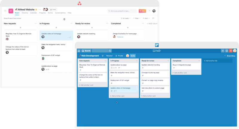
screengrab of trello and asana

We have Trello and Asana for project management. These tools come in real handy when you have a team working on multiple projects. You can make separate channels to keep different projects and related conversations unaffected from other projects. And for communication, Slack saves the day for us. It also lets us separate our sincere work conversations from our casual chats via channels. For video collaboration we use Google meet and Zoom.

Choosing the right suite of tools reduces half of your work/collaboration effort. They might vary for you so do your research and choose wisely.

Meticulous planning and preparations

video call screengrab

We start with a brainstorming session which sets the precedence for the sprint, wireframing and designing process. This chalks out a roadmap for reaching the solution. To make things easier for all the stakeholders involved, our project managers prepare a design brief that answers some basic questions at the outset. It includes:

  • Selecting the right participants
  • Informing everyone about the aim of the meeting and what roles will they play
  • The meeting’s specifics, including the time and date. Making a calendar event for this works out well for us.
  • Stationary and technical requirements, post-its, colored sharpies, quiet background, good internet connection that will allow all-day video conferencing, software to be used, as well as incorporating suggestions from the participants.

Once the brief is sent out, we do follow up calls with the participants. This will ensure that everyone onboard is on the same page to avoid any delays once the meeting starts.

Starting the design sprint

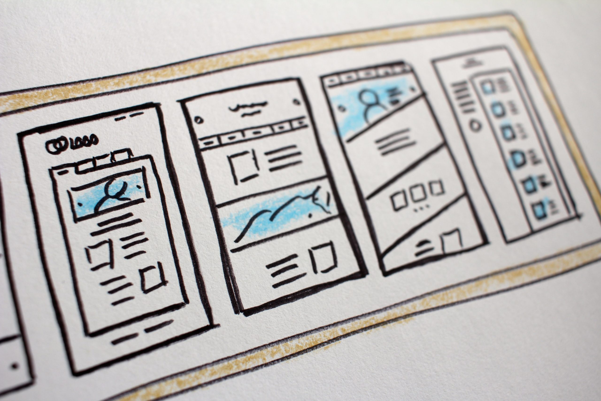
Interface sketches

This elaborate planning is put to test here. We carry out two exercises

1. How might we?

This exercise helps us answer the fundamental questions of the application.

For example, your team is creating an app that helps to keep track of a user’s pet’s meals, vet appointments, exercise timings, etc. You can start by thinking about how you might attract the right set of audience, encourage them to use the app as well as address the different problems of pet owners.

All these “how might we” questions will help you come up with an outline of your product or service. Each team member can come up with a few specific questions that will show possible directions for designing and prototyping the project.

2. Crazy Eights

Crazy Eights has helped us come up with some of our most creative ideas. Everyone on the team needs to come up with 8 different ideas. This gives us a lot to choose from and mix-up the ideas to come up with the best designs.

Creating a prototype and testing it with users

Person holding a phone in front of a laptop

In this stage, we work on combining the ideas to reflect well into an interactive prototype. We build wireframes using Axure and Invision helps us add interaction to our presentation. This is then followed by high fidelity prototypes using Sketch or Figma.

Once the prototypes are built, we bring in unbiased users to put out ideas to test. We leverage UserTesting.com to conduct the testing process with our users.

Conducting remote testing

Person taking notes in front of a laptop

  • You should be able to see how is your user interacting with your prototype
  • You can communicate with them continuously for smooth interaction
  • Remote testing should not affect the overall process and thus give the most accurate results.

We test run our setups for avoiding any hiccups once the users are onboard. This saves our time and ensures a smooth testing routine. A Google sheet is created by our team, which pools together all the answers in one place for the questions asked.

This sheet has answers related to the overall app idea, problem areas, and specifics related to the app design. All these answers are shared with the interviewer who evaluates the answers with what she/he observed during the testing. If possible, we do live recording of the users when they are interacting with our prototype, with their permission. This live recording helps us eliminate any biases that could be done subconsciously from the user or the interviewer’s end.

Final takeaways

After successfully running remote design sprints for the past few months, we have come up with a list of prerequisites for running this process smoothly.

  • Live video conferencing is a must at all stages accompanied by a good webcam and microphone. A reliable internet connection helps avoid any lags or connection drops.
  • Setting up meetings considering all the time zones differences. We use World Time Buddy to schedule our meetings. In case you are spread all across the globe, you can keep rotating the meetings to make it easier for everyone involved. You can also record your meetings for the participants who were unable to attend.
  • A quiet work environment during this sprint. This helps in minimizing any background sounds and distractions, thus keeping everyone focused on the tasks at hand. With all of us working from home, this can be a bit difficult, but you should encourage your team to keep this in mind.
  • Have one on one conversations before and after the sprint to see how efficient this process was for everyone involved. Any troubles faced by your teammates will surface on these calls. This feedback loop is aimed at improving this process.
  • Your tool selection should take into consideration all the stakeholders involved, and how comfortable they are with the tools.

To Conclude

Planning and executing remote design sprints is a daunting task. We have been collaborating remotely before this pandemic confined all of us into our home. Over time, we have improved our process with constant evaluation and tool selections.

We would love to collaborate with you virtually and integrate our learning within your projects as well. You can get in touch with us here.

UX Writing: The Art of Designing Conversations

A staggering 88% of online consumers are less likely to return to a site after a bad experience, and often, it’s the words that make or break this experience. Bill Gates once remarked, “Content is king,” and in the world of UX, this rings truer than ever. UX Writing isn’t just about filling in the blanks; it’s about creating a narrative that guides, engages, and resonates with the user. This article explores the multifaceted role of UX Writing in shaping digital experiences, offering insights that blend strategy with creativity.

The Essence of UX Writing

UX writing is a vital aspect of user experience, guiding interactions between humans and digital platforms. It involves crafting conversations, from button labels to error messages, and its effectiveness relies on clarity, conciseness, and contextual relevance. UX writing is the unsung hero of user experience, leading users through a digital landscape without their awareness.

Conversation Design and User Interface Copywriting

At the heart of UX Writing lies Conversation Design, a discipline that shapes the dialog between user and interface. It’s about anticipating user needs and responses, ensuring that every interaction feels intuitive and human-centric. Similarly, User Interface Copywriting focuses on the language used in these interactions, blending clarity with personality to create a seamless experience.

Content Strategy for UX

A robust Content Strategy for UX underpins effective UX Writing. This strategy involves understanding the audience, their journey, and the desired outcomes of their interaction with the interface. It’s about creating content that not only informs but also engages and delights users, thereby enhancing the overall user experience.

Implementing UX Best Practices

A key aspect of UX Writing is aligning with best practices. This includes clear and concise language, maintaining a consistent voice and tone, and ensuring accessibility. For example, Dropbox’s use of friendly, approachable language in its interface helps demystify cloud storage, making it more accessible to non-tech savvy users.

Applying Actionable Insights

Actionable insights are at the core of effective UX Writing. This means not only understanding the user’s journey but also anticipating their needs and responses. Jst like when Spotify users search for a song that’s not available, the app doesn’t just display an error message; it suggests similar tracks. This proactive approach turns a potential frustration into an opportunity for discovery.

Microcopy in UX

Microcopy, a small text snippet, can clarify functions, address user concerns, and inject personality into the interface. It’s a blend of utility and creativity, providing essential information in a tone that resonates with the user. Airbnb’s search functionality uses a conversational touch to personalize the experience and set a relaxed tone, exemplifying UX Writing at its finest.

Digital Communication Design

Digital Communication Design in UX Writing involves the arrangement and presentation of text, incorporating factors like typography, color, spacing, and hierarchy to enhance readability and user comprehension. 

Good ways also involves presentation, as the layout on a screen significantly impacts information processing. Google’s simple search page is an example of this, designed for ease of navigation for all demographics.

User Experience Best Practices

Adhering to User Experience Best Practices involves creating content that is accessible, inclusive, and empathetic. It’s about understanding the diverse needs of users and ensuring that the interface is usable and understandable by all.

Voice and Tone in UX

The voice and tone used in UX Writing should align with the brand’s personality and the context of the user interaction. This consistency in voice fosters trust and reliability, while the appropriate tone can enhance user engagement and satisfaction.

Accessibility in UX Writing

Accessibility is crucial for ensuring content is perceivable, operable, understandable, and robust for all users, including those with disabilities. This approach not only meets legal requirements but also expands the reach and inclusivity of digital products. Microsoft’s inclusive design principles demonstrate this, catering to a wide range of abilities and reaching a broader audience.

Human-Computer Interaction (HCI)

Understanding HCI principles is crucial in UX Writing. It involves recognizing how users interact with computers and designing text that facilitates these interactions in the most efficient and satisfying manner.

Real-World Digging

A study by NN/g found that clear microcopy can boost task completion rates by 22%, while user-friendly language in error messages reduces frustration and increases satisfaction. Effective UX Writing can boost a website’s conversion rate by 17%.

Conclusion: Crafting Digital Excellence with Galaxy Weblinks

UX Writing is an art that requires a deep understanding of user psychology, a flair for language, and a commitment to creating intuitive and engaging digital experiences. It is important in crafting digital experiences that are not only functional but also emotionally resonant. It’s about creating a conversation that feels personal, informative, and inclusive.

At Galaxy Weblinks, we understand the power of words in the digital space. Our approach to UX Writing goes beyond mere aesthetics; we focus on creating content that drives engagement and fulfills user needs, ultimately contributing to a seamless user journey. Our expertise in UX design, digital marketing, and web development is not just about building platforms; it’s about crafting experiences that resonate, reflect, and respond. Let Galaxy Weblinks guide you through the nuanced landscape of UX Writing, where every word is a deliberate step towards enriching user experiences.