Effective Scaling Of Applications – Tips and Tricks

Before jumping into making a plan for scaling your application, ask yourself what attracts your user now more than ever before?

No! Not the discounts or free offers.

It’s the flawless experience that draws more and more users’ attention that leads to conversion.

Rather than playing the “wait and watch” game, now is the right time to scale up your application. As the demand grows, it should be able to handle multiple requests and an increase in user traffic.

There has been a significant surge in the use of e-commerce apps, online learning software, video conferencing tools, virtual tutoring, or language apps since the outbreak of COVID-19 around the world. Many of the web and mobile offerings were not prepared for this sudden increase in user traffic and faced performance and scalability issues.

In this blog, we will explore the various ways and means to scale applications effectively.

1. Distribute Traffic with Load Balancing
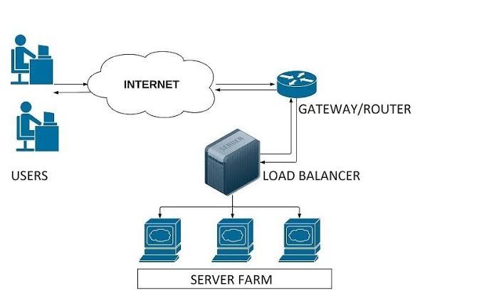
a diagram of load balancers in cloud

Say, your application runs on one server and that can no longer sustain the current load. We recommend adding an extra server or servers to handle the required amount of throughput for your application.

To evenly distribute traffic across the servers, we use load balancers.

There are various methods that a load balancer can route traffic between the servers. One of them is round robin, which sends requests to the servers on a cyclical basis.

For example, if we have 3 servers, then it would send the first request to server 1, the second request to server 2, the third request to server 3, and so on. However, the most efficient method is when the load balancer would send the request only if the server can handle it.

This is how we increase request processing capacity by deploying more server instances on load-balanced computing resources.

But what if this load balancer dies out? Then we would not have a backup!

To overcome this issue, we can set up two or three load balancers where one would be actively routing the traffic and the others would be backup.

The load balancers can be a tangible piece of hardware, or they can simply be software in one of the servers. The cloud services are rampantly available, making it a relatively cheap and easy way to establish a load balancer.

2. Do Not Make Your Database a Bottleneck!
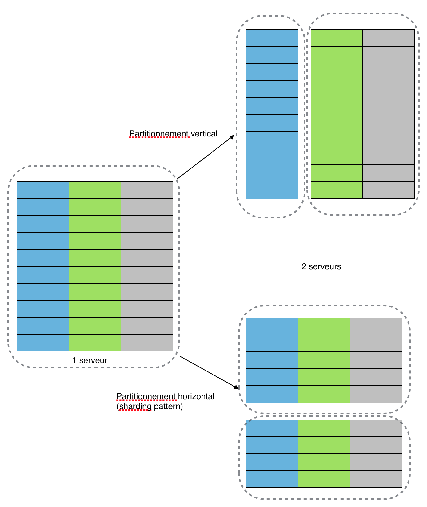
Database diagram

As you grow the number of deployed servers, you might increase the request load on your database. At some point, database accesses will start to incur more latency when it reaches saturation.

For example, having more than ten million users query from the same database is not good. The database would take time to search for a single user amid ten million users.

The solution is to increase your database’s capacity to scale further. You can try to optimize your queries, add more CPUs and/or memory. Perhaps replicate and/or shard your database.

Sharding is used to increase database efficiency by having two or more databases so that queries could be split between them. This will ensure that the queries are executed in minimum time.

One more way to reduce the load on your database is to avoid accessing it whenever possible. This is where caching comes in.

In-memory data caching can be one of the most effective strategies to improve your overall application performance and to reduce your database costs.

Caching can be applied to any type of database including relational databases such as Amazon RDS or NoSQL databases such as Amazon DynamoDB, MongoDB, and Apache Cassandra.

3. Monitor the Performance

A vector of mobile and a laptop

Imagine you want to test an existing deployment to see if it can still provide fast response times if the database size grows by 10x. You first need to generate a lot of data, which ideally echoes the characteristics of your data set and relationships. You need to also generate a realistic workload.

You then need to load and deploy your data set and run load tests, probably using a load testing tool.

This is a lot of work!

The alternative is monitoring. Simple monitoring of your system involves making sure that your infrastructure is operational. If a resource is running low, such as memory or disk space, or remote calls are failing, you should be alerted so that remedial actions can be taken before things go south.

There is a myriad of solutions and cloud-based monitoring available for monitoring. They allow you to capture metrics about your system’s behavior and present these in a unified dashboard to support both the monitoring and analysis of your performance.

When you need to scale your system and tune performance, the data you capture guides your efforts and experiments.

Being data-driven in your system evolution helps ensure you invest your time modifying and improving the parts of your system that are fundamental to supporting your performance and scaling requirements.

Understand your company’s scalability needs and implement the same. What works for other companies may not work for you. Reach out to us if you want to be amazed by the results you achieve after scaling your application with expert developers and testers.

UI Best Practices – Designing buttons that score clicks!

User Experience Design is one of our core competencies. In this blog, we will share with you the best practices of designing buttons for your user interface that will attract maximum clicks. These UI button practices will help your users prioritize tasks by removing friction on-screen while sticking to the basic principles of UX elements for web/mobile applications.

Many designers take inspiration from various new UI designs and apply in their applications like this:

video showing buttons in UI

But what’s wrong with this elegant on-hover and click state button?

Unfortunately, it’s lacking the very first basic rule of button design – “Make it look clickable”.

UI/UX designers should pay much attention to button designs to make buttons stand out, and read numerous articles, analyze and share ways, secrets, and principles to set the color, shape, position, size, and more factors.

Use those designs that follow basic ground rules of UI design. Especially ones that can not only lead users through a website/mobile app effectively but can also entice them to click for better sales.

And as a designer, you always need new clues, ideas, or inspiration to make a unique and useful button for your web/mobile apps.

So here are 5 latest and best button practices that you cannot miss out in 2020. And hope they can inspire you somehow:

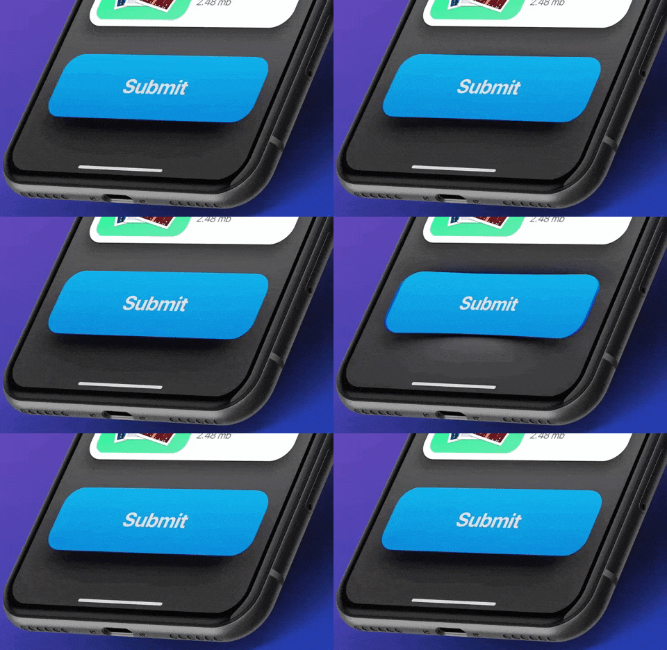
1. Eye-Catching Hover Effects

This Framer button uses a very appealing hover effect. When users move over or across the Play button, the whole button bounces out with a cool 3D Gradient design. Once users move the mouse cursor away, the hover effect will suspend completely. Such designs are eye-catching and interesting.

Video showing buttons in UI
Edoardo Mercati

What can you learn:

You can add various hover or interaction effects to optimize your button designs in your app or web design. They could be very useful to entice users to click and go to the next stage, such as playing a podcast, buying a product, filling contact information, or reading more details, etc.

You can add some changes in colors, shadows, shapes, texts, opacity, frames, and animations of a button according to your action requirements to make it more attractive for users.

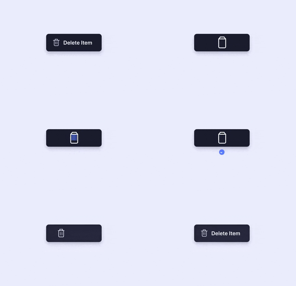
2. Microinteractions for Delete Button

You can show the functions of buttons more vividly by using “button + animation ”. Once users click a button to delete, the action gets depicted by an animation showing the file getting shredded. This is a vivid and imaginative way to showcase the “delete button”. It is an effective way to engage the users while they delete multiple files.

Animation showing button in UI
Aaron Iker

What can you learn:

In your button design, you can add vivid animations to your buttons based on different scenarios, features, and labels to make your buttons outstanding and appealing. Overall, this is excellent to improve user experience.

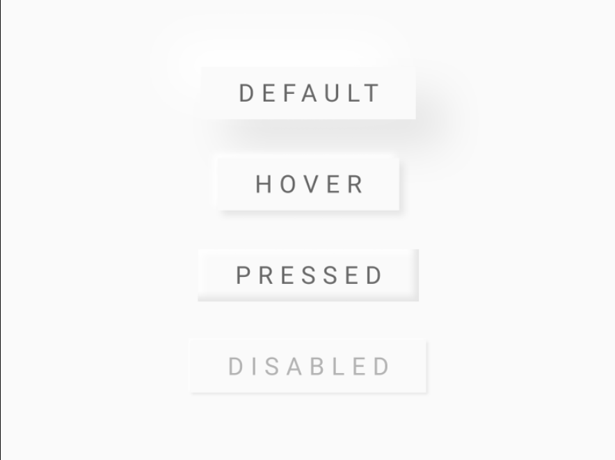
3. Provide Feedback with the Button States

You should always let users know that the command was registered and promptly. This requirement isn’t about how the button initially looks to the user; it’s about interaction experience with the UI element. A good way to make sure nothing is lost in transition is to define the button states in your button design.

Image showing different types of UI buttons
Ryan

What can you learn:

Usually, a button isn’t a one-state object. It should change its state to let the user know that appropriate action is being taken. It becomes essential to provide visual feedback to users to indicate the current state.

4. Buttons with Shadows and Highlights

Drop-shadows make the element stand out against the background. They also highlight it as a clickable or tappable element. Objects that appear as raised give the impression that they could be pressed down. They’re also useful for improving the visibility of light-colored design elements, especially text. Even with flat buttons (almost flat, to be exact), they give subtle interactive cues.

video of buttons in UI
Lucas Haas

What you can learn:

Shadows are key entities in telling your users which UI element they are looking at. Users understand that the element is interactive if a button casts a subtle shadow.

5. Floating Navigation Button

The tooltip uses a very cool floating button that attracts users’ attention and extends the functions of the web/mobile app. It is eye-catching and useful for your users and allows them to easily switch and choose other parts of the web/mobile app. And in this way, such floating buttons can be really interesting, attractive, and impressive for users.

Animation of buttons in UI
Milan Raring

What can you learn:

In your mobile or web app designs, you can create similar multifunctional navigation buttons floating in an interface to extend the functions of a mobile/website app. You can also customize a special way to expand the functions, options, or menus based on users’ interaction with these floating buttons.

Conclusion

Buttons are going nowhere! They will further evolve and get more interactive. Plan them with the utmost consideration, so that your users can enjoy the micro-interactions. Make them flashy, make them intuitive, and make them useful – and let users engage with your application.

Top iOS 14 features you MUST know!

Apple unveiled the latest version of its iOS operating system, iOS 14, at the WWDC keynote in June 2020.

iOS 14 is one of Apple’s biggest iOS updates to date, introducing Home screen design and widget changes, picture-in-picture, Siri improvements, updates for existing apps, and many other tweaks that streamline the iOS interface.

Apple has seeded a total of seven betas yet of upcoming iOS 14 and iPadOS 14 updates to developers for testing purposes.

Let’s look into some major UI updates and features that stole the spotlight.

Widgets

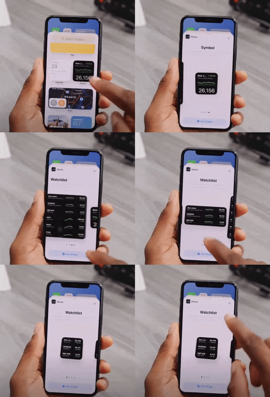
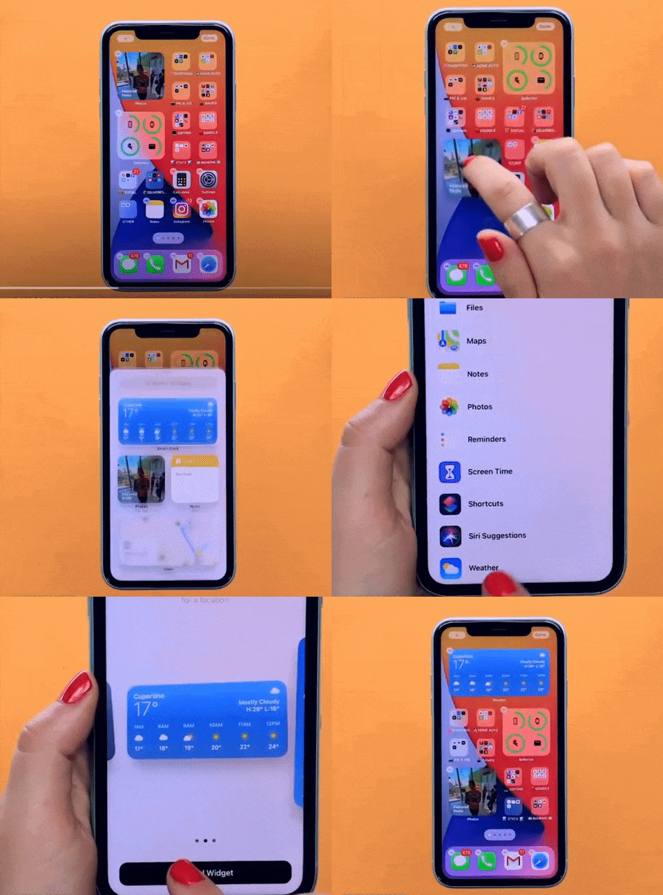
‌iOS 14‌ introduced a redesigned Home Screen that supports widgets on iPhone for the first time, breaking up that stagnant tiled-grid-of-apps look. ‌Widgets‌ have been redesigned and can now be customized in three sizes through the new ‌widgets‌ gallery.

video of a person using a phone

Widgets provide more data than ever to provide more functionality, and Apple redesigned its widgets for default apps like Weather, Stocks, and Calendar. There are also new widgets for Apple News and Screen Time.

Widget Gallery will comprise all of your widget options — by long pressing on the display, choosing “Edit Home Screen” and then tapping the “+” button.

These suggestions are based on what users are installing the most, and third-party app developers can create new widget experiences for their apps.

person showcasing iOS 14 features on iphone

Widget Smart Stacks

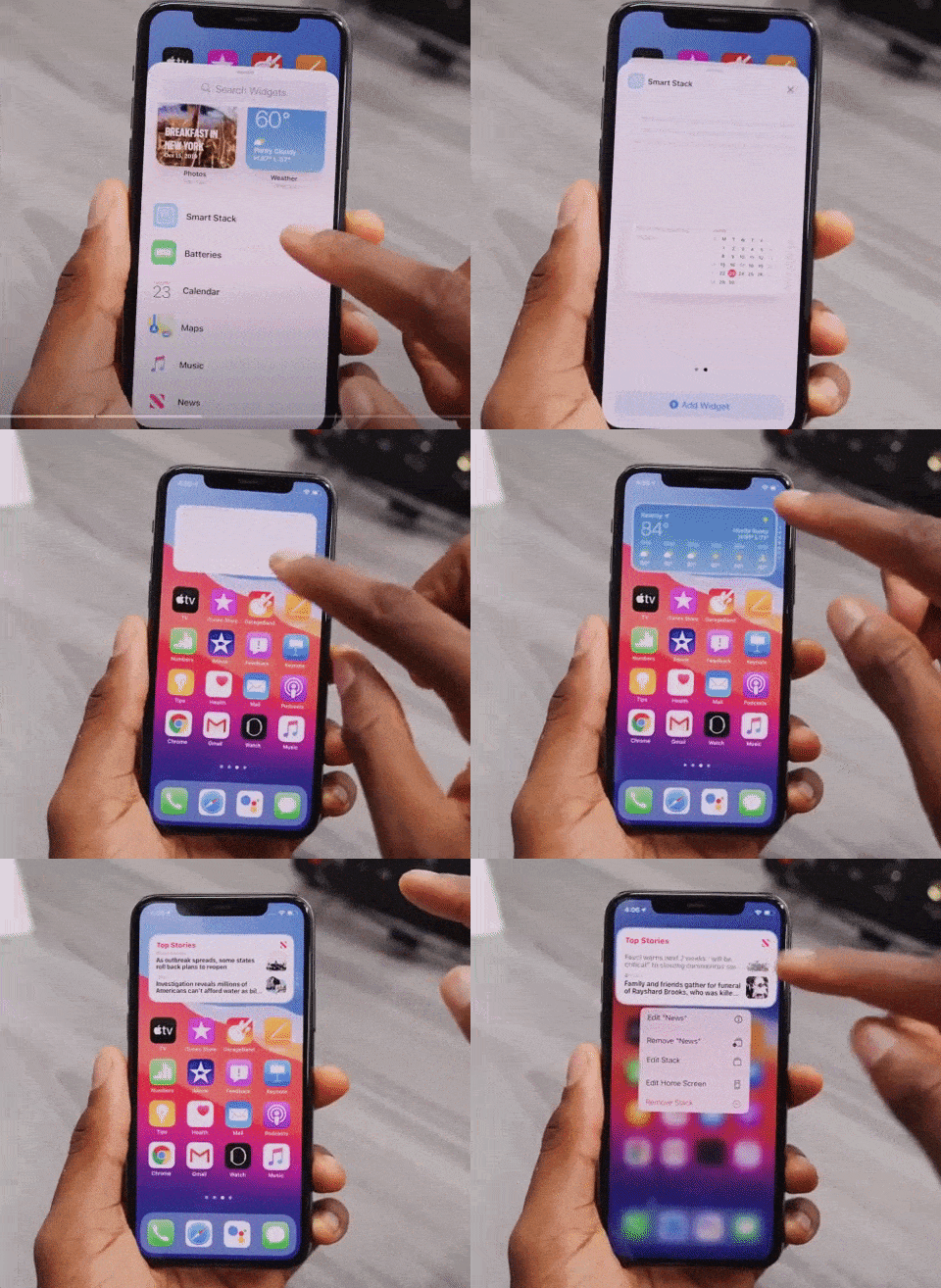
You can stack up to 10 widgets on top of one another to better utilize space and can swap between them with a swipe, both in the Home Screen and Today view.

video of a person using an iPhone

There’s a separate Smart Stack feature that’s different from widget stacking. A Smart Stack is a widget stack, created in the Widget Gallery view, that automatically surfaces the best widget option based on activity, location, and time – making sure you’re looking at what’s most relevant.

You can, of course, swipe through the Smart Stack yourself.

App Library

picture of an iPhone

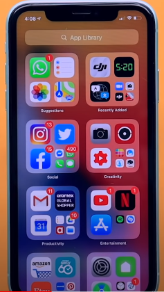
App Library is a great new feature that shows all of the apps you have installed in an organized, simple-to-navigate view that’s similar to the app list view on the Apple Watch. That is categorized into Health and Fitness, Social, Reference and Reading, Productivity, Utilities, Education, Games, Creativity, and Lifestyle.

Compact UI

In the previous version, there are plenty of apps and actions that just unnecessarily take up the entire screen. Now they are all fixed.

Incoming phone calls no longer take up the entire screen in iOS 14 and instead show up as a small banner at the top of the display that you can easily hide, ignore, accept or reject based on your preference.

This also applies to Siri, FaceTime calls, and third-party VoIP calls.

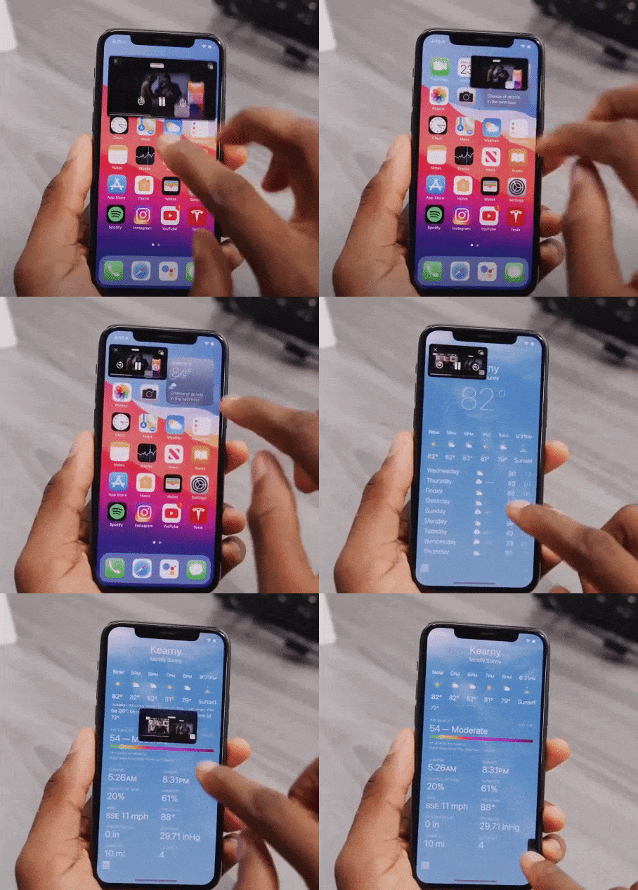
While doing a FaceTime, you will experience a Picture-in-Picture UI that you can easily swipe up, go home, and do other things without pausing the video.

video of a person using an iPhone

Picture-in-picture has been widely supported throughout the entire OS. So, if you are watching any video in Safari or a movie on Apple TV or an app, you can shrink the video in a picture-in-picture window while getting other things done in the background.

Siri Search Updates

Like before, Siri does not take up the whole screen in iOS 14 now. You can call Siri long-press the power button and can see a small animation at the bottom of the screen. It pop-ups an answer at the top of the screen. (But it doesn’t let you interact with anything underneath directly without exiting Siri- if you want to).

Unique iOS 14 Accessibility Features

These upgrades may look minor for iOS 14, but they will be immensely helpful for visually and hearing-impaired users.

Within the new update, you’ll be able to set up your iPhone to listen out for specific noises such as a siren or fire alarm or even a cat. If the phone hears the noise, it’ll notify the user.

According to Apple, it won’t be sending any of your data onto the internet to allow for this feature as this is all done using on-device technology.

Another unique feature in accessibility settings is that you can now map double-tap or triple tap on the back of the phone to a shortcut like Siri, mute, volume down/up, lockscreen, and others.

There are so many other minor changes that have been made in each beta version. ‌iOS 14‌ and ‌iPadOS 14‌ are available to registered developers and public beta testers at this time. Stay tuned to find out which features we are finally going to see in the iOS 14 final release this month.

A comprehensive guide to Mobile App Design

2.56 million and 1.85 million.

According to Statista research, these numbers are the number of applications available on Google and Apple’s app store, respectively.

Each one of these applications is trying to solve a problem. Problems like payment friction, learning, boredom, and whatnot. A million solutions for billions of smartphone users.

But, bear in mind that a problem can be approached in numerous different ways and not all solutions are up to the mark. Most of the apps are not thoroughly researched or planned and hence lack in UX, functionality, optimization, etc..

Having delivered 80+ successful enterprise and user-facing apps, we have learned and curated a set of best practices that help us deliver flawless mobile solutions. Here’s a comprehensive guide to Mobile App Design.

Establishing the ‘Why’ of your app

Trees with question mark on it

Yes, this is an obvious one! Some things that will be established after you have had your ‘eureka’ moment. Meaning, you know that you have to design an app that will solve your user’s problem with ease but you need to dive deeper.

To facilitate this, answer all the questions below before you jump in the design and development phase:

  • What is the problem that you are trying to solve for your users? (like assessing users mental health)
  • Can you define your app’s aim in a single sentence? (This will give you a precise answer to the question above)
  • How do you plan on solving the problem from your user’s viewpoint (and not yours)?
  • What is your USP?
  • How many competitors are there in the market and how do you plan to differentiate your product offering?
  • If your idea is unique, how do you plan on educating your potential users and convincing them to download your app?

These answers will lay the groundwork for your app thus it’s vital that they are clear and understood by all your team members. Write these answers, print them out, paste them in your office, but ensure that everyone is on the same page.

You can always go back to the answers in case there is a detour in your journey.

Creating a functional design

Two smartphone laid on a table with their displays on

Now that there is crystal clear clarity (pardon the alliteration), it’s time to design your app. You should start with wireframes and prototypes for validating your idea. Some tools that will help come in handy are:

  • Sketch
  • Axure
  • Miro
  • Adobe XD

People spend the majority of their time on mobile apps. This implies that the users are hooked to a certain set of apps. How to get in this inner circle?

A clean, simple, and intuitive UI is the answer. This seems a bit vague so let’s define some tips and methods that will help us here.

Storytelling via your UI

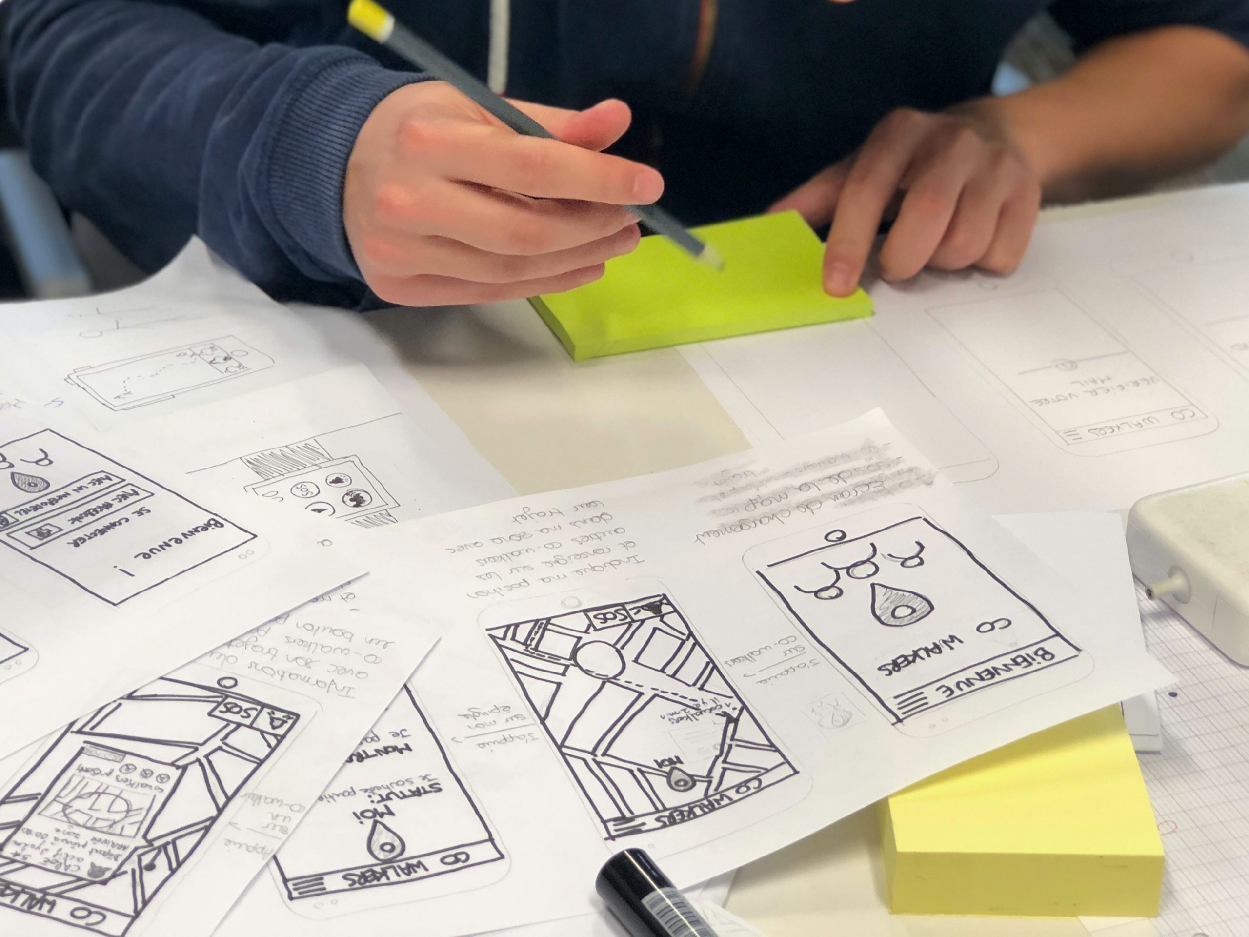
paper sketches of an app

We all love stories and mindful endings. And this can be done via your copy, illustrations, animations, etc. Storytelling will help your users share your vision and have better clarity of why your app exists.

  • Make your UI copy conversational and avoid jargon at all costs.
  • Leverage tooltips for better engagement.
  • Be clear when sending out an error message. Pinpoint whatever is wrong or missing.
  • Come up with a pleasing onboarding process

Thus you can humanize your app via a story and it gives the users a chance to look into the vision that you have for your app.

Familiar App Navigation

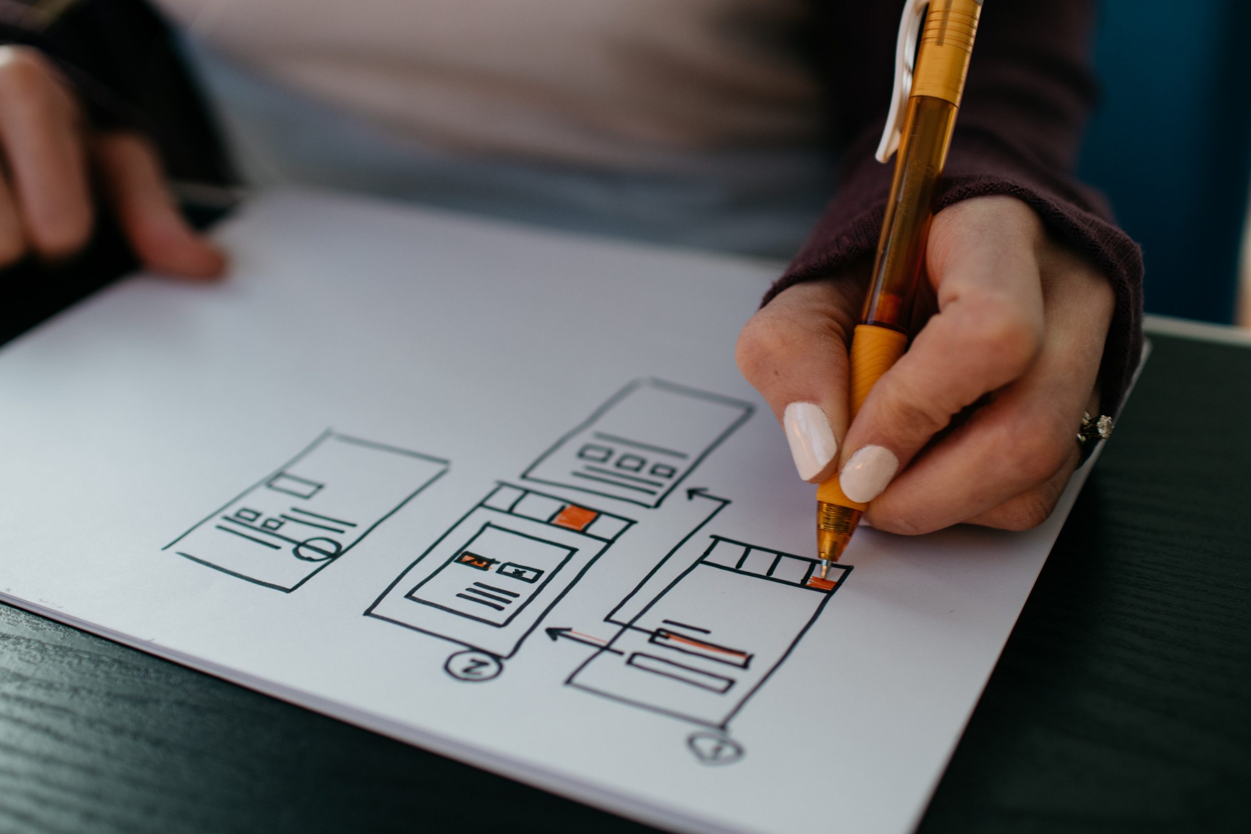
Person sketching mobile screens

Design your app in such a way that your users need no additional directions to navigate your app. We do not imply that you should copy from competitors. Rather, look out common practices that your user is habitual to, irrespective of the app category.

Stick to using UI elements like hamburger menu, tabbed navigation, or skeuomorphic icons, and so on. The aim is to avoid surprising your user on every click.

Keep in mind how people hold their phones

People holding their phones

We all hold our phones in many ways. Holding it in both our hands in landscape mode, holding the phone in one hand and using the thumb to scroll, using both hands for operating, etc.

Whichever the way, ensure that the vital interaction buttons are within the thumb’s reach and not in the stretch zone. Place the key functionalities and information somewhere in the center. And no elements are hidden behind fingers and palms.

Touch targets

graphic of bubbles

According to MIT’s Touch Lab’s Study, 10mm by 10mm is the minimum touch target size. We have to design for fingers and thumbs, not for cursors.

You can increase as per your need. Say if you are focusing on the elder demographic via your mental wellness app, it would make sense to increase the touch target’s size.

Also the spacing between touch targets should be adequate. They should not be so close to each other that it leads to wrong selection.

Use Established Gestures

person holding a phone perpendicular to their body

Using the same gestures may seem like a creativity barrier but if you don’t do this, your users will suffer.

Scrolling up and down, pinching for zooming in and out, etc should be used wherever possible. Also if you do wish to deviate a little, inform your users and even better demonstrate it for them so that there is no confusion.

You can also test this in your hi-fidelity prototypes to see if your users are struggling with understanding and using the different gestures.

Consistent layout

person holding a phone in front of their computer

Consistency is the lifeline of good design. You can design such an app via:

Visual hierarchy and weight via color play, typography, size, etc.
All your interactions, gestures, navigation should follow the same pattern throughout your app.
Your design should look the same across varying screen sizes and platforms.
If you have a live website, you should aim for a similar-looking app.

Easy Onboarding Tour

person using a tablet device

As mentioned early, your onboarding is a chance to curate your story and present it to your users. Don’t miss out on this.

You should not overwhelm your users with all the information in one go. You will turn your users away even before they complete the onboarding. Your tour should be a progressive one, encouraging users to keep moving on.

Break the information into smaller sizes for easy remembrance. And give the option to skip and resume the tour as per the user’s convenience. This gives the user the control and thus motivates them to interact more.

Keep the sign up simple and give the option to login via social media accounts. If possible, ask users to sign up in the later stages of onboarding. This way you get to highlight your value beforehand, thereby reducing the churn rate.

You will also need to take care of these practices –

  • You should have in-app search functionality, especially for ecommerce websites with huge product offerings.
  • Deter from asking unnecessary permissions. Continuing the above example of a mental wellness app, asking access to messages and contacts may not be well received by the user.
  • Minimize your user’s input. Enable autofill for your forms to speed up the signup process.
  • Keep your notifications to a minimum. Frequent notifications are annoying and may result in the users switching off the notifications altogether.
  • Optimize your app for voice search.

Your app should be designed in a way that your users do not think about the design of your app rather they focus on its functionality.

Testing Your App

person holding a phone while taking notes

Once you have invested your time and effort into designing and developing your app, you should test your app’s beta version on a focused group. Ask them for their honest feedback and improvement areas.

You have to test for your app for:

  • Functional testing for seeing the working of the functions and features.
  • Performance testing under different network bandwidths, older mobile devices, and servers.
  • Accessibility compliance
  • Interruption testing for how the app behaves upon incoming calls, notifications, low battery warnings, any cable attachments or detachments, etc.

Ready, Set, Release

After you ensure that your app is good to go out in the app world(s), sit back, and hit the launch button.

A side note here, things may not go as expected post-launch, so you need to have an open mind and pay heed to the feedback from your real users.

We, at Galaxy Weblinks, have been on this rollercoaster ride of app design, development, and release a good number of times, in case you wish to talk to us about your app and even new ideas, you can get in touch with us here.