There’s a popular user experience quote: “A user interface is like a joke. If you have to explain it, it’s not that good.” While clever, that statement is far from the truth.
We agree that user interfaces shouldn’t be complicated. On the other hand, you can’t expect a new user to understand a new interface without any direction. That’s where user onboarding flows come into play.
This also stands true for the existing users who need directions to understand an updated interface or a new feature.
In this article, we will discuss those onboarding UIs that will help both new and existing users understand features – breaking the myth at the same time that user onboarding begins and ends with the first experience.
We’ll be discussing UI patterns like tooltips, hotspots, modals, etc. that have roots in specific types of “popup” window situations and are popularly used interchangeably in general web conversation.
Each of them offers some common purpose:
- Contextual help: Offer helpful hints and support in the context of your product.
- New feature Announcement: Draw attention to a new feature without interrupting a user’s workflow.
- Influence User behavior: Gently nudge users to explore, learn, or take action.
When used correctly, they can be powerfully engaging. But when used the wrong way, they can feel like spammy popups that disrupt the user experience – ultimately causing users to churn.
It’s important to find the right balance between communicating with your users and just letting them do their thing. With that in mind, let’s discuss what they are.
In-context Tooltips
As opposed to a ‘first look’ experience, these tips appear as the user explores the product that can either explain the value of that feature/section or explain how to use it.
This technique waits for the user to take an action and presents the value right then and there. Similar to the tour, it is usually implemented as an overlay. Here is a list of 5 mistakes that you can avoid to boost feature adoption while designing tooltips.
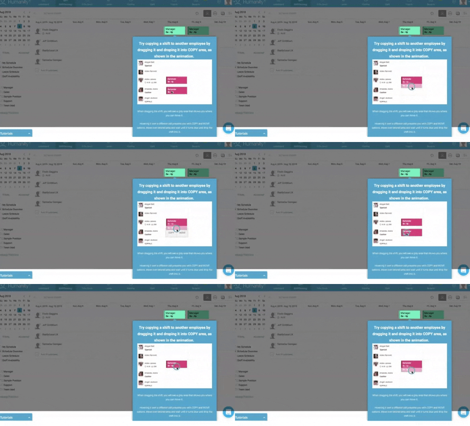
Pros: The tooltips are in-context, so it solidifies the feature-value pairing, reducing cognitive load. This can also be created with 3rd parties like Appcues or Chameleon.
Cons: Some might never get discovered.
Popup Modal Window/Lightbox
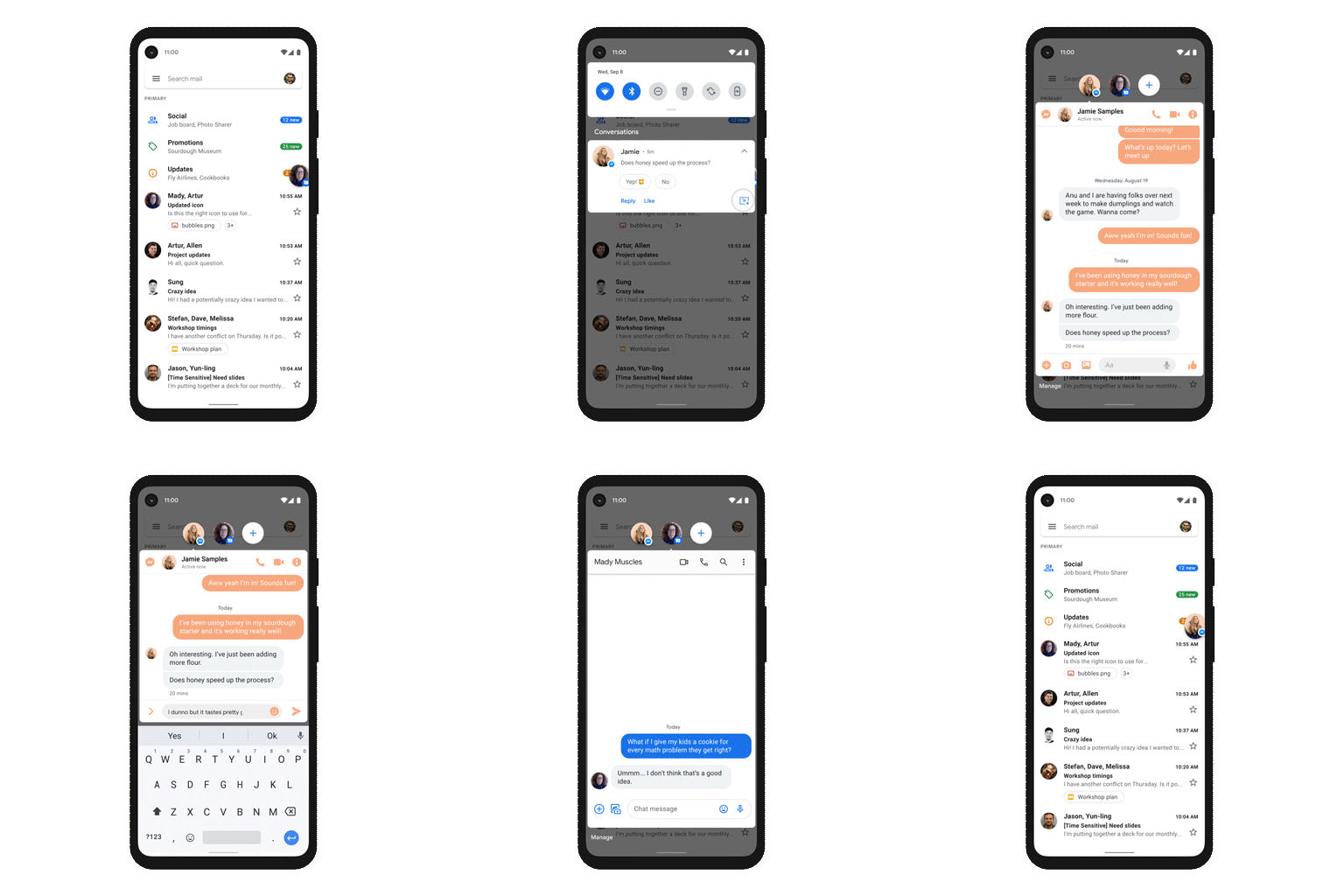
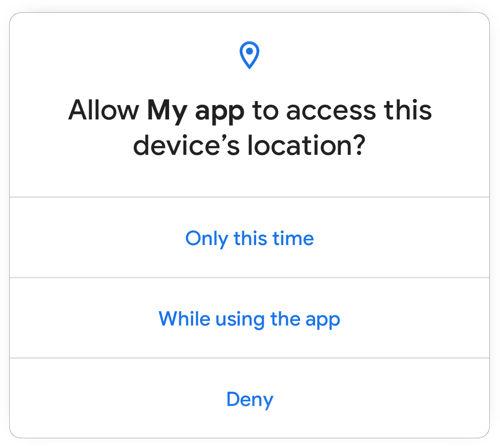
A modal popup is great for announcements and situations where an action is encouraged, but not required. As with every customer communication, the information should be valuable and timely.
While some users may be in the habit of avoiding anything that pops up, embedded UX patterns could be something users look forward to when used the right way.
It’s similar to a lightbox that is used as a generic term for any popup that darkens the website and displays a dialog containing an image or other content. Often used to display galleries or content that should temporarily take complete focus from the rest of the page.
Generally, they can be dismissed with a cross button or by clicking anywhere in the darkened part of the page.
Gmail’s simple onboarding flow offers a good example of an effective modal window that creates delight, rather than frustration.
Pros: Immediately requires a CTA, the intended action is clear and direct.
Cons: Can often be a little intrusive.
Hotspots
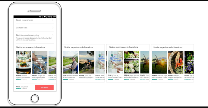
They work similarly to tooltips. Some apps skip product tours and welcome screens and opt to show people tooltips and hot spots instead.
The goal of this user onboarding technique is to point out to users the certain features that play a key role in the user environment, even without noticeable warnings.
Pros: Allowing customers to explore functionality at their own pace and when they need to use different parts of the app makes this an excellent onboarding strategy. Especially for users switching from a different platform for the same product.
Cons: Users might get annoyed if you are using more than 3 hotspots on a screen.
Blank Slate Tips
Think of every not-yet-populated section/view of your product as space to nudge the user to create content. Use that space to educate the user on what type of content goes there, how to add it, how long it might take, and what value it will add.
Pros: It’s a great use of negative space. It’s persistent until they replace it with content. There’s nothing more daunting than a blank piece of paper! It leverages people’s completionist tendencies.
Cons: It might not be enough on its own.
Conclusion:
It’s important to find the right balance between communicating with your users and just letting them do their thing.
Put careful consideration into the “when” and “why” of your mobile tooltip design. Remember, tooltips are annotations – they should add value to the user experience, not overpower it.
There is no “right” or “perfect” user onboarding flow. What works for one site/product/app might not work for another. What works for one user might not work for another.
For example, you might need to onboard a developer vs. an average user.
Designing a user onboarding flow that works is complicated. It involves a lot of research, testing, and optimization.
Contact our UX design experts to shorten your users’ time-to-value, get them to that ‘aha moment,’ strengthen your brand, and do it all fast!
About Galaxy Weblinks
We specialize in delivering end-to-end software design & development services. Our UI/UX designers are creative problem-solvers with a decade of experience in all facets of digital and interactive design. We create compelling and human-focused experiences delivered through clean, and minimalist UI.
