The COVID-19 pandemic had a significant impact on global eCommerce trends. With brick-and-mortar stores closing overnight, customers flocked to the internet to purchase their necessities. The pandemic hastened the shift to online shopping by up to five years.
mCommerce, or mobile commerce, refers to online shopping via a mobile device such as a smartphone or tablet. It will continue to grow in the coming years as a majority of people now prefer to shop on their phones.
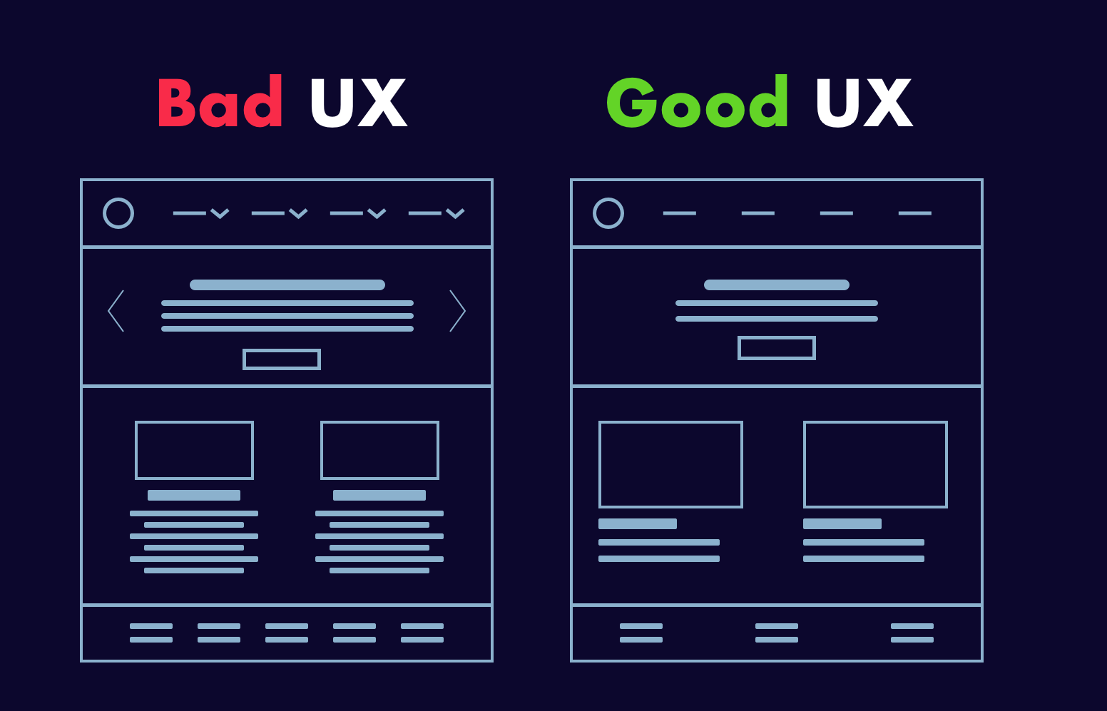
Even though mobile devices account for the majority of Ecommerce traffic, desktop sites have lower cart abandonment rates and higher average purchase values. Mobile Commerce is the way of the future, but if designers want to maximize profits now, they must improve desktop sites with Ecommerce UX best practices.
Yet, mobile sites fail to meet three key metrics: they have higher cart abandonment rates, low conversion rate, and lower average order values than desktop sites.
Four Crucial Pages of the Ecommerce Experience
Almost all Ecommerce sites on desktop rely on a similar sequence of pages to guide customers through the sales process.
- Homepages that are uncluttered and offer irresistible value propositions
- Category pages that are well-organized and simple to navigate
- Product pages that have been polished and incorporate social proof and compelling content
- Checkout pages that are simple to use, show progress, and make customers feel safe
…
Uncluttered Homepages
1. Product Names That Shoppers Understand
Internally consistent product names can be perplexing to customers. Provide context for decision-making. Names based on model numbers or underlying technology run the risk of alienating the general public. The same is true for titles that are overly cute or creative. Choose product names that indicate utility or value in the eyes of shoppers.
2. Enable Search From Anywhere
Ecommerce websites offer a plethora of products and therefore, the search feature becomes an essential way for customers to find products based on their requirements. Sticky search bars ensure that search is available everywhere on every page, but for the sake of conversion, it is best to remove search from checkout pages.
3. Highlight Deals and Promotions
Customers visit Ecommerce sites with a specific product in mind. Deals and promotions go unnoticed when they blend into homepages. Bright colors, bold text, and full-page photos are used in call-out advertisements.
If a promotion is the most important thing shoppers need to know about, make it the center of attention.
4. Make the Product’s Value Immediately Visible
Getting the product page right is important as first impressions matter. Customers must be able to quickly determine the worth of a product. We recommend that you assist the customers in visualizing how your product will solve their problems and improve their lives (the Jobs to Be Done framework is a useful starting point).
Keep your product descriptions and technical specifications brief and to the point. Use photos and videos that demonstrate the benefits of the product. If the shoppers must read and scroll a lot, or watch long-winded explainer videos to understand the value, then you are doing something wrong here.
…
Well-organized Category Pages
1. Display Best-Sellers
Bestsellers should be labeled with distinct icons or placed in bestseller sections. Why? Bestsellers provide social proof. When people are unsure, they will look to others’ actions to determine their own. This is especially true for first-time buyers.
A similar rule applies to newly released products. Displaying new and improved items is more than just a one-time sales tactic; it is a way to entice customers to return for future updates.
2. Ensure Ease-of-Use Navigation
The navigation must be simple. Customers should not have difficulty switching between category pages or enabling product filters. Sites with a large number of products in a single category should use left-column navigation to allow customers to sort products by various attributes (faceted search).
3. Display Products in Grids
Desktop screens provide ample space for product grids. Grids align with F-pattern scanning and allow shoppers to quickly compare multiple products. They are especially useful for items that are easily explained with pictures. To get the most out of grids, keep the number of items per row between two and four. Grids become significantly more difficult to scan when there are five or more products.
Bonus: List views can be useful, but they’re best for products that require more detailed explanations.
…
Polished Product Pages
1. Create large, eye-catching “Add to Cart” buttons.
When it comes to product pages, “Add to Cart” buttons must be visible. Make them large, contrast-heavy, and easy to click. Resist the urge to be witty and instead create call-to-action text that is clear and action-oriented.
When customers add items to their shopping carts, they must receive visual feedback. Many desktop sites do this with cart-summary overlays that slide in from the side of the screen for a brief moment (a creative way to allow shoppers to transition to checkout or keep browsing).
2. Upsells and related products can help you earn more money.
If customers are dissatisfied with what they see on product pages, they should not have to return to category pages to find other options. Show them alternatives at comparable price points or more expensive options with better features, reviews, or brand recognition.
It is also possible to suggest complementary items to the product page. Considering purchasing shoes? Why not get some shoelaces and arch supports as well? Make sure that related items have a “Add to Cart” option to reduce friction.
3. Make use of copy and imagery to demonstrate the good life.
Ecommerce content should be informative, but persuasion requires more than facts and feature lists. Use text and images to help customers imagine the good life that awaits them after they complete their purchase.
Again, desktop sizes are advantageous. There’s no reason not to use massive photos and videos or show products from multiple perspectives. The same is true for the copy. Don’t be afraid to use large headers and a lot of white space around text blocks.
4. Use Social Proof to Persuade
Shoppers are more likely to buy if they see social proof. Ratings and reviews have a significant impact on purchasing decisions, but desktop sites are large enough to accommodate other types of social proof:
- Customer-taking product photos
- Approval badges from independent review sites
- Celebrity and influencer endorsements
- Expert quotes
Social proof aims to make shoppers feel as if they are making informed decisions that are consistent with the positive experiences of others.
…
Simple Checkout Pages
1. Accept Various Payment Methods
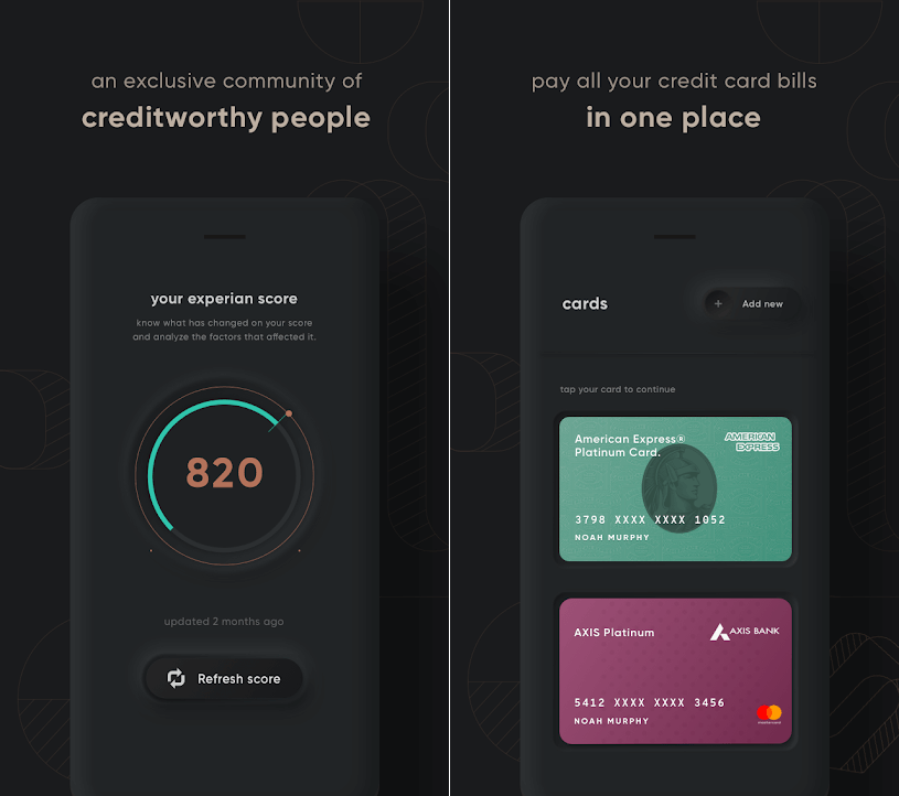
When it comes to payment gateways, shoppers’ primary concerns are convenience and security, and these are two of the leading causes of cart abandonment. Fortunately, an increasing number of online payment options alleviate security concerns while also expediting checkout. Third-party payment options supported by well-known brands (such as Amazon and Apple) may be more appealing to customers than entering credit card information.
It is also worthwhile to consider “buy now, pay later” (BNPL) options such as Paypal Credit and Klarna. BNPL is a type of point-of-sale credit that allows customers to pay for products overtime after they receive them.
2. Give a detailed order summary.
This is highly recommended. We suggest that you provide shoppers with brief order summaries that include:
- Details and quantities of the product
- A breakdown of all charges
- Details on shipping and billing
It’s also a good idea to display product images, but make sure the attributes match the attributes chosen by customers (color, size, finish, etc.).
3. Think about Guest Checkout.
Guest checkout may not be appropriate for all Ecommerce retailers, particularly those whose business strategies revolve around the creation of customer accounts. It has, however, been shown to speed up checkout, prevent account creation fatigue, and reduce cart abandonment.
An alternative is to require email confirmation for orders, then follow up with deals in shipping and delivery messages.
4. Display Shoppers Checkout Progress
Ecommerce customers spend a significant amount of time and energy searching for products online. When they’re ready to buy, they want to know that the end of the process is near. A progress bar is a simple way to show shoppers where they are in the checkout process.
…
We hope that this practical piece curated from our eCommerce experience will assist you in developing the best Ecommerce strategy. And if you want to interact with your customers in a completely new way and increase your conversion rate, get in touch with our experts here.
About Galaxy Weblinks
Galaxy Weblinks is a company that specializes in creating the best online experiences for your users. We have experience customizing websites on a variety of platforms, including Shopify, WooCommerce, and Magento. Contact us today to discuss your Ecommerce project.


