Ecommerce User Journey – 15 Must-haves to Include

The COVID-19 pandemic had a significant impact on global eCommerce trends. With brick-and-mortar stores closing overnight, customers flocked to the internet to purchase their necessities. The pandemic hastened the shift to online shopping by up to five years.

mCommerce, or mobile commerce, refers to online shopping via a mobile device such as a smartphone or tablet. It will continue to grow in the coming years as a majority of people now prefer to shop on their phones. 

Even though mobile devices account for the majority of Ecommerce traffic, desktop sites have lower cart abandonment rates and higher average purchase values. Mobile Commerce is the way of the future, but if designers want to maximize profits now, they must improve desktop sites with Ecommerce UX best practices.

Yet, mobile sites fail to meet three key metrics: they have higher cart abandonment rates, low conversion rate, and lower average order values than desktop sites.

Four Crucial Pages of the Ecommerce Experience

Almost all Ecommerce sites on desktop rely on a similar sequence of pages to guide customers through the sales process.

  • Homepages that are uncluttered and offer irresistible value propositions
  • Category pages that are well-organized and simple to navigate
  • Product pages that have been polished and incorporate social proof and compelling content
  • Checkout pages that are simple to use, show progress, and make customers feel safe

Uncluttered Homepages

1. Product Names That Shoppers Understand

Internally consistent product names can be perplexing to customers. Provide context for decision-making. Names based on model numbers or underlying technology run the risk of alienating the general public. The same is true for titles that are overly cute or creative. Choose product names that indicate utility or value in the eyes of shoppers.

2. Enable Search From Anywhere

Ecommerce websites offer a plethora of products and therefore, the search feature becomes an essential way for customers to find products based on their requirements. Sticky search bars ensure that search is available everywhere on every page, but for the sake of conversion, it is best to remove search from checkout pages.

3. Highlight Deals and Promotions

Customers visit Ecommerce sites with a specific product in mind. Deals and promotions go unnoticed when they blend into homepages. Bright colors, bold text, and full-page photos are used in call-out advertisements.

If a promotion is the most important thing shoppers need to know about, make it the center of attention.

4. Make the Product’s Value Immediately Visible

Getting the product page right is important as first impressions matter. Customers must be able to quickly determine the worth of a product. We recommend that you assist the customers in visualizing how your product will solve their problems and improve their lives (the Jobs to Be Done framework is a useful starting point). 

Keep your product descriptions and technical specifications brief and to the point. Use photos and videos that demonstrate the benefits of the product. If the shoppers must read and scroll a lot, or watch long-winded explainer videos to understand the value, then you are doing something wrong here. 

Well-organized Category Pages

1. Display Best-Sellers

Bestsellers should be labeled with distinct icons or placed in bestseller sections. Why? Bestsellers provide social proof. When people are unsure, they will look to others’ actions to determine their own. This is especially true for first-time buyers.

A similar rule applies to newly released products. Displaying new and improved items is more than just a one-time sales tactic; it is a way to entice customers to return for future updates.

2. Ensure Ease-of-Use Navigation

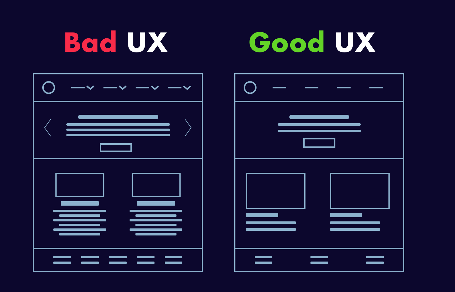
The navigation must be simple. Customers should not have difficulty switching between category pages or enabling product filters. Sites with a large number of products in a single category should use left-column navigation to allow customers to sort products by various attributes (faceted search).

3. Display Products in Grids

Desktop screens provide ample space for product grids. Grids align with F-pattern scanning and allow shoppers to quickly compare multiple products. They are especially useful for items that are easily explained with pictures. To get the most out of grids, keep the number of items per row between two and four. Grids become significantly more difficult to scan when there are five or more products.

Bonus: List views can be useful, but they’re best for products that require more detailed explanations.

Polished Product Pages

1. Create large, eye-catching “Add to Cart” buttons.

When it comes to product pages, “Add to Cart” buttons must be visible. Make them large, contrast-heavy, and easy to click. Resist the urge to be witty and instead create call-to-action text that is clear and action-oriented.

When customers add items to their shopping carts, they must receive visual feedback. Many desktop sites do this with cart-summary overlays that slide in from the side of the screen for a brief moment (a creative way to allow shoppers to transition to checkout or keep browsing).

2. Upsells and related products can help you earn more money.

If customers are dissatisfied with what they see on product pages, they should not have to return to category pages to find other options. Show them alternatives at comparable price points or more expensive options with better features, reviews, or brand recognition.

It is also possible to suggest complementary items to the product page. Considering purchasing shoes? Why not get some shoelaces and arch supports as well? Make sure that related items have a “Add to Cart” option to reduce friction.

3. Make use of copy and imagery to demonstrate the good life.

Ecommerce content should be informative, but persuasion requires more than facts and feature lists. Use text and images to help customers imagine the good life that awaits them after they complete their purchase.

Again, desktop sizes are advantageous. There’s no reason not to use massive photos and videos or show products from multiple perspectives. The same is true for the copy. Don’t be afraid to use large headers and a lot of white space around text blocks.

4. Use Social Proof to Persuade

Shoppers are more likely to buy if they see social proof. Ratings and reviews have a significant impact on purchasing decisions, but desktop sites are large enough to accommodate other types of social proof:

  • Customer-taking product photos
  • Approval badges from independent review sites 
  • Celebrity and influencer endorsements
  • Expert quotes 

Social proof aims to make shoppers feel as if they are making informed decisions that are consistent with the positive experiences of others.

Simple Checkout Pages

1. Accept Various Payment Methods

When it comes to payment gateways, shoppers’ primary concerns are convenience and security, and these are two of the leading causes of cart abandonment. Fortunately, an increasing number of online payment options alleviate security concerns while also expediting checkout. Third-party payment options supported by well-known brands (such as Amazon and Apple) may be more appealing to customers than entering credit card information.

It is also worthwhile to consider “buy now, pay later” (BNPL) options such as Paypal Credit and Klarna. BNPL is a type of point-of-sale credit that allows customers to pay for products overtime after they receive them.

2. Give a detailed order summary.

This is highly recommended. We suggest that you provide shoppers with brief order summaries that include:

  • Details and quantities of the product 
  • A breakdown of all charges
  • Details on shipping and billing

It’s also a good idea to display product images, but make sure the attributes match the attributes chosen by customers (color, size, finish, etc.).

3. Think about Guest Checkout.

Guest checkout may not be appropriate for all Ecommerce retailers, particularly those whose business strategies revolve around the creation of customer accounts. It has, however, been shown to speed up checkout, prevent account creation fatigue, and reduce cart abandonment.

An alternative is to require email confirmation for orders, then follow up with deals in shipping and delivery messages.

4. Display Shoppers Checkout Progress

Ecommerce customers spend a significant amount of time and energy searching for products online. When they’re ready to buy, they want to know that the end of the process is near. A progress bar is a simple way to show shoppers where they are in the checkout process.

We hope that this practical piece curated from our eCommerce experience will assist you in developing the best Ecommerce strategy. And if you want to interact with your customers in a completely new way and increase your conversion rate, get in touch with our experts here.

About Galaxy Weblinks

Galaxy Weblinks is a company that specializes in creating the best online experiences for your users. We have experience customizing websites on a variety of platforms, including Shopify, WooCommerce, and Magento. Contact us today to discuss your Ecommerce project.

The Good and the Bad of Dark UI Designs

From mobile screens to TV sets, dark UI designs are seen far and wide and appreciated for the visual appeal that they offer. A dark theme depicts sophistication and elegance. However, dark UI designing comes with multiple challenges. If the implementation is poor, things can very well go south.

Digital products having dark UIs are perceived as powerful, elegant, and mysterious. They are a formidable trend across the digital spectrum. It’s said that dark mode can reduce eye strain, save battery life and increase accessibility. But, most of the time, dark themes are an aesthetic choice.

Over the past few years, dark themes are amongst the most requested features. Both Apple and Google have a dark theme as an essential part of their UI. Be it browsers, mobile applications of social media platforms, or VR/AI games, dark themes are everywhere as an option, if not a default feature. 

Source: Apple

Dark User Interface – The Good and the Bad

Choosing one of the two is a tricky balancing act. The dark theme is not suitable for all interfaces and neither is the light theme. Selecting the right options depends on brand fit, cultural suitability, and color psychology. Also, consider the emotional impact before asking your developer to go for either one. 

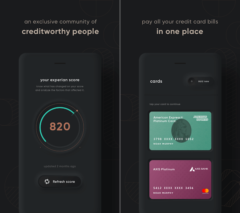
For instance – a financial app designed for millennials to take care of their credit card bill payments may look cool with a dark theme, but the same won’t work for a big bank’s website, serving the general, larger population. Too rich, too dark, and too stylish may frustrate people who just want to check their balances and transfer money.

Source: Cred

Dark UIs for B2B SaaS applications are notoriously difficult to design. Web UI components like widgets, forms, data tables, and dropdowns can look odd on a dark theme. Owing to the type, context, and environmental factors, certain brands and products are not an ideal fit and may prove an insurmountable challenge.

If your designers have not worked with dark UI design before, they might find themselves in rough, uncharted waters. In the world of dark UIs, norms are bent, pitfalls aplenty, and trends change quite often. 

Having said that, using dark UIs is a good call for a number of reasons:

  • With the minimalist design having only a few content types.
  • When there is appropriate context and use; like a nighttime entertainment app.
  • When a striking and dramatic look is needed.
  • To make a statement for the brand.

Not to forget, there are scenarios when dark UI is a bad call. When there is too much text (dark background makes reading difficult), a lot of mixed content types, or the design calls for a wide range of colors, the dark theme should be avoided. 

Impact of dark theme on UI design

As developers, we are always considerate of UI design trends and user preferences while making the best use of our time and resources. So, is adding a dark mode design a worthwhile use of the client’s budget?

We would say, this totally depends on the use case. As established earlier, the dark mode can sometimes be a hindrance to comprehension. We won’t recommend it for digital products where it could lead to big consequences. For instance, online banking services or regulatory platforms.

In other instances, we can turn to dark UI design to influence user behavior. If user engagement is an important metric for your product like Twitter, Reddit, etc, then the case for the dark theme will be stronger.

7 dark theme design tips from Galaxy

Dark theme design captivates the audience when done right. That’s what we aim for with all products that we develop. Here are seven design tips that we also practice:

  • Considering brand (identity, image, etc) 
  • Avoiding pure black
  • Avoiding heavily saturated colors
  • Ensuring enough contrast in colors
  • Softening white backgrounds
  • Matching color to the brand message
  • Communicating depth

Summing up 

It boils down to personal preference…

For most users, it all comes down to personal preference. Most of them don’t care about their eyesight or battery life, or have an aesthetic preference – they just like the way it looks and that is it. With iOS 14, Apple, who controlled their product’s design with an iron fist, allowed users to add custom icons and home screen widgets. Maybe this is not about choosing between light or dark mode, but about allowing users to configure what they like.

About Galaxy Weblinks 

Galaxy delivers end-to-end software design & development services. With a decade of experience in digital and interactive design, we create compelling and human-focused experiences. Our UI/UX designers are creative problem-solvers, delivering clean, and minimalist UI.

DesignRush Lists Galaxy Among the Top Software Developers in Boston

We are elated to announce that DesignRush has recognized Galaxy Weblinks Inc as one of ‘The top software development companies in Boston’. A heartfelt thanks to our clients,  employees, and the DesignRush team for this recognition. 

Galaxy is a web and mobile app development firm that’s been in the industry for over two decades. With over 1000 projects under our belt, we have the technical expertise and know-how to help your business achieve its goals. Our clients appreciate us for our dedicated project management style and open communication channels. 

In light of our accomplishments, we’ve been considered one of the top companies for software development in Boston by DesignRush, a B2B market research authority.  DesignRush’s work helps interested buyers find and partner with the ‘right’ vendors. The evaluation is done by industry experts based on quality, attention to deadlines, fairness of cost, and overall ability to drive results. 

This recognition is the fruit of our labor and of our commitment to providing unmatched Software Design, Development, DevOps and QA Services and dedication to the business objectives of our clients. We attribute our success to the Galaxy team’s creativity, perseverance, and technical skills.” 

Varun Bihani, Partner at Galaxy Weblinks

We’re grateful to DesignRush, our clients, and our team for this recognition. It’s only through the trust of our clients, collective efforts of our partners, and dedication of our teams that we’ve been named among the best in Boston.

At Galaxy Weblinks, we are committed to delivering robust, performant, and easily scalable solutions. Get in touch with us to know how we can help you achieve your business goals through our proven expertise, unmatched skillset, and effortless communication.

10 Design Principles for Exceptional User Interface

Creative visuals, attractive logo design, or intricate animations! What goes into making an exceptional user interface? A good UI includes a mix of factors that make it clear, consistent, simple, and user-oriented.

Defining the requirements of a good user interface is especially critical if you are considering outsourcing your project. Your design and development partner should understand the key principles that transform a user interface into a powerful tool for attracting new customers and retaining existing ones.

Let us go over the core principles of an effective and appealing user interface.

The 10 Fundamentals of a Good User Interface

Here is what goes into an appealing and intuitive user interface for a web or mobile application.

1. Consistency is the key

Source: Behance

In good user interface design, consistency rules the roost! Everything is affected, from the colors, icons, and fonts to the placement of menus and buttons. If changes are required and the designers who worked on the first version are no longer available, the situation becomes even more critical.

Top digital solutions do not astonish their users with radical changes. Instead, they use brand books and company style guides to maintain a consistent and unified style throughout UI design.

2. Hierarchy in screens

Source: Dribbble

Some inexperienced designers make the mistake of attempting to highlight everything on a single screen. Instead of guiding customers to a purchase or other desirable action, they bombard them with information.

That is why hierarchy is an essential component of a successful user interface.

It should be designed in such a way that users can quickly find the point of focus and understand what you’re trying to convey visually.

3. Flexibility 

Users now enjoy looking for a solution to their problems. That is why a good user interface should be supplemented with tabs, shortcuts, and hover tooltips. Such elements improve the interface’s usability and intuitiveness.

You may also like: 10 Tips to Improve Your Website Accessibility

For example, if an app allows you to upload photos, it should also allow you to crop, resize, rotate, and edit the image right next to it. The designers’ goal is to assist users in determining where such options can be found and whether such features are available at first glance.

4. Clear and intuitive user navigation

Where can I find the main menu? If you’ve ever asked yourself the same question, you’ve most likely encountered a poorly designed user interface. While visible to users, it should be “invisible” in terms of user disruption. A high-quality user interface should be well-structured and contain only the necessary elements.

For instance, a car-rental website should not be cluttered with unnecessary buttons, menus, and visual elements, but rather provide the option to rent a car right on the main screen. As a result, users will spend less time navigating your application and complete the transaction.

5. Target audience is well-defined

A digital product with a clear understanding of its target users has a better chance of retaining and engaging users. The primary goal of any web or mobile app is to alleviate the pain points of users, which is impossible to do without understanding how they interact with an application.

A good user interface is built on preliminary and in-depth market research, engagement of best practices from similar products, and evaluation of the target audience. This enables acting on a user’s needs and desires based on such an analysis and transferring the solution to the app interface’s pain points.

6. Transparency of user actions

When you click a button, you expect to see some sort of response. In UI design practices, leaving users without any feedback is considered bad etiquette. When users click on a menu, it’s a good idea to confirm the action with some sort of indication of successful operation, such as animation, color change, pop-up window, progress bar, and so on.

7. Limited number of gestures

Swiping, tapping, pressing, gesturing, or voice command are all options. All of these actions are used in the user interface to guide customers to the desired outcomes. Although it may appear to be a brilliant idea to use them all within an application, top interfaces such as WhatsApp or Facebook stick to a limited number of gestures.

When using an application, users should have a clear understanding of the actions that must be taken in order to achieve the desired result. If you tap to open a file, you should use the same gesture in all similar situations.

8. Additional tips and tricks

User retention is the primary task and, conversely, the primary challenge of any digital product. Fortunately, an effective user interface can help achieve the goal.

You may also like: 3 UX Gamification Techniques to Boost Engagement

Creating onboarding tips and showing them to customers is a good practice for very complex solutions. The UI carefully guides them through the app and helps them remember what each element is responsible for by placing small tips here and there, such as hover tooltips.

9. Attractiveness

This point is critical, despite being somewhat controversial in the eyes of some. A good user interface is one that is appealing and reflects the brand’s personality. Buttons, colors, fonts, and visual elements all contribute to a distinct brand story.

What appears appealing to one group of users may be repulsive to another. As a result, a successful user interface should be founded on extensive research. Furthermore, the visual aspect of user design should be used to reinforce functionality. Popular and well-known applications do not use colorful visuals that add no real value to the user interface.

10. Compliance with design standards

As previously stated, users must understand what to expect from a user interface.

Following Google’s and Apple’s primary and well-known design standards for Android and iOS is a good idea.

Take, for example, a search bar.

It is not a good idea to move it from the top of a page to the bottom. This way, the user interface will inadvertently make users struggle to perform actions that should be intuitive.

Conclusion

As you can see, good user interface design entails more than simply making an app or website look nice. It considers all of the users’ needs and creates an interface that reinforces consistency and assists users in completing their tasks in the most seamless manner possible. Use these tips as a guide for your next project, and you’ll be sure to deliver not only a functional product, but one that users will want to return to. 

Do you want us to get you or your company started on creating quality design components for your product? Reach out to us to get your project off the ground.

About Galaxy Weblinks

We specialize in delivering end-to-end software design & development services. Our UI/UX designers are creative problem-solvers with a decade of experience in all facets of digital and interactive design. We create compelling and human-focused experiences delivered through clean, and minimalist UI.

Node.js vs Python | Which Backend Framework to Choose?

Choosing the right backend technology for your project is a decision that can have a long-term impact on your software. A favorable decision will be robust and easier to scale while a wrong one could send you down the path of rewriting the entire app, costing you time, money, and team morale in the process. 

Backend technologies are directly attributed to the stability, performance, and scalability of systems, hence thorough research is needed before making the decision. This blog will help you with that research. 

We’ll be comparing Node.js and Python on the following grounds:

  • Frameworks, libraries, and community
  • Use cases
  • Learning curve
  • Scalability
  • Performance

Backstory

Initially used in data sciences, Python has been ranking in web development as the most popular backend language since 2018-19.

Python is a programming language while Node.js, a runtime environment, on the other end boasts of a speedy V8 which makes it a popular choice for real-time server applications. 

So when you’re choosing either for your application take their respective ecosystems and how they fare for you into consideration.

Frameworks, Libraries, and Community

Python has Django and Flask as the most popular frameworks in its arsenal. Python also has support for rich libraries for various projects like:

  • Panda for data analysis
  • OpenCV for image processing 
  • matplotlib or Numpy for data visualization
  • TensorFlow/Scikit-Learn/PyTorch for machine learning
  • Raspberry Pi for robotic applications

When it comes to Node.js, NPM(Node Package Manager) is one of the richest libraries out there with about 1 million packages available. The most popular and dependable packages are:

  • express.js – a MEAN stack microframework
  • Nest.js – This framework is Node’s answer to Django
  • lodash for modular utilities
  • react for UI.

Takeaway

  • Both frameworks boast a rich ecosystem and libraries, which makes them a difficult choice. It comes down to your project and its inherent needs. If you think Python has the libraries that would make your life easier, then that’s the one you should go for. Same with Node.js!

Node.js vs Python use cases

Comparing Node.js and Python superficially is futile because both are robust and actively supported. To solve this mystery we have to dive into details. 

Python can be seen as a general-purpose language and hence is suitable for a vast range of applications. You can build web apps, machine learning projects, numerical computations, and even deep learning. The Banking and Insurance sector has a default inclination towards Python for the backend as it’s strong and natural at handling big data sets. 

When we talk about real-time and web-based projects that are data-intensive like chatting or streaming platforms, Node.js is the best option. Developers choose Node.js because of its asynchronous nature. It is ideal for projects that don’t require heavy processing and are good with I/O operations. Node.js is also preferred for memory-intensive applications like rendering 3D projects. 

Takeaway

  • Choose Node.js for small and extremely fast run-time apps.
  • Choose Python for large systems with huge datasets that require stability and consistency

Learning curve

Node.js is not a challenge to those who are adept at JavaScript. You can even utilize the same language to build the frontend as well as the backend of your application. Node, however, is natively asynchronous. The new developers find it hard to wrap their heads around in comparison to synchronous Python.

Python, on the other hand, is known as the easiest backend language to learn, as far as earlier phases are concerned. It is a compact and very well-documented language. 

Takeaway:

  • If your team is familiar with asynchronous code then it might be easier to go with Node.js. You’d still need to hire backend experts for complex problems. 
  • Even though introductory Python is dubbed as the easiest backend language to learn, the difficulty increases with the complexity of the problems.

Scalability

Node.js has an event-based asynchronous architecture and non-blocking I/O, which ultimately contributes to efficient scaling. As a default feature it’s great for smaller applications but not so much for the bigger systems. New developers or even intermediate ones will find it difficult to scale. 

Python is synchronous, however, it has additional tools that allow data migrations and data streaming. What works in its favor is how well it scales in code complexity.

Takeaway:

  • It’s a difficult call when it comes to scalability because both tackle scalability in their unique way, be it through architecture or tools. 

Node.js vs Python performance

We want fast apps and we want them now!  

Although it’s an unfair comparison, Node.js with its V8 engine and asynchronous architecture is one of the fastest server-side solutions among its peers. 

Python is not that far behind in terms of speed. With the latest release and speed optimizations, it has achieved up to 50% speed improvement in some cases. 

Takeaway:

  • Choose Node.js if building a real-time solution
  • In other cases where high-load is a concern, Python is recommended. 

Conclusion

When choosing the right software technology for your project, choosing between Node.js and Python can only add to your confusion as both are exceptional backend technologies. They can both be used to build robust, scalable, and performant software. 

We hope that this blog has helped you choose the appropriate backend framework for your project. If you’re still left with some unanswered questions, get in touch with our backend experts here.

Mobile Navigation on Large Website – Tips, Tricks, and Best Practices

Designing mobile apps for large, content-rich websites comes with its own set of challenges. The alterations in viewport size now completely change the way we navigate a website. There are thousands of pages that need to be sorted and organized to make them accessible at a tap. You would also need to be sure that the users don’t suffer information overload. It’s a complicated puzzle that needs to be put together.

Here are some things you should know about mobile navigation and some best practices.

  • Menus: Utilize visual hierarchy to differentiate primary and secondary navigation.
  • Submenus: Avoid creating sectional menus. Allow users to peek into submenus via the dropdown or open/close menu.
  • You Are Here Indicators: Leave breadcrumbs for users to indicate their whereabouts. 
  • Navigating Between Websites: If you have multiple sites tied into the main website, then try to keep things consistent with headers and other elements. Link those headers in subdomains and landing pages to your main site. 
  • Site Search: Use keywords that your audience uses to optimize for search. All the pages must have proper context and details to land up in your target users’ search results.

Menus

Almost all the websites you’d see use the Hamburger menu for navigation on mobile. We have nothing against it but a little clarity goes a long way concerning accessibility. Here you can find alternatives for the Hamburger menu. 

Takeaway

  • A hamburger menu is a great option for tight spaces, but something such as a simple ‘Menu’ label aids easier navigation for all.
  • Larger sites are easier to navigate when menus are organized categorically, like primary and secondary navigation or based on user groups.

Submenus

The menus that expand by allowing users to open/close to see different submenus are very convenient. This way users can quickly sift through sections to find what they are looking for without going inside individual pages. 

Takeaway

  • Use dropdown or expand/collapse menu for deeper secondary and tertiary level navigation.
  • If you opt for section navigation, place it on the screen, where it is noticeable and close to the content.

Breadcrumbs

Your website’s page titles might match the navigation labels, but only a handful of users use this information to determine what page they’re on. A user should know the current state, if they end up at the same spot, again and again, it would lead to frustration.

Takeaway

  • Ensure that the user knows where they are on your website’s navigation to prevent frustration caused by getting lost. Also, provide a way back as breadcrumbs do.

Navigating Between Websites

When dealing with a lot of information, large websites divide certain parts of information or services into microsites. To ascertain that it doesn’t overwhelm users or cause any confusion, keep the headers consistent and link them back to the main site’s homepage. 

Takeaway

  • Use global headers to keep things consistent within sister sites with a link back to the main site. 
  • Use an offsite indicator if you’re linking the navigation menu to an external site.

Site Search

Optimize site search for keywords and keyword groups that your target users often use.

If your organization’s lexicon is complex and consists of internal lingo then confirm that your keyword search is equipped with auto-suggest. Often the page-based site search returns no results if there is nothing to be found corresponding to that keyword on that page. In such scenarios, the global site search could be of help and lead the visitor to the right place.

Takeaway

  • Use familiar keywords common with your target users to optimize site search
  • For large websites utilize global site search but with clear clues of visitors’ whereabouts.
  • Ensure that pages when landed on via any search—site search or a Google search—provide appropriate context.

Wrap up

While building large and complex websites mobile navigation shouldn’t be considered as an afterthought. Considering the massive adoption of mobile for internet usage, it could be a bad move to have botched-up mobile navigation for a large website. It could reflect badly on your brand, your products, and your services, as people might think of your offerings as not on par with the competition.

Our design experts at Galaxy can help you identify and solve these problems with you. Usability shouldn’t be an afterthought and mobile experiences are the backbone of any online business today, connect with us to make experiences that complement your business.

About Galaxy Weblinks

We specialize in delivering end-to-end software design & development services and have hands-on experience with mobile app and site design in agile development environments. Our designers, engineers, and developers help improve security, reliability and features to make sure your business application and IT structure scale and remain secure.

Vue vs React: When and How to Make the Right Choice

Vue.js and React.js are two popular frontend JavaScript frameworks, with React tipping the scales for the last three years. Both tools provide developers with a productive approach to developing various Web applications, but each has its own best use cases and addresses different business needs. In this article, we’ll look at some of those use cases, as well as the benefits that distinguish Vue.js and React.

The Cream of the Crop

There are numerous reasons for Vue and React’s prominence on the developer landscape. Before we delve deeper into their distinguishing features, let’s take a quick look at what the two have in common that makes them so popular.

Virtual DOM  – With a regular DOM, the entire page is rendered after making changes. With both these frameworks, only the changed object is updated, thereby saving time and resources that heavy DOM manipulations would consume.

Component-based UI development – The extensive component libraries provided by Vue and React facilitate code reuse, increase developer productivity, and accelerate the development process.

Concentrate on the view library — Separate concerns for routing, state management, and so on.

Official component library for building mobile apps — Long-awaited in Vue, but now available in both tools.

React and Vue are among the two of the most popular JavaScript frameworks. According to the State of Frontend 2020, the most popular JS languages are React and Vue. 4500 professional front-end developers took part in this survey.

While both the platforms have some common advantages, let us compare how they measure up in terms of performance, scalability, security, flexibility, and other important parameters.  

Vue vs React: Performance

JavaScript utilizes two types of object models, virtual DOM and real DOM. The organization of working with the DOM is a major factor in the performance of JavaScript tools for developing interfaces.

React makes use of the virtual DOM, which is a lightweight, browser-independent system. One of the main reasons for React’s popularity is that it works very well with the DOM.

Vue also makes use of the virtual DOM, but it outperforms React in terms of performance and stability.

The performance difference between Vue and React is minor, measuring only a few milliseconds. This demonstrates that Vue and React have very similar performance.

There are some cases in which one framework outperforms the other. When you change the state of a React component, all of the components in its subtree re-render. You can prevent child component re-renders in React by using immutable data structures, ComponentUpdate, or PureComponent. However, this can add complexity and result in DOM state inconsistencies.

With Vue, the dependencies are tracked to avoid any unnecessary re-rendering. 

Vue vs React: Flexibility

React’s core provides only basic functionality. With the practical application of this library, its capabilities must be expanded. This provides the developer with a great deal of freedom when it comes to selecting additional tools.

They usually solve the following problems with the assistance of additional libraries:

  • routing, 
  • application state management, 
  • server rendering, and 
  • mobile app development

Vue, as opposed to React, provides a more comprehensive set of standard tools to developers. This enables you to use third-party libraries to solve the same problems that the React ecosystem typically solves.

Vue vs React: Security

Vue apps are slightly easier to secure than React-based apps. While automatic protections against XSS vulnerabilities are not possible, Vue developers can sanitize HTML code before implementation or use external libraries to help protect against attacks. You can explicitly render a safe HTML and protect the application. 

To protect against XSS vulnerabilities, server-side rendering attacks, SQL injections, and other threats, React security relies on the developer following security best practices.

Vue vs React: Scalability

React is at an advantage due to its ease of scalability. React apps are written entirely in JavaScript, and the developers can use traditional code organization methods for easy scaling. Reusability of components improves React’s scalability.

While Vue is also scalable, it is more commonly used in smaller applications due to its diverse set of flexible tools (although the size of the app of course depends on the architecture). Because of the dynamic architecture, you will need to use Vue’s libraries and Mixin elements to overcome scaling limitations. We believe that React is a better choice for building enterprise applications.

Vue vs React: Popularity

We can track developer interest in these two frameworks over the last two years using Google Trends statistics. It is quite obvious that React and Vue are in a race to best each other. 

Let’s look at the stack overflow 2020 stats. The survey is about popular web frameworks and shows the percentage of developers who are developing with the language or technology and are interested in continuing to develop with it. In this ranking, React is ranked second. And Vue is only a little behind. Vue has grown in popularity in a relatively short period since its initial release in 2014.

Vue vs React: Community Support

The React library is maintained and developed by Facebook. Anyone who chooses React as the foundation for their application’s frontend can be confident that it will not become an abandoned project anytime soon. Many additional tools have been created and maintained by the React developer community.

Vue, on the other hand, has grown in popularity, with many programmers contributing to its development. 

Vue vs React: Mobile Development

You can use React Native to create native iOS and Android apps. 

Vue is not as fortunate in this regard. It has announced its official support for the Weex project, a cross-platform UI framework developed by the Alibaba Group. With Weex, you can use the same Vue syntax to create browser components as well as iOS and Android apps.

Weex is still in the early stages of development and is not yet as mature or well-tested as React Native. A NativeScript plugin for creating truly native apps with Vue.js is another variant of NativeScript-Vue.

How to Make the Right Choice

Vue.js

Vue, as a progressive framework, can be incrementally integrated into an existing project based on project requirements. As an example, it could be used as a lightweight library to add interactivity to a Web application. 76 percent of developers polled for the 2019 edition of the State of Vue.js Report cite ease of integration as Vue’s most valuable asset. Whereas, 90 percent of developers in the 2021 report of State of Vue.js, claimed there is a very high probability of them using Vue.js for their next project.

Vue is ideal for delivering MVPs and startup ideas quickly, thanks to its simple learning curve and tools like Vue CLI 3 and Vue UI. Vue is also a cost-effective solution for small to medium-sized apps as a result of these factors. 

Don’t let that fool you into thinking Vue isn’t suitable for large Web apps. It has a large ecosystem of tools and companion libraries, allowing the framework to address the complex requirements of enterprise-grade applications.

React

React was designed for large-scale Web projects, therefore using it for small and simple apps may be excessive. Although it takes a lot of boilerplate code to get a working project up and running, React’s architecture pays off in the long run.

JSX gives developers access to the full power of JavaScript — flow controls and advanced IDE features like autocompletion and listing are included in component view templates.

React, unlike Vue, lacks official packages for routing and state management. To create complex apps, you must rely on third-party solutions for almost everything. However, the options are numerous. Experienced developers tasked with delivering advanced projects will understand which of the numerous libraries will be the best fit to meet the business requirements of a specific Web application.

Conclusion

Vue.js and React are both excellent frameworks for creating interactive user interfaces. You must consider several factors when deciding which one is best for your next project, including your specific use case, business needs, environment, developer availability, budget, and timeframe.

We hope this guide has helped you decide between React.js and Vue.js for your next project. If you still have questions about the technologies, or if you need a team of experienced developers to help you create your project, please contact us using the form here!

About Galaxy Weblinks

We specialize in delivering end-to-end software design & development services and have hands-on experience with popular front-end and back-end frameworks. Our back-end and front-end engineers also help in improving security, reliability, and features to make sure your business application scales and remains secure.

Google Core Web Vitals for your WordPress Website

All WordPress sites are made different, and they all react differently when exposed to different kinds of stress and scenarios. The speed and performance can be attributed to various factors. Fortunately, there are some guidelines for a robust foundation and optimum performance. These guidelines will also help you improve user experience and search rankings. The latest in the line of these guidelines is Google Core Web Vitals, which helps measure User Experience quality. 

Talking of UX, here is a blog that we recommend for UX tweaks to improve customer retention by DesignRush.

Before we go further to understand what Google’s CWV metrics mean for your WordPress websites, here is a primer on Google Core Web Vitals.

Understanding Page Load

Let’s understand the fundamentals before we get down to tweaking for speed and performance optimization. This is what goes behind every page load:

>>Server receives request

>>If HTML is cached the server responds instantly, if not then it takes time to build it

>>Browser reads through the HTML and makes a rough outline

>>Browser loads CSS from the HTML, if any

>>Browser loads JavaScript if required

>>Browser matches styling with the outline

>>Images and other elements load as encountered

>>Font files are applied to the text

While all of this is happening in the backend, it’s easy to take page loads for granted. It only becomes a problem when it’s taking more time than usual. Performance metrics can help you identify problem areas and take actions accordingly and subsequent optimization can shave seconds off of your load times. 

Optimize your hosting environment

Poor performance can be caused by various factors. But in most cases slow page speeds can be attributed to the hosting environments and time it takes for servers to respond. Since the server has to load the WordPress framework, connect the database, and process content into its final structure, all in an instant. 

Cached pages are instantly available to the visitors and the server doesn’t have to generate fresh pages upon each page request. An ideal approach would be to go with a hosting solution that provides a caching facility. WPEngine and Pantheon are such options for WordPress needs.

Keep a check on resources needed to render a page

Even after receiving the HTML, the browser doesn’t show anything until it figures out how everything needs to look. That includes downloading and parsing stylesheet data. These are additional files that can be kept in check to render things faster.

Best practices to keep resource dependency in check:

  • Use a pipeline to compile scripts and styles into single resources. Similarly, you can also combine all of your JavaScript and CSS into single files using plugins.
  • Reduce the number of font file downloads. The lesser the number of custom fonts used the better.
  • Make use of critical CSS/fonts that load in the order of their appearance on the viewport.

Keep everything up-to-date

When the caches expire, the pages regenerate and the page loads all over again. Large monolithic site builders like DIVI or WPBakery add to the loading time as they add numerous database calls to every page on the site. 

Audit your installed plugins and see if they are contributing to slower load times. Update all your plugins for security and performance purposes as bugs or flaws can be used as a backdoor for attacks. 

Hosting and managing WP Servers

Apart from cosmetic optimizations, you can get more control and performance out of your WordPress website by hosting and managing your server. In case you’re thinking of getting your server, these techniques will help. 

  • You can reduce the number of data calls needed to generate a page via object caching.
  • WordPress loads and compiles several PHP files while building a page. Using OPCache to store compiled code will improve your page generation time.
  • Use a reverse proxy for page caching. You could look at tools like Varnish and NGINX for that.

Wrapping Up

We are yet to see the major implications on search rankings of this algorithm update but we suggest that you incorporate all these updates on your WordPress website. The optimizations and tools that we have mentioned here will only help you to keep your site up and running and faster than ever.  

About Galaxy Weblinks

We specialize in delivering end-to-end software design & development services and have hands-on experience with popular front-end and back-end frameworks. Our back-end and front-end engineers also help in improving security, reliability, and features to make sure your business application scales and remains secure.

3 Ways Microservices Save you From Drawbacks of Centralized Data

The microservices approach is made possible in large part by favoring decentralization of software components and data — specifically, by breaking up “monolithic” elements into smaller, easier to change pieces and deploying those pieces on the network.

Their goal, in organizational design terms, is to decentralize decision authority. Instead of having a few people make architectural and software decisions for everyone in the organization, decentralization allows them to distribute decision-making power amongst the people who do the work.

When it comes to data, companies that create individual services for specific business logic frequently feel compelled to consolidate all application data into a single, centralized datastore. Their goal is to make sure that all the data is available for any service that may require it. Managing a single datastore is simple and convenient, and data modeling can be consistent for the entire application to use, regardless of the service that uses it. 

However, we would recommend that you avoid doing this. Here are three reasons why centralizing your data is a bad idea and how microservices help in checking the drawbacks.

1. Centralized data is hard to scale

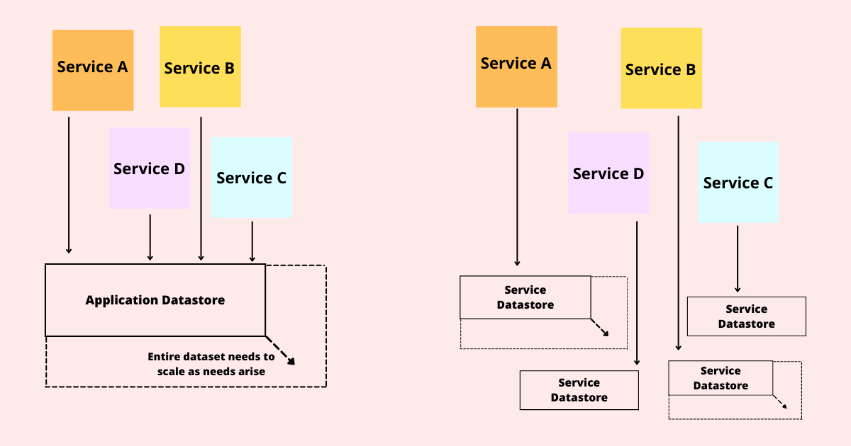
When the data for your entire application is in a single centralized datastore, then as your application grows you must scale the entire datastore to meet the needs of all the services in your application. This is depicted in the diagram below (Figure 1). If you use a separate data store for each service, only the services that have increased demand need to scale, and the database being scaled is smaller. This is shown on the right side of Figure 1.

Centralized data

It’s a lot easier to scale a small database bigger than it is to scale a large database even larger.

How microservices help in scaling?

Scaling is the process of dividing software into smaller units. Scalability refers to the application’s ability to implement more advanced features. It contributes to the application’s security, durability, and maintainability. In the industries, three types of scaling procedures are used. The microservice scaling methodologies include x-axis, y-axis, and z-axis scaling; below is one of the methods along with the corresponding real-world example.

Scaling on the Y-Axis:

Vertical scaling, which includes any resource level scaling, is also referred to as Y-axis scaling. Any DBaaS or Hadoop system can be thought of as Y-axis scaled. The user’s request is redirected and restricted in this type of scaling by implementing some logic.

As an example, consider Facebook. Facebook must handle 1.79 million users every second, so traffic control is a major responsibility for Facebook network engineers. To avoid any danger, they use Y-axis scaling, which entails running multiple servers with the same application at the same time. To control this massive amount of traffic, Facebook redirects all traffic from one region to a specific server, as shown in the image. In architectural terms, this transferring of traffic based on region is known as load balancing.

2. Centralized data is hard to partition later

A common thought that pops up in the mind of every app developer is, “I don’t need to worry about scaling now; I can worry about it later.” As your application grows in popularity, you must consider rethinking architectural decisions to meet increased traffic. 

Distributing your datastore into smaller datastores is one of the common architectural changes. It is much more convenient to do at the beginning of the application’s life cycle than it is later. When the application has been around for a few years and all parts of the application have access to all parts of the data, determining which parts of the dataset can be split into a separate datastore without requiring a major rewrite of the code that uses the data becomes extremely difficult. Even simple questions become difficult to answer. What services are making use of the Profiles table? Is there a service that requires both the Systems and Projects tables?

The longer a dataset remains in a single datastore, the more difficult it is to later divide that datastore into smaller segments.

How microservices help in data storing and partition?

A microservice may use one, two, or more databases. Some of the data stored by the microservice may fit well in one type of database while others may fit better in another. There are numerous viable database technologies available today, and I will not compare them here. However, there are some broad database categories to consider when making a decision, such as relational databases, key/value stores, document databases, column stores, and graph databases.

By separating data into separate datastores based on functionality, you avoid issues associated with separating data from joined tables later, and you reduce the possibility of unexpected data correlations in your code.

3. Centralized data makes data ownership impossible

The ability to divide application ownership into distinct and separable pieces is one of the major benefits of dividing data into multiple services. Individual development teams owning applications is a core tenet of modern application development that promotes better organizational scaling and faster response to problems when they arise. The Single Team Oriented Service Architecture (STOSA) development model discusses this ownership model.

This model works well when you have a large number of development teams all contributing to a large application, but it also works well for smaller applications with smaller teams.

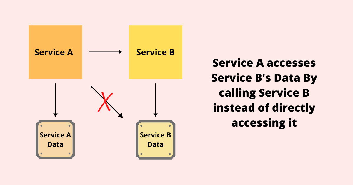
The issue is that for a team to own service, they must own both the code and the data for the service. This means that one service (Service A) should not have direct access to the data of another service (Service B). If Service A requires something from Service B, it must call a service entry point for Service B rather than directly accessing the data.

ownership

This gives Service B complete control over its data, how it is stored, and how it is maintained.

So, what are your options? Each service in your service-oriented architecture (SOA) should have its data. The data is a component of the service and is incorporated into it.

Designing Microservices: Best Practices

The design of microservices must ensure a weak coupling for services to be modified independently and to operate autonomously. Services that are weakly coupled will benefit fully from the microservice architecture, such as fault tolerance, load adaptation, implementation ease, and so on.

Furthermore, it must be highly cohesive to ensure that exchanges between these services are as coherent as possible via the following rules:

  • Design simple microservices that can be composed or linked to others according to the modularity and composability rule.
  • Engine interfaces must be isolated according to the separability rule. Internal microservices are not structured, whereas interfaces are.
  • Representation rule: design data-controlled microservices that have a simpler operation, are more robust and have better scalability.
  • Generation rule: avoid encoding repetitive and trivial things and encode using programs rather than WSDL files to generate code for the interfaces.
  • Make the necessary technological and methodological decisions based on the problem to be solved, not on a software catalog or a stack certified by a corporate guru.

Here is how Galaxy can help you

When release cycles take months rather than weeks, your company is frequently unable to deliver modern online experiences. Development bottlenecks impede your ability to update applications, preventing you from innovating and iterating. And an out-of-date or clumsy user experience prevents you from retaining and winning over customers.

Galaxy’s experts will assist you in implementing an end-to-end vision by developing a modern development stack for building enterprise applications with the necessary frontend and microservice technologies for your business. We will help your team quickly build, design, and launch applications based on microservices.

Learn about Galaxy’s Microservices, Frontend, Backend, and DevOps capabilities, which can help your organization build better and faster apps, sites, and portals.

About Galaxy Weblinks

We specialize in providing end-to-end software design and development services and have firsthand knowledge of backend and frontend technologies. Our engineers, DevOps experts, and UX/UI specialists work to improve security, reliability, and features to ensure that your business application and IT structure scale and remain secure.

How to Ensure Success in Your Next Software Release?

The release of a new upgrade is typically a stressful time for software companies. It is all too easy to overlook some of the necessary steps or to fail to communicate something to another department. Developing an effective plan is a critical component of any release.

A successful plan integrates all departments, including engineering, quality assurance, marketing, sales, technical support, and training. Everyone must have a common goal and be moving in the same direction. In addition to developing the next release strategy, you must also plan for backward compatibility, effectively communicating with your customers ahead of time, minimizing and controlling bugs, ensuring users can install your product, and much more.

In our article, you will learn about:

  • Why is it sometimes important to curb your enthusiasm and wait for the right time before your next software release?
  • Our list of 4 major tips for planning a successful next software release.

When the software release rush isn’t in your favor?

Software update for the Nest ‘smart’ thermostat (owned by Google) went wrong in 2016 and left users in the cold. When the software update went wrong, it forced the device’s batteries to drain out, which led to dropping in the temperature. Customers were unable to heat their homes or use any amenities as a result.

Nest claimed that the problem was caused by a firmware update in December 4.0 and other issues such as old air filters or incompatible boilers. Later, it issued a 4.0.1 software release, which resolved the problem for 99.5 percent of the affected customers.

Each new release carries a high risk of failure or detection of serious defects by the end-user. These may cost us the trust of our customers. So, how can you avoid the losses that may result from the poor quality of a new version of your product?

#1 Automate the processes with CI/CD

Continuous Integration (CI) comes in handy here. It is a DevOps tool that starts the compilation process, unit tests, and any static analysis tools used after each commit/merge process. Any other quality-related tests that are automatable are also carried out. Whereas, Continuous Delivery (CD) allows you to automate the entire process from the development environment to the production environment. Learn about the best CI/CD practices here.

But what if you don’t have an experienced person on hand and/or don’t have enough budget or time to implement the entire CI and CD process?

Then you should put your money on people who will look after the quality of our product and will not be afraid to obstruct the next issue.

Working in an agile environment, the Product Owner always makes the final decision on the release of a new version. The individual should have a complete picture of the current situation in terms of work progress and product quality.

#2 Prioritize bug fixing list

As the product manager, go over the outstanding bug list with the testing team regularly. Examine the status of each open (unresolved) bug and comprehend the scenarios that led to their discovery.

If you find high-level bugs that need to be fixed, you can choose to postpone the release date. In the case of low-level/cosmetic bugs, you may wish to address them in a later release.

As an example, suppose you have the following bug list:

  • There are no show-stopping bugs
  • There are no high-level bugs
  • Two moderate-level bugs
  • The user is unable to access the address book without receiving an error message
  • When a user imports an address, the “country” field is filled with unreadable characters
  • 10 cosmetic/low-level bugs

In this case, you may decide that unreadable characters in the country field are an acceptable bug because the user can easily delete them. However, you acknowledge that you do not want to alert the user with an error message when they access the address book.

Place bugs in priority order, just as you did when you prioritize your product requirements, and make trade-offs as needed.

#3 Explain your test strategy

How will you carry out these tests? Go into as much detail as possible.

  • What rules will your tests adhere to?
  • What metrics will you collect and at what level?
  • How many different configurations or environments are you going to put through their paces?
  • Are there any special requirements or procedures that you must put to the test?

You must also be aware of the results of your test. To put it another way, what are the pass/fail criteria for each test? 

Thus, lack of access to the test environment may cause issues with the release infrastructure. It is critical, paradoxically, to be able to roll back our changes and restore the previous version of the system. Sometimes the test environment, in which the system performed flawlessly, differs significantly from the production environment, where undesirable effects may occur, necessitating a rollback to the previous version of the system.

#4 Introduce and test new functionalities

Critical paths are equally important because they serve as the foundation for the entire process that our users will follow, and they should not encounter any gaps or problems along the way. It is also a significant risk to release a new version without thoroughly testing the functionality associated with this path. 

Similarly, failure to provide end-users and the maintenance team with sufficient knowledge about new functionalities. Remember to notify stakeholders about the new functionalities that will be included in the next version so that they are not caught off guard by changes in the processes.

Conclusion

There are numerous reasons why your software should not be released as soon as possible and at any cost. It’s a good idea to weigh the “pros and cons.” Nonetheless, the development team must inform the Product Owner whether it is reasonable to proceed with the most recent software release launch. As a result, if you notice that something isn’t working properly, take the call to block a release. Also, proceed with the release when the Quality Assurance team approves the release as well.