Flutter 1.22 Update| All You Need To Know

Google has released Flutter 1.22 on October 1st, 2020 following the 1.20 release in August. This update is focusing on syncing well with iOS 14 and Android 11 updates, among other features. This cross app development platform is set to make developers and app users happy. So let’s see how this will happen.

Flutter iOS 14 Updates

iOS app development is now set to be a better process than before with Flutter 1.22 update. There is now support for XCode 12 and as Xcode requires iOS 9.0 or higher versions, the default template is now 9.0 (previously it was 8.0). Developers are getting preview support for App Clips too. Crashes reported specific to iOS and font rendering issues were also fixed in this update. And not to miss, when a developer is using cupertino_icons 1.0 with Flutter 1.22, they are getting access to almost 900 new icons via the CupertinoIcons API.

Flutter Android 11 Update

There are two updates for Android developers. Flutter now supports exposing the safe insets of various Android displays i.e. notches, cutouts, and the display of waterfall edges. This will facilitate the placement of elements via MediaQuery and SafeArea APIs. And the second one is that animations are now in synchronization with the Android keyboard.

Google Maps And WebViews

Both these plugins are now ‘production ready’. One can write the code, build the APK, and release it, as per convenience. There is a note here by the Flutter team. They say that Android developers will have to manually enable webview_flutter until it becomes a default setting.

Extending The Buttons Family

Keeping up with the Material guidelines, there is now an additional ‘universe’ of buttons. Now developers won’t have to make widgets from scratch because of the lack of a few buttons. One can mix and match the older and newer buttons as per their requirements.

Analysis Tool For App size

Your developers won’t be quizzed for app sizes ever again. They can get their hands on the breakdown of native codes, assets, and even package level details of the compiled dart code. This size and composition summary is given by the analysis size tool. Such insights will help your team for keeping the app size within the set limits.

Smooth Scrolling

This feature is still in preview but it is an interesting one. It is present to bridge the gap between input and the display frequencies when they are not the same. Enters, resamplingEnabled flag. Flutter claims that you can see almost 97% improvement by enabling this flag and removing said discrepancies. Once there is a certain consensus about this feature, you can expect it to be the default setting. Apart from the above-mentioned features, there are some notable ones listed below:
  • Support for new internationalization and localization
  • Improved navigator 2.0
  • Improvement in the output linking of VSCode
  • State Restoration option in Android (In Preview)
  • Developers can host the inspector tab from Dart DevTools directly inside IntelliJ.
We’re excited about Flutter 1.22, so much so that we have even started exploring it from our end, yes we are nerds that way :D. In case you too want an inside look at how we are planning to use this update to the fullest in our new projects, you can ping us here.

About us

We, at Galaxy Weblinks, are all for new ideas and experiments. We believe that being up-to-date in this fast-paced world gives us adequate time to explore and implement new changes. Our mobile development team is proficient in building apps that are well aligned to our client’s and platform requirements. Contact us for a free consultation!

Agencies That Build #1 – Finding the right balance | Jay Owens

In this ever-changing and highly competitive technological landscape, people swear by the Hustle Mentality. “One needs to work 18 hours a day to be successful”. Well, our guest here thinks differently!

In the first-ever podcast by Agencies That Build, we invited Jay Owens, CEO – Design Extensions, a flourishing Florida-based Digital Agency to be our guest speaker. With Thor’s Mjölnir in hand, Jay Owens busted this and other interesting entrepreneurial myths with us.

In this episode, the ‘Agency Whisperer’, Jay Owens talks about his journey as an agency owner and striking a balance in personal and professional life. We also talk about the best ways to achieve business goals, giving optimum value to the customers and banishing uncertainties around outsourcing.

Jay says and we have to agree – “The customer is not always right, that can be enabling.” He has a way with words and the experiences he brings to the table are very relatable.

He shares that when you know that your customer is making an error in judgment or taking the wrong decision, you don’t ‘yes man’ them. You tell them the best way to address the problems and get them back on the right track. After all, that is why they hired your services!

Jay stressed on the value you are providing while building the solution for your customers. The agencies need to ponder, “what is the product that you are good at producing, that provides real value for people, that you are excited about selling?” Then get a system in place to sell it.

In the quest of maximizing the value you provide to your clients, you may need to bring in the right development partners, and if needed, outsource to the devshops overseas. Clients may be a little skeptical! But, you know that for quicker turnarounds and the best quality of work, offshoring to development partners is the best bet; so you ease them into it.

After all, everyone is just trying to get the job done. No matter where they are geographically based.

Some of the other key highlights of the podcast –

  • You need to physically write down your goals, what you want your life to look like in 1 year, 3 years, and 10. Then ask, “what needs to be true today for that to be true tomorrow? What needs to change?”
  • Be intentional about relationships and the people around you- have great people to look up to, people standing beside you and you need someone to look up to you, to mentor.

Our podcast will help you put your outsourcing fears to rest, as Jay Owens takes you through his journey as an agency owner. Listen to the podcast here!

There’s also a YouTube link to the podcast!

Sponsored by Galaxy Weblinks

Galaxy Weblinks is a software development partner of Digital Marketing agencies. We use cutting edge technologies, mature processes, and proven methodologies to build future-ready digital solutions. Contact us today!

How to get Bidirectional Scrolling right in your responsive design

Incessant scrolling while using an application is perceived as a flaw on both mobile and desktop. To address this concern, a shift to horizontal scrolling of elements is in trend now.

We are seeing an increase in designs using non-breaking lists that are scrolled horizontally for more content especially on mobile, where horizontal space is limited.

On the other hand, vertical scrolling works as a mainstay of virtually every digital interaction you’ll come across.

A few years ago, the users used to remain reluctant to move sideways through content. However, the users have evolved since then and are more receptive to the idea of scrolling in both directions. It is more preferable to scroll through vis-a-vis clicking multiple pages or screens. Scrolling is completely natural and more efficient.

Users have learned to scroll. Never-ending newsfeeds and content have taught this interaction to users over and over again. In a mobile-first world, scrolling has become the number one interaction with digital content.

Users are impatient. They don’t wait to get a page fully loaded to scroll and discover the content later.

Although, the whole shift has led to the challenge of designing a smooth bidirectional scrolling experience without compromising the responsive design.

  • Creating desktop and mobile experience a mess while trying to ensure the same user experience
  • Hiding content behind menus
  • Having to scroll down and across in a zig-zag fashion
  • Taking more clicks (or flicks) to horizontally scroll the content into view on desktop

Here are two best practices for bidirectional scrolling to figure out when horizontal scrolling is great for UX:

Horizontal scroll works best when you want to display a subset of a category

Websites like Netflix have been using the responsive principle to showcase huge libraries in a way that lets you get to what you’re interested in extremely quickly.

Even e-commerce shoppers are scrolling more frequently than ever and are doing a great job when it comes to responsive design.

Image source: Vlad Ermakov for widelab

You’ll see a section, and there’s a plethora of content towards the right if you keep scrolling. When you scroll down, it’s just one line for each topic or section, making it easy to get to what you want quickly, then scroll to the right to dive deeper into that section.

The main principles that these sites have in common and have seen success with are:

  • Displaying a large catalog of products or items so that different product categories can be easily shown.
  • Displaying discrete sections or slides of information on applications like recommended or similar products on e-commerce websites.

Make your navigation more obvious and attractive

This seems to be the biggest problem faced by visitors when it comes to horizontal scrolling based websites. Even those that look incredible can end up confusing and turning off their users. That will result in leaving your website and finding one that is easier to get around on.

So navigation should be clear and easy so that your users don’t have to sit on your page for too long trying to determine how to get somewhere.

Make sure there is a visible label, and easy to use menu options of some kind that will get them to the information they want, especially about the bidirectional scrolling at the home page.

“Users are encouraged to scroll when it’s easy for them to see what is visible on the page without even requiring any action.”

If you fail to provide the right e-commerce site elements and above the fold and create an enjoyable digital shopping experience, you’re going to have difficulty getting shoppers to scroll.

The honest truth is that you need just the right mix of vertical and horizontal scrolling.

Conclusion

There is a lot of debate over the internet about the usage of the bidirectional scroll and its impact on UX. But it helps a lot in compartmentalizing the content and saves a lot of vertical space on an app if used wisely.

If your app and website are struggling with responsive design issues, feel free to contact our experts.

About Galaxy Weblinks

We specialize in delivering end-to-end software design & development services. Our design process stems from an agile and a responsive digital development that incorporates effective collaboration, streamlined projects which strives for better results.

Android 11 | The update we didn’t know we needed

Google with its Pixel event and launch of two new phones, started rolling out the latest Android 11 OS. Like always, the Pixel phones are the first ones in getting an update and the rest of the devices will get the updates based on their OEMs and how they optimize the new OS for their respective devices.

The update does not have many head-turning features like Android 10 but it sure does an amazing job in elevating the overall user experience. Like the message bubbles, new notification categories, limiting app permissions, among others.

So let’s explore these and the other new features of this update.

Categorized Notifications

A video showing user interface of Android 11

Android 11 will make your life easier by categorizing notifications into Conversations, Alerts, and Silent. This enables you to prioritize your ongoing conversations, be it on WhatsApp, Instagram, or similar messaging apps.

The other two categories keep all your notifications aligned with your needs. You are kept in the loop with the alerts you opt-in, such as news updates. You can mute the ones that nudge you a bit more than it needs to.

Furthermore, in line with keeping conversations more accessible, the ‘chat bubble’ makes a comeback this year. This works the same way as Facebook’s Messenger floating chat button and lets you reply quickly to your current conversations.

Built-in screen recorder

Photo of a phone lying down on table

A long awaited feature, in-built screen recording has finally found its way in this update. Screen recording was possible via third party apps, but there was always some restriction or modifications required for accessing the device’s internal audio settings.

What more, you get this functionality right in the Quick Settings menu. You are getting the option to record audio via microphone or use the device’s audio, record the screen taps or not, etc at last.

Changes in App Permissions

A screencap showing app permission dialogue in Android 11

The apps will now have one-time permission to your sensitive information like location, messages, contacts, etc with the help of the ‘While using the app’ option. Once you close an app, the permissions are revoked and need to be requested again.

Access to information all the time will not be present for a majority of the apps. And just in case you haven’t selected this option when you are not using an app for a longer duration, the permission gets ‘auto-reset’ and your data remains safe.

More options in Power Button Menu

Screenshot of Android 11 power button menu

The long press action on the power button now gives you smart device controls and GPay shortcut. One can add up to six devices for easier control. The need of opening separate apps for these devices gets eliminated here.

However, there is no compulsion put by Google on the device manufacturers to imply this feature. So we will have to wait to see how this plays out.

Media Controller Widget

Screenshot of Media controller Widget in Android 11 phone

The media controller is moved to the quick settings menu (from the notifications bar). This ensures that the ‘clear all’ action of notifications does not pause the song or podcast you are listening to. Plus you can go back to the media that you had paused earlier without opening the concerned app.

Other Notable Features

Apart from the ones we have already covered, here are a few more interesting features:

  • You can see notifications from the past 24 hours via history. So in case, you dismissed any notification accidentally, you can go through them again. However, this is not a default setting, so you would need to change that.
  • You can now resize the picture-in-picture window according to your convenience and avoid any obstruction with your work.
  • You can now schedule your dark mode. It can be set as per sunrise/ sunset or to your own time.
    ‘Dynamic Meterdness API’ will detect if you are on a 5G network and will then show you the best quality of videos, graphics, etc.
  • Google’s Voice Access will now be more conversational and simple for differently-abled users.
  • There are 117 new emojis from the Unicode Emoji 13.0 set.

Google has paid attention to many features that were long overdue in this update. Given that it will be rolled out a bit late for the majority of android users nonetheless we are excited about how it fares against the last version.

Our Android team is also excited about the possibilities that Android 11 brings to the eco-system and challenges that they can solve with the new functionalities. If you’re looking for Android development in Mobile, Wearables, TV, and other hardware, feel free to reach out us.

Effective Scaling Of Applications – Tips and Tricks

Before jumping into making a plan for scaling your application, ask yourself what attracts your user now more than ever before?

No! Not the discounts or free offers.

It’s the flawless experience that draws more and more users’ attention that leads to conversion.

Rather than playing the “wait and watch” game, now is the right time to scale up your application. As the demand grows, it should be able to handle multiple requests and an increase in user traffic.

There has been a significant surge in the use of e-commerce apps, online learning software, video conferencing tools, virtual tutoring, or language apps since the outbreak of COVID-19 around the world. Many of the web and mobile offerings were not prepared for this sudden increase in user traffic and faced performance and scalability issues.

In this blog, we will explore the various ways and means to scale applications effectively.

1. Distribute Traffic with Load Balancing

a diagram of load balancers in cloud

Say, your application runs on one server and that can no longer sustain the current load. We recommend adding an extra server or servers to handle the required amount of throughput for your application.

To evenly distribute traffic across the servers, we use load balancers.

There are various methods that a load balancer can route traffic between the servers. One of them is round robin, which sends requests to the servers on a cyclical basis.

For example, if we have 3 servers, then it would send the first request to server 1, the second request to server 2, the third request to server 3, and so on. However, the most efficient method is when the load balancer would send the request only if the server can handle it.

This is how we increase request processing capacity by deploying more server instances on load-balanced computing resources.

But what if this load balancer dies out? Then we would not have a backup!

To overcome this issue, we can set up two or three load balancers where one would be actively routing the traffic and the others would be backup.

The load balancers can be a tangible piece of hardware, or they can simply be software in one of the servers. The cloud services are rampantly available, making it a relatively cheap and easy way to establish a load balancer.

2. Do Not Make Your Database a Bottleneck!

Database diagram

As you grow the number of deployed servers, you might increase the request load on your database. At some point, database accesses will start to incur more latency when it reaches saturation.

For example, having more than ten million users query from the same database is not good. The database would take time to search for a single user amid ten million users.

The solution is to increase your database’s capacity to scale further. You can try to optimize your queries, add more CPUs and/or memory. Perhaps replicate and/or shard your database.

Sharding is used to increase database efficiency by having two or more databases so that queries could be split between them. This will ensure that the queries are executed in minimum time.

One more way to reduce the load on your database is to avoid accessing it whenever possible. This is where caching comes in.

In-memory data caching can be one of the most effective strategies to improve your overall application performance and to reduce your database costs.

Caching can be applied to any type of database including relational databases such as Amazon RDS or NoSQL databases such as Amazon DynamoDB, MongoDB, and Apache Cassandra.

3. Monitor the Performance

A vector of mobile and a laptop

Imagine you want to test an existing deployment to see if it can still provide fast response times if the database size grows by 10x. You first need to generate a lot of data, which ideally echoes the characteristics of your data set and relationships. You need to also generate a realistic workload.

You then need to load and deploy your data set and run load tests, probably using a load testing tool.

This is a lot of work!

The alternative is monitoring. Simple monitoring of your system involves making sure that your infrastructure is operational. If a resource is running low, such as memory or disk space, or remote calls are failing, you should be alerted so that remedial actions can be taken before things go south.

There is a myriad of solutions and cloud-based monitoring available for monitoring. They allow you to capture metrics about your system’s behavior and present these in a unified dashboard to support both the monitoring and analysis of your performance.

When you need to scale your system and tune performance, the data you capture guides your efforts and experiments.

Being data-driven in your system evolution helps ensure you invest your time modifying and improving the parts of your system that are fundamental to supporting your performance and scaling requirements.

Understand your company’s scalability needs and implement the same. What works for other companies may not work for you. Reach out to us if you want to be amazed by the results you achieve after scaling your application with expert developers and testers.

UI Best Practices – Designing buttons that score clicks!

User Experience Design is one of our core competencies. In this blog, we will share with you the best practices of designing buttons for your user interface that will attract maximum clicks. These UI button practices will help your users prioritize tasks by removing friction on-screen while sticking to the basic principles of UX elements for web/mobile applications.

Many designers take inspiration from various new UI designs and apply in their applications like this:

video showing buttons in UI

But what’s wrong with this elegant on-hover and click state button?

Unfortunately, it’s lacking the very first basic rule of button design – “Make it look clickable”.

UI/UX designers should pay much attention to button designs to make buttons stand out, and read numerous articles, analyze and share ways, secrets, and principles to set the color, shape, position, size, and more factors.

Use those designs that follow basic ground rules of UI design. Especially ones that can not only lead users through a website/mobile app effectively but can also entice them to click for better sales.

And as a designer, you always need new clues, ideas, or inspiration to make a unique and useful button for your web/mobile apps.

So here are 5 latest and best button practices that you cannot miss out in 2020. And hope they can inspire you somehow:

1. Eye-Catching Hover Effects

This Framer button uses a very appealing hover effect. When users move over or across the Play button, the whole button bounces out with a cool 3D Gradient design. Once users move the mouse cursor away, the hover effect will suspend completely. Such designs are eye-catching and interesting.

Video showing buttons in UI
Edoardo Mercati

What can you learn:

You can add various hover or interaction effects to optimize your button designs in your app or web design. They could be very useful to entice users to click and go to the next stage, such as playing a podcast, buying a product, filling contact information, or reading more details, etc.

You can add some changes in colors, shadows, shapes, texts, opacity, frames, and animations of a button according to your action requirements to make it more attractive for users.

2. Microinteractions for Delete Button

You can show the functions of buttons more vividly by using “button + animation ”. Once users click a button to delete, the action gets depicted by an animation showing the file getting shredded. This is a vivid and imaginative way to showcase the “delete button”. It is an effective way to engage the users while they delete multiple files.

Animation showing button in UI
Aaron Iker

What can you learn:

In your button design, you can add vivid animations to your buttons based on different scenarios, features, and labels to make your buttons outstanding and appealing. Overall, this is excellent to improve user experience.

3. Provide Feedback with the Button States

You should always let users know that the command was registered and promptly. This requirement isn’t about how the button initially looks to the user; it’s about interaction experience with the UI element. A good way to make sure nothing is lost in transition is to define the button states in your button design.

Image showing different types of UI buttons
Ryan

What can you learn:

Usually, a button isn’t a one-state object. It should change its state to let the user know that appropriate action is being taken. It becomes essential to provide visual feedback to users to indicate the current state.

4. Buttons with Shadows and Highlights

Drop-shadows make the element stand out against the background. They also highlight it as a clickable or tappable element. Objects that appear as raised give the impression that they could be pressed down. They’re also useful for improving the visibility of light-colored design elements, especially text. Even with flat buttons (almost flat, to be exact), they give subtle interactive cues.

video of buttons in UI
Lucas Haas

What you can learn:

Shadows are key entities in telling your users which UI element they are looking at. Users understand that the element is interactive if a button casts a subtle shadow.

5. Floating Navigation Button

The tooltip uses a very cool floating button that attracts users’ attention and extends the functions of the web/mobile app. It is eye-catching and useful for your users and allows them to easily switch and choose other parts of the web/mobile app. And in this way, such floating buttons can be really interesting, attractive, and impressive for users.

Animation of buttons in UI
Milan Raring

What can you learn:

In your mobile or web app designs, you can create similar multifunctional navigation buttons floating in an interface to extend the functions of a mobile/website app. You can also customize a special way to expand the functions, options, or menus based on users’ interaction with these floating buttons.

Conclusion

Buttons are going nowhere! They will further evolve and get more interactive. Plan them with the utmost consideration, so that your users can enjoy the micro-interactions. Make them flashy, make them intuitive, and make them useful – and let users engage with your application.

Top iOS 14 features you MUST know!

Apple unveiled the latest version of its iOS operating system, iOS 14, at the WWDC keynote in June 2020.

iOS 14 is one of Apple’s biggest iOS updates to date, introducing Home screen design and widget changes, picture-in-picture, Siri improvements, updates for existing apps, and many other tweaks that streamline the iOS interface.

Apple has seeded a total of seven betas yet of upcoming iOS 14 and iPadOS 14 updates to developers for testing purposes.

Let’s look into some major UI updates and features that stole the spotlight.

Widgets

‌iOS 14‌ introduced a redesigned Home Screen that supports widgets on iPhone for the first time, breaking up that stagnant tiled-grid-of-apps look. ‌Widgets‌ have been redesigned and can now be customized in three sizes through the new ‌widgets‌ gallery.

video of a person using a phone

Widgets provide more data than ever to provide more functionality, and Apple redesigned its widgets for default apps like Weather, Stocks, and Calendar. There are also new widgets for Apple News and Screen Time.

Widget Gallery will comprise all of your widget options — by long pressing on the display, choosing “Edit Home Screen” and then tapping the “+” button.

These suggestions are based on what users are installing the most, and third-party app developers can create new widget experiences for their apps.

person showcasing iOS 14 features on iphone

Widget Smart Stacks

You can stack up to 10 widgets on top of one another to better utilize space and can swap between them with a swipe, both in the Home Screen and Today view.

video of a person using an iPhone

There’s a separate Smart Stack feature that’s different from widget stacking. A Smart Stack is a widget stack, created in the Widget Gallery view, that automatically surfaces the best widget option based on activity, location, and time – making sure you’re looking at what’s most relevant.

You can, of course, swipe through the Smart Stack yourself.

App Library

picture of an iPhone

App Library is a great new feature that shows all of the apps you have installed in an organized, simple-to-navigate view that’s similar to the app list view on the Apple Watch. That is categorized into Health and Fitness, Social, Reference and Reading, Productivity, Utilities, Education, Games, Creativity, and Lifestyle.

Compact UI

In the previous version, there are plenty of apps and actions that just unnecessarily take up the entire screen. Now they are all fixed.

Incoming phone calls no longer take up the entire screen in iOS 14 and instead show up as a small banner at the top of the display that you can easily hide, ignore, accept or reject based on your preference.

This also applies to Siri, FaceTime calls, and third-party VoIP calls.

While doing a FaceTime, you will experience a Picture-in-Picture UI that you can easily swipe up, go home, and do other things without pausing the video.

video of a person using an iPhone

Picture-in-picture has been widely supported throughout the entire OS. So, if you are watching any video in Safari or a movie on Apple TV or an app, you can shrink the video in a picture-in-picture window while getting other things done in the background.

Siri Search Updates

Like before, Siri does not take up the whole screen in iOS 14 now. You can call Siri long-press the power button and can see a small animation at the bottom of the screen. It pop-ups an answer at the top of the screen. (But it doesn’t let you interact with anything underneath directly without exiting Siri- if you want to).

Unique iOS 14 Accessibility Features

These upgrades may look minor for iOS 14, but they will be immensely helpful for visually and hearing-impaired users.

Within the new update, you’ll be able to set up your iPhone to listen out for specific noises such as a siren or fire alarm or even a cat. If the phone hears the noise, it’ll notify the user.

According to Apple, it won’t be sending any of your data onto the internet to allow for this feature as this is all done using on-device technology.

Another unique feature in accessibility settings is that you can now map double-tap or triple tap on the back of the phone to a shortcut like Siri, mute, volume down/up, lockscreen, and others.

There are so many other minor changes that have been made in each beta version. ‌iOS 14‌ and ‌iPadOS 14‌ are available to registered developers and public beta testers at this time. Stay tuned to find out which features we are finally going to see in the iOS 14 final release this month.

A comprehensive guide to Mobile App Design

2.56 million and 1.85 million.

According to Statista research, these numbers are the number of applications available on Google and Apple’s app store, respectively.

Each one of these applications is trying to solve a problem. Problems like payment friction, learning, boredom, and whatnot. A million solutions for billions of smartphone users.

But, bear in mind that a problem can be approached in numerous different ways and not all solutions are up to the mark. Most of the apps are not thoroughly researched or planned and hence lack in UX, functionality, optimization, etc..

Having delivered 80+ successful enterprise and user-facing apps, we have learned and curated a set of best practices that help us deliver flawless mobile solutions. Here’s a comprehensive guide to Mobile App Design.

Establishing the ‘Why’ of your app

Trees with question mark on it

Yes, this is an obvious one! Some things that will be established after you have had your ‘eureka’ moment. Meaning, you know that you have to design an app that will solve your user’s problem with ease but you need to dive deeper.

To facilitate this, answer all the questions below before you jump in the design and development phase:

  • What is the problem that you are trying to solve for your users? (like assessing users mental health)
  • Can you define your app’s aim in a single sentence? (This will give you a precise answer to the question above)
  • How do you plan on solving the problem from your user’s viewpoint (and not yours)?
  • What is your USP?
  • How many competitors are there in the market and how do you plan to differentiate your product offering?
  • If your idea is unique, how do you plan on educating your potential users and convincing them to download your app?

These answers will lay the groundwork for your app thus it’s vital that they are clear and understood by all your team members. Write these answers, print them out, paste them in your office, but ensure that everyone is on the same page.

You can always go back to the answers in case there is a detour in your journey.

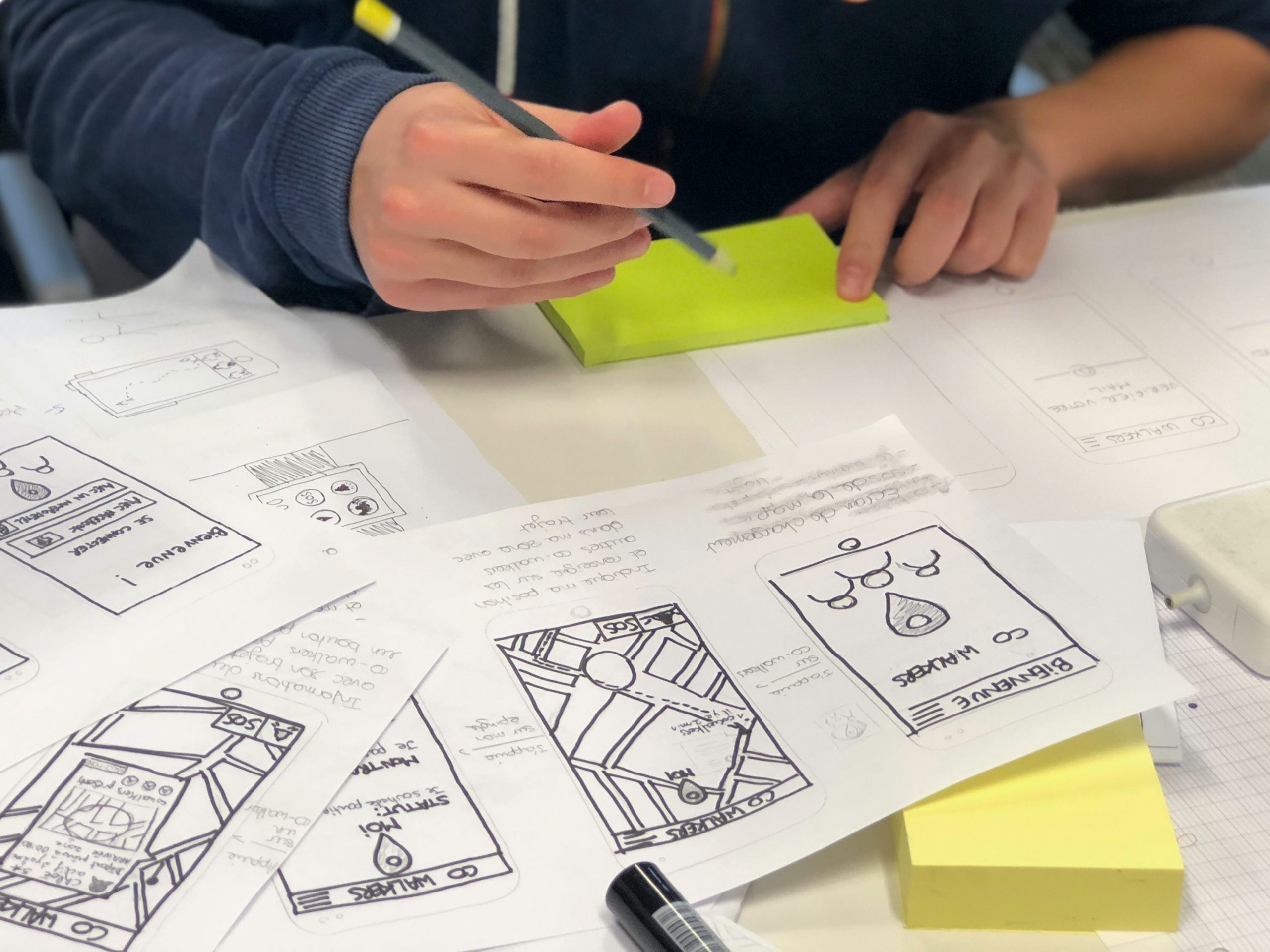
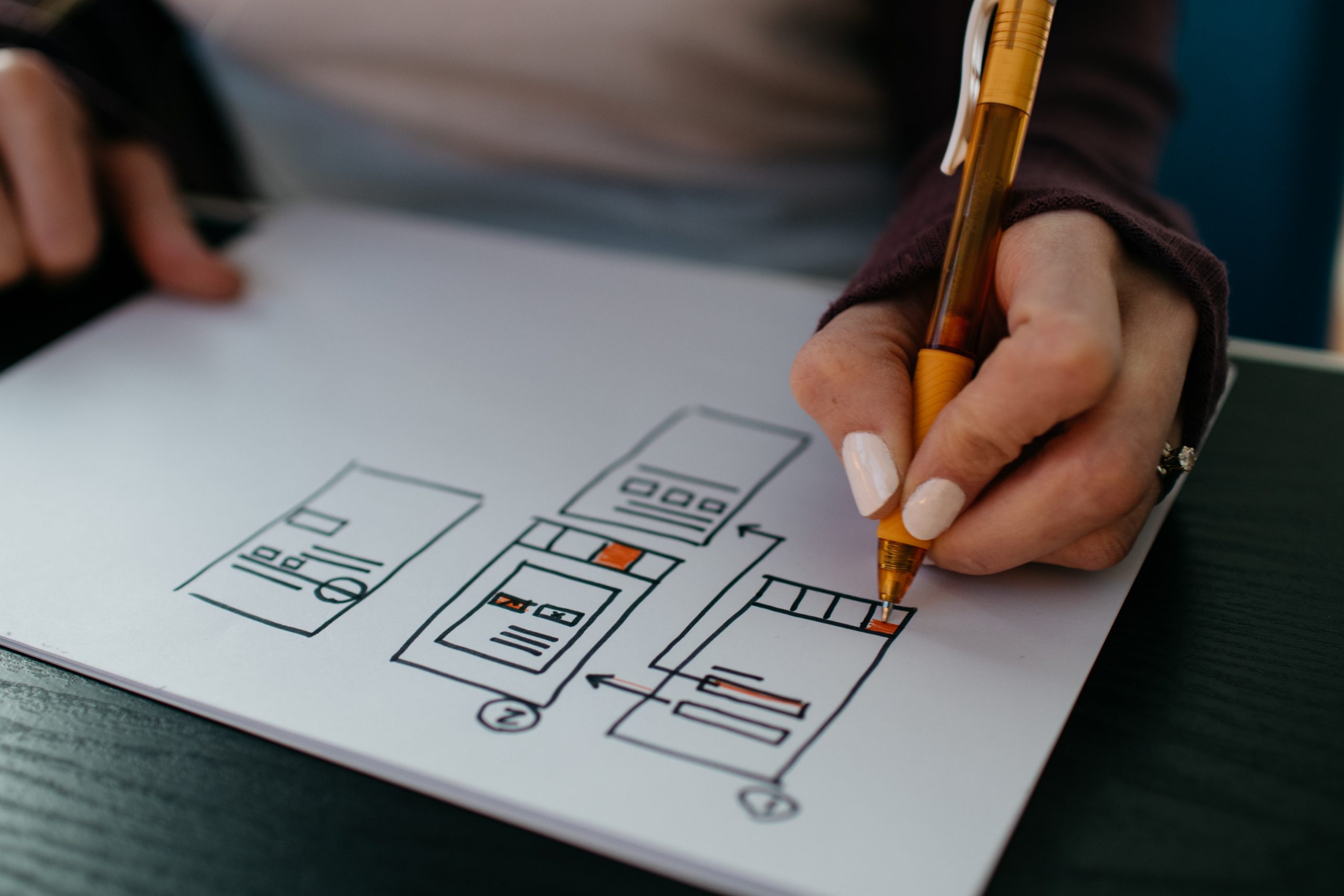
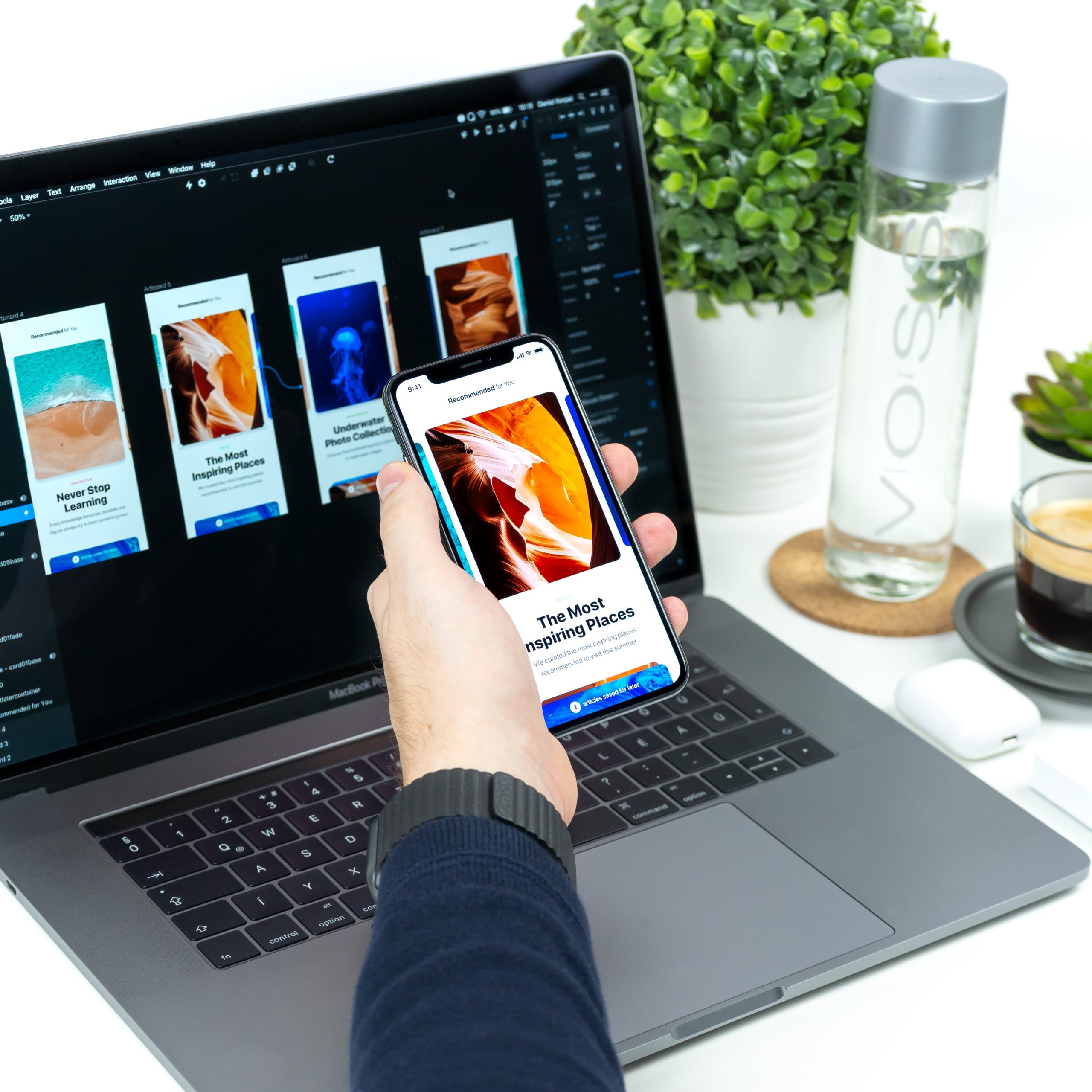
Creating a functional design

Two smartphone laid on a table with their displays on

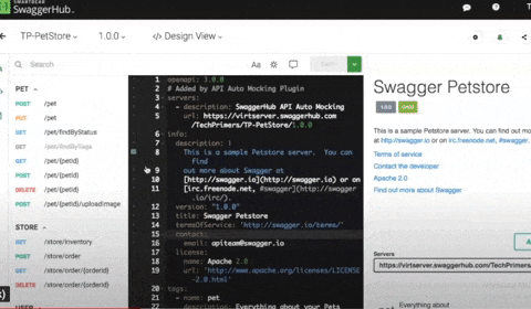
Now that there is crystal clear clarity (pardon the alliteration), it’s time to design your app. You should start with wireframes and prototypes for validating your idea. Some tools that will help come in handy are:

  • Sketch
  • Axure
  • Miro
  • Adobe XD

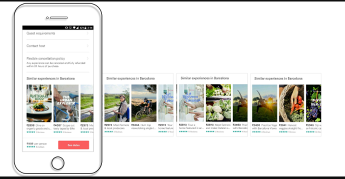
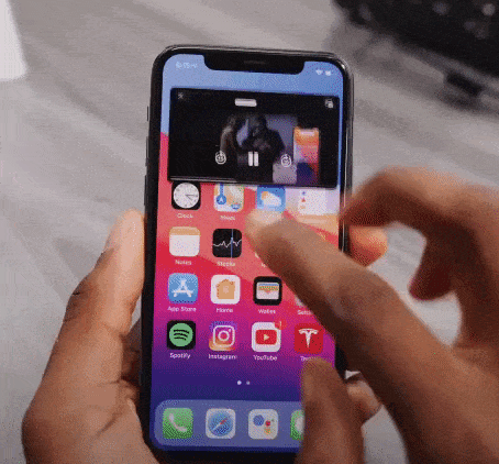
People spend the majority of their time on mobile apps. This implies that the users are hooked to a certain set of apps. How to get in this inner circle?

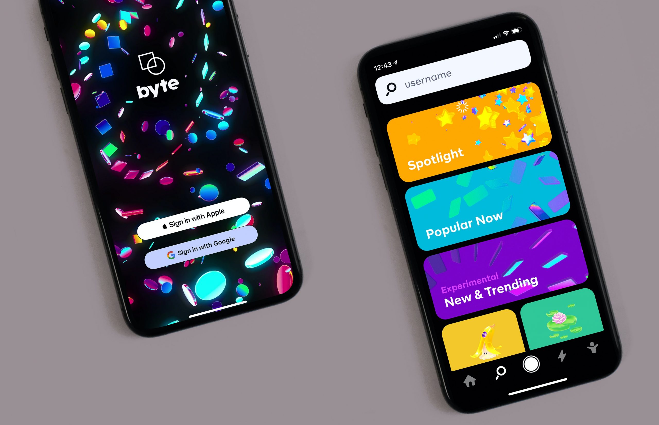
A clean, simple, and intuitive UI is the answer. This seems a bit vague so let’s define some tips and methods that will help us here.

Storytelling via your UI

paper sketches of an app

We all love stories and mindful endings. And this can be done via your copy, illustrations, animations, etc. Storytelling will help your users share your vision and have better clarity of why your app exists.

  • Make your UI copy conversational and avoid jargon at all costs.
  • Leverage tooltips for better engagement.
  • Be clear when sending out an error message. Pinpoint whatever is wrong or missing.
  • Come up with a pleasing onboarding process

Thus you can humanize your app via a story and it gives the users a chance to look into the vision that you have for your app.

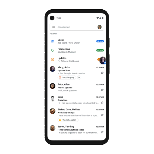
Familiar App Navigation

Person sketching mobile screens

Design your app in such a way that your users need no additional directions to navigate your app. We do not imply that you should copy from competitors. Rather, look out common practices that your user is habitual to, irrespective of the app category.

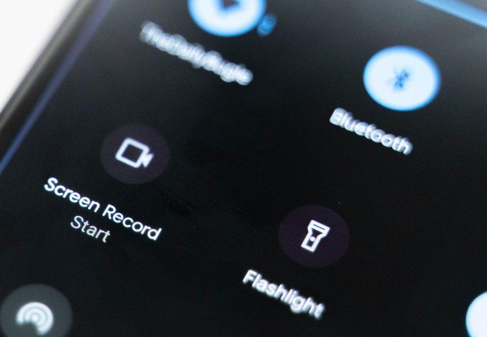
Stick to using UI elements like hamburger menu, tabbed navigation, or skeuomorphic icons, and so on. The aim is to avoid surprising your user on every click.

Keep in mind how people hold their phones

People holding their phones

We all hold our phones in many ways. Holding it in both our hands in landscape mode, holding the phone in one hand and using the thumb to scroll, using both hands for operating, etc.

Whichever the way, ensure that the vital interaction buttons are within the thumb’s reach and not in the stretch zone. Place the key functionalities and information somewhere in the center. And no elements are hidden behind fingers and palms.
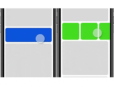
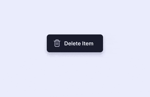
Touch targets

graphic of bubbles

According to MIT’s Touch Lab’s Study, 10mm by 10mm is the minimum touch target size. We have to design for fingers and thumbs, not for cursors.

You can increase as per your need. Say if you are focusing on the elder demographic via your mental wellness app, it would make sense to increase the touch target’s size.

Also the spacing between touch targets should be adequate. They should not be so close to each other that it leads to wrong selection.

Use Established Gestures

person holding a phone perpendicular to their body

Using the same gestures may seem like a creativity barrier but if you don’t do this, your users will suffer.

Scrolling up and down, pinching for zooming in and out, etc should be used wherever possible. Also if you do wish to deviate a little, inform your users and even better demonstrate it for them so that there is no confusion.

You can also test this in your hi-fidelity prototypes to see if your users are struggling with understanding and using the different gestures.
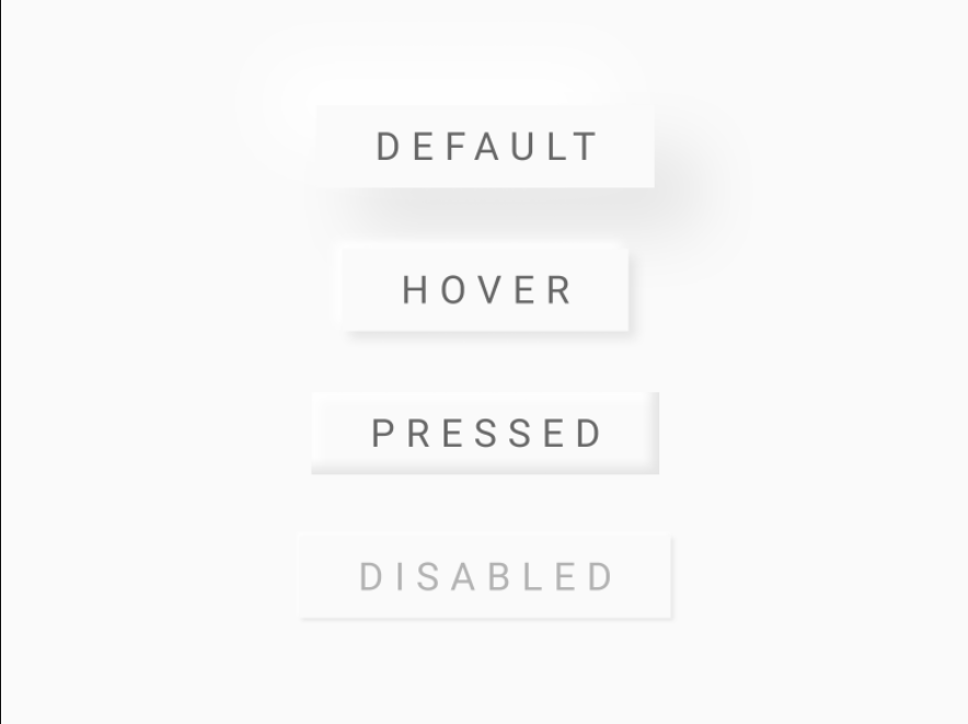
Consistent layout

person holding a phone in front of their computer

Consistency is the lifeline of good design. You can design such an app via:

Visual hierarchy and weight via color play, typography, size, etc.
All your interactions, gestures, navigation should follow the same pattern throughout your app.
Your design should look the same across varying screen sizes and platforms.
If you have a live website, you should aim for a similar-looking app.

Easy Onboarding Tour

person using a tablet device

As mentioned early, your onboarding is a chance to curate your story and present it to your users. Don’t miss out on this.

You should not overwhelm your users with all the information in one go. You will turn your users away even before they complete the onboarding. Your tour should be a progressive one, encouraging users to keep moving on.

Break the information into smaller sizes for easy remembrance. And give the option to skip and resume the tour as per the user’s convenience. This gives the user the control and thus motivates them to interact more.

Keep the sign up simple and give the option to login via social media accounts. If possible, ask users to sign up in the later stages of onboarding. This way you get to highlight your value beforehand, thereby reducing the churn rate.

You will also need to take care of these practices –

  • You should have in-app search functionality, especially for ecommerce websites with huge product offerings.
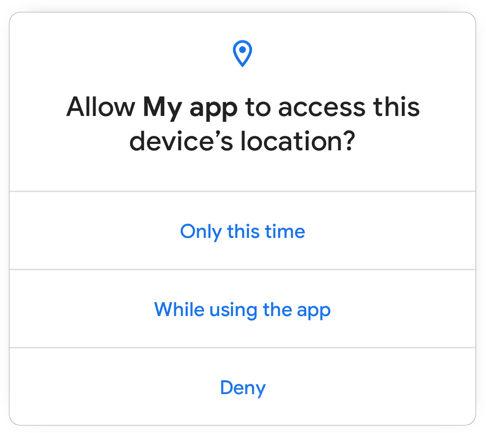
  • Deter from asking unnecessary permissions. Continuing the above example of a mental wellness app, asking access to messages and contacts may not be well received by the user.
  • Minimize your user’s input. Enable autofill for your forms to speed up the signup process.
  • Keep your notifications to a minimum. Frequent notifications are annoying and may result in the users switching off the notifications altogether.
  • Optimize your app for voice search.

Your app should be designed in a way that your users do not think about the design of your app rather they focus on its functionality.

Testing Your App

person holding a phone while taking notes

Once you have invested your time and effort into designing and developing your app, you should test your app’s beta version on a focused group. Ask them for their honest feedback and improvement areas.

You have to test for your app for:

  • Functional testing for seeing the working of the functions and features.
  • Performance testing under different network bandwidths, older mobile devices, and servers.
  • Accessibility compliance
  • Interruption testing for how the app behaves upon incoming calls, notifications, low battery warnings, any cable attachments or detachments, etc.

Ready, Set, Release

After you ensure that your app is good to go out in the app world(s), sit back, and hit the launch button.

A side note here, things may not go as expected post-launch, so you need to have an open mind and pay heed to the feedback from your real users.

We, at Galaxy Weblinks, have been on this rollercoaster ride of app design, development, and release a good number of times, in case you wish to talk to us about your app and even new ideas, you can get in touch with us here.

How OpenAPI and Swagger helps in developing RESTful APIs?

We are all aware of how APIs connect different devices and applications and allow us to place an order, book a flight, or make a reservation.

Since software products are becoming more and more about a bunch of micro-services and third-party APIs mashed together, it is critical to get their structure in order. Plus, as the number of APIs continues to rise, the lack of global API standard risks slowing down innovation and limiting collaboration.

That’s where specification comes in the picture.

An API specification is a document that describes an API.

It is stored in a machine-readable form such as JSON or a YAML file and can be converted to human-readable API documentation.

What is Swagger and OpenAPI Specification?

Swagger is a tool for designing, building, documenting, and mocking APIs. It uses the OpenAPI Specification (also known as OAS) to describe requests, responses, and any other details about your RESTful APIs.

(RESTful APIs enable web applications that are built on various programming languages to communicate with each other.)

Swagger and OpenAPI specification lets developers design and develop REST APIs seamlessly and effortlessly. These specifications help in describing the structure of a REST API so that machines can read and mock them.

For instance, to access a REST service, the client needs to know the REST API of that particular service. You would also need to write the code according to that documentation.

With OpenAPI, this step is automated.

There exists a machine parse-able file that explains to computers how a REST API works. It tells code what replies to expect and what requests exist. To quote from the OpenAPI description:

“The OpenAPI Specification (OAS) defines a standard, language-agnostic interface to RESTful APIs. This can be used by documentation generation tools to display the API, code generation tools to generate servers and clients in various programming languages, testing tools, and many other use cases.”

. . .

Developing APIs with Swagger and OpenAPI

The Swagger toolset includes a mix of open source, free, and commercial tools, which can be used at different stages of the API lifecycle while using OpenAPI spec.

These tools include:

  • Swagger Inspector: API testing tool that generates OpenAPI definitions from an existing API and lets you validate your APIs.
  • SwaggerHub: API design and documentation, built for teams working with OpenAPI.
  • Swagger Editor: Swagger Editor lets you preview documents in real-time, and edit OpenAPI specifications in YAML inside your browser.
  • Swagger UI: Swagger UI is a collection of CSS, Javascript and HTML, and assets that dynamically generate beautiful documentation from an OAS-compliant API.

And others…..

For instance,

Writing your first specification?
You can use editor.swagger.io which loads petstore samples.

The left side shows OpenAPI specification and the right side shows OpenAPI documentation which is generated based on spec. Initially, developers used to create documentation from the code.

Adding a step of specification while creating an API helps in sharing it with different teams who are going to work on these APIs or use these APIs in their application. That’s when the design and documentation of APIs come in handy.

So if you have an OpenAPI implementation and an OpenAPI description file of a REST API, you can feed that description file to the OpenAPI implementation.

And this implementation now knows how to use the REST API, it can even auto generate code to use the REST API in different languages or can generate human readable documentation for you.

. . .

Why OpenAPI Spec for developers?

As shown above, many developers find it valuable to work with a specification to automatically generate and improve their documentation, as this improves consistency and saves time.

Also, it enhances the developer experience as it makes it easier to try out and explore an API. As it helps other developers to consume your API, and having a well defined/documented API will have a great impact on it. You can focus on the API consumers need beforehand.

Secondly, it enables independence between teams, e.g, QA, Backend, and Frontend engineers know how the API is supposed to do, so they are all aligned on it.

Removing these dependencies speeds up the release process because different teams can do their tasks at a much faster pace.

Conclusion:

The OpenAPI Initiative is part of the Linux Foundation, which makes it a bit more trustworthy and at least looks like it won’t go away soon.

Whereas, Swagger tools are convenient because you can manage files in the repository and send it out as specifications with one command.

Whatever your approach to building APIs, we can help you in having a trusted and consumer friendly tool to orchestrate your API lifecycle, which can be a crucial game changer in your application development.

CPaaS and UCaaS | What is the difference?

The current times have brought with them a paradigm shift in the way we communicate and conduct our business. Companies are starting to migrate from on-premise to cloud-based communication technologies. The question remains, as with other technologies; what and how to build an effective communication stack?

The choices:

An allrounder off the shelf communication solution such as UCaaS.

or

CPaaS for building new and highly specific functionality into existing technology.

UCaaS or Unified Communications as a Service comes neatly packed under a single ready-to-use toolkit. Via UCaaS, business owners like you can select the desired tools and features suited for your business model.

These can include messaging services, voice and/or video calling, setting the lower and upper limit of attendees, etc.

CPaaS or Communications Platforms as a Service takes a different approach here. CPaaS offers flexibility to business owners via handing them the Software Development Kits and the required communications APIs, which they can build upon or configure with their existing business model.

From this point onwards, it’s on the inhouse development team to build their own real-time communications platforms for being in touch with their stakeholders around the globe. CPaaS gives the option to start from level 1 instead of scratch in case you opt for it.

I would like to point out here that UCaaS comes in the category of SaaS whereas CPaaS comes under PaaS. They both have some shared features and some distinct set of benefits. Let’s focus on the similarities first which will then be followed by the differences.

Shared Benefits of CPaaS and UCaaS

RGB stripes on a screen

Now that we have introduced both the platforms, let’s look at some of the legit commonalities that the two share:

Variety of Customization options

Both are cloud delivery models and can be highly customized based on business requirements. You may opt for audio calls only, add extra security layers for internal and external communications, set up passcodes for meetings, etc.

Cost Efficient Solutions

You don’t have to pay for the features that you know are of no use to you. Perhaps you are looking for a solution for a small team of 15-20 members. You don’t have to shell out extra dollars for a higher number of attendees if that is not your current need.

Easy Scalable Models

All cloud based models come with great flexibility, UCaaS and CPaaS are no exceptions. You can scale up or down as per your requirements. You can configure chatbots, team messaging and collaboration options, embedded communications, etc all on the cloud which can eliminate the need for internal infrastructure and its maintenance.

Enhanced Connectivity

Since both these models are cloud based, they can connect your teammates anywhere anytime and with any device. This ensures that devices, geographic proximity, and even network bandwidths are not an issue for smooth collaboration.

So, how do these two differ?

two pigeons on a roof

Well, to begin with, UCaaS represents the plug and play model whereas CPaaS requires custom development before you can reap its benefits.

The UCaaS model offers two options namely Single-Tenancy model and Multiple-Tenancy model. In the Single-Tenancy model, every customer can customize the solution as per their needs. And in the Multiple-Tenancy model, multiple customers use the same software making this model a little less reliable.

The CPaaS leaves the development and deployment to the clients and lets them work with the SDKs and APIs as per their needs. Clients can add features according to their requirements.

Another point here is that UCaaS does not necessitate skilled and experienced developers whereas if you are to work with APIs and SDKs, this is a default requirement.

UCaaS completely focuses on leveraging cloud infrastructure. CPaaS can be used as an extra layer of features to complement the on-premise systems.

So what’s the ideal scenario for using these technologies?

Experts believe that these technologies can be used complementary to each other. When your business needs are highly customizable, you can opt for CPaaS, but you need to have the expertise to customize it. CPaaS also lets you secure your communications in your way. You also have the option of integrating AI and ML into your products.

For more generic communication (mainly external ones) with stakeholders where the plug and play option suffices, you can go for UCaaS. It is more time saving and you need not hire highly skilled developers for its implementation.

So here is a summarized version that you can present to your team for making the right decision.

A comparison chart

UCaaS and CPaaS are certainly not the different sides of a coin, rather they both have their respective places in the industry. In case you are looking for further clarity on these said models or wish to opt for one, we can help you with it. Feel free to contact us here.