5 Useful Tips For UX Designers 

How often does it happen that we put in days and weeks in designing the perfect UI design thinking that it will be a user delight.

But when the first analysis comes in, the numbers paint a different and a rather disappointing picture.

Every UX Designer under the sun has gone through this situation. Sometimes an overabundance of creativity can make us overlook the default practices.

In one of our previous blogs, we talked about the layout fundamentals that will ensure an attractive UI design. Taking that thread ahead, this article would highlight the UI tips and tricks which will work in improving your overall design.

Recognition Over Recall

App icons

In Jakob Nielsen’s 10 usability heuristics, he recommended recognition over recall.

For instance, it is much easier to recognize the skeuomorphic shopping cart icon when shopping online because it is easily relatable with our regular shopping experience. If we try to replace this shopping cart icon to another icon, say cards (signifying payment), it will be hard for the users to recognize and relate to it.

The recognition time is much shorter than the recall time due to the simple fact that our brains are wired to recognize the things that we see frequently as against fairly new ones.

Use industry standard visual cues, layouts, patterns when designing tooltips, icons, buttons, etc.

Give Feedback To Your Users

loading sign painted on a wooden fence

Just like we accept a response from the person we are in conversation with, the same goes when interacting with websites and apps.

Additionally, the absence of human interaction on the web necessitates a response for letting your user know what’s going on.

Common feedbacks can include:

  • A single change in color of interaction buttons
  • Letting your users know how much the load time is
  • Their progress on the tutorial and the product tour (if any)
  • Letting them know the exact requirements when creating new passwords
  • Pinpointing the error when filling out long forms

You can leverage microinteractions to keep your users engaged. Microinteractions are the cherry on top of your beautiful UI (that is if you like cherries :p).

Rotating buttons, color changes, different cursors when on links, etc are all great and subtle examples of microinteractions.

Design An Intuitive Navigation Route

Aerial picture of cars on a fly-over

This may sound a little vague so allow me to elaborate.

When we say intuitive navigation, we refer to the predefined routes and interactions that a user is likely to take. When your users pause to understand a certain function or take time to complete any task, look into the navigation route again.

Try to point out why your user left your website or app in the middle of the product tour. Were they given the option to skip the tour or they simply abandoned it in between?

Was there something that distracted your users? Perhaps they got confused because of the different elements present, etc.

We recommend that you try to anticipate where your users can get stuck and change it accordingly.

The idea behind an intuitive design is that it confers to the established patterns of the industry or from the market leaders as well.

Let Your CTA Stand Out

Sale poster outside a shop

This should ideally be a given while designing a winning UI. However, there is a big possibility of missing out on this one when you are in the flow.

We recommend that the CTA should be the most highlighted element on the page. You can do this via color play, text labels, font, and varying size, white space, etc. There should be no other element more enticing than your CTA.

Another point to keep in mind is that the CTA copy should be short but concise. CTA, in our opinion, should not exceed 5 words (ideal limit being 3 words). Avoid multiple CTA, for this reason, read the point below.

Limiting Your User’s Cognitive Load

Chess board

What do you think is easier, ordering from a 3 items menu or 30 items menu? For most of us, it would be 3. When offered with multiple options, the human brain tends to be indecisive.

Also, according to psychologist George Miller’s theory of chunking, humans’ working memory is capable of handling seven plus or minus two “chunks” of information.

When we tend to put a lot of information out there, the majority of it is bound to be forgotten by your users and even overwhelm them. Thus, why not limit it from the beginning itself?

You can always try to break down all your information into simple forms or categorize them to reduce crowding on any given page.

We know how difficult it is to design something that resonates with a wide demographic and we also know for a fact that it’s impossible to please every single one of your users. These tips will ensure maximum engagement and stickiness.

And if you want the UI/UX specialists to analyze and help revamp your UI then get in touch with us here.

Migrating your Legacy Apps to Cloud

Cloud usage has increased by many folds over the past few years. Public clouds have become the goto choice of enterprises for enhanced scalability, disaster recovery, reduced maintenance costs, remote collaboration and flexibility.

Moving your enterprise app and infrastructure to the public cloud instead of making it obsolete and declaring it’s EOL is an efficient decision according to many executives.

The most relevant example in the current scenario is Netflix. Long before Netflix went cloud, it was locked in a struggle with Blockbuster to dominate the video rental market.

Then the Netflix executives saw the opportunity and made two favorable decisions.

  • First – Moving their online streaming service to cloud.
  • Second – Without making their legacy app and infrastructure obsolete.

As the benefits were clear when they considered the abilities needed to transform their business model.

Man throwing pile of money off of table

As a result, Netflix was among the first companies to go cloud during that time. They spent $40 million in the mid-2000s to build its data centers and pay for the license fees to stream just 1% of their movie catalog.

However, there is uncertainty when it comes to migrating legacy applications to cloud. It’s given that legacy apps have served business over the years very well. There is a lot of data, business algorithms, backend, and frontend architecture here.

But, these on-premise data centres are proving to be expensive in expansions and maintenance terms. And many of these applications run on technology that is outdated with no further updates and any active community support.

Thus stakeholders are pushing towards legacy apps migration to cloud. There are many more reasons which may be specific to your organization like:

  • Your on premise data centre has reached it maximum storage capacity
  • You need to scale due to mergers or acquisitions
  • You are facing security threats
  • Unanticipated growth in short span of time
  • New compliance guidelines
  • Looking to optimize your apps from ground up

If any of the above reasons resonate with you, it’s time to take the call and start migrating your legacy app to cloud. Listed below are the several ways of carrying out this process

Lift and Shift Approach

Cranes lifting heavy stuff

In this approach, you will be migrating your app without any changes done. It will be a simple, untouched migration, very much like cut-copy-paste strategy. This approach is most suited for apps that have a simplified architecture and thus can be migrated as they are. Any well defined commercial apps or apps having less functionalities can go by this strategy.

Refectoring/Rearchitecting

Old building restoration

Many applications are bound to fall in this category. Firstly, legacy apps are built using older frameworks and technologies that have deteriorated to a point where they can not be revived and thus are obsolete. Secondly, once these apps start crashing frequently, developers will eventually have to work harder than usual to find a long term solution.

Prior to migration, these applications are given a makeover which is suitable for uploads on cloud platforms and also simplifies their structure.

They are then written in a way that they don’t fall under the legacy application category any time soon. This is very much similar to when people shift their homes, they discard many household things and make space for advanced, newer items.

When applying this to legacy apps, you will be able to remove redundant information, irrelevant functionalities, etc for making it cloud ready.

Retiring the Legacy App

lock and chain on an old rusty gate

In some odd scenarios, legacy app optimization for cloud may not fruitful at all. You should think of rebuilding it from scratch instead. This is often because of the fact that designing, developing and deploying a new application will be much more time saving and easier than working on the legacy application.

It can be attributed to functionalities that are no longer required and can be removed. This gives a new perspective and ensures that you will utilize the optimum cloud services and storage facilities. You will be freeing up assets which will be used for your redesigned app.

Outsourcing your migration

endeavor riding piggyback on a 747

External vendors are happy to take this migration task off your hands. They are experts in this and can thus do it more effectively and use less time for the whole process. Your outsourced partners can provide insights into which approach to take from the ones mentioned above.

You can also let them manage your cloud for you. They will take the responsibility of your servers, ensuring that they are up and running at all times. Any security breach can be handled by them within a short duration and even help you in switching cloud service providers in the future.

There is no one size for all approach anyway. You can always use a mix of the strategies mentioned above.

Before you jump into migration, make sure that you take into account the possible obstacles and prepare accordingly. These issues can be related to security troubles, unaccounted costs, little differences in requirements, etc. You should involve all your team members, including designers, testers, engineers before going ahead with the final decision.

We at Galaxy Weblinks work around the clock for giving best services to all clients and managed cloud services is one among them. For any consultation, drop us your contact here and we will get in touch.

Why should you consider a Single Page Application for your next project?

Single Page Applications(SPAs) are all around us. Industry leaders like Google, Trello, Facebook, Gmail, Github, vouch for it.

Their structure is considered the best for seamless user experience and resonates well with the native app-like experience on browsers. However, there are many more reasons that have made SPAs so popular in the developers’ community. Read on to find out more.

Advantages of choosing SPA

person pushing shopping carts

– Fast and Flexible Approach

SPAs load only the user’s requested content instead of reloading the entire page repeatedly. Other sources like DOM elements, CSS, HTML are loaded only once at the beginning of the application. Only data is exchanged between the server and the client afterward.

This improves the page loading speed and lessens the waiting time for the users. And given how user’s attention span and patience levels are decreasing day by day, this is a noteworthy feature.

– Works on Lower Network Bandwidths

SPAs can work well in lower network bandwidths. Even when your users are present in remote locations with slow internet speeds, SPA-based solutions will not hinder the overall user experience.

– Enhanced User Experience

You can give your users a simple yet aesthetic experience. This is possible because of transition effects and parallax scrolling. This makes the websites interactive and provides a simple linear website for the users for limitless scrolls, helpful for the mobile experience too.

– Caching Mechanism

Caching of all local data is very efficient in SPA. A single request is sent to the server and all the data gets stored in one ago. This stored data can then be used even when your users are offline.

– Easy Debugging

Debugging is easy in SPA, thanks to Chrome and the apps used to develop it, namely, AngularJS Batarang, React Developer tools, etc. Most of these frameworks have their debugging tools for Chrome. The life of developers is a little less bumpy in the SPA’s debugging in comparison to MPA’s debugging. You can also monitor network operations, look into every page element, and the data associated with them.

SPAs have a lot to offer. However, there are some drawbacks as well! Let us see what they are.

Where SPAs Lack

Street shop with a Google tag on it

– SEO troubles

SPA structured apps are believed to be ranked lower in the search results page. They run on Javascript and the data is downloaded on the client’s request only. Thus, these single page apps don’t reload new pages with unique content and URLs making it difficult for the search bots to find and crawl it.

– Security issues

The rage about the security of data is at all times high! SPAs do have security risks associated with them. It is said that SPA is prone to cross site scripting attacks. Via this, hackers can push client side scripts into your web app.

Developers need to be alert with the information sent in the initial page load. Any slip here can lead to data leaks and information may end up in the hand of hackers.

All this said and understood, there are places where opting for MPA is said to be a better option. But in case you are wanting to see if SPA is the answer you are looking for, refer to the next section.

The Ideal Scenario for an SPA

As mentioned earlier, SPAs are not the most optimal option when it comes to SEO optimization. But if you are looking to build a social network like Facebook or Linkedin (both are based on SPA), you can opt for it.

Next in line are closed community groups and SaaS platforms, SPAs are said to be the go to choice for these two categories as well.

SPAs take the spotlight when it comes to building native app experience for browsers with less load time. If you are building a dynamic personal or company website having small data volume then also you should go for SPA.

There are many frameworks that you use to build SPAs. The preferred ones are Angular, Meteor, Ember JS, React, Vue, Backbone JS.

The end choice of course needs to align with your business needs and future perspectives. Feel free to consult with our experts here.

Next.js vs. Electron: Making the Right Choice for Your Project

The global enterprise software industry is projected to make a remarkable $302.9 billion in revenue by 2025. This fact highlights the critical importance of selecting the right technology stack to ensure your project’s success.

One such decision that holds immense relevance today is choosing between Next.js and Electron for your development needs. This choice is not only relevant to Software Engineers and Technical Project Managers but also to Startups and Tech Entrepreneurs looking to grow their projects.

Next.js: Simplifying Web Application Development

Let’s begin by looking at Next.js, a framework that has gained widespread acclaim for simplifying web application development. It’s an open-source React framework that offers server-side rendering (SSR) and static site generation (SSG) out of the box.

For those seeking a straightforward approach to building web applications, Next.js is a top choice. Its built-in support for SEO optimization ensures that your website performs well in search engine rankings, providing a solid foundation for attracting visitors.

Electron: The Desktop App Dynamo

When it comes to desktop application development, Electron takes the stage. Electron is a framework that allows you to create cross-platform desktop applications using web technologies like HTML, CSS, and JavaScript. It offers efficiency and versatility, allowing developers to leverage web expertise and achieve cross-platform consistency on Windows, macOS, and Linux.

Notable applications like Slack, VS Code, and Discord are powered by Electron. For instance, Slack’s Electron-powered desktop app seamlessly combines web and desktop functionalities, offering a unified and polished user experience. 

Making an Informed Choice

When deciding between Next.js and Electron, there are several factors to consider:

  1. Application Type: 

Think about the nature of your project. If you’re building a web-based application meant to be accessed through browsers, Next.js is the natural choice. For standalone desktop applications, Electron is the go-to option.

  1. Performance: 

Next.js offers impressive performance for web applications. In contrast, Electron apps can be resource-intensive. Your choice should align with your application’s performance requirements.

  1. User Experience: 

Consider the user experience you want to deliver. Next.js excels in creating web experiences, while Electron empowers you to craft desktop applications with native-like interactions.

  1. Development Team: 

The expertise of your development team matters. If your team is well-versed in web development, Next.js may provide a smoother transition. Electron might require additional knowledge of desktop application development. 

Take Spotify, for example, which utilizes Electron for its desktop app. Spotify delivers a familiar interface and a rich audio experience, seamlessly blending web technology with desktop functionality.

Your Project’s Path Forward

The choice between Next.js and Electron hinges on your project’s specific requirements and your development goals. As a Software Engineer or Developer, mastering JavaScript equips you to tackle both web and desktop application development, enhancing your versatility.

At Galaxy Weblinks, we understand the significance of making the right technology choices. Whether you lean towards the web-centric Next.js or the versatile Electron, we are here to assist you on your development journey. With our expertise in design, Agile methodologies, and web development services, we can help you navigate the complexities of modern software development.

If you’re ready to explore the possibilities, feel free to contact us today.Our dedication to providing excellent software solut

Apple users say hi to App Clips (Instant Apps)

In its first ever and one of its kind WWDC, Apple unveiled features that will define the newer generation of its system. iOS 14 update has a lot going for the home screen, navigation, Siri, accessibility, and privacy. One of the highlights of the announcement was App Clips.

In this article, we will explore this remarkable new feature of this iOS update. App Clips, which is similar to instant apps on Android lets you use an app without having to download it for one-off tasks, like booking a cab.

How is it done?

You can initiate the App Clip card to pop-up via QR codes, App Clip links, or an NFC tag. This card has an app description and the action you wish to complete; such as, hailing a cab! The card expands on clicking, giving you all the necessary information.

The main advantage of this feature is that the app works seamlessly with other apps (iMessage, Apple Maps, or Safari) as a pop-up without taking over the entire screen. This is especially handy when, say you are on the road, navigating via Maps. The App Clips will not force you to stop the navigation for looking at a food joint’s menu. Instead, it will let you browse and place orders via the App Clip.

The App clips are also compatible with Apple Pay and Sign in with Apple. Therefore, no need to reveal your sensitive information to apps that you don’t trust, as you can pay via Apple Pay.

Another advantage of App Clips is that iOS wouldn’t run them in the background. Thereby, it restricts the background access to your phone’s information that the app could collect if it was to run in the background.

App Clips will save your time as it will lead you to your task directly and will not clutter your home screen. Additionally, your data will be erased in case you do not use App Clip frequently.

Although App Clips is similar to Android’s Instant Apps, it is a new and important feature for iOS users. The beta version is now available for public testing.

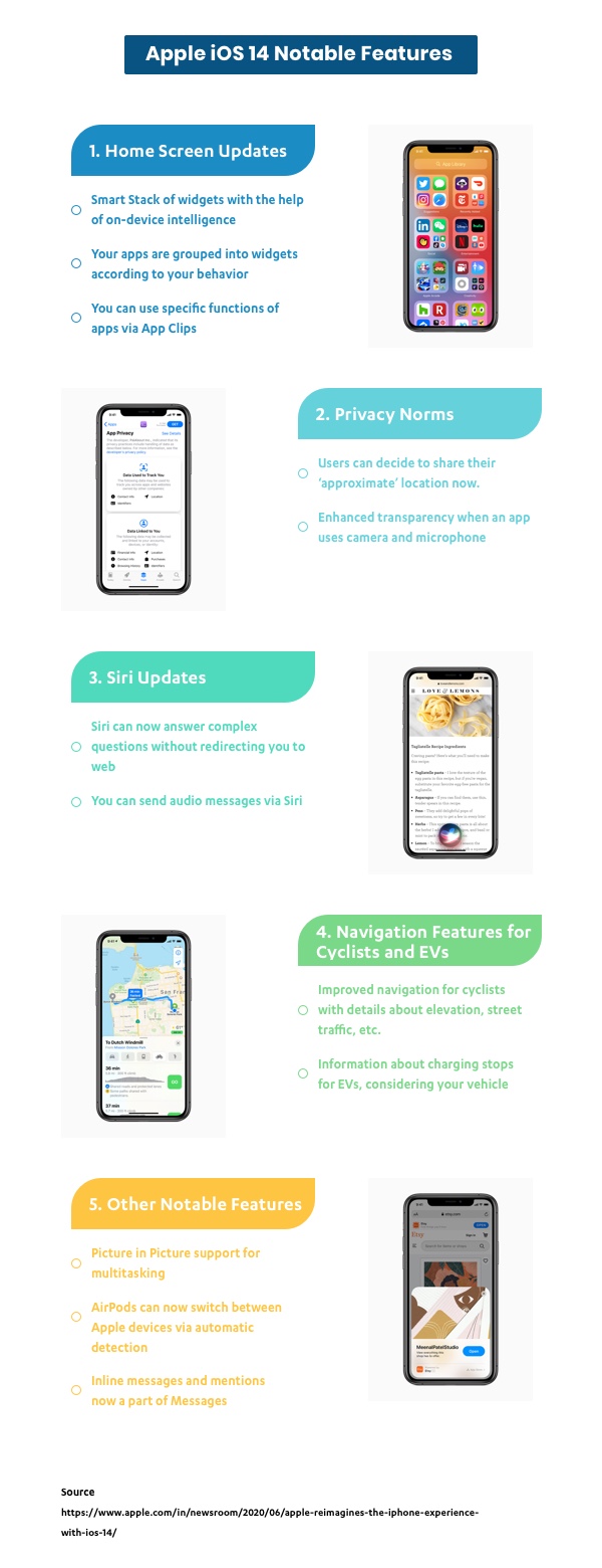
There are many more engaging features that have been introduced in the iOS 14 update. Have a look!

Infographic image of Apple iOS 14 Updates

Happy Exploring!

6 Best practices to avoid common backend mistakes

Software development is complex and thus mistakes happen all the time. It’s something that shouldn’t bother you too much since it has happened to every backend developer.

The fact is that most times, the reason for these mistakes is pressure which leads to human error. Deadlines, feedback anxiety, skipping testing, and rushing things are the four horsemen of backend mistakes. The trick is find your way around it not to ignore it.

“One who makes no mistakes makes nothing at all.” – Giacomo Casanova

We have listed down the best practices so you don’t have to cut corners at the backend of your project.

1. Don’t push the code without getting reviewed

People discussing something behind a glass wall

Pushing your code alone?

It’s always better to get your code reviewed with either a frontend developer from the same project or a backend developer from another project. As the former has domain knowledge while the latter has backend knowledge.

And if you are working with a team, then dont push code to the default branch without the code author or other backend developer reviewing it line by line. As it might create a conflict for others working on the project as they wont be able to merge their code. This leads to vulnerabilities and difficulty in maintaining the code.

Thus it becomes crucial to create a pull request which is a simple and effective way to get your code reviewed. This allows the rest of the developers to discuss changes in a branch and agree to merge them once everyone approves.

Also ensure analyzing the code by a tool like TSLint for TypeScript or ESLint for JavaScript, before pushing it to the default branch too. As these tools ensure consistent code style, and are useful when working in teams so you don’t have to disagree on topics like tabs vs spaces.

2. Avoid using too many technologies for same thing

Books beside a cactus pot

The availability of MERN/MEAN/LAMP stack models as ready solutions for medium and large project development saves so much time. As using one language (JavaScript) for both client-side and server-side development improves teamwork, simplifies collaboration, and speeds up development.

To eliminate the risk of bugs/vulnerabilities due to a higher number of dependencies and slower installation as more dependencies have to be installed, it’s best you use the same technology and the same pattern to resolve a given problem.

If you are talking about complex projects or about the projects with special requirements for security and performance such as public sector, banks, etc., then in such cases, it becomes necessary to build an individual technology stack which makes it possible to satisfy all the set requirements.

3. Test at each level with a bug fix

Door with 404 sign on the wall

Didn’t we already fix that?

It’s a question that you or your teammate often get after the product manager posts a snapshot of the bug.

The very other moment you are retracing the time you fixed that bug in the commits, but what’s the point?

You are already in the production code that is difficult to maintain as you are afraid to break anything, which increases the number of bugs. And to avoid such scenarios, writing all the tests at each level together with a new feature and regression tests together with a bug fix would help.

This ensures a higher work performance in both the long and short term, less bugs, and finally designing a better architecture.

4. Design the data model with whole team

Person drawing with a black marker on a glass

Here is an experience that nobody wants to go through – Fixing a poorly designed data model after an application is in production.

A badly designed data model can cause invalid production data, data being difficult to analyze or maintain, and very slow data queries.

It’s not only important to understand the database itself, but also how to create the right data model to fit your application’s scalability and performance requirements. If a bad data model isn’t deployed to production yet, you can just update the data model and remove the invalid data created at lower environments. Therefore, it’s better to take some time upfront to discuss with your team, and use a proven methodology.

You can break it down into five steps:

  • Understand your application workflow
  • Model the queries required by the application
  • Design the tables
  • Determine primary keys
  • Use the right data types effectively

And If a bad data model is already deployed to production, besides updating the data model, try writing a migration to fix the invalid data.

5. Monitor each production microservices

Person tying thread on pins fixed on a board

When a microservice is down, it’s likely some backend development work that needs fixing. As backend developers have to implement a status endpoint for each microservice.

Without monitoring all the microservices you might risk major bugs due to the most microservice being down.

Whereas, when you’re gradually breaking down a monolithic app to microservices or building a new system from scratch, you now have more services to monitor. Each of these will likely:

  • Use different technologies and/or languages
  • Live on a different machine and/or container
  • Have its own version control

With this, the system becomes highly fragmented and a stronger need arises for centralized monitoring as well. You’ll need to add trace information to each service, and need a tool that can monitor multiple services side by side. So you can understand how they interact with each other, and prevent bugs by figuring out which microservice is down, beforehand.

6. Avoid over-engineering and over-optimization

Person opening rotary lock

Over-engineering is like overthinking.

You’re trying to find solutions to problems that either are too early to tackle or don’t exist yet. In the end, you are left with very long functions/methods, poor commit message naming, and too much logic.

This also often means ugly code, quick hacks, abandoning programming principles like DRY, SOLID and TDD, and little to no abstraction.

It all boils down to two common reasons:

  • The What-if mentality
  • The Just-in-Case mentality

And unless absolutely imperative, this will create needless complexity, costing you significantly more than the final value delivered.

Well, it goes back to the You Ain’t Gonna Need It, syndrome. You need to constantly ask yourself if the way you’re currently writing code solves the immediate problem or program requirement OR if you’re writing it in a way to future proof it and make it more resilient to change.

Getting the right balance so that code is easy to understand AND easy to change, can be extremely challenging. It takes a lot of fine-tuning and experimentation. Implementing these best practices have always helped keep common mistakes at bay, might just do the same for you too.

For Backend related development or assistance, drop us a line.

7 layout fundamentals for that oddly satisfying UI

We all love harmony in our lives. Harmony of tones and hues, of perfect shapes and negative spaces. Be it in music, interior design, or on the dense pixel sheet of our workstations.

Often times this harmony is disturbed by all-out arrangements of elements, essential or not, in tiny places. Resulting in claustrophobic or anxious experiences, like the one we have at a cluttered desks or rooms.

And you most certainly don’t want your users to feel that way about your app or website. A good visual hierarchy which takes spacing, fonts, colors etc, all into consideration helps in coming up with consistent and clean UI designs.

To ensure that users don’t abandon your websites citing cluttered design or app as the reason, here are some layout fundamentals that will help you in creating an eye pleasing design.

Use Grids

Person holding a phone

We all started learning numbers by writing them in square grid notebooks and continued using it for handwriting practices as well. Grid style is implanted in our minds without us being aware of it. Even painters don’t shy from using grids as an assistance to picture all the elements of a painting.

It helps in accurate spacing out and ‘social distancing’ of interactions, images and content within your design. The grids are not visible to your users, but anything out of alignment will catch their attention first (unless that is your intention). Thus, designing without grids will lead to inconsistent design.

A popular argument against grids is that it limits the creativity space of the designers. However, we believe in deploying grids from initial phases itself, and then move 1-2 elements which we want to be the spotlight. This ensures consistency among our designs and at the same time, we are able to get the users attention in a short span of time.

Scanning patterns

Many studies have confirmed that we scan content or texts from left to right and in patterns, the most popular ones being ‘F’ and ‘Z’. Your users do this to find information which is relevant and interesting to them.

‘F’ scanning pattern is subconsciously carried out in cases of content heavy websites like informational ones, news and magazines, blogs etc.

‘Z’ scanning pattern is done which has lesser content and which require less scrolling.

Once you know your visitor’s attention points, you can place your CTAs, value addition information and interaction buttons accordingly.

White space

picture of a foggy mountain

Negative space or white space is a vital component of visual hierarchy. White space helps the users in accessing an element’s importance. If there is a lot of negative space around an interaction, users by default perceive it to be significant.

Adequate usage of negative space will ensure that your users follow the pathway you designed.
Negative space will help in drawing your user’s attention to the elements of your choice and will increase the engagement rates of your website.

Spacing out the elements keeping this in mind will assist in creating a visually pleasing design.

Typography

Text on a screen

Remember those calligraphy classes our mothers insisted on for improving handwriting? Don’t know about the handwriting, but calligraphy letters sure did look great on paper!

And yes, there is a difference between calligraphy and typography but both work on taking your content to the next level in terms of presentation and visual aspects.

Your content copy is what will your user understand about you and your organization. It will communicate who you are and what value you will provide to your customers. And the right typography will ensure that your users focus on the text written and have no criticism for the font selected.

Typography in practice is not choosing fonts or making fonts, it’s about shaping text for optimal user experience- Oliver Reichenstein

Using too many fonts can be distracting for the user. Instead use color, alignment, size and smaller variations to align with the importance of the copy you wish to highlight.

Golden ratio

Fibonacci spiral image

The golden ratio, 1:1.618 is a mathematical discovery. But in design, it showcases the best proportional size of the elements and helps in creating an eye pleasing website and apps.

It can be applied to every element of your design right from white space, buttons and interactions size, typography, images and icons.

The overall design should also be in this proportion. Applying this ratio, ensures harmony and reduces any clutter or visual noise in your design.

Color Play

Picture of a test business card design

There are hundreds of emotions and moods connected with colors. The good (or bad) thing about colors is that they run their own show. Meaning, each color has a defined effect, the bright ones taking the center stage themselves, while the dull ones remain backstage.

Here also, taking too many different colors can strain the users eye and ruin the virtual experience. Colorful things do attract people but only to a certain point.

Even if you do wish to experiment with colors, you can come up with a color palette having a mix of colors belonging to a similar color family.

For interactions like CTAs, buttons, you can opt for bright or dark colors for getting your user’s attention. You can always play with the brightness, hue and saturation of the colors for establishing visual hierarchy.

Size

Sketches and a tablet laid out on a desk

Any large object put in an empty room is bound to attract visitors, moving past all the other objects. The same applies to your virtual contact points.

Size of icons, buttons, images, logos, interactions will be the deciding factor for all your users. Starting with larger objects, designers then size down as a visitor scrolls down the page.

A side note here, once the largest object is fixed, other elements should have a considerable difference in their size, otherwise there the design will become cluttered.

All the points mentioned above, when stitched together, build an UI that enhances your user experience by laying the foundation of a good visual hierarchy. Missing out on any points will lead unnecessary visual noise.

A good design is when your user is not bothered by your design in the very first place. Looking for a partner that can do the same for you, talk to our designers here.

Performance changes that we might see in Angular 10

Even though there is no word on Angular 10’s release and to be honest it’s too early to expect a release, the developers and community has blessed us with 6 RCs and a taste of what Angular 10 could become.

Here are the tweaks/changes that Angular 10 could sport for improved performance and stability.

  • Angular 10 will be lighter in size than previous versions.
  • Developers will receive suggestions for components that are defined in the libraries, now that dependency information and ng-content selectors are added to metadata.
  • Type-checking performance improvements have been made to the compiler-cli.
  • TypeScript 3.8 and the previous versions support has been removed, thus making 3.9 version a featured one.
  • In this update, any warnings with regards to unknown elements will be logged as errors. This ensures there is no unknown error that will keep developers awake at night.
  • Performance improvement via reduction in size of the entrypoint manifest and tweaks in caching technique.
  • To improve the performance of ngcc, developers can now immediately report a stale lock file. Also, a cached copy of a parsed tsconfig can be stored and is reusable in case tsconfig is the same.
  • Multiple translation files merging is now supported as against a single translation file allowed per locale. Users will be able to specify multiple files per locale. And with the help of messaging ID, the transactions will be merged from each file.
  • Several bugs are fixed, like the core avoiding any migration error in case a non-existent symbol gets imported and proper identification of modules which are affected by overrides in TestBed.

It seems that we’ll finally get to see a trimmed version of Angular which is smaller in size but just as fast. It’s still too early to say what part of these updates will make it to the production version of Angular 10 but it will be exciting to see how it turns out.

We try to keep up with the latest happenings of the Angular community so that we are up to speed with the prerequisites and hurdles that might come during a migration or upgrade. And for stable released versions of Angular you can get in touch with us and kickstart your development projects.

WordPress 5.4 ‘Adderley’ | New features and improvements

The recently released WordPress 5.4 ‘Adderley’ update has got a lot to look forward to! Since this highly popular CMS ditched its classic editor for blocks, the updates that followed were more or less about the editor. This incremental update brings some changes in Gutenberg along with accessibility improvements, site health check mechanisms, and numerous other enhancements.

Before we dive deeper into the update’s details, here is a quick list of reasons for anyone who is deferring any updates for a later date.

Why should you upgrade to 5.4?

While incremental updates might not seem that urgent, here are some compelling reasons that will urge you to think otherwise:

A continuous upgrade helps address security loopholes and ensure that your website is protected against possible security breaches.
Like other updates, WordPress updates are also focussed on continuous performance improvements of your website.
Updates help your website become more user friendly and accessible, thereby creating a better user experience.

Let’s take a closer look at the new features and enhancements in this update.

Changes in the Gutenberg Editor

  • Social Icon buttons

You can now add more than 30+ social platform icons to all your posts and website pages. It includes Reddit, Medium, Facebook, Linkedin, and more. This will eventually help you increase engagement across all your social media platforms.

  • Gutenberg’s got a performance upgrade as well

There is a 14% reduction in the loading time of the editor as compared to 5.3 update.

  • More color options

There is now a gradient background option available for columns, cover, and buttons. This new color customization option goes a long way in making your website’s layout more engaging and visually appealing.

Additionally, you are no longer restricted to a single color of the text in paragraphs. You can add inline text color within your paragraphs.

  • Buttons block

You can now get multiple blocks on a single page. This means multiple CTA in a single block, thus letting your user decide which option to go for. Plus, you can play with button style, text font, and the background colors.

  • Full screen mode

Gutenberg editor now opens in full screen mode by default. You can switch the mode in the top right menu and go in, ‘editor settings’, and uncheck the ‘fullscreen mode’ option.

The community has a mixed reaction towards this addition, especially for beginners. A notable issue is that when the full screen mode is activated, the top bar and admin panels are removed. This makes the navigation a task for the new users.

  • TikTok embed block

This update now has embed blocks for TikTok videos, similar to adding Youtube videos.

  • Featured image

You now have the drag and drop option to add featured images to your blog instead of manually selecting the image. The size and alignments can also be adjusted in the gallery block.

Other notable changes

  • New welcome model

The new welcome model provides a tour of the Gutenberg editor. Tips are no longer present and in its place, there is a slideshow with necessary explanations of blocks and official documentation reference. And the good thing is that this welcome guide can be seen as and when needed via the top right corner menu.

  • Accessibility improvement

On the accessibility front, keyboard navigation in media modal and privacy policy’s readability is improved. You also have the option to change the image title in the image block itself.

  • Health checks enhancements

There is a new widget on your site’s admin dashboard. This displays your website’s overall health and gives you a warning on possible issues. In case you want detailed reports, there is a CTA button that will provide the required information and possible remedy for the issues.

Incremental updates are just as important as version upgrades because the exploits don’t stop unless you do the essential regular maintenance.

About Galaxy Weblinks

We have a team of WordPress experts that will assess your WordPress website and help you be at the top of your game when it comes to security, performance, and stability. Contact us for a free

3 Remote work problems and how to deal with them

Since Covid-19 is what everyone is talking about, so we are going to spare you the gruesome pandemic details. Instead we’re going to talk about remote work challenges and how to deal with it.

In order to flatten the curve numerous industries have ceased operations, while some which can still be operational with distributed teams are trying to make the most of it.

Modern jobs are suitable for a distributed workforce but working remotely and managing teams while sitting miles apart is more difficult than it seems.

A little background about remote work before we begin. It was in 1983 that a legend named Steve Roberts showed the world that working remotely is possible; when he embarked on a 17,000 mile trek across America. All he had was bicycle and a solar powered portable computer on which he penned his iconic book ‘Computing across america’.

Since we are not on a bicycle trekking/working across America, this should be fairly easy for us with an arsenal of tools that are literally made to serve remote work, right? The truth is, while it is relatively easier but it isn’t a cakewalk either.

There are other problems that we need to take into consideration while talking about work that thrives on collaboration.

1. Having to work in Isolation

In contrast to a remote working environment teams in offices solve problems by arguing, empathizing, and celebrating together. The informal chats of the peers away from their desks is also one of the contributing factors to the birth of new ideas.

Whereas in a remote environment there are no such opportunities or need of small talk or relationship building. As a result people feel disconnected from their coworkers. Just to get everyone on the same page remote work requires a lot of communicating and alignment.

What to do?

Filling communication gaps with tools

There are a lot of tools to facilitate real time communication in between teams. You also have to make it clear to your team that these tools are not strictly for work communication.

Try to initiate casual and transparent communication by hopping through tools like Slack or Skype to check in on your coworkers to see how they are doing. Share funny news or memes to keep it light and to let them know that it’s okay to slack.

2. No structure or discipline

Unplanned sessions and meetings help maintain a sense of constant ideation and alignment.  The problems are discussed and solved in real time with immediate feedback. It’s not that ideal for a distributed team.

What to do?

Scheduled check-ins with flexible agendas

Getting meetings on a calendar can help you establish a structure that in turn keeps your team regular in communication and in deliveries. Slack can be your friend here, as you can make separate channels for informal conversations, ideas, agendas, task status, and updates.

For the people who need urgent assistance they can get on a call with concerned coworkers easily.

3. Deadlines delaying Burnout

One week you will be full of fresh ideas and energy to execute them and the next you’ll be entertaining your imposter. Isolation might lead to other problems that might not surface in an office environment when you’re working alongside other people.

Being sedentary all day in isolation might make you less productive eventually causing a burnout.

What to do?

Put everything on the calendar

Identify your most productive hours and working from there define your time slots for working and slacking for the day. When you give yourself time to go outside away from the screen and allow your mind to wander, you feel refreshed and relaxed. Avoiding onset of a potential burnout.

The secret to good remote work is treating it like you would at your office. Start small like taking shower and getting dressed before logging in, then move on to more important stuff like checking in with your manager for feedback and informal chat. Like everything difficult, remote work demands discipline and discipline starts with small meaningful steps.