What are the best practices to build a Mobile App?

Turning your great mobile app idea into reality requires a significant amount of time, effort, and money. Mobile app development is a complex and long process that involves different tasks to get the final product. These tasks require decision-making and can be crucial to an efficient overall development process that not only has cost implications but also determines the overall success of your app.

This necessitated the need for a well-outlined app development process. In this article, we have compiled some of the key mobile app development best practices for developers.

Carrying out research and formulating a plan

Each app idea aims to solve a specific problem catering to the needs of its user base. So it is a crucial first step to –

  • Carry out thorough research to know your market
  • Understand the target audience
  • Identify the market gap
  • Research your competition, and differentiate your product offering.

Better research leads to a better product when it comes to app development. If you don’t invest your time in research, you will end up with a lot of iterations which would mean increased manhours and capital.

Choosing the right development platform and app type

Choosing the right platform for your application at an early stage is crucial since the iOS and Android app development processes are different from each other and take time to develop. It is important to choose the right app type (native, hybrid, or web apps). All these types have benefits and limitations, and the right selection is usually determined based on answers to these questions.

  • What is the objective of building your app?
  • What are the key features to be included in your app?
  • What is your budget to develop the app?
  • How quickly do you want to develop the app?
  • Are you more interested in building an MVP across different platforms?
  • Do you want to build it in-house or outsource?

Focusing on design and user experience (UX)

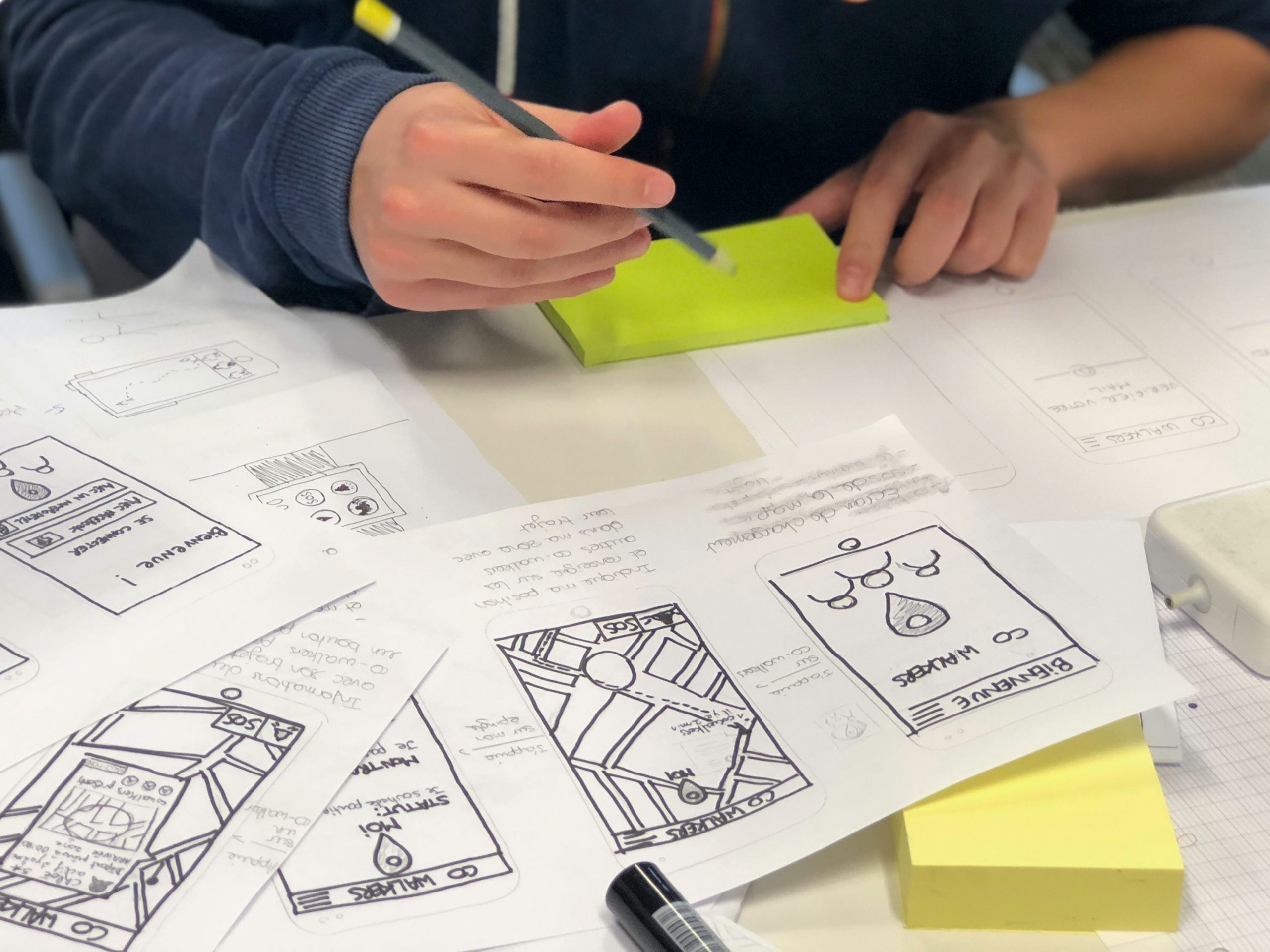
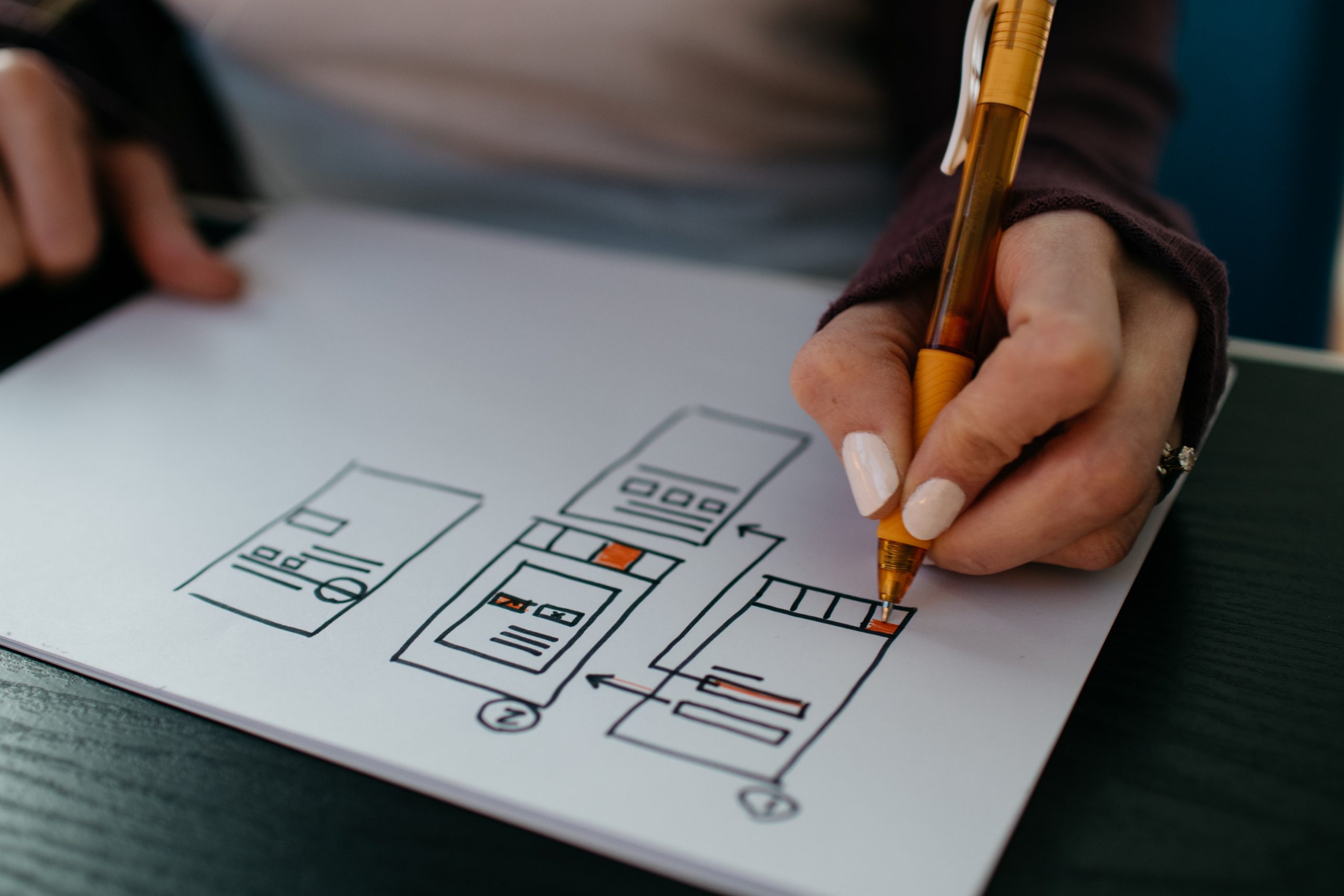
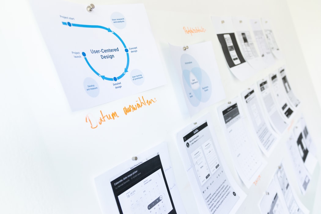
Design is the most important aspect that helps you build a connection between your users and your product.  A good design enhances usability, accessibility, and pleasure the user has while interacting with your app and ultimately your company. Before starting coding for the app development, the focus should be on carrying out a detailed design phase to create prototypes to check their effectiveness. If an app is built without a good UX and after spending huge amounts of time and money, the customers will not stick to the product. So a revamp after launch would be very expensive and brand-damaging in many cases.

Carrying out debugging and testing 

Debugging and testing are the most important parts of mobile app development best practices. Tests need to be carried out extensively to ensure that your app is running efficiently. These tests should run for different test scenarios and conditions to make sure the app is ready for the users.

Focusing on app security 

App security is crucial when it comes to customer data and sensitive user information. Many times developers ignore the security risks while developing the mobile app and thus allow vulnerabilities risking user information while collecting, using, and transferring such data. A developer should carefully implement best practices around privacy at all stages of the app’s life cycle. New privacy rules and policies are developing quickly and developers should be on top of these changes in regulation and policy matters as well as follow the app development rules and guidelines for the different operating systems (App store, Play store, etc).

Planning app updates post-launch

An app requires frequent updates and maintenance support post-launch to accommodate user feedback, feature enhancements, technology enhancements, privacy policies, operating system updates, etc. A good development team should plan for these updates timely to roll out bug fixes, minor changes, or features enhancements.

A few common mistakes during the app development process

We highlight below a few common mistakes that are mainly due to not following the best practices during the app development process.

  • Lack of research around the market, users, competitors, etc
  • Not addressing user requirements and incorporating user’s feedback
  • Focusing only on budget and not adhering to budget management
  • Poor design UI/UX
  • Overloading the app with complex features and functionalities that are not user friendly
  • Not creating an MVP and testing out different prototypes
  • Hiring a development team that does not follow best practices and are misaligned with the overall objective
  • Poor planning and communication during the app development process
  • Lack of maintenance activities and no timely updates of the app

Conclusion

Mobile app development is an ongoing process and it will continue to evolve over time and during the development process. Following these best practices during the app development process can help you avoid common mistakes that can prove to be expensive and damaging to the company’s brand. If you’ve any doubts related to mobile app development and if you need assistance developing one, then feel free to talk to us here.

Native or Hybrid app: What to Choose?

Today the majority of companies are increasingly using digital products to address industry-specific challenges, for instance, enhance customer loyalty and experience, automate reporting, boost sales, or improve document management. But mobile app development is an expensive investment. When you want one for your business, the next big question is ‘which development approach to choose for building the mobile app?’. So, if you are wondering whether you should take the native or hybrid route for creating your next mobile application, you’ll find this article extremely useful. We’ve decided to compare these two options to help you understand what will be the best one for your project. The critical differentiators we’ve discussed here considering both the options will help you while developing a new application. Let’s get started!

What is a native app?

A native mobile application is a smartphone program, which is coded in a specific programming language like Java and Kotlin for Android or Swift and Objective-C for iOS. This type of digital solution offers a higher level of performance and reliability. Installed directly from stores (Google Play, App Store), native apps generally have access to the camera, a list of contacts, microphone, GPS, and other things on a device.

What is a hybrid application?

A hybrid app is a software program that uses elements of both native and website applications. To develop Hybrid you use HTML, CSS, and JavaScript, these are then wrapped in the Native application using a wrapper like Xamarin or Apache Cordova, or React Native. In recent years, hybrid applications have been growing in popularity. Through using the same user interface, they can be built and released across multiple different platforms. To put it even simpler, this is the same app that can be installed from Google Play and App Store.

What should you choose: Native or hybrid apps?

Before we jumpstart with the comparisons, here are a few questions you must think about and ask yourself first that will help you make the right choice: -Do you want to amaze your users by building an entirely native application that integrates into the platform of their choice (Android or iOS)?; Do you want to be able to tap into a user’s device functions i.e. camera, GPS, etc. to make a feature-rich and customized application? Or -Are you more interested in taking an MVP approach, and quickly developing a hybrid application that can be released across platforms?; Do you foresee future updates and changes that are done automatically?

Comparing Native and Hybrid Applications

Codebase

The most important characteristic of a native mobile application is that it has different codebases for each OS – iOS and Android. Created using HTML, CSS, and JavaScript (like websites), hybrid solutions enable developers to write a single codebase. On top of that, the app can be run on all devices regardless of OS. Native: a separate codebase for each OS Hybrid: a single codebase When you require a native app development, you may need a separate development team for each platform, leading to increased development costs. With this, you might need to consider that you have in-depth knowledge and understanding of specific programming languages for each platform.

Performance

Though native application development is more time-consuming, it is faster and more reliable by its very design than a hybrid one. A hybrid app has only a wrapper that is downloaded to the user’s phone (which may or may not contain all the navigational elements) with most of the data being loaded from the server. In contrast, as users navigate a native mobile app, the visual elements, structure, and contents are already on their phone, available for instant loading, and thereby providing a seamless experience. Native: High Hybrid: Moderate! Can be higher with extra efforts in the development phase This characteristic is crucial when it comes to apps that have to ensure instant response to user actions, provide high availability through handling peak loads, even with a slow Internet connection.

User Experience (UX)

Native applications offer the best UX compared to all other types of apps. The user experience specifically for a particular OS becomes critically important to the mobile presence in the market. To offer a good UX with a hybrid app, you would need the most brilliant user experience architect/developer that can truly build an app that caters to the two dominant user types: Android users and iPhone users, as their style guidelines are simply too different. Native: Great Hybrid: Good So, in both cases, the application’s controls, interactions, visual cues, and gestures must be seamlessly integrated with your platform’s extensive style guide.

Mobile application development cost and time

Different codebases have to be written for each platform, and therefore, a native product takes more time. This also implies the team extension, which means the involvement of iOS and Android engineers. Whereas, making a hybrid app is less time-consuming and needs less effort, which is a great advantage. Native: High Hybrid: Easier and faster to develop If your programmers are fluent in several languages, libraries, and frameworks, this will reduce the time and price of building any project. Further customizations will be possible to be made, and you can also choose to release only an Android or iOS application.

Security

Enhanced security is one of the key benefits of native mobile apps over others. They enable software developers to integrate various functions such as two-factor authentication that help ensure data safety and privacy. Whereas, a Hybrid app always has some Native code (for instance to start a Web container like a WebView). That does make them susceptible to vulnerabilities that affect web browsers and those that affect native apps. Native: Enhanced Hybrid: Good Essentially, there is more work involved in securing your hybrid application, but just as much is involved in maintaining native ones.

Conclusion

The battle between hybrid apps and native apps is never going to end because there’s a place and need for both. Ultimately, to make the best decision for you, you need to measure the benefits each one offers and evaluate them against your goals. Contact us, if you want to discuss your business application idea. We will help you through the entire process of launching an app, and help you understand the benefits of both the approaches that fit your business needs. About Galaxy Weblinks We specialize in delivering end-to-end software design & development services and have hands-on experience with native, hybrid, cross-platform, PWA development. Our engineers also help in improving security, reliability, and features to make sure your business application scale and remain secure.

Flutter 1.22 Update| All You Need To Know

Google has released Flutter 1.22 on October 1st, 2020 following the 1.20 release in August. This update is focusing on syncing well with iOS 14 and Android 11 updates, among other features. This cross app development platform is set to make developers and app users happy. So let’s see how this will happen.

Flutter iOS 14 Updates

iOS app development is now set to be a better process than before with Flutter 1.22 update. There is now support for XCode 12 and as Xcode requires iOS 9.0 or higher versions, the default template is now 9.0 (previously it was 8.0). Developers are getting preview support for App Clips too. Crashes reported specific to iOS and font rendering issues were also fixed in this update. And not to miss, when a developer is using cupertino_icons 1.0 with Flutter 1.22, they are getting access to almost 900 new icons via the CupertinoIcons API.

Flutter Android 11 Update

There are two updates for Android developers. Flutter now supports exposing the safe insets of various Android displays i.e. notches, cutouts, and the display of waterfall edges. This will facilitate the placement of elements via MediaQuery and SafeArea APIs. And the second one is that animations are now in synchronization with the Android keyboard.

Google Maps And WebViews

Both these plugins are now ‘production ready’. One can write the code, build the APK, and release it, as per convenience. There is a note here by the Flutter team. They say that Android developers will have to manually enable webview_flutter until it becomes a default setting.

Extending The Buttons Family

Keeping up with the Material guidelines, there is now an additional ‘universe’ of buttons. Now developers won’t have to make widgets from scratch because of the lack of a few buttons. One can mix and match the older and newer buttons as per their requirements.

Analysis Tool For App size

Your developers won’t be quizzed for app sizes ever again. They can get their hands on the breakdown of native codes, assets, and even package level details of the compiled dart code. This size and composition summary is given by the analysis size tool. Such insights will help your team for keeping the app size within the set limits.

Smooth Scrolling

This feature is still in preview but it is an interesting one. It is present to bridge the gap between input and the display frequencies when they are not the same. Enters, resamplingEnabled flag. Flutter claims that you can see almost 97% improvement by enabling this flag and removing said discrepancies. Once there is a certain consensus about this feature, you can expect it to be the default setting. Apart from the above-mentioned features, there are some notable ones listed below:
  • Support for new internationalization and localization
  • Improved navigator 2.0
  • Improvement in the output linking of VSCode
  • State Restoration option in Android (In Preview)
  • Developers can host the inspector tab from Dart DevTools directly inside IntelliJ.
We’re excited about Flutter 1.22, so much so that we have even started exploring it from our end, yes we are nerds that way :D. In case you too want an inside look at how we are planning to use this update to the fullest in our new projects, you can ping us here.

About us

We, at Galaxy Weblinks, are all for new ideas and experiments. We believe that being up-to-date in this fast-paced world gives us adequate time to explore and implement new changes. Our mobile development team is proficient in building apps that are well aligned to our client’s and platform requirements. Contact us for a free consultation!

Android 11 | The update we didn’t know we needed

Google with its Pixel event and launch of two new phones, started rolling out the latest Android 11 OS. Like always, the Pixel phones are the first ones in getting an update and the rest of the devices will get the updates based on their OEMs and how they optimize the new OS for their respective devices.

The update does not have many head-turning features like Android 10 but it sure does an amazing job in elevating the overall user experience. Like the message bubbles, new notification categories, limiting app permissions, among others.

So let’s explore these and the other new features of this update.

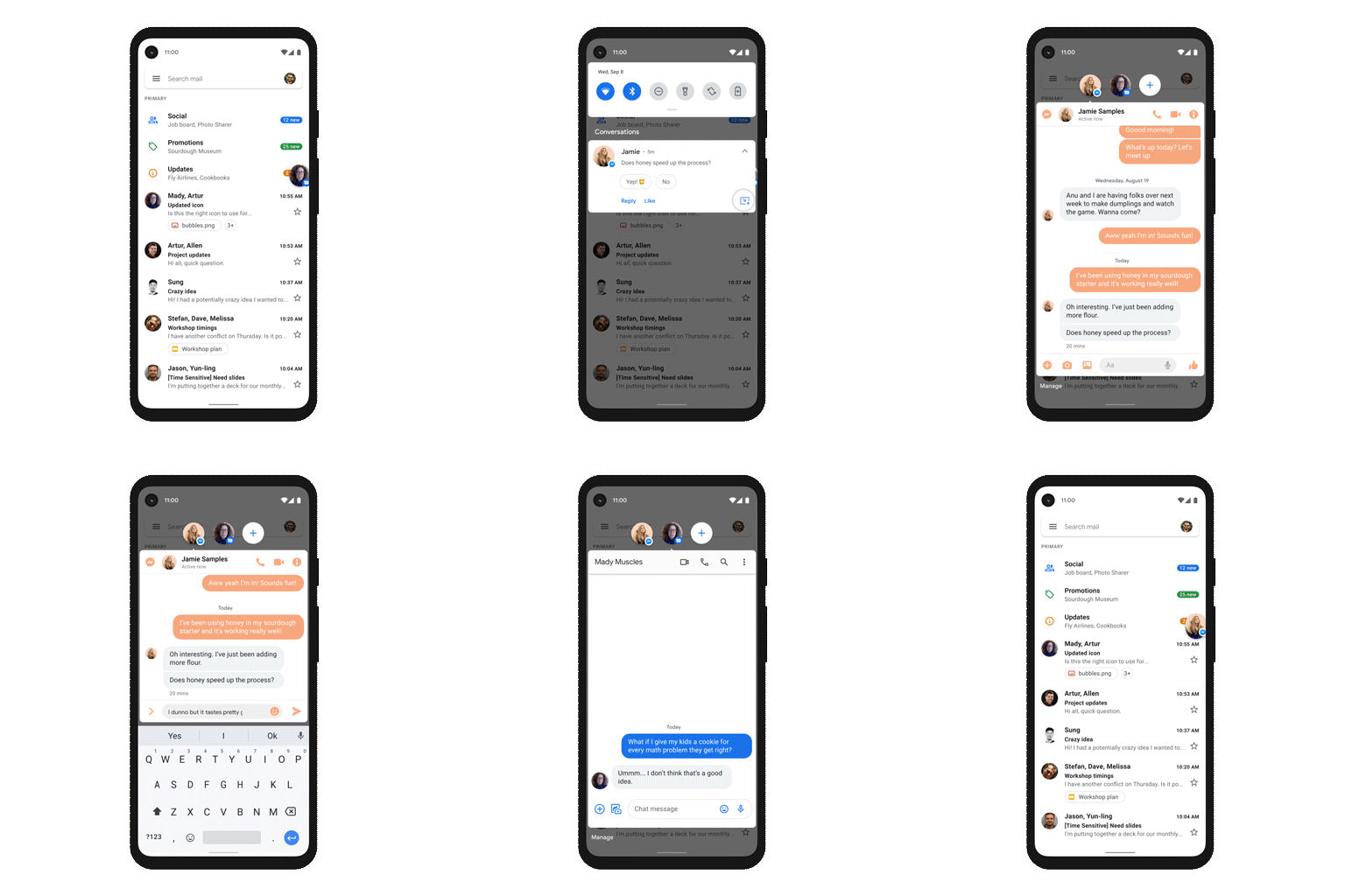
Categorized Notifications

A video showing user interface of Android 11

Android 11 will make your life easier by categorizing notifications into Conversations, Alerts, and Silent. This enables you to prioritize your ongoing conversations, be it on WhatsApp, Instagram, or similar messaging apps.

The other two categories keep all your notifications aligned with your needs. You are kept in the loop with the alerts you opt-in, such as news updates. You can mute the ones that nudge you a bit more than it needs to.

Furthermore, in line with keeping conversations more accessible, the ‘chat bubble’ makes a comeback this year. This works the same way as Facebook’s Messenger floating chat button and lets you reply quickly to your current conversations.

Built-in screen recorder

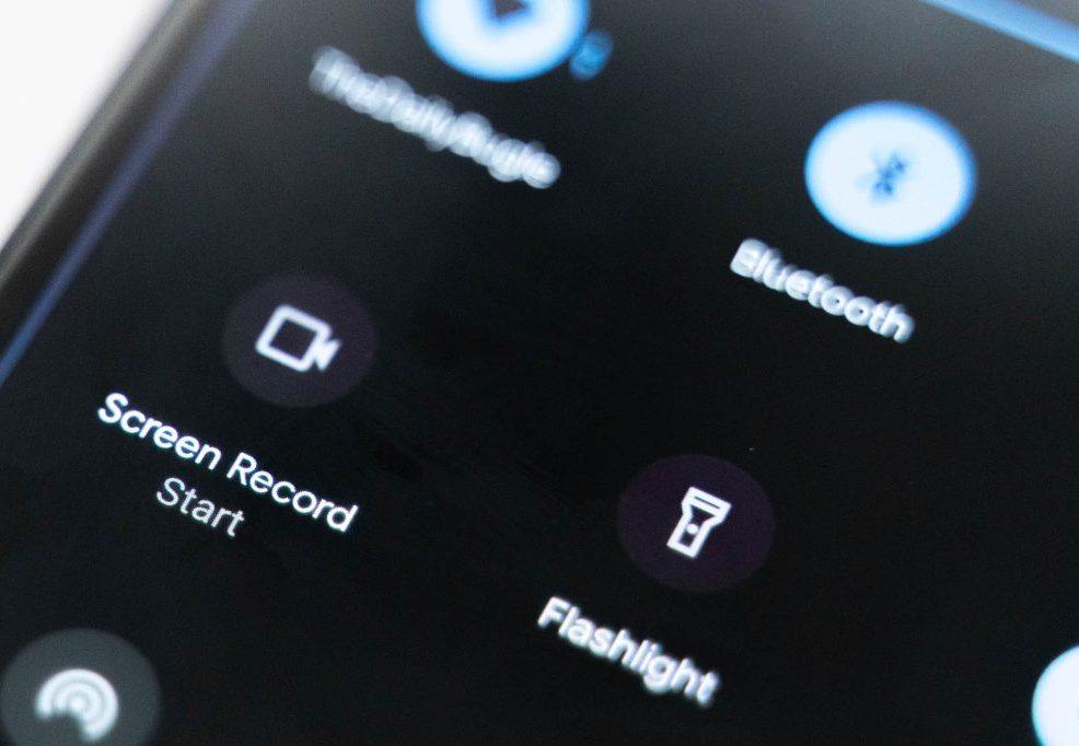
Photo of a phone lying down on table

A long awaited feature, in-built screen recording has finally found its way in this update. Screen recording was possible via third party apps, but there was always some restriction or modifications required for accessing the device’s internal audio settings.

What more, you get this functionality right in the Quick Settings menu. You are getting the option to record audio via microphone or use the device’s audio, record the screen taps or not, etc at last.

Changes in App Permissions

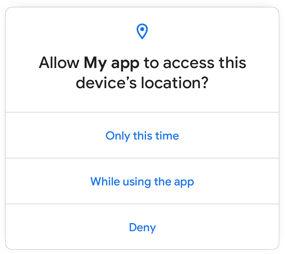
A screencap showing app permission dialogue in Android 11

The apps will now have one-time permission to your sensitive information like location, messages, contacts, etc with the help of the ‘While using the app’ option. Once you close an app, the permissions are revoked and need to be requested again.

Access to information all the time will not be present for a majority of the apps. And just in case you haven’t selected this option when you are not using an app for a longer duration, the permission gets ‘auto-reset’ and your data remains safe.

More options in Power Button Menu

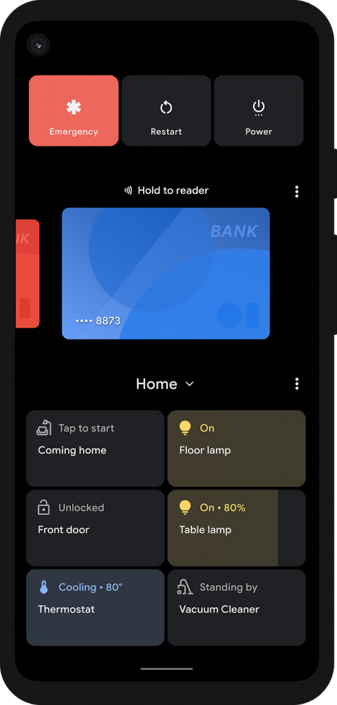
Screenshot of Android 11 power button menu

The long press action on the power button now gives you smart device controls and GPay shortcut. One can add up to six devices for easier control. The need of opening separate apps for these devices gets eliminated here.

However, there is no compulsion put by Google on the device manufacturers to imply this feature. So we will have to wait to see how this plays out.

Media Controller Widget

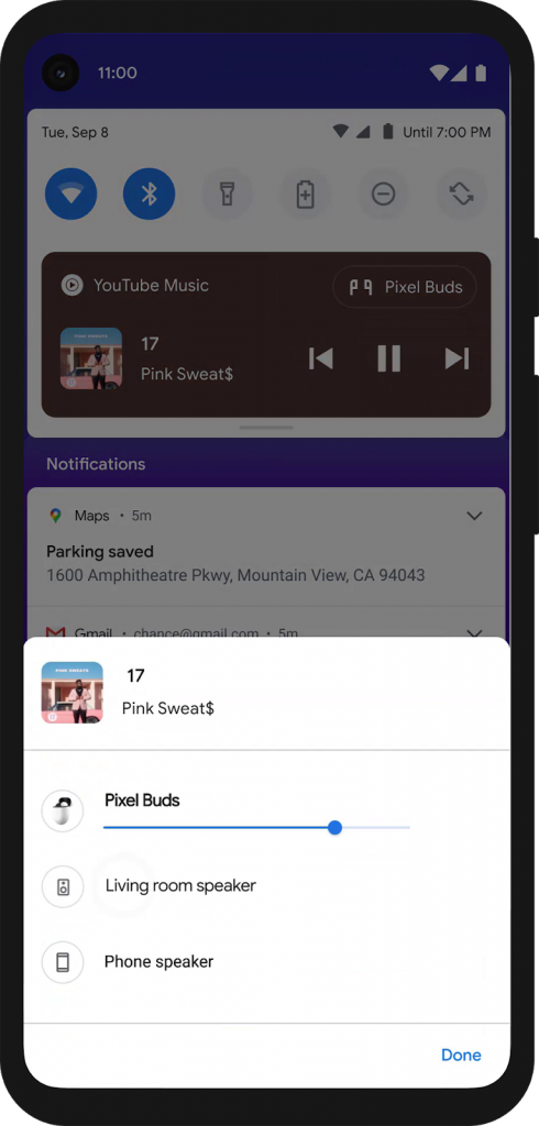
Screenshot of Media controller Widget in Android 11 phone

The media controller is moved to the quick settings menu (from the notifications bar). This ensures that the ‘clear all’ action of notifications does not pause the song or podcast you are listening to. Plus you can go back to the media that you had paused earlier without opening the concerned app.

Other Notable Features

Apart from the ones we have already covered, here are a few more interesting features:

  • You can see notifications from the past 24 hours via history. So in case, you dismissed any notification accidentally, you can go through them again. However, this is not a default setting, so you would need to change that.
  • You can now resize the picture-in-picture window according to your convenience and avoid any obstruction with your work.
  • You can now schedule your dark mode. It can be set as per sunrise/ sunset or to your own time.
    ‘Dynamic Meterdness API’ will detect if you are on a 5G network and will then show you the best quality of videos, graphics, etc.
  • Google’s Voice Access will now be more conversational and simple for differently-abled users.
  • There are 117 new emojis from the Unicode Emoji 13.0 set.

Google has paid attention to many features that were long overdue in this update. Given that it will be rolled out a bit late for the majority of android users nonetheless we are excited about how it fares against the last version.

Our Android team is also excited about the possibilities that Android 11 brings to the eco-system and challenges that they can solve with the new functionalities. If you’re looking for Android development in Mobile, Wearables, TV, and other hardware, feel free to reach out us.

Top iOS 14 features you MUST know!

Apple unveiled the latest version of its iOS operating system, iOS 14, at the WWDC keynote in June 2020.

iOS 14 is one of Apple’s biggest iOS updates to date, introducing Home screen design and widget changes, picture-in-picture, Siri improvements, updates for existing apps, and many other tweaks that streamline the iOS interface.

Apple has seeded a total of seven betas yet of upcoming iOS 14 and iPadOS 14 updates to developers for testing purposes.

Let’s look into some major UI updates and features that stole the spotlight.

Widgets

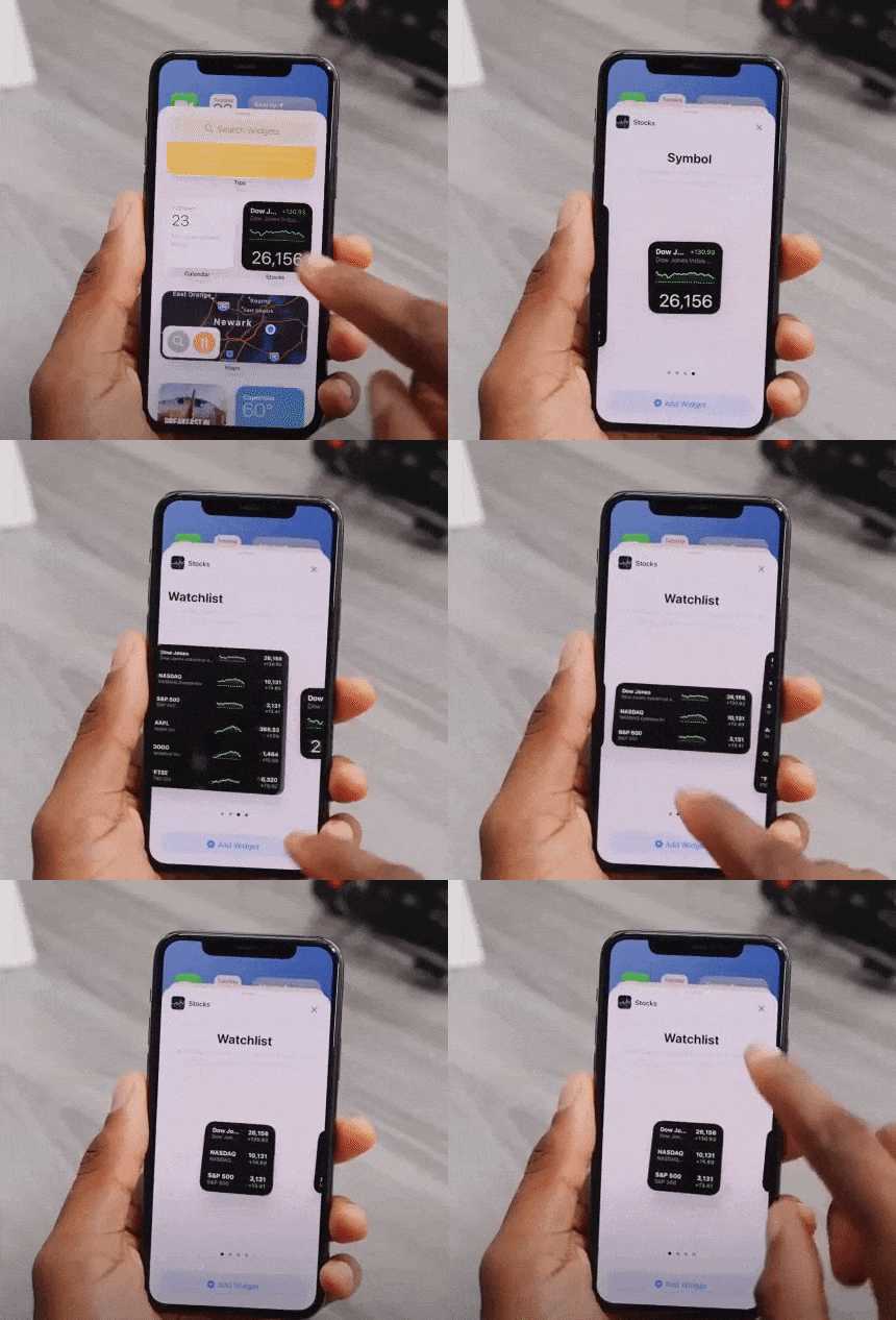
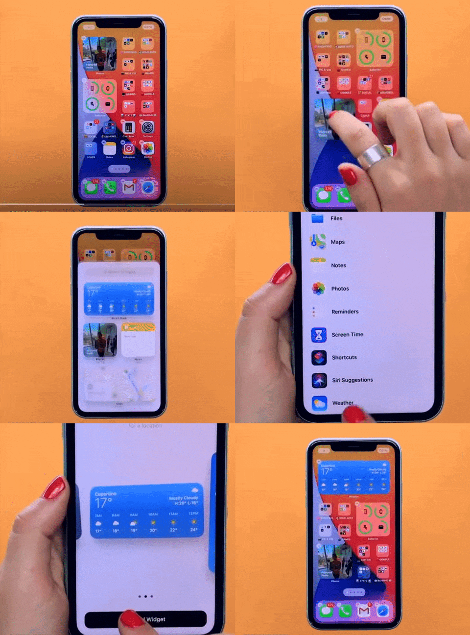
‌iOS 14‌ introduced a redesigned Home Screen that supports widgets on iPhone for the first time, breaking up that stagnant tiled-grid-of-apps look. ‌Widgets‌ have been redesigned and can now be customized in three sizes through the new ‌widgets‌ gallery.

video of a person using a phone

Widgets provide more data than ever to provide more functionality, and Apple redesigned its widgets for default apps like Weather, Stocks, and Calendar. There are also new widgets for Apple News and Screen Time.

Widget Gallery will comprise all of your widget options — by long pressing on the display, choosing “Edit Home Screen” and then tapping the “+” button.

These suggestions are based on what users are installing the most, and third-party app developers can create new widget experiences for their apps.

person showcasing iOS 14 features on iphone

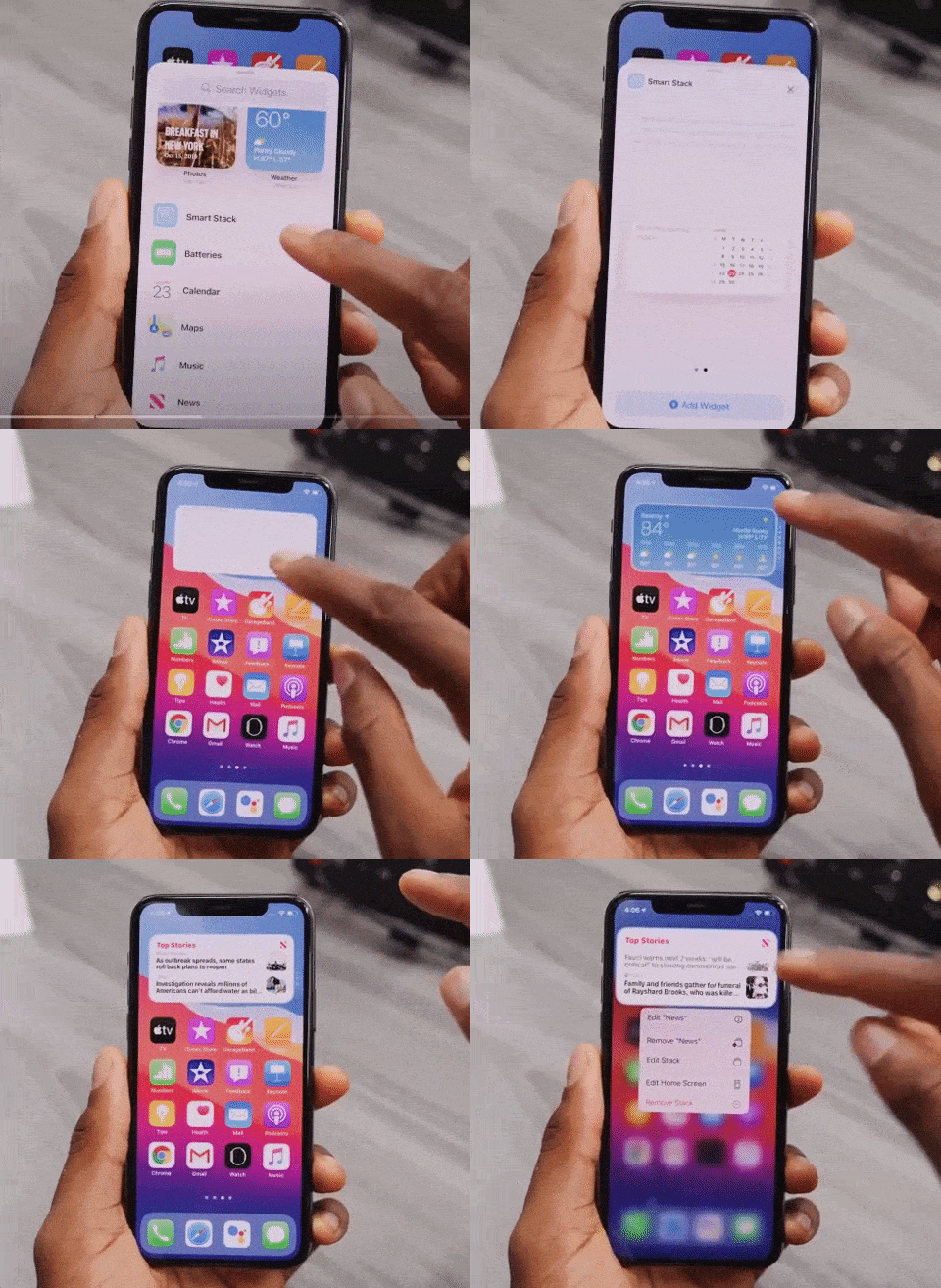
Widget Smart Stacks

You can stack up to 10 widgets on top of one another to better utilize space and can swap between them with a swipe, both in the Home Screen and Today view.

video of a person using an iPhone

There’s a separate Smart Stack feature that’s different from widget stacking. A Smart Stack is a widget stack, created in the Widget Gallery view, that automatically surfaces the best widget option based on activity, location, and time – making sure you’re looking at what’s most relevant.

You can, of course, swipe through the Smart Stack yourself.

App Library

picture of an iPhone

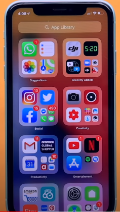
App Library is a great new feature that shows all of the apps you have installed in an organized, simple-to-navigate view that’s similar to the app list view on the Apple Watch. That is categorized into Health and Fitness, Social, Reference and Reading, Productivity, Utilities, Education, Games, Creativity, and Lifestyle.

Compact UI

In the previous version, there are plenty of apps and actions that just unnecessarily take up the entire screen. Now they are all fixed.

Incoming phone calls no longer take up the entire screen in iOS 14 and instead show up as a small banner at the top of the display that you can easily hide, ignore, accept or reject based on your preference.

This also applies to Siri, FaceTime calls, and third-party VoIP calls.

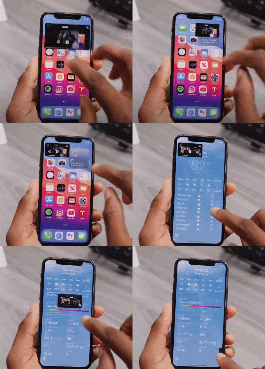
While doing a FaceTime, you will experience a Picture-in-Picture UI that you can easily swipe up, go home, and do other things without pausing the video.

video of a person using an iPhone

Picture-in-picture has been widely supported throughout the entire OS. So, if you are watching any video in Safari or a movie on Apple TV or an app, you can shrink the video in a picture-in-picture window while getting other things done in the background.

Siri Search Updates

Like before, Siri does not take up the whole screen in iOS 14 now. You can call Siri long-press the power button and can see a small animation at the bottom of the screen. It pop-ups an answer at the top of the screen. (But it doesn’t let you interact with anything underneath directly without exiting Siri- if you want to).

Unique iOS 14 Accessibility Features

These upgrades may look minor for iOS 14, but they will be immensely helpful for visually and hearing-impaired users.

Within the new update, you’ll be able to set up your iPhone to listen out for specific noises such as a siren or fire alarm or even a cat. If the phone hears the noise, it’ll notify the user.

According to Apple, it won’t be sending any of your data onto the internet to allow for this feature as this is all done using on-device technology.

Another unique feature in accessibility settings is that you can now map double-tap or triple tap on the back of the phone to a shortcut like Siri, mute, volume down/up, lockscreen, and others.

There are so many other minor changes that have been made in each beta version. ‌iOS 14‌ and ‌iPadOS 14‌ are available to registered developers and public beta testers at this time. Stay tuned to find out which features we are finally going to see in the iOS 14 final release this month.

A comprehensive guide to Mobile App Design

2.56 million and 1.85 million.

According to Statista research, these numbers are the number of applications available on Google and Apple’s app store, respectively.

Each one of these applications is trying to solve a problem. Problems like payment friction, learning, boredom, and whatnot. A million solutions for billions of smartphone users.

But, bear in mind that a problem can be approached in numerous different ways and not all solutions are up to the mark. Most of the apps are not thoroughly researched or planned and hence lack in UX, functionality, optimization, etc..

Having delivered 80+ successful enterprise and user-facing apps, we have learned and curated a set of best practices that help us deliver flawless mobile solutions. Here’s a comprehensive guide to Mobile App Design.

Establishing the ‘Why’ of your app

Trees with question mark on it

Yes, this is an obvious one! Some things that will be established after you have had your ‘eureka’ moment. Meaning, you know that you have to design an app that will solve your user’s problem with ease but you need to dive deeper.

To facilitate this, answer all the questions below before you jump in the design and development phase:

  • What is the problem that you are trying to solve for your users? (like assessing users mental health)
  • Can you define your app’s aim in a single sentence? (This will give you a precise answer to the question above)
  • How do you plan on solving the problem from your user’s viewpoint (and not yours)?
  • What is your USP?
  • How many competitors are there in the market and how do you plan to differentiate your product offering?
  • If your idea is unique, how do you plan on educating your potential users and convincing them to download your app?

These answers will lay the groundwork for your app thus it’s vital that they are clear and understood by all your team members. Write these answers, print them out, paste them in your office, but ensure that everyone is on the same page.

You can always go back to the answers in case there is a detour in your journey.

Creating a functional design

Two smartphone laid on a table with their displays on

Now that there is crystal clear clarity (pardon the alliteration), it’s time to design your app. You should start with wireframes and prototypes for validating your idea. Some tools that will help come in handy are:

  • Sketch
  • Axure
  • Miro
  • Adobe XD

People spend the majority of their time on mobile apps. This implies that the users are hooked to a certain set of apps. How to get in this inner circle?

A clean, simple, and intuitive UI is the answer. This seems a bit vague so let’s define some tips and methods that will help us here.

Storytelling via your UI

paper sketches of an app

We all love stories and mindful endings. And this can be done via your copy, illustrations, animations, etc. Storytelling will help your users share your vision and have better clarity of why your app exists.

  • Make your UI copy conversational and avoid jargon at all costs.
  • Leverage tooltips for better engagement.
  • Be clear when sending out an error message. Pinpoint whatever is wrong or missing.
  • Come up with a pleasing onboarding process

Thus you can humanize your app via a story and it gives the users a chance to look into the vision that you have for your app.

Familiar App Navigation

Person sketching mobile screens

Design your app in such a way that your users need no additional directions to navigate your app. We do not imply that you should copy from competitors. Rather, look out common practices that your user is habitual to, irrespective of the app category.

Stick to using UI elements like hamburger menu, tabbed navigation, or skeuomorphic icons, and so on. The aim is to avoid surprising your user on every click.

Keep in mind how people hold their phones

People holding their phones

We all hold our phones in many ways. Holding it in both our hands in landscape mode, holding the phone in one hand and using the thumb to scroll, using both hands for operating, etc.

Whichever the way, ensure that the vital interaction buttons are within the thumb’s reach and not in the stretch zone. Place the key functionalities and information somewhere in the center. And no elements are hidden behind fingers and palms.

Touch targets

graphic of bubbles

According to MIT’s Touch Lab’s Study, 10mm by 10mm is the minimum touch target size. We have to design for fingers and thumbs, not for cursors.

You can increase as per your need. Say if you are focusing on the elder demographic via your mental wellness app, it would make sense to increase the touch target’s size.

Also the spacing between touch targets should be adequate. They should not be so close to each other that it leads to wrong selection.

Use Established Gestures

person holding a phone perpendicular to their body

Using the same gestures may seem like a creativity barrier but if you don’t do this, your users will suffer.

Scrolling up and down, pinching for zooming in and out, etc should be used wherever possible. Also if you do wish to deviate a little, inform your users and even better demonstrate it for them so that there is no confusion.

You can also test this in your hi-fidelity prototypes to see if your users are struggling with understanding and using the different gestures.

Consistent layout

person holding a phone in front of their computer

Consistency is the lifeline of good design. You can design such an app via:

Visual hierarchy and weight via color play, typography, size, etc.
All your interactions, gestures, navigation should follow the same pattern throughout your app.
Your design should look the same across varying screen sizes and platforms.
If you have a live website, you should aim for a similar-looking app.

Easy Onboarding Tour

person using a tablet device

As mentioned early, your onboarding is a chance to curate your story and present it to your users. Don’t miss out on this.

You should not overwhelm your users with all the information in one go. You will turn your users away even before they complete the onboarding. Your tour should be a progressive one, encouraging users to keep moving on.

Break the information into smaller sizes for easy remembrance. And give the option to skip and resume the tour as per the user’s convenience. This gives the user the control and thus motivates them to interact more.

Keep the sign up simple and give the option to login via social media accounts. If possible, ask users to sign up in the later stages of onboarding. This way you get to highlight your value beforehand, thereby reducing the churn rate.

You will also need to take care of these practices –

  • You should have in-app search functionality, especially for ecommerce websites with huge product offerings.
  • Deter from asking unnecessary permissions. Continuing the above example of a mental wellness app, asking access to messages and contacts may not be well received by the user.
  • Minimize your user’s input. Enable autofill for your forms to speed up the signup process.
  • Keep your notifications to a minimum. Frequent notifications are annoying and may result in the users switching off the notifications altogether.
  • Optimize your app for voice search.

Your app should be designed in a way that your users do not think about the design of your app rather they focus on its functionality.

Testing Your App

person holding a phone while taking notes

Once you have invested your time and effort into designing and developing your app, you should test your app’s beta version on a focused group. Ask them for their honest feedback and improvement areas.

You have to test for your app for:

  • Functional testing for seeing the working of the functions and features.
  • Performance testing under different network bandwidths, older mobile devices, and servers.
  • Accessibility compliance
  • Interruption testing for how the app behaves upon incoming calls, notifications, low battery warnings, any cable attachments or detachments, etc.

Ready, Set, Release

After you ensure that your app is good to go out in the app world(s), sit back, and hit the launch button.

A side note here, things may not go as expected post-launch, so you need to have an open mind and pay heed to the feedback from your real users.

We, at Galaxy Weblinks, have been on this rollercoaster ride of app design, development, and release a good number of times, in case you wish to talk to us about your app and even new ideas, you can get in touch with us here.

Apple users say hi to App Clips (Instant Apps)

In its first ever and one of its kind WWDC, Apple unveiled features that will define the newer generation of its system. iOS 14 update has a lot going for the home screen, navigation, Siri, accessibility, and privacy. One of the highlights of the announcement was App Clips.

In this article, we will explore this remarkable new feature of this iOS update. App Clips, which is similar to instant apps on Android lets you use an app without having to download it for one-off tasks, like booking a cab.

How is it done?

You can initiate the App Clip card to pop-up via QR codes, App Clip links, or an NFC tag. This card has an app description and the action you wish to complete; such as, hailing a cab! The card expands on clicking, giving you all the necessary information.

The main advantage of this feature is that the app works seamlessly with other apps (iMessage, Apple Maps, or Safari) as a pop-up without taking over the entire screen. This is especially handy when, say you are on the road, navigating via Maps. The App Clips will not force you to stop the navigation for looking at a food joint’s menu. Instead, it will let you browse and place orders via the App Clip.

The App clips are also compatible with Apple Pay and Sign in with Apple. Therefore, no need to reveal your sensitive information to apps that you don’t trust, as you can pay via Apple Pay.

Another advantage of App Clips is that iOS wouldn’t run them in the background. Thereby, it restricts the background access to your phone’s information that the app could collect if it was to run in the background.

App Clips will save your time as it will lead you to your task directly and will not clutter your home screen. Additionally, your data will be erased in case you do not use App Clip frequently.

Although App Clips is similar to Android’s Instant Apps, it is a new and important feature for iOS users. The beta version is now available for public testing.

There are many more engaging features that have been introduced in the iOS 14 update. Have a look!

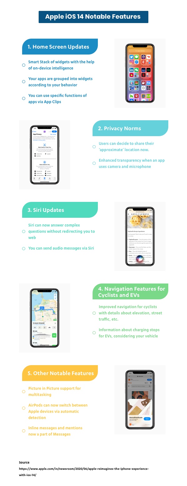
Infographic image of Apple iOS 14 Updates

Happy Exploring!

Instagram Made Me Rethink About Touch Targets

I’m sure you might have come across numerous articles on the web that talk about why we need adequate touch targets for each interactive element on any touch-based interface. (Especially mobiles which have a relatively smaller landscape.)

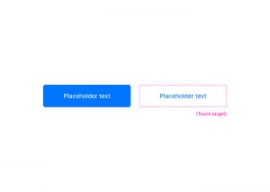
A ‘touch target’ refers to the area associated with an element that triggers the interaction when users tap on it. This area usually extends beyond the visual shape of an element when it isn’t an explicit part of its design.

Have a look at these two buttons, for instance; one is filled while the other is just textual.

Even though the button on the right does not have a visual shape like the other one, its touch target (although not explicitly visible) extends way beyond the text area.

Ideally , these touch targets should be at least 1cm x 1cm (or 38px x 38px) in size, as suggested by Nielsen Norman Group, to promote better capability for users.

Now, I’ve been an avid user of Instagram - which I’m sure you may know, has been one of the world’s most popular apps for quite a long time now - and lately, it struck me that most of the elements on its interface do not follow the common norms for touch targets.

Have a look at this shot, for instance.

Horizontal spacing

In the first highlight, you may notice that all the tags are very close by with hardly any horizontal space left in between. When tags are relatively long, they are much easier to tap on even if they are set close to each other.

Vertical spacing

This type of spacing is usually more concerning in the case of small screens, as no matter how big an element is horizontally, if it is stuffed tightly between two other interactive elements, it’ll be difficult to tap on it.

The same is happening with elements in the second highlight. The action to ‘view comments’ and the ‘profile names’ are very closely stacked.

Another example would be the location link just above the picture in the shot below.

Despite all the discrepancies in spacing, I do not remember a single instance wherein I tapped on an element which I wasn’t intending to tap on!

And I think most of you guys did not, either. Unusual, right? Considering how tight those elements are spatially.

This leads me to believe that the area that we cover when we tap is not that large, after all.

The bigger yellow circle has a dimension of 1cm X 1cm (or 36px X 36px), while the smaller oval (formed by tapping with the right thumb) is 24px (or 0.6cm) long and 15px (or 0.4cm) high - which is essentially how much area we cover while tapping - and it may even be smaller.

If we go by this logic, maybe we can mend our designs to fit more content in a relatively small landscape without sacrificing accessibility… or not? I’d love to know your thoughts on this.

5 Onboarding Flows to retain your mobile app users

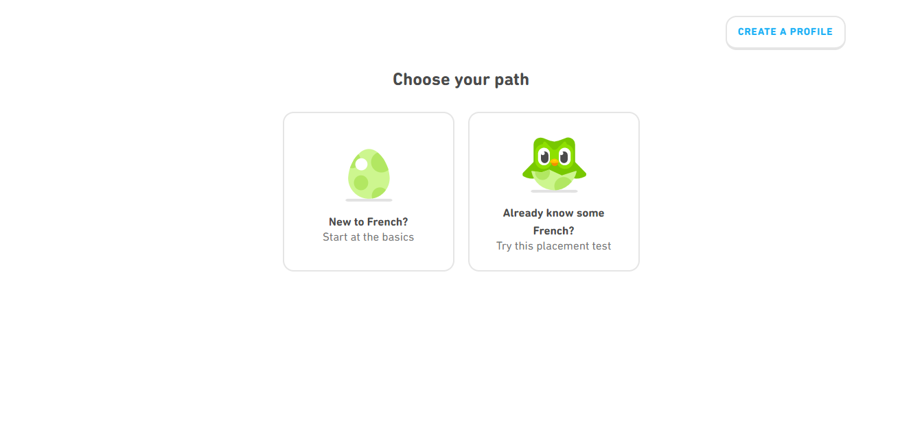
Contemporary mobile apps have different ways of onboarding and retaining their users. Duolingo, a very popular language-learning application offers free sessions before they ask you to sign up. On the other hand, Airbnb’s onboarding flow starts strong with an authentication page, saving users from a simple account creation overkill.

There are multiple onboarding practices that businesses use to engage their users. It is vital to strike a balance in gathering essential information as a lack of context can drive away your users and information overload can lead to a higher bounce rate.

However, the data unveils a bitter truth:

1 out of 4 people abandon mobile apps just after their first use.

Your users must understand the core value of your product faster for an enhanced retention rate.

In this article, we share a list of 5 different onboarding flows, to help you get your users hooked to your app.

1.  Keep your account setup process simple

person holding a phone

If your mobile application necessitates users to sign up to access the app features, the setup process needs to be quick and simple.

This especially holds for Social media or Messaging apps that request device permissions and include an explanation of why the access is required.

Communicating with users builds trust and alleviates security concerns. Avoid scaring away your new users by coming across as too intrusive.

Avoid: Do not ask your users to fill up their information on numerous screens. We recommend authentication via their social accounts, such as Google or Facebook.

2. Highlight the value

Netflix sign up screen

Ask your users the problem they want to address with your mobile application. In this onboarding flow, do not focus on the awesome features of your app. Instead, help them understand why they need to use it.

We recommend communicating the value or specific benefits instead of highlighting features and functionalities.

This has worked out well for apps like Netflix (mobile) and Evernote. Your onboarding process must showcase how the app will meet the user’s expectations.

Impress your users with the various benefits they can reap while using your mobile application. ‘Here is what our product can do’ and ‘Here what you can do with our product’ are completely different approaches and need to be deployed as per your discretion.

Avoid: Don’t overwhelm the users with numerous screens. The key benefits of your app must be displayed in the minimum number of screens during the onboarding process.

3. Showcase the key functionalities

Paypal website screenshot

Introducing your users to the functionalities of your app is another way to onboard them. This onboarding flow is appropriate for apps that have complex features.

This approach fits well for apps like payments, Ecommerce and professional services. Engage your audience, explain the critical features and make them curious about the way these functionalities will help them.

It is essential to communicate the key features upfront to effectively help users understand how your app works. This approach clears up any confusion that the new users may encounter while using your application.

Avoid: Don’t use long texts and jargon. We recommend using illustrations for showcasing the core features in place of long text. This makes it convenient for the users to understand how the app functions.

4. Get users to commit to a mission

Duolingo website screenshot

If you want users to get familiar with your product quickly, encourage users to interact actively with gradual engagement. We suggest that you gather crucial information about users, but in an interactive way. This would usually postpone the signup process.

Gamifying your mobile app onboarding process is an example of this interactive approach. e-learning apps (Duolingo), fitness apps (Fitbit), productivity apps (Habitica) have encouraged their users to interact actively.

The possibility of users to stick with the platform is impacted hugely by having them commit to a mission before signing up.

Avoid: Discourage complicated reward systems. We suggest offering small rewards on completing a module or breaking it down to small units.

5. Create tailored user experiences

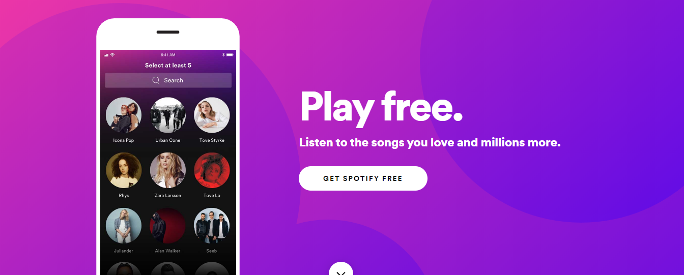
Spotify website screenshot

Many apps improve user retention by helping users continuously discover relevant content while helping them select their preferences. If the users can’t discover the content they are interested in, they are almost guaranteed to abandon your app.

Apps like Spotify, Hulu, Pinterest and other entertainment apps leverage user onboarding to create tailored user experiences by inquiring about users’ favorite genres or preferences.

This approach requires you to either ask your users for data or obtain it through a third-party source such as the users’ browser. Alternatively, you can ask the new users for their date of birth and gender as they sign up for a free account during onboarding.

Avoid: An endless content repository is a double-edged sword. The suggested preferences should be categorized in broadly, to avoid overlapping and boredom.

The Next Step

They say it’s all about the first impression! No second chance..

However, many apps including Instagram, Airbnb, LinkedIn, Slack, etc. have adopted onboarding flows as an ongoing process using multiple A/B tests. These companies are successfully onboarding users that align best with their corporate goals and user’s needs.

It’s true that from the user base to the business model, each app is wildly different. One-size-fits-all practices rarely work. The only way to implement the best onboarding flow for your users is by testing various practices.

About the Author:

Animesh is a Sr. Project Manager at Galaxy and an expert in aligning client objectives with our mobile development team to deliver amazing digital products.

About Galaxy

Galaxy Weblinks has extensive experience in building Mobile Applications using iOS, Android and Hybrid Technologies. We provide specialized technology solutions to address complex business problems, across different industries. From idea to design to development and all the way to the app store, Galaxy Weblinks will work as an extension of your team to handle the entire mobile application development lifecycle. Visit Galaxy to know more about our capabilities.

Understanding cost breakdown of an app via IKEA

A smartphone without apps and a home without furniture are of no use for the people living in it. Although living in a smartphone is metaphorical but it’s true.

A lot of things can go wrong when you’re trying to put together an app or IKEA furniture. Both these tasks have a buffet of customizations, making it even more difficult to stick to one’s decisions. And not to forget, more customization is synonymous with an increase in the overall estimated cost. 

To ensure that your estimated and actual costs are not miles apart, we have curated a list of major factors that affect the overall cost of building an app. With an IKEA twist. 

DIY or Outsource

Tools for furniture making

Besides modularity, digital applications and IKEA furniture have other things in common. And before you disagree with this, allow us to elaborate.
As a first time entrepreneur, you are all geared up to start building your own app, equipped with all the know-hows, and a good amount of experience, similar to a person who is all set to assemble their own Liatorp Entertainment System or PAX wardrobe.
But as both the DIYs project proceed, a realization dawns on the creators after the initial user research is carried out. Your app is not optimized for device performance and UI is poorly designed. The same way the sliding doors are not at all sliding, there seems to be shortage of screws despite having counted them before starting off. 

These results surface only after you are neck deep into both these projects and you start thinking if you should have hired the specialists altogether. 

Lucky for us, there are freelancers and app development agencies who are happy to complete your projects and get them up and running in minimum possible duration. Thus, take this decision before it’s too late and save your time and efforts.                                                                                                                       

Design Requirements 

Design inspiration on whiteboard

Your UI/UX design is what will differentiate your app online. Your design should minimize the cognitive load of your users. If you are looking for customizations like parallax scrolling, custom cursors, micro interactions and other animations, be prepared to shell out more money. Just as you would do for your PAX wardrobes. 

All these requirements will increase your design and development time, taking anywhere from 500 to 1500 hours, thereby increasing your cost accordingly. 

Yes, IKEA furniture can be hard to assemble at times, but once completed, it does make the daily life of the users easy.

Your app design should be on similar lines. It should become a part of your user’s daily life without their realization. And this can be achieved with an intuitive and easy to use app design. 

Type of Applications

Applications on a smartphone

This will be determined by your target audience and the quality of user experience you’re aiming to achieve, keeping in mind the available budget.  

Web app

A web app is the least expensive app version. It is an optimized version of your mobile website but with limited functionalities and minimum amount of complexities. The cost of developing a simple web app can range from $3,000 to $15,000.

Native app

Native apps are built in the languages specific to the platform(s) they are developed for. You can make a feature rich app and add loads of functionalities to it. They can be downloaded from the Apple app store or Google play store only. Since they have to be developed for the platforms individually, the cost of development is on the higher end. These apps can cost anywhere from $20,000 to $100,000 for each platform. 

Hybrid app

These apps are platform independent and are developed using a single language. It helps in catering to a larger audience from the start. The development and maintenance costs are also less in comparison to native apps. It ranges from $10,000 to $30,000. But it fails to beat native apps in the user experience it provides. 

Features and Functionalities of Your App

Utility and design of double bunk bed furniture

The estimated cost and time required in building your app depends heavily on the functional complexity and features. 

Think of Stuva loft bed. It comes with a table, wardrobe, open shelf and of course, a bed. Does your kid really need all this?

Relate this with your app. There are tons of features to choose from for your app. Like, user login, search option, social media integration, chat bot support, geolocation, Google map integration, multi language support, push notifications, payment integration and a lot of others. In the initial phase, you will not require all the functionalities. 

It is always good to see how well your app does after the initial releases by focusing on the core features of your app. This will also reduce your time to market. You can do the refining process in the next app releases. 

Selected Platforms for Your App 

Different models of smartphones

Selecting a platform for your app depends on who and where your target audience is. Android users exceed iOS users by a good number. But this does not mean that you take the android only approach.

Developing an iOS app is more complicated as it requires more expertise and needs to align with the strict App store guidelines. But an android app’s compatibility and functionality have to be tested across a wide range of devices and versions. And you can’t possibly test for all of the available devices.

If your budget allows development for both platforms, it is the best approach to go by. Ensure that you know who is your target audience. For example, if your target base is largely in Asia and Africa, then you must focus on developing an android app first. But if you are aiming for the US and Western Europe, iOS should be your priority for these regions.

When developing an app for any single platform, the cost variation is negligible. A simple app costs around $15,000 but the cost increases with more complexities. But in case you are thinking of developing for both the platforms, the cost will be doubled. 

Required Level of Expertise and Specialization

Expert guide

Assembling a PAX wardrobe complete with drawers, sliding doors, pullout trays, is a task even for the expert furniture assemblers. 

When developing an app, you will need a project manager, UI/UX designer, developer, and QA tester for starting off your project. Even when you are able to fulfill some roles, you will be required to hire experts for other fields to get the best results. 

Sure the cost of experts will be more, but your app will have a good headstart with such a team. And these requirements will keep on changing with your user base and your team will keep growing with your business. 

Location of Your Developer

Wooden map of the world with pins

Whether you’re outsourcing partially or completely, geography plays a significant role in deciding your app development costs. With density, competition also gets stiffer. For this very reason, development costs in Asian countries are much less in comparison to North American and European countries. The costs vary from $20 per hour in Asia to as high as $200 per hour in Europe.

There is no rule of thumb that says that lower hourly rates will lead to poor product delivery or higher rates will give the best products. You can save huge costs by researching and outsourcing to the right remote teams.

Hidden Costs 

An iceberg floating in open water

While you were busy buying your BESTA wall mounted unit, reading up on assembling guides and organizing the flat pack furniture on its arrival, you forgot to buy a drilling machine and the extra care essentials for maintaining that high gloss finish. 

Conceptualizing, developing and deploying your app is not when you get to take a goodnight’s sleep. Instead after the release of your app, you will have to keep some money aside for app maintenance and support. This would include fixing bugs, giving additional support for new OS versions and third party integrations, implementing new features, storing your user data and even monitoring your user activity are all a part and parcel of your app after it’s release. 

Thus, be it DIYing your own furniture or app development, these projects are no cake walk (but don’t forget to cut a celebratory cake after completion of the projects). Having an accurate estimation of time and cost is a good starting point for any app development venture.