Why Design QA should be a non-negotiable part of your process?

Did you ever happen to spot some inconsistencies in your product’s design that were not there in your prototype? The color being a bit different, some changes in the font style or micro interactions not working the way they are supposed to.

You think that some of these errors could have been avoided if a designer was shown the coded version before the app release. And you are not alone in thinking like this. There is a solution to combat this problem.

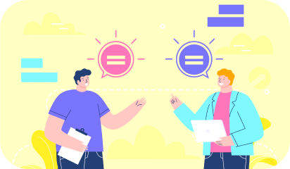
The answer is… Design QA.

So what exactly is Design QA and how does its implementation resulted in streamlining our product cycle. Here are some tips and tricks for you that we learned along our journey.

Defining Design QA:

Design QA is a cross verification process done by designers. It entails checking for any inconsistencies in your copy, visual aspects, micro interactions, and the likes of the code developed before the release of your product.

Why is it neglected from design sprints?

In many organizations, design sprints are very elaborate, taking a full week or longer. And this is prior to the developer hand off. Once this is done, designers move on to other projects with no further updates on the previous product. Bringing designers back for the review is not considered by many. And some other common reasons we hear for neglecting design QA are:

  • A misconception in the design world is that a designer’s work is done after forwarding Zeplin links and Invision prototypes. But that is seldom the case.
  • Design QA discussion can cause friction between designers and developers, making it an uncomfortable conversation to have at times.
  • Design QA is seen as an add on step in an already elaborate design sprint. When teams are working under time constraints, collaborating with designers for more reviews is not ranked high on the priority list.

Why did we implement it in our process?

The reasons for design QA to be a part of our process is nothing different from what the experts vouching for it say. We pitched it to our clients explaining its importance and what benefits will they get after its successful implementation. Some major factors that drove us to inculcate it within our process were:

It’s a pretty underrated time saving hack

Design QA will be good for your long term goals. Getting a few extra hours of your designers is better than a few extra days of your developers to search, spot, and iterate for design inconsistencies after the app release.

Better collaboration between your designers and developers

When designers and developers are in the same room (or call) it will help in solving the issues at hand quickly. Your designers will be aware of the technical issues that developers are facing and will account for such issues in the future.

Developers will also get insights into how designers have envisioned the final product and code to bring out the same in the product.

No surprise design inconsistencies

A designer’s work does not end after a simple functionality test of buttons and interactions. Instead, they evaluate the design elements behavior right from the speed of the interaction to the feedback of an action being performed, will there be a slide-out option or slide in, you get the picture.

Minimum design debt

Design debt is accrued over time when small changes and improvements are kept for the next sprints every time they are brought up. As this pile keeps on growing, it results in a bad user experience. And there will be a point where no amount of small tweaks will make it better and you end up rewriting your whole product.

Integrating Design QA in our existing process ensured that we never went back to square one because of design debt.

You’re convinced that it belongs in your process, now how do you implement it?

We know that it is easier to say rather than execute any changes in your workflow. But how to transition from ‘thinking’ to ‘doing’? Here are some tips that have helped us in including design QA within our workflow.

  • Start out together

The first and most vital thing that we have learned is to involve stakeholders from various product stages in the initial meetings. This helps in seeing the feasibility of the product’s features and setting the right expectations for everyone onboard.

  • Sort issues on the basis of priority

You will face numerous issues when testing the final product from the design point. But not all these issues have to be solved right away, some can wait till the next sprint cycle or are the icing on the cake type features.

When discussing with your developers, define priorities to get the critical issues addressed before ones that are only for aesthetic value addition, this way you are making your developers life a tad bit easier.

  • Have a checklist ready

We all know how good our memory is when we need it the most. Having a reference checklist when design QA is carried out will ensure that we don’t miss out on essential checks. Look for text alignment, colors, content placement and spacing.

You also need to check for the accessibility of the design. Here again, a checklist sorted on priority basis makes it easier for everyone involved.

  • Start the review the moment you get your hands on functional prototypes

We believe that there is no fixed timeline that needs to be followed when it comes to review cycles. Infact, the earlier the review cycle starts, the better. Waiting till the last moment can lead to unexpected delays in the launch of your product.

Getting a designer review on the product’s features will keep the development going in the right direction.

  • Give reasoning behind your feedback

Just saying that “this does not look/feel right” defeats the purpose of reviews. You should back your reviews with proper reasoning and even document them for references. This will not only help your developers but your designers as well to evaluate what they like the best and why.

Design QA has helped us ship perfect products reflecting the original design intents. This has worked wonders for us, especially when collaborating remotely. To get your stakeholders onboard, you can utilize the same reasoning that aided us in actively streamlining our workflow.

Reinforcing leading training platform for heavy user load

For over 35 years, NHLS has been a robust source for enterprise technology and software training solutions offering industry-leading learning content. They provide computer courses and certifications to more than 30 million students through in-person and online learning experiences.

Understanding the challenges

NHLS turned to Galaxy to check the load the platform can withstand under certain user scenarios over different web pages, and wanted the system to be able to entertain 10,000 concurrent users. They expressed concerns over the performance of their learning platform seen during user interaction.

They wanted us to go for performance testing to pull off higher volume load tests, and implement required measures to optimize website load times and ensure zero-downtime during the busiest days.

Test planning and implementation

We developed an in-depth understanding of the client’s system architecture and the platform. We used Jmeter to simulate heavy loads on virtual servers, networks to check strength, test the ability to handle heavy loads and determine system performance for a variety of loads.

We started with 1000 users. Reports of regression and stress tests made it pretty clear that the webapp is not optimized, since even after the FMP (first meaningful paint), the load times were far from what we expected. Servers were running out of capacity even on a few requests, which was not ideal for the server architecture NHLS already had.

Their application concurrency target was 10,000 users which was initially crashing at 100 users. In order to identify the point of bottlenecks due to which application started degrading performance, we defined few performance test objectives:

  • Response Time: To check the amount of time between a specific request and a corresponding response. User search should not take more than 2 seconds.
  • Throughput: To check how much bandwidth gets used during performance testing. Application servers should have the capacity of entertaining maximum requests per second.
  • Resource Utilization: All the resources like processor and memory utilization, network Input output, etc. should be at less than 70% of their maximum capacity.
  • Maximum User Load: System should be able to handle 10,000 concurrent user load without breaking database by fulfilling all of the above defined objectives.

Bottlenecks we encountered and the Solutions we provided

We used Jmeter to start testing with 100 users and then ramped up progressively with heavier loads. We performed real-time analysis and conducted more thorough analysis using a variety of tests like load test, smoke test, spike test and soak test.

In order to get to grips first with inaccurate page load and slow page speed, we decided to test per page load. We onboarded with our team of developers and network/server engineers to look into the bottlenecks and solve the issues to get expected results.

Bottleneck #1: Obsolete code

Adding new features to old coding architecture accumulated unnecessary JS and CSS files, code controllers and models on every page. This was acquiring cumbersome and resource-heavy elements or code throughout the website, and exacerbating the page load.

Solution:

We minified static assets (JavaScript, CSS, and images) i.e. optimized scripts and removed unnecessary characters, comments and white spaces from the code to shrink file sizes. To further improve the page speed, the server team performed static code caching that reduced the bandwidth usage from the website.

This resulted in a significant size reduction in requested assets and improved the page speed taking only 2 seconds to load the home page.

Bottleneck #2: Memory

A single query was processing more data than needed, mainly accessing too many rows and columns, from so many parts of the database. This in case of large tables means that a large number of rows were being read from disk and handled in memory causing more I/O workload.

Solution:

We used RDS Performance Insights to quickly assess the load on the database, and determine when and where to take action, and filter the load by waits, SQL statements, hosts, or users.

We performed indexing, removed redundant indexes and unnecessary data from the tables to quickly locate data without having to scan/search every row in a database table every time a database table is accessed. Server team used Innodb storage engine for MySql to organize the data on disk to optimize common queries based on primary keys to minimize I/O time (minimizing the number of reads required to retrieve the desired data).

Bottleneck #3: CPU

Use of nested loops to process large data sets made it difficult to trace the flow of the code, hitting so many requests (1-10k requests) on the database by a single user. This caused the code to execute multiple times in the same execution context hitting the CPU limit and driving up its usage.

Solution:

We performed query performance optimization to remove unnecessary code in loop (by making sub queries of queries) and removed multiple loops thus reducing time of rendering content from looped code that resulted in sending only 100 requests by a single user now. This reduced page size, response time, and marked down CPU resources and memory from 8GB to 4GB on the application server.

Ridding the code off of redundancies and optimizing the database helped us get to the 5000 user traffic mark. This lessened the extra work of the MySQL server, reducing server cost to 10-20%.

We launched a single server on AWS and configured all the required packages such as Apache, PHP and PHP-fpm, load balancer, and others to run our application.

Bottleneck #4: Network Utilization

The former HTTP/1 protocol was using more than 1 TCP connections to send and receive for every single request/response pair. It utilized many resources on the web page making different requests for each file. As the overload continued, the server began to process more and more concurrent requests, which further increased the latency.

Solution:

We used HTTP2 to reduce latency in processing browser requests via single TCP connection. Enabling Keep-Alive avoided the need to repeatedly open and close a new connection. It helped reduce server latency by minimizing the number of round trips from sender to receiver. And with parallelized transfers, letting more requests complete more quickly thus improving the load time.

  • To identify the slow log queries, and requests taking long execution time in the code, we established a proxy connection between Apache web server and PHP-FPM (communicating through modules earlier) to identify the bottlenecks of individual entities by letting them functioning individually. Then we configured PHP-FPM to identify RAM capacity by calculating how many max. parallel connections RAM can handle, leaving the system memory free to process at the same time.
  • We found inadequate server capacity, while inserting the data in the login and without login scenario to create real-life testing environment.

We proposed a distributed server system so that more than 1 server can be auto generated. We added auto scaling and added 4 servers, but was still burning at the load of 8k users and saw an increased server cost. With Round Robin load balancing, we distributed incoming network traffic or client requests across the group of backend servers. This helped us identify that the load is increasing due to inaccurate working processes of sessions stored in the database.

Bottleneck #5: Session queues

The server was getting overloaded due to accumulating too many sessions when performing load of 10k users login concurrently. And because the sessions were stored in a database, increase in the wait activities decreased the transaction throughput taking session time upto 100s, thus increasing the load on the system.

Solution:

We switched storing sessions from database to Memcache server. It stored sessions and queries in memory/cache instead of files, thus reducing the number of times that the database or API needs to be read while performing operations. It cached the data in the RAM of the different nodes in the cluster, reducing the load in the web server.

Making such scalable and cost-efficient server infrastructure helped the client application achieve the load of 10k users in less than 5 mins using only 2 servers capacity.

The testing process was able to ensure a smooth customer experience and save significant capital expense by maximizing server capacity already in place.

Redesigning lessons from Super Bowl

About 100 million people tune into Super Bowl every year. The game is big because the money is big. Companies spend an average of $5 million for a 30 second screen time between plays. Apart from that the Super Bowl generates $300 million in commercial revenues. With all this money and eyes included, Super Bowl’s 2000s online persona would have been a bad fit for today. Around that time the TV spots were doing great; they were emotional and hitting the right spots, online space on the other hand was the exact opposite. A texty mess. This blog takes a dive in the website redesign of Super Bowl and helps you draw conclusion in case you’re also asking yourself ‘If I should redesign?’. Practically speaking, we didn’t have the modular frameworks back then and there was so little to work with. HTML, PHP, CSS, and maybe Flash. In hindsight lack of choices seems better. Then why even bother doing this unfair comparison, you ask? Because with this comparison we’ll help you answer a decade old and the most crucial questions of all: Whether you should redesign or not? Let’s answer this big question with a couple of smaller ones-
  • What is the end goal with your website?
  • What are the problem areas?
  • What will redesign cost?
This is a capture of the old Super Bowl website before the redesign. It shows a 3 column layout filled with all sorts of content with no visual hierarchy and respect to white spaces in sight.
Screenshot of superbowl.com 2009
The Homepage looks like a headache made out of HTML. For a dedicated page this homepage sure seemed like a missed opportunity to draw attention towards the primary goal of NFL; getting more people to see the game night. Which brings us to the goal of redesign.

Goal of the redesign

Your reasons for redesign can be purely aesthetic like getting bored of your existing design to something strictly business related; existing design being not good enough for conversions. Rebranding also could be one of the reasons to redesign, when you’re trying to launch a new product or service. Like Super Bowl rebranding their colorful and lively logos for an easy consistent brand image in the form of a new logo post 2010. Once you’re clear about your goal you can start working on the website or tell the people, who are doing it for you, exactly ‘what you want’. For the Super Bowl homepage the goal would be to get more people to watch the game, while providing other information like venue and time, all at a glance. Something that doesn’t make the visitor work for little but crucial information.

A picture is worth a thou……

Screenshot of Super bowl website
The new design uses the same principal. Just a few days before the game, the homepage features a simple hero image with the game venue cleverly placed in the backdrop. The new website leverages contrast to make the important information stand out. Like who’s competing, when, and where? There is also a CTA, that clearly mentions what to do next. Being the only action visible before the scroll makes it easier for the readers to complete their journey to the goal.

What are the problem areas?

Like any other website suffering with bad UX, the design team responsible for Super Bowl’s also had to answer questions such as this. When you’re sure about giving a makeover to your website. Usability reports and insights will help you reaffirm the reasons for your redesign. Having the data-backed reasons to do so won’t hurt. Ask your agency or hire specialists to evaluate your website, think heuristics, visual QA, and accessibility tests. Knowing exactly what’s wrong helps you gauge the magnitude of the solution, since redesign is not a days job. So now you’ve figured out the goal of your redesign and the problem areas that you need to work upon. Now all you need is a plan.

How will the redesign work?

Redesign for an enterprise is like clockwork, where all the cogs need to be engineered to fit without fault. Ask these questions to ensure smooth operation of your clockwork:

Is the development in house or outsourced?

It’s not necessary to keep the redesigning in-house if you have a team of your own, since outsourced dedicated teams can produce equivalent or better work more efficiently. When an outsourcing team handles the grunt work, your design team can dedicate their important time for planning how the redesign will go about. If you lack resources, you can completely outsource the design otherwise you can opt for design assistance.

Who leads the overall project and vision?

Inclusion is great for collaboration but it can distract the team from the goal. It is important for your redesign that there is a nay-sayer that keeps the team on track and keeps the project and vision from becoming something else, a hybrid of everyone’s opinion. Just as a Quarterback in football.

How will progress and success be measured?

If there were no yard markings then the football players won’t know if they get another 4-downs or how far they have come on the field. Clearly defined milestones of progress and success will do the same for the team working on your redesign. It prevents constant to and fro later in the process that only results in delays and inconsistent outcomes.

What are your timelines?

Football games typically last for 60 minutes, divided in four quarters of 15 minutes. It helps decide the pace and play of the game. For somewhat same reasons timelines are important for your milestones too. After defining the milestones you’d also need to plan when you’re expecting them. Getting chunks of predefined deliverables in time helps set momentum for project completion.

How much will a redesign cost?

If you manage to find the right agency and all the cogs slide right into place, then you won’t have to worry about the overheads. A medium to large website redesign can cost around $10000 to $50000 depending on the customization and functionalities you require. Before throwing that kind of money on a redesign project you must ensure that you’re getting a handsome ROI out of the whole exercise. If you’re thinking that ‘Just doing it’ would fix all your issues then it’s nothing more than a shot in the dark.

Takeaways

  • Keep Navbar sticky and visible at all times
  • Avoid multiple CTAs on a single screen
  • Give content some room to breathe
  • Make your copy clear and concise
  • Prioritize content according to your goals
When it’s the right decision, redesigning your website can have a positive impact on your business. But, if it isn’t the right decision, a site redesign can be a huge waste of time and resource. If not redesign then what? Custom landing pages, targeted ads, and localization are a great place to start.

Personalization | Key to E-commerce success

With most shopping happening online, the consumer purchasing behaviour has seen a paradigm shift. Earlier the options were limited and buying decisions were quick but now consumers have to sift through a ton of choices to get to what they’re looking for. Just like people trying to hear through a cloud of noise.

For instance, try calling people by their names in large and crowded places. No matter how loud the party gets, the right person or people will turn back. Years of evolution have helped us develop selective hearing. The internet is the same crowded place where everyone is trying to get your attention.

But somehow out of all the products and promotional campaigns, some cut through the noise and make you feel like they were made for you. It’s because they gave a personal touch to their campaigns or their websites.

Accenture, an MNC, found in a research that personalization is key to the success of an e-commerce store.

The results revealed some information that was against what is commonly believed in regards to consumers and their data.

56% of consumers get carried away with the store’s personalization when the store recognizes them with a name.

65% of them prefer retailers that know their buying history. Only if the data is used to provide tailored recommendations.

58% of them buy products from the recommended section provided by the e-commerce store.

In exchange for these, 86% of consumers are willing to share data for getting a personalized experience.

In a world of information overload, personalization is a godsent feature. Here are some personalization strategies which you can adopt for your eCommerce store.

1. Personalize your Homepage

In real world, the homepage of your website would be the entrance to your brick and mortar store. When a potential customer comes at the doorstep of your shop, you must provide the ultimate user experience by greeting them in the best possible way.

Homepage personalization is one of the important keys to do that.

Unlike real stores, online stores can leverage data to know the preferences of a customer on their first visit. From here on Cookies store relevant information to help you tailor the user experience for their next visits.

Amazon homepage screenshot

Amazon, targets every single individual via personalization. Whenever a user selects a particular category to browse more, they get redirected to the same page in the next visits.

2. Location-based personalization

It’s easy to customize products based on location as it improves the shopping experience. It even helps to display campaigns based on the user’s location.

Most e-commerce sites know where the user is coming from and where they want their products to get shipped. They use this valuable information to get more accurate results.

Here is an example of a Butterfly twist that lets its users get the look and feel as if they are shopping at some native place.

screenshot of an eCommerce website

Butterfly twists pull the IP address of the users and personalise product page according to the location. For example if your user is from America, it will set the default page to American sizes and currency.

There is a limitation to this practice. Companies must not force customers to view products on a country-specific site. As a user, it gets really annoying when the website keeps redirecting when you’ve specifically chosen to explore a different location than your own.

Websites need to understand that people are not always buying for themselves and they can choose to explore some other regions, otherwise what’s the point of the Internet.

3. Integrate User-Generated content

User-generated content is another dimension for increasing sales on an e-commerce store.It gives customers a chance to review the details of the product before making final payment.

User review screenshot of an ecommerce website

Yotpo’s benchmark study found that on an average conversion rate of the customers who saw UGC is 166% times higher than those who don’t.

Campus protein uses the UGC on the website so that users can add ratings to the entire product catalog. It even displays the carousel of Instagram inspired UGC at the bottom of the site to reveal the user’s likes and dislikes for the products.

4. Create an array of recently viewed items

Generally, most of the users browse through a company’s site to see the products that are in trend.

Although users trust their memory, they still fail to recall all the products they saw the day before. This is why they look for some sort of help from the store.

Adidas website screenshot of recently viewed items

Adidas wins an impressive score in recommending products and creating awareness. It uses attribute based and collaborative filtering to convert customers and help them select the right running shoe.

5. Reaffirm user choices with Social Proof notifications

It’s a new way to personalize your e-commerce store. It helps you send real time notifications and other relevant updates to your customers.

Many organizations are using this technology to provide relevant and contextual information about the product and the company.

Picture of a McD store from outside

McDonald’s have been using a similar strategy to boost conversions for years. It updates its website’s marquee to show how many people they have served till date. This strategy attracts potential customers towards the quality brand trusted by millions of people. It is not a real time notification variety but it achieves the same goal.

6. Create urgency with timed social retargeting

It is often seen that if a customer doesn’t like the products or is not willing to purchase anything, they leave the site or else jump to another one. It gets difficult to retain them once they bounce to find better options.

In such scenarios, social retargeting helps promote products wisely. Spending on customers who are less likely to buy is like wasting resources. Thus, companies must select their target after thorough analysis.

Screenshot of a ecommerce website

e-bag is a perfect example of social retargeting. It uses this concept to offer ideas for the backpacks through retargeted ads to all those who have seen or viewed the products before.

7. Help them with style guides or assistants

In addition to UGC, almost every shopper needs a personal assistant to take them to the best match for their taste. But it would probably break the bank. Moreover, it’s not possible with an e-commerce site.

But onsite assistance with quizzes and style guides can do the needful. It would help them to make better buying decisions. This is what e-commerce stores are doing.

E-commerce stores are creating a personalised wardrobe for every user who answers questions related to taste, choice, style and budget. The best thing about it is that it regularly updates the user’s wardrobe with new products and informs them about it through mails.

Screenshot of SheIn ecommerce website

Shein went a step ahead in personalized recommendations. This step does more than offering a size chart. It helps users discover new products and styles. They even feature live shows where stylists come and talk about the attire they are wearing. It helps users to get to know about the product which they are thinking of buying.

Wrap up

Aligning all the above mentioned strategies on your ecommerce store can help you to:-

  • Reduce friction
  • Increase engagement
  • Retain customers
  • Boost conversions

After reading something just as this piece might motivate you to redesign your website but adding small but useful elements wherever possible will work just as efficiently as possible. It will help you in enhancing customer shopping experience on a large scale.

If you’re thinking of getting the max out of your product promotions and customer visits and don’t know where to start then get in touch with our e-commerce experts here.

Using quantitative research methods to improve UX

There are times when the solution to a design problem may “instinctively” pop into your head. Yet, in some scenarios, your instinct might be a valid method in solving design problems.

But, one subjective decision on whether the CTA must be bigger or not, can cost you drop in conversion on the line and ultimately, millions.

Moreover, it’s pretty hard to convince people or your stakeholders when your designs are solely based on intuition. Because they always go in trusting your work with the blindfold half-on and are prepared to point to quantitative data backing-up your hypothesis.

Quantitative user research gives you numbers that you can rely on. Take an example of an online supermarket platform where a lot of decisions are taken w.r.t. the color scheme, UI elements, categorization of products, place of variants option, etc. Quantitative research helps you measure the success and failure of such design aesthetics; you just have to do the leg work.

Take a look at some of the quantitative user research methods and how they can be implemented in your research process.

A/B and Multivariate testing

Doors

There is always some disagreement among the designers over the placement of small UI elements. Let your user’s choice be the deciding factor here. Build different variations or versions of your web components or page and present the same to your users. This method will assist you in determining which CTA button is being preferred by your users, or which typography is more appealing to them, and alike.

Their engagement with each experience can be measured and collected in an analytics dashboard and analyzed through a statistical engine with the prior versions. Through comparative testing you can learn which version attracts more clicks or to demonstrate the positive/negative impact of new features or changes to a user experience.

A word of caution: there should only be one difference in all the variants. It will be easy to draw consensus this way and give you definite reasons for selecting one design over the other.

Card sorting

stciky notes with sharpies

Card sorting is used for structuring your information architecture. It is a cost-effective method as you can provide users with labelled index cards or online card-sorting platforms when conducting remotely. Let them arrange it according to their understanding of topic and ask for debrief later on. Such sessions help participants to do the labelling and categorization as they like.

In an e-commerce website, you can see if under “Packed food items” users are searching for both instant and frozen food items or expecting them in separate categories. Even when you ask them to come up with their own categorization, you can always know how your users group information – are they thinking of nomenclature like “Gourmet Cravings” or looking for simple names like “Food and Beverages”.

Once you have all the data, look for common items, category names or themes, and for groups that were frequently paired together. It helps you organize content so that it suits your users’ mental models, rather than the point of view of your company.

Tree tests

two people looking at a giant mind map

It is a task based analysis wherein you ask users to look for individual elements from the navigation structure that you have built. Tree tests help in improving your navigation by observing how real users navigate your site rather than just going on assumption.

Continuing the e-commerce example, let’s assume you ask the participants to locate “instant noodles”. Your users may go in searching for it under “packed food” category instead of scrolling down to find the “instant food” category. This is how it is often conducted to design page layouts and navigation menus.

It’s the reverse of card sorting. Instead of creating own categories, tree testing asks users to work with an existing set of categories, and highlight where they believe an item is most likely to be located.

Google analytics

Post release, you can use Google Analytics (GA) to see the type of daily users visiting your website. You can compare it with the persona(s) that you have built. You can see where your users are dropping off and what activities they are performing. You can leverage insights on user trends, page with the highest interaction, and how are they navigating.

For instance, in the e-commerce venture, analytics will help you understand your user demographics, type of device they are using, product preferences, how far are they scrolling, et al.

GA makes data visualization easier. There are multiple options to represent your data like line graphs, pie charts and bar graphs, thus making it easy to explain it to all the stakeholders involved. Thus, with the information in capable hands, GA can do wonders for your business.

Back To You..

To achieve your ultimate goal of intuitive and easy-to-use interface, backing your design decisions with data from quantitative research will help you build experiences that are fit and relevant for your target audience in the long run.

Hence, instead of depending solely on subjectivity or qualitative research, design must be validated with quantitative research, and proven design practices, as design exists to solve real problems, which inherently makes it objective.

Your product’s success ultimately boils down to how well you have done the user research. As a UX studio our team is equipped to tackle any UX challenge thrown their way. For any assistance related to user research and analysis, feel free to talk to us.

Gutenberg vs Page builders | Settling an year long debate

The appeal of WordPress is simplicity. The debate on Gutenberg and Page builders is much more than functionalities. It’s more about ease of use.

In the world of page builders, Gutenberg emerged as a complete paradigm shift for the users. The battle goes on whether the page builders will be replaced by Gutenberg and lose their influence? Or is Gutenberg alienating most of the current user base because of its workflow?

In this blog, we are going to compare WordPress page builder plugins with Gutenberg to help you select an ideal choice that suits your WordPress website requirement.

Live visual editing

If you want to figure out how things would appear without saving the page – through an actual live preview of a page as you edit it – then here is a big turn up you will find in the differences.

Page builder offers the level of visual editing that Gutenberg doesn’t. A page builder lets you design the entire page in a WYSIWYG interface. You can save the preview time by making direct changes in the layout and style of the web page.

Styles and themes compatibility

Page builders provide more style options in comparison to Gutenberg editor. Elementor and Divi Builders are among the perfect examples for it.

For a button, Page builder offers a lot of customizations like color, border radius, animations, filters etc. But Guntenberg will only have few choices in its bag like shape, background color, and text color.

Gutenberg relies on WordPress for themes and styles. With custom CSS, you can customize your blocks but the overall look of the page will be the same as your theme. On the other hand, Page builder lets you override themes and styles. Thus help in creating a unique experience for standalone landing pages.

Responsive design controls

Gutenberg does not have a responsive design control. But plugin like Kadence blocks adds custom blocks to extend Gutenberg’s editing capabilities. You will be able to better control columns for different screen sizes and will be responsive according to your theme.

But you can’t change how that responsive design will work in Gutenberg.

Whereas page builders provide responsive design control for each element. Therefore, if you want to have full control on the design, you must prefer page builders as an ideal option.

Layout functionality

You can’t customize margins and paddings for individual blocks in WordPress’ new default editor. It gives some basic options for alignment such as left, right, and centre. On the other hand, a page builder gives you the option to edit every single entity on the screen like margins and paddings.

Gutenberg has some third party extensions to let you use drag and drop options to adjust different layouts for different devices. One of the most popular extensions is Kadence blocks. It adds detailed layouts in a web page. But Gutenberg’s default column block is limited and cannot be compared to page builders.

It’s for this reason, you will always require a page builder to get full layout control.

Scope

Gutenberg comes with limited actions. Ease of use is the main goal of Gutenberg. It is intended to be used by writers, bloggers, and businesses.
Whereas, Page builders work well for people who rely on customizations for their development needs.

Page builders are commonly used by eCommerce stores, WordPress agencies, aspiring designers, small businesses, among others.

Takeaways

  • Gutenberg is for people who put reliability and ease-of-use over a buffet of customizations.
  • You can prefer Page builder when you have specific vision for site’s design. You can create unique designs according to your needs and preferences.
  • You can use Page builders when you want to add some specific features that are not present in Block editor. Some of these features include media carousels and subscription forms.
  • People who are used to the freedom of customizations in page builders will find the simplicity of gutenberg quite limiting.

Currently, Gutenberg is not powerful enough to replace highly flexible page builder plugins. It’s just a modern version of the classic editor. But there’s a good news Gutenberg enthusiasts…

Integrating page builder plugins within Gutenberg has the potential to bring out the best of both worlds. Maybe WordPress is heading that way only with custom fields integration.

As a result, you’ll be able to use different modules as separate blocks in Gutenberg editor itself. It would help you to create rich and more flexible web experience. At the same time a future with a win-win situation for all.

Making web more inclusive with Manual Accessibility Testing

People don’t want to miss out on the digital era. And accessibility testing is how we make sure that smart devices and computers are accessible for everyone, regardless of ability or age.

Manual testing is the oldest form of testing in which testing is done via empathy, knowledge, and experience. While automated tests are done on the basis of a set pattern written in code.

Manual accessibility testing is an amalgamation of web browser plugins, assistive computer technologies, and keyboard-only interactions which help testers determine the usability of software, applications, websites or pages.

Why manual accessibility testing is important?

People with laptops and books in front of a desk

Manual accessibility testing is very effective, as it is capable of detecting issues and defects that cannot be traced programmatically. An automation test requires coding, which is time-consuming while testing a number of small changes. Whereas you could test the same functionalities or changes manually on the fly.

Manual testing is mainly needed for keyboard-only commands, compatibility with various assistive technologies, and coordination with color-adjustment plugins for web browsers & software.

Here are the three ‘Must Do’s’ of manual testing:

Screen reader compatibility

Assistive technologies such as screen-readers (Talkback,VoiceOver, JAWS, NVDA, etc.) help people with vision impairments to understand and use the web better by reading what appears on the application.

There are certain assistive situations which are difficult to replicate in an automated setting like- understanding the context of alternative text, determining where links lead, or navigating menus. This is where manual testing is useful to determine how readable your content is for various assistive technologies.

Keyboard only navigation

It’s the most basic and the easiest way of testing accessibility manually. It is done by pressing ‘tab’ key of the keyboard. Ideally, each link will get focused on every ‘tab’ press and thus the user will be able to navigate through the application. Manual accessibility testing helps you determine if your site is optimized for keyboard-only functionality such as accessing all menu, moving between sections of a page and more.

Double-checking the colors

Most of the automated scans and browser plugins are not that accurate with contrast ratio of images related to background images. Manual testing helps in spot check for color contrast, particularly on text overlaid or embedded in images. Manually testing each area of your website against established standards help make sure your content is understandable to a broader range of users.

Who performs manual accessibility testing?

Testing experts and users are two important tester groups for manual accessibility testing. It’s only after getting the web page or application tested by the experts and users that the process of testing is termed successful. The experts test the technical aspects and basic code of the software, whereas users help validate the effectiveness and quality of the accessibility testing.

Testing experts

In manual testing, the software testers execute the test cases and generate test reports without the help of any automation software testing tools. In this process, the tester checks all the essential features of the given software or application.

Group of Users

User testing is mainly performed with the help of assistive technologies (as they check the software from the end users point of view), wherein the users check various features of the web page or software that offer accessibility to every person and not only with disabilities.

Cases where manual accessibility tests are a must

Here are the scenarios when you should go for manual accessibility tests:

Usability Testing

Here, human observation is the most important factor, so a manual approach is preferable. In this type of testing you need to measure how convenient, efficient, or user-friendly the product or software is for the end users.

Exploratory Testing

We need the human curiosity to execute the testing process in this scenario. This is an area in which you require the tester’s creativity, logical/analytical skills, experience, and knowledge. The test is characterized here by a short time for execution and/or a poorly written specification documentation.

Ad-hoc Testing

It is a totally unplanned method of testing where the insight and understanding of the tester is the only important factor. In this type of testing, there is no specific approach.

Manual accessibility testing is more preferable in small projects, when the testing phase runs for a short period of time, because:

  • Running simultaneous multiple test cases aren’t that necessary
  • Maintenance and installation is time consuming and costly
  • Lack of time to get the resources trained in the tools and start testing

In addition to first impressions, when we talk about the functionality, there’s no replacement for manual testing. It goes beyond fail/pass as manual accessibility testing also ensures less time taken between a customer issue and a fix. In fact, there will always be a place for manual testing in ensuring accessibility of an application or a web page, no matter how much automated testing evolves.

Achieving quality output well within your budget and timeline can be difficult for you. We can help you find the best approach based on your testing situation to reach your goal.

What are Design Systems and why do we vouch for one?

Design System is one of the most excessively used design terms in the software industry right now, so much so that it has given birth to a parody Twitter account that calls people out on their overuse of the concept as a mere keyword.

There is a lot of uncertainty about its definition, different professionals have different definition of Design Systems. But here’s one that will put your mind to ease.

A Design System is a set of deliverables(not a deliverable itself) that acts as a single source of truth for design and development teams to realize a product. It evolves constantly with the product, tools, and new technologies.

What a Design System isn’t

Going with the wind a lot of companies tend to claim that they have a Design System in place. But in reality, they’re just pointing towards their Sketch libraries and style guides.

You can’t call libraries or style guides Design Systems for the same reasons you can’t call individual notes of music, a song.

You can’t make a functional software with just some static designs and patterns, just as you can’t make a song with a music sheet filled with notes and melodies, you’d also need instruments and singers to conduct a piece of music.

How to find the right one?

Design Systems can be simple, comprehensive, strict, loose, mono or cross-platform. Based on the scale of projects or operations, you can define what kind of Design System you need. Because it’s always easier to find things when you know what you’re looking for.

Start by asking the right questions:

  • Number of people that’ll use the system?
  • What are their profiles?
  • Are they willing and able to adapt?
  • How many products, platforms, and technologies?
  • Degree of consistency across them

Based on the scope there are two types of Design system. You can either go for a Modular Design System or an Integrated one.

Modular

Module based Design Systems are good for large scale projects like e-commerce, finance and government websites. It’ll enable you to scale quickly and adapt to multiple user needs. There is one downside to module based system though, it can be expensive to build and maintain.

Integrated

An integrated system focuses on one unique context. It’s also composed of parts, but these parts will not be interchangeable. This kind of system suits products that have very few repeating parts and that need a strong and often changing Art Direction (portfolios, showcases, marketing campaign).

Based on the process you can either build a Centralized or Distributed Design System.

Centralized

In a centralized model, one team is in charge of the System and makes it evolve. This team ensures that the System covers everyone’s needs.

Distributed

In a distributed model, several people of several teams are in charge of the system. The adoption of the system is quicker because everyone feels involved but it also needs team leaders that will keep an overall vision of it.

Regardless of the type of system you choose, a Design System consists of:

  • Interaction models
  • Typography
  • Page layouts
  • Components
  • Colour
  • Sounds
  • Tone and voice
  • Words, grammar, and mechanics
  • Spacing
  • Code snippets paired with elements

Why building a Design System can be transformational for your organization?

If you’re a big organization, it’s likely that you have multiple products and services that need to reflect a consistent brand identity. A Design System helps you do that with it’s efficient organization and one-click implementation across all the assets. A Design System has all the pieces engineered to fit together like a lego set, as and when needed. Which makes designing highly scalable, reliable, efficient, and robust.

Here are the benefits of a Design System

  • Productive and cost-effective. Reusable components lets the team be efficient and deliver faster, as they don’t waste time on repetitive tasks or useless meetings.
  • Brand continuity across all products or services. If a UI element which is a part of hundreds of screens is changed, it conveniently reflects in all the places it’s used.
  • Better collaboration and knowledge sharing. With every essential piece of information easily accessible in the system, onboarding new team members also becomes easier.
  • No need to code. Everything is in one place just ready to be picked out and used without having to code. Just copy the required snippet and implement the visual element of your choice.

An extensive design system alone won’t solve your problems. You’ll also need good designers to create a unique and reusable system and good developers to interpret it their own way.

Let us know if you’re on the lookout for something just like this. Pardon the Coldplay wordplay.

6 factors to consider before choosing your e-commerce platform

Setting up a shop online? Well it’s easier than setting one up made of bricks and mortar.

But it doesn’t mean that E-commerce is easy. The insane level of competition aside, your problems start even before you’ve begun to build your website. You start with zeroing in on an e-commerce platform for your business but the options are numerous and all seem to offer similar functionalities. It can be a bit confusing.

This is not a comprehensive list but we intend to simplify the selection for you. So here are some factors like pricing, payment gateways supported, security, etc. to help you select the right e-commerce platform.

1. How secure is the platform?

One of the first things that you should consider in your e-commerce platform is that the language it is based on. Because the platforms based on object-oriented programming language come with embedded security protocols and hence are considered safer.

Magento and Shopify pay extra attention to reduce the vulnerabilities of websites with two factor authentication. And for platforms which do not have multi factor authentication to protect sensitive information, security plugins can provide that extra layer of safety.

A platform is safe when-

  • An e-commerce platform should conduct security audits for sustaining websites.
  • It should safeguard sensitive data from breaches and attacks.
  • Also, to prevent any monetary frauds an e-commerce platform should be PCI and SSL certified.

2. If it is SEO friendly

39% of e-commerce traffic comes from direct searches. This is a good reason for you to take SEO considerations into account.

Popularity of a website depends on various factors with content playing a significant role in attracting the audience towards the site. To understand things better, ask questions like, does the e-commerce platform allow you to write meta-information about the product or is there Google site map support? These questions are important as they have a direct impact on SEO rankings of the site.

Onveos is a perfect choice if you are considering SEO as a selection factor because it provides independent fields for SEO elements. Other than this you can also go for Magento, Woocommerce, and OpenCart as they play a significant role in inbound marketing initiatives.

3. Responsiveness

A responsive web design helps in providing a great user-experience from a desktop to tablets and mobiles of various sizes and orientations.

Having a separate mobile and desktop site requires having different marketing campaigns, product information & banners, catalogues, etc. Platforms like Magento and WooCommerce have various responsive themes and templates to make websites vertically stacked.

Shopify even lets you edit HTML and CSS directly. You can change the colors, size, and positioning of any element on the page within the platform.

4. Multi-channel support

Always prefer a platform that lets you sell product or service across different channels like Instagram, FB Messenger, Amazon, and others. It increases the revenue percentage on whole.

The best multi-channel e-commerce platforms are Shopify, Big Commerce, PrestaShop, Magento, and Woo Commerce. As soon as you choose a platform, your next step should be towards understanding the audience. It will help you analyse what your end users are looking for and how do they buy things online.

Adding more channels will increase the task of managing and tracking inventory system. Centralised management of the data creates diversified selling options in online marketplaces. Multi-channel selling increases the revenue of e-commerce sites.

5. Plugins and integrations

Even though an e-commerce platform has all the things to run an online business, it still needs integrations and plugins to add crucial functionalities like Payment gateways, Tax calculators, Inventory management, etc.

You’ll find a popular bunch of essential plugins and integrations that are common to all the platforms. But your platform of choice should be the one that has an active community and supports plugins and integrations relevant to your business.

6. Last but not the least, compare the price

Price of an e-commerce platform depends on multiple factors like design, setup configuration, custom development, maintenance, and so on.

The per month cost of Shopify platform starts from $9 and goes till $299 whereas Volusion starts from $15 and goes upto $299. Shopify is a perfect choice if you are looking for multiple features and add ons in your app. You can select Volusion for a more selling-focused experience.

Big-commerce has the highest starting price of $29.5 followed by 3dcart at $29. Big commerce is one of the best platforms for SEO considerations. 3dCart is a feature rich platform that builds and manages online stores real well.

Before you zero in on any platform, match your website’s specific needs with the platform’s features and estimated cost. E-commerce platforms can also utilize AI, VR, Chatbots, and Blockchain to help your online business stay relevant.

We know how important is it for you to get things right as your business is in question. If you’ve any doubts related to e-commerce platforms and if you need assistance developing one then feel free talk to us here.

Vue or React | Which Javascript framework should you choose?

The pursuit for finding the perfect “javascript framework” can seem like a wild goose chase. But it never is. There are one too many frameworks and each one has traits that makes choosing more difficult.

Whether you’re trying to get into frontend or shifting from PHP or C++ to Javascript, these comparison points between Vue and React are just the thing to get your started.

Popularity

Javascript is quick in releasing frameworks and libraries. The only constant thing is the continuous change in the top positions of the frameworks and libraries.

According to the trends Vue might not seem like a go-to choice of people.

Screenshot of Vue Github stars

But GitHub stars tell a different story altogether. In June this year VueJS surpassed React. And Vue is still in the lead with 152k stars in comparison to React’s 140k stars.

A point to be noted is that Vue has lesser number of commits and contributors. A possible explanation is that Vue is driven by the open source community where as React has Facebook’s employees as its contributors.

Community support

Facebook’s backing to React signifies strong community support. Till date, React has 171k questions on StackOverflow in comparison to Vue’s 44k questions. But React’s community is more fragmented than Vue’s. This makes it difficult to find answers to even common issues and roadblocks. But Vue gained immense popularity and support from the developers. Vue has successfully created its own name without any major brand’s backing.

Learning curve

Developing your website via React will require you to have a huge knowledge of third party libraries as React is a library and not a framework. Whereas Vue has tools like Vue CLI 3 and Vue UI which will help you in building MVPs real quick. Vue is considered to be more developer friendly due to it’s short learning curve. Also Vue has taken inspiration from Angular and React which makes the transition easier for developers.

Performance

Performance can be measured on various aspects. Measuring it on the basis of framework’s size, Vue has a smaller framework size in comparison with React. Vue’s framework size is of 80KB whereas React is of 100KB. This will have an impact on the initial load time as well.

Virtual DOM is used by both React and Vue. But Vue has better performance and memory allocation due to its well built structure. A word of caution, the final performance will also depend on your application size and how well your code is optimized.

Documentation

Vue’s development team has put in a lot of effort in the tool’s documentation. The API reference is said to be the best in the industry. There is a detailed overview of Vue’s ecosystem, which is absent in React’s documentation. All the information required for creating Vue’s applications is well-written and accessible with ease. All this goes in Vue’s favour. React’s documentation includes basics and some advanced concepts, however it fails to present it in an easily accessible manner.

Use cases

Vue and React are both used by known global names for their websites and applications. Behance, Louis Vuitton and LiveStorm have used Vue. And Airbnb, Netflix and PayPal have selected React. The list is long for both. Vue is scalable and gets integrated easily, so it can be used for bigger development projects as well. However, using React for smaller projects is not a smart decision according to industry experts.

So, When to select one over the other?

If you are a fan of:

  • Flexibility
  • Experimenting with lots of libraries and tools
  • Large community support
  • Javascript more than HTML

React will be your go to option.

If you are someone who:

  • Is looking for short learning curve
  • Likes clean code
  • Wants a lightweight framework
  • Need an MVP on short notice

Vue should be your go to option.

The battle for choosing the ‘best suited’ framework depends upon your specific requirements. And your requirements will change over the course of time. Be prepared for that change as well.