Bugzilla vs Jira: Choosing the Right Agile Bug Tracking Tool in 2024

According to a 2023 IDC analysis, ineffective bug tracking caused 74% of software projects to incur cost overruns and delays. Clearly indicates in 2024 that selecting an appropriate tool is a strategic choice as well as a technical one. This choice impacts not just project timelines but a business’s agility and success. Bugzilla and Jira stand out as key tools in this domain, each offering unique benefits to streamline development and enhance team productivity. Understanding their differences and strengths is essential for any team aiming to deliver high-quality software efficiently in today’s fast-paced market.

Understanding Bugzilla and Jira

Bugzilla, a tool developed by the Mozilla Foundation, is known for its straightforward approach to tracking bugs and issues. Bugzilla offers a robust, open-source solution for bug tracking, emphasizing simplicity and effectiveness. It shines in environments where straightforward bug tracking is paramount, supported by its customizable issue fields and automated email notifications. However, its integration into Agile workflows can be less intuitive, requiring additional configuration to align with Agile methodologies.

Jira,  developed by Atlassian, renowned for its comprehensive project management features, seamlessly integrates Agile methodologies with bug tracking. It offers scrum and kanban boards, customizable workflows, and extensive reporting capabilities, making it an ideal choice for teams deeply invested in Agile practices. Jira’s ability to adapt to complex project needs, coupled with its wide range of integrations, positions it as a versatile tool for dynamic development environments. 

Feature Comparison: Jira and Bugzilla

Bugzilla Features:

  • Open-source and free to use
  • Customizable fields and workflows for bug tracking
  • Advanced search capabilities for issue management
  • Email notifications for updates and changes

Jira Features:

  • Agile project management tools, including scrum and kanban boards
  • Customizable workflows to match team or project needs
  • Extensive integration options with other tools and platforms
  • Advanced reporting and analytics for better decision-making

Agile Bug Tracking: The Core of Agile Success

Agile methodologies prioritize continuous improvement and adaptability, with bug tracking being a key component. Efficient bug tracking helps teams identify, prioritize, and resolve issues quickly, minimizing disruption and maintaining project momentum. The right tool should integrate seamlessly into the team’s workflow, facilitating swift identification, prioritization, and resolution of issues. Integrating bug tracking tools into Agile workflows enhances team collaboration, sprint planning, and overall project visibility. Jira’s built-in Agile features, like sprints and boards, provide teams with efficient task management tools, reflecting Agile principles. Bugzilla, with its customizable approach, can be tailored to fit Agile workflows but may require more effort.

Bugzilla vs Jira in Agile Environments

In Agile environments, the flexibility and adaptability of the bug tracking tool are paramount. Jira, with its agile project management features, is designed to support Agile methodologies out of the box. It allows teams to create sprints, track progress with boards, and adapt workflows on the fly. Bugzilla, while highly effective in bug tracking, requires more customization to fit into Agile workflows but offers unparalleled depth in issue management.

The Importance of Choosing the Right Tool

An ill-suited bug tracking system can be a bottleneck, causing delays, inefficiencies, and communication breakdowns. Startups might gravitate towards Bugzilla for its cost-effectiveness and simplicity, whereas larger entities with intricate Agile projects might prefer Jira’s comprehensive suite of project management tools.

The decision between Bugzilla and Jira transcends mere preference; it’s a strategic one. A tool that aligns with your team’s size, workflow, and project complexity can significantly impact productivity and project outcomes. For instance, startups or small teams might lean towards Bugzilla for its cost-effectiveness and simplicity, while larger teams or those with intricate Agile projects might find Jira’s extensive features more aligned with their needs.

The Business Impact in 2024

The contemporary software development scene demands swift adaptation, efficient workflows, and high-quality outputs. The selection between Bugzilla and Jira has far-reaching implications on a company’s agility, project management efficacy, and market responsiveness.

Actionable Insights for Tool Adoption

  1. Evaluate Your Team’s Workflow: Choose a tool that mirrors your team’s current workflow or the Agile methodology you aspire to implement.
  2. Consider Integration Needs: Assess the need for integration with other tools and platforms. Jira’s extensive marketplace offers a wide range of add-ons, whereas Bugzilla’s open-source nature allows for custom integration.
  3. Prioritize Usability: Ensure the tool you choose is user-friendly for your team. A complex tool might offer extensive features but can lead to low adoption rates.

Empowering Agile Teams with Strategic Tool Selection

As the debate of Bugzilla vs Jira continues, it’s clear that the choice depends on specific project needs, organizational size, and workflow preferences. Whether you’re leaning towards the comprehensive Agile project management features of Jira or the straightforward, focused approach of Bugzilla, the key is to select a tool that supports your team’s journey towards Agile excellence.

At Galaxy Weblinks, we understand the crucial role of efficient bug tracking in achieving Agile success. We’re not just technology experts; we’re strategic partners, offering comprehensive IT consulting and software services to support your journey at every stage. From selecting the ideal bug tracking tool aligned with your needs to streamlining your entire software development process, we craft tailored solutions to ensure your projects run smoothly, your teams operate efficiently, and your business achieves enduring success.

Is your business fully leveraging its technology potential? Book a free discovery call with us at Galaxy Weblinks to explore how our wide range of IT consulting and software services can align with your goals, ensuring you’re equipped with the right tools and strategies for success.

Tips To Remember While Designing a Website

In the world of online business and marketing, website plays an important role. Website signifies the online presence of your business. Hence your website should look good and it should represent your company or business.

Your website should be attractive and presentable. An online business fate depends upon the structure of your website. There are many important factors that should be considered in creating a successful website.

Here are some tips that should be remembered while designing a website:

Website objective

Before designing a website, you should properly know what are your goals? After that you can start working on them. You should make a plan before designing a website. Planning is the best way to reach to your objectives. Your website objective can be anything from selling of a product or service to providing information. Objectives will help you in overall designing of the website.

Budget

You can spend a lot of money on designing a website, but it’s better to make a budget. Your budget should be planned according to the elements of your website. If you don’t have enough money, you can go to online software program which will help you in designing a website. But still you need to spend money on marketing and hosting of the website. Experts say that you should spend 50% on marketing and 50% on website design and updating your website.

Quality content

It is mostly seen that people spend a lot of time on the designing part of the website and they forget about the content. Content is the king of the website. Content has the power to attract the potential audience. Content on the website explains your business goals and objectives which will help you to excel your business. If you are not a good writer, you can hire someone. If you want to grab attention of your target audience unique and quality content will help you.

Visual Aspects

You only have 8 seconds to grab your visitor’s attention. And it all starts with a good visual hierarchy. A clean and organized hierarchy will act as an invisible guide for your visitors. It will lead users on your designed user flow. You can achieve it by using visual cues, typography, color, contrast ratios, and ample white space. Avoid using a lot of typography and colors as it may distract your visitors. But you can play around in CTAs, as these are supposed to draw visitor’s attention.

Branding

Which style represents your organization? Is it chic, elegant ,old school, or a bold brand. Design a website which mirrors your brand’s style. Make your logo the first thing a user encounters by placing it in the upper left corner as users will scan your website in F or Z pattern. Leverage your current client testimonials as evidence of your work. You should link your active social media accounts for letting visitors connect with you instantly. Your social media activities will help in establishing your stand on various topics, CSR activities, work culture, etc. All this will play a role in building your brand.

Usability and Accessibility

Your website’s usability will be established with its intuitiveness from the user’s perspective. Are all possible answers that your user is looking for available to them? It includes an easy CTA for your newsletter subscription, simple navigation, having autofill activated for forms, et al. Carry out usability tests to know where your users are struggling and if the features are easily discoverable. It will help in establishing your website’s usability from the end user perspective.

One in every five American citizens has some disability pertaining to eye sight, hearing, and motor skills among others. When you design your website without taking care of accessibility norms, you are missing out on potential clients. Use the accessibility guidelines to make the website content compliant to at least AA level of the WCAG. Level AA of the Web Content Accessibility Guidelines (WCAG) is widely accepted, highest level being AAA.

Responsive website

We live in an era of varying screen sizes. Designing only for PCs and Macs is no longer the norm. Design your website keeping in mind your mobile and tablet visitors as well. Your website should not appear cluttered when seen on smaller screens. You should check for the
functionality of your website on every device. Test out every button and interaction before the final release. Taking care of these aspects will ensure similar user experience across all the screens.

Market your website

After designing your website, don’t think that your work is done. Submit your website to all search engines. You can also do active marketing through social media sites like Facebook, Twitter and Google+. You can add your website links to other famous websites so that traffic gets diverted to your site. Marketing and advertising of a website may take some time, you need to be patient.

A website is an identity of your business. And when it comes to online business, your first impression is the last impression. So you should be careful while designing a website.

At Galaxy Weblinks we offer web development services. We specialize in developing custom websites and web applications with robust and stable backend process. For details please visit us here.

Hamburger menu | To use or not to use

Even though it might seem like a contemporary design element but Hamburger menu is as old as our personal computers. It was designed by Norm Cox, design lead for the first ever graphical user interface made for Xerox Star.

Since then Hamburger icon has become synonymous with menu and a way to make the screens clutter free. Almost all of the internet recognizes it as the menu icon.

But as ubiquitous as the hamburger is, it is not going to stay that way. Here’s why

Makes feature discovery a task

Practically every designer has used hamburger menu as a goto navigation component. What a lot of people miss is the fact that it’s hidden and whatever is out of sight, is out of mind.

It’s proven that using hidden menu adds to the friction and user would rather skip than go through the difficulty of revealing and discovering hidden features.

Besides, people are more likely to use visible navigation than a hidden one.

Conflicts with system navigation

When smartphones sacrificed the capacitive and solid buttons for screen real estate, on-screen and gesture navigation had to make their way in the UI.

iOS apps have been struggling with hidden navigation long before no-buttons-all-screen went mainstream. Designer can only put so much in a navigation bar. It’s either menu or back button for navigation because none or both are a bad option for usability.

Non-glanceable

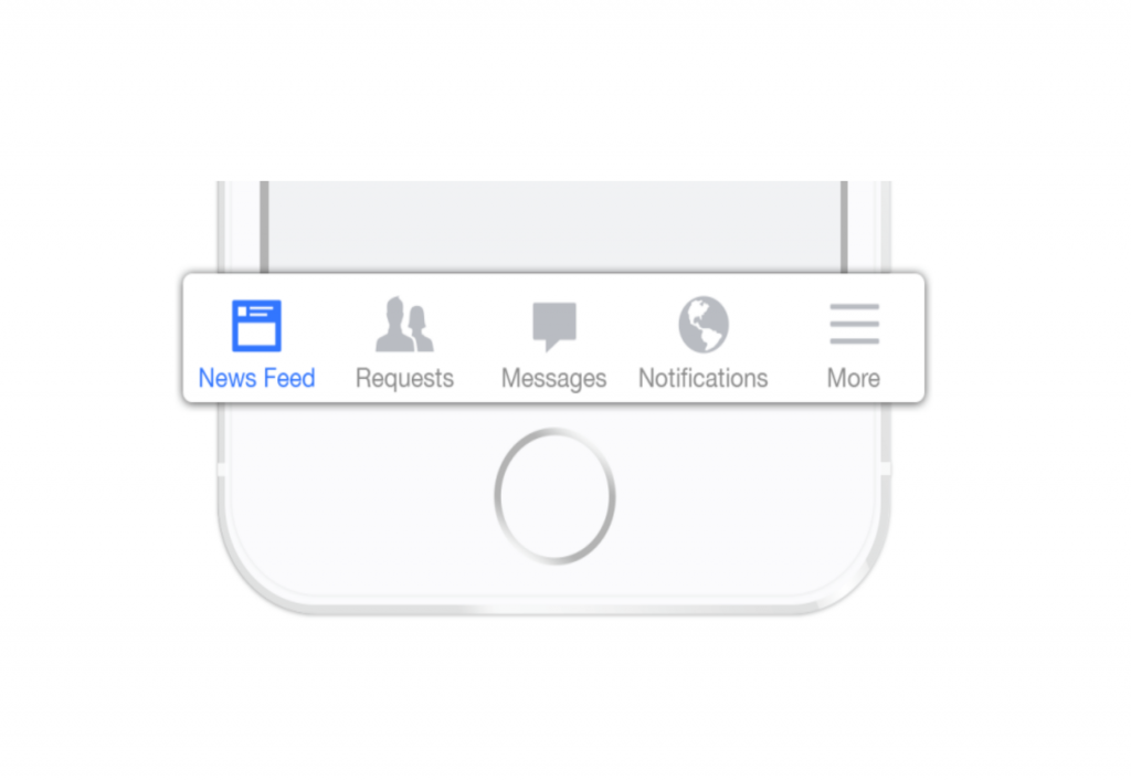
Adding a layer of difficulty just so that interface looks cleaner is bad for engagement and conversion. Visible menu such as tab bar lets the user see right away what’s what. It also makes notifications more contextual.

People find it easier to switch between tabs than discover hidden features via menus.

It’s just like choosing what to order when you’re hungry. What are you more likely to order, a dish for which you can see the ingredients for or a dish for which you can’t?

The former, of course, nobody likes to experiment on an empty stomach.

Now that the hamburger is out, what are your options

Tabbed navigation

This menu is prominently used in mobile phones. Smartphone screen sizes have increased substantially and single handed usage has become more difficult than ever. The hamburger which was easily approachable once with smaller sized screens is now even out of the stretch zone of the palm.

Tabbed navigation at the bottom brings the navigation down where everything is easily reachable within the reach of your thumb.

If you look at the Android UI Guidelines you will find that the Tab Bar is now a main navigation component. Which means that it’s more suitable for current and upcoming devices.

Progressively collapsing menu

This is a progressive approach towards hamburger menu. But unlike hamburger, this navigation adapts to screen size without hiding the features.

This menu utilizes familiar iconography to collapse the navigation according to the screen size without losing much information.

Combination of tab and hamburger

Combination menu comes in handy in the scenarios where the design calls for more than 5 menu items. Phone screens are big but they can only be as wide as the grip of the palm. There is no way to accommodate the amount of items that a hidden menu can house.

A combination menu has four tabs and a hamburger to house more items.

Takeaway

Hamburger menu has its share of good and bad. A bad implementation doesn’t necessarily mean that the UI component is bad. There are apps where hamburger makes for an ideal choice and in other cases it causes friction in user experience.

It all boils down to what’s more suitable for your app or website. Any of the hamburger alternatives will work for you as long as it’s not hidden.

7 actionable tips for being a great programmer

What makes a great programmer?

If you’ve spent a significant time speaking in between curly braces then you must know that it’s not just about shipping code that works. You need to be able to write code that’s easy to read and refactor. Soft skills are also crucial to understand requirements and communicate the same with your teammates, so that nothing gets lost in translation.

Here are 7 similar tips to help you through the process of becoming a pro

A woman working on a computer

1) Use pragmatic comments and consistent naming convention

Programming is like any other language and if you really know how to speak or write programming then developers after you won’t have to struggle to crack naming conventions or comments on your code.

Comments on code are generally a bad practice because it means that the code’s not good enough. If it needs additional explanation, then it can be written in a better way. You know it’s a bad code when you see unnecessary and repetitive comments or commented codes.

Programs must be written for people to read, and only incidentally for machines to execute –Harold Abelson

It’s not that all comments are bad. In some situations comments can be really helpful, like warning comments or reminder comments.

It is always advised to name packages, classes, variables, and functions consistently to make code easy for the next developer to work with. You can use your naming conventions for dynamically and statistically typed languages. It will enhance the readability of code.

2) Test and debug your code smartly

We all make mistakes at some point while developing software. It is a part of any process. No one gets it right in the first attempt.

Fix the cause, not the symptom- Steve Maguire

Identify hidden flaws through implementation and final module testing in different stages of development cycle. These include requirement analysis, designing, development, implementation and integration stages.

IDEs like Eclipse, NetBeans or IntelliJ IDEA works best these days for writing test programs, testing, and debugging code.

3) Keep it healthy

Old functions and replaceable variables can add to the dead code tally. To get rid of such code, delete old function or a class from the location completely otherwise it will get compiled during the run of the project.

Of course bad code can be cleaned up. But it’s very expensive – Robert C. Martin

Besides, timely removal of unnecessary code can reduce your code size by 30% to 40%.

Use Codepro Analytix, Cobertura, Sonar, and other such tools to improve the quality of your code.

4) Choose tech for longevity

Selecting tech based on immediate requirements may prove to be detrimental in the long run. When investing in new technology and tools, make sure that it aligns with your future goals and requirements.

We always look for everything in the immediate proximity, that is a mistake – Thomas Bernhard Ghen

For example, VBA, Delphi and Perl were once popular. But they are obsolete now. Developers either use top tier languages like Java and Python or second-tier languages like Scala and Swift to build contemporary programs and applications. There is also a third tier of programming languages like Rust and Crystal that you can use for learning and experimentation.

5) Master soft skills

When working in teams, understanding your fellow programmer needs and in turn making them understand your needs requires effective communication skills.

Soft skills get little respect but they will make or break your career – Peggy Klaus

Encouraging interactions within the team can also help in building your own discussion forum. Create a learning environment within the team by developing curiosity and adaptable approach.

6) Under-promise and over-deliver

You need to be realistic when setting project deadlines. Keeping a buffer of a few extra days in your project timeline can be helpful for any unexpected delays.

Make it work, make it right, make it fast- Kent Beck

And in case everything goes smoothly, kudos to you for completing the project before the set dates.

7) Focus on solving a real-world problem

Research on real world problems and try finding the solutions for them. This will help in building your programming skills. Besides it provides a sense of purpose, especially when you’re trying to adopt a new skill. It’s easy to get distracted and lose the motivation when you’re faced with complex problems.

First solve the problem then write the code – John Johnson

You also need to develop creative outlook and problem solving skills to solve problems that are too complex for conventional approaches. Simply learning a programming language won’t help until you focus on solving real-world problems.

Bonus tip: Practice…practice..and more practice.

With these tips integrated in your process and enough practice, you’ll be on your way to greatness. Just as this guy..

Simply put, there’s a lot to gain and little to lose while taking the time to really understand the core concepts. Keeping in mind it requires a deliberate practice to improve your work and build credibility with others.

5 mistakes to avoid while designing tooltips

Tooltip is a great UI pattern for user onboarding and feature discovery. But there is a thin line between useful and annoying tooltips. This post will help you draw the line.

Your tooltips are either helping users by telling them about the features that are exclusive to your product or they are interrupting users in between their important tasks to tell them how brilliant your new upload feature is. It’s a mistake to question your user’s intelligence. Tooltip design often fails because of common mistakes like these.

Here is a list of 5 mistakes that you can avoid to boost feature adoption and product tour completion rates with your tooltip design.

1. Where are the hints when you need them the most!

Image of a man acting confused in a shopping mall

One of the most frustrating things about tooltip design is visibility. While designing unique interfaces, placement and size of tooltips are often ignored. A user can’t use something if it’s hidden.

Most common implementation of transient tooltips doesn’t take touchscreens into consideration. Hover triggers have tiny hit points. Anything tiny is bad for accessibility. These actions require fine motor skills to land and hold on the hit point for a while.

2. Must have one upper case, one lower case, special char….poof!

Ant Man shrinking

Consider tooltip as friction in user experience, if the users have to go out of their way to perform a difficult action, chances are they’ll skip.

If the interaction in your design requires a lengthy explanation, then tap or hover to reveal action becomes an unnecessary burden.

3. Oh! Here is a tooltip telling me to write in the field it’s obscuring

Lady running through kitchen

Some transient tooltips are designed to expand over the input field while some stretch past smaller screens. You can’t read and act simultaneously when the tip is inaccessible or covering the input fields.

Tips are supposed to help the user with the interaction and not obstruct it.

4. Should have told me earlier that tapping this button will terminate my session

Train pilot emergency breaking

Timing is crucial in tooltip design. The tips should be aligned with the user flow. Feature adoption and user’s understanding of your product depends on the relevance of tips and not the frequency of it.

A user will only be interested in reading about a feature when they need to use it. Overwhelming the user with information for the sake of feature discovery will only make them skip the info.

5. What does it have to offer?

Last but not the least, comes your tooltip copy. A boring and irrelevant copy might cost you the user motivation to even encourage an action. Motivation, Ability, and a Trigger are the three crucial elements in BJ Fogg’s Behaviour Model that prompts a user to take an action.

Copy is an indispensable part of a tooltip because it motivates the user to take action. Your tooltip is doomed to fail if your copy isn’t conversational or it doesn’t reflect your value proposition.

In a nutshell

Even the most intuitive UI needs tooltips while onboarding new users or introducing new concepts. The difference between not-so-obvious and obvious is not that obvious. Think about your target users while making these assumptions. Explaining a basic feature to an experienced user might annoy them.

Facebook, Asana, and Slack are some of the best examples of great tooltip design. Their tooltips are a part of the user flow. Facebook has a subtle, conversational, and attractive approach towards tooltips, which informs and encourages action as well.

If you’re seeing significant drops in your user onboarding or feature adoption then give us a shout here, we’ll be happy to help you optimize your tooltip design.

Unboxing popular PWAs | Techniques used and impact

What is common between Pinterest, Tinder, Uber, Trivago, and Airbnb?

All these companies experienced a surge in their product’s performance, user-engagement, and conversions by going mobile-first with progressive web apps.

Why did they go for PWA you ask? Legacy websites of these popular platforms were doing good for big screens but not so much for the small screens. Considering the ever increasing growth of mobile users and loss of potential market they decided to prompt users towards their native apps.

After seeing people bounce from their native apps too, they decided to go with progressive web apps.

This blog covers progressive techniques that Pinterest and other major companies use to build PWAs.

Pinterest reduced its Javascript bundle size via Route-Based Chunking

Code-splitting reduces time to interactive by loading only the code that’s needed beforehand while the rest of the code loads lazily.

Pinterest broke-up & shaved hundreds of KB off their JavaScript bundles weighing 650kb. Pinterest split it’s multi-megabyte JavaScript bundles into 3 different categories of webpack chunks (Vendor, Entry and Async). They used webpack’s CommonsChunkPlugin (replaced with SplitChunksPlugin in webpack v4) to break out their vendor bundles into their own cacheable chunk and added React Router for code-splitting.

As a result, Pinterest was able to take down the size of their core bundle from 650KB to 150KB.

Uber and Tinder also took a similar approach and….

  • m.uber comes in at just 50kB and loads in less than 3s.
  • Tinder took down its core bundle size from 166kb to 101kb and reduced its load time from 11s to 4s.

Faster loading for Tinder and Nikkei via Inline Critical Path CSS

The bigger and more css files you have, the longer the page takes to load. Inlining critical CSS eliminates Render-blocking scripts.

Tinder used Atomic CSS to create highly reusable CSS styles to inline all the critical CSS in the initial paint. Tinder used Google Analytics and CSS stats for each release to keep track of what has changed. It saw change in average load times went from ~6.75s to ~5.75s. Thus, removed critical CSS from their core bundles.

Nikkei, a Japan based media business, inlined all the critical CSS with 0 render blocking stylesheets. This optimization helped Nikkei to reduce its first meaningful paint by more than 1 second.

What else can you do besides code-splitting and inlining CSS?

Asset caching via Service Workers

Service worker is a lightweight net proxy which allows web applications to cache all of its necessary resources to load substantially faster for returning visitors. Essentially, it helps in caching main JavaScript, CSS, and static UI assets.

One way to generate a Service Worker file and a list of assets is via Workbox Webpack plugin. Many web applications take advantage of Workbox Webpack plugin for network resilience and offline asset caching. That further has helped these companies to speed up Time To Interactive on repeat visits and first meaningful paint.

Treebo saw 31% improvement in TTI and loaded in under 4 seconds, whereas Pinterest reduced its TTI from 23s to 5.6s.

You can refer to Google Offline Cookbook for other caching strategies.

The Future

Making speed one of the core metrics is an important step towards delivering a hassle-free and cutting edge experience to your customers. More and more websites are opting for an offline-first web. It’s only practical to adopt the ‘write once and use anywhere’ approach against writing natively for every other platform.

Google and Microsoft are also working towards a future where PWAs are available alongside full-fledged apps in app stores. It’s safe to say that PWA is in fact the future of the interwebs.

Progressive techniques can give your website a much needed performance boost like these apps that you just read about. Thinking about making the move to PWA? Talk to us here.

The Bare Bones of Skeleton Screens

Losing customers to Slowpoke of a UI is a nightmare for any UX designer. What if there was a pseudo-catalyst that could make your UI seem like there was no delay. In this post, we’ll tell you about skeleton screens and how it can get rid of your slow-loading nightmares.

So, what are these spooky sounding skeleton screens?

A Screenshot of of a loading Facebook homescreen

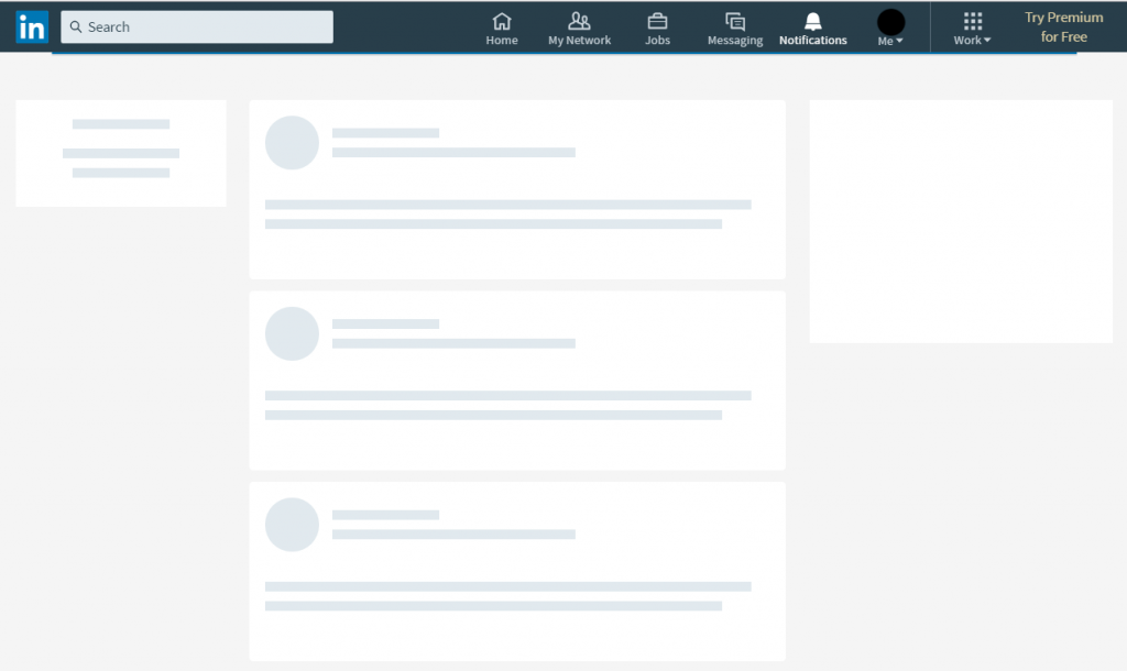
Skeleton screens are the better alternative to progress bars or spinners. It’s a blank page that mimics the layout of an actual web page that it’s trying to load. The primary purpose is to imitate the page as to give the website visitor the feeling that the page is actually loading.

Fast Company stated a study by Google that reported they lose about 8 million searches a day from 4/10 of a second of delayed loading time. This is why a skeleton screen is so important. Mimicking a loaded screen will give your site the needed time to retain the attention of a visitor while the page loads.

Progressive loading is one of the recent developments in Skeleton interfaces. As the name suggests the Individual page elements become visible as they load progressively instead of displaying all at once when the page fully loads.

There’s a challenge though

The only time you’ll have a hard time designing skeleton screens is when you’re deciding the elements your site will have as placeholders. The most effective placeholders are UI elements, as website visitors are usually attracted towards the interactive elements when they’re looking for specific pages.

The benefits of getting it right

A screenshot of a loading LinkedIn homescreen

Skeleton screens can lower site/app’s bounce rate. When a website visitor sees it, their eyes will gravitate towards the feature they’re most likely to use. Take LinkedIn’s loading page for instance.

If a visitor needs their profile information, they will automatically look left for the loading element or group of elements that resembles a profile info structure. If they want to go through the updates from their network, then their eyes will go towards the center. Same goes for one of the early adopters of skeleton approach, Facebook.

Benefits we talked about at a glance

  • Lowers your bounce rate
  • Helps website visitors feel less frustrated with load times
  • Gives people a prediction of where certain content/images will load
  • Shows people that progress is being made in the loading process

Why Not the good ol’ spinner or progress bar?

A GIF of a loading spinner

When a visitor’s in a hurry to find information and you see a slower, stagnate loading bar or spinner, what do you think?

Most people think, “How many seconds will I give this site to load before I leave and look for another?” The visitor’s frustration will rise as they stare at this one loading bar and will be more likely to bounce.

Spinners/loading bars give people uncertainty about the load time and uncertainty will lead to them leaving a site. This is why skeleton screens are necessary for better UX.

Bonus tips

  • Break down your page bit by bit to outline it
  • Locate your static graphics that won’t change while the site is being used
  • Create the body of the site, using those static graphics first
  • Fill in where you know your text populates — it should look like a background, not like it’s appearing from nowhere
  • Test the skeleton screens as you implement them
  • Tweak images and imitated text boxes until they more closely represent what your page actually looks like

Even though Skeleton screens are just a cosmetic cure for slower loading applications but it does the job of retaining the visitor’s attention real well.

We hope that you enjoyed this post about skeleton screens. If you’re looking to improve your UX beyond skeleton screens, then this UX Training might be just the right thing for your team.

What is Code Readability? – A Key Pillar of Software Development

The global software industry suffers annual losses exceeding $300 billion due to a seemingly inconspicuous issue – poor code readability. The journey from well-structured code to a tangled, confusing mess can drain a significant portion of a company’s revenue. In this article, we’ll explore the profound impact of code readability on the software development landscape. We’ll explain why it’s a critical factor, and most importantly, we’ll provide practical insights to help you transform your software projects. Whether you’re an expert coder, a tech team leader, or simply someone exploring the world of software, let’s explore this essential concept and its tangible consequences.

The Foundation of Code Readability

At its core, code readability refers to the ease with which a human can comprehend, interpret, and modify a piece of source code. It’s not just about making code “look pretty” but rather ensuring that it’s clear, logically structured, and understandable by others, including your future self.

Why Code Readability Matters?

Code readability isn’t just a nice-to-have quality in software development; it’s an imperative for several compelling reasons: 1. Collaboration: Software development is rarely a solitary endeavor. Teams of developers collaborate to build complex systems. Readable code becomes a universal language that all team members can understand and work with seamlessly. Imagine a startup with a small development team. A developer writes complex, cryptic code that only they can decipher. When that developer leaves, the rest of the team is left grappling with the code, leading to delays and frustration. 2. Maintenance: Over the lifespan of software, maintenance and updates are inevitable. Code that’s readable is easier to modify and extend. It reduces the chances of introducing bugs while making changes. According to a study by Microsoft Research, for every 100 lines of code, there are typically 15-50 defects. Clear and readable code helps reduce this number significantly during maintenance. 3. Onboarding New Team Members: As your team grows, you’ll onboard new developers. Code readability accelerates their onboarding process, allowing them to become productive faster. A software consultancy hires a junior developer. Thanks to well-documented and readable code, the new team member can quickly grasp the project’s structure and start contributing effectively within days.

Readable Code vs. Unreadable Code: Spot the Difference

Let’s take a moment to compare readable and unreadable code:

Readable Code:

def calculate_average(numbers): total = sum(numbers) count = len(numbers) return total / count

Unreadable Code:

def calc_avg(nums): t = 0 c = 0 for n in nums: t += n c += 1 return t / c The readable version is not only easier to understand but also less prone to errors. It uses descriptive variable names and follows a logical structure, making it accessible to anyone familiar with Python.

Abstractions in Coding: The DRY Principle

DRY, which stands for “Don’t Repeat Yourself,” is a fundamental principle in software development. It encourages the creation of abstractions to avoid redundancy. Abstractions not only enhance code readability but also improve maintainability. Think of an e-commerce website where product prices are displayed in multiple places. By abstracting the price formatting logic into a reusable function, you ensure consistency and readability. If you need to change the formatting, you do it in one place, and the entire website updates accordingly.

Code Reviews: Human Code Readability Checks

Human code reviews are common practice in development teams. They serve as a crucial gatekeeper for code quality and readability. During a review, experienced developers examine the code for readability, adherence to coding standards, and potential improvements. A survey by SmartBear found that 60% of respondents considered readability and maintainability the most important factors in code reviews.

Transforming Code Readability into Business Processes

Code readability is not merely a concern for developers; it’s a cornerstone of successful software projects. It facilitates collaboration, eases maintenance, and accelerates onboarding. By adhering to the principles of readable code, businesses can minimize development bottlenecks, reduce errors, and improve overall project efficiency. At Galaxy Weblinks, we understand the profound impact of code readability on software projects. Our web development services prioritize clean, readable code to ensure your digital solutions are not just functional but also maintainable and scalable. Let us help you enhance your web development processes and create software that stands the test of time.

InVision Superman Versus Framer X Batman — Who’s Your Bet On?

If you’ve looked over these tools before, then you’ve probably wondered how they compare when facing off one with another. What’s InVision’s kryptonite? Why Framer X doesn’t play well with other superhero tools? And which is the best tool for web developers? Our article will help you make an informed decision regarding which platform is better suited for your web design team. We’ll walk you through the pros and cons of both platforms and tell you about each of their special features.

InVision Studio’s Strengths

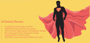
Whether you and your team use Macs or PCs, InVision is available for both and allows for collaboration with a team in real time. Each collaborator has their own mouse, so you and your team can be working on the same project at the same time without worrying about only one person having control at one time. InVision Studio is incredibly teamwork friendly with their real-time version updates, permission management, and version control. You can also easily share components because their component library is built directly into the InVision Studio.

InVision’s Live Share interface even allows a VOIP chat and a free hand-drawing tool for making sketches within the program itself. It also syncs up to the rest of the InVision platform and can be created and managed on the cloud, making it all-encompassing. And, it’s easy to include team members from start to finish on any project.

They provide an indefinitely free trial, but it is limited to just one project, but that’s more than enough time to test out all of the platform’s capabilities.

  • Prototyping is seamless with InVision as you can drag and drop items from a comprehensive gesture list with instant playback and the ability to preview your work directly in Studio. It even simulates designs in a web-browsing experience for clearer UX previewing.
  • Integrated animations give you a frictionless experience. Not all pages and animations have to be static, right? These animation tools can help bring your pages to life for better UX.
  • Responsive design is music to every designer’s ears but add in an adaptive layout and it sounds so much better. InVision has advanced pinning and percentage geometry with responsive element flow, so it won’t matter whether your customers prefer desktops, tablets, or mobile devices when your designs look stunning on them all.

highlighting invision tool strength

InVision’s Superpower

InVision has an amazing public API with a library filled with UI and UX kits, icons, and apps, which will make your UX seamless.

InVision Studio’s Weaknesses

InVision’s kryptonite is that it’s on the pricier side, which may seem a little too high for simply being a hosting platform.

Since it’s a tool for building click-through prototypes and getting feedback on them, you cannot make designs in the platform itself, but rather have to make designs in another app and upload them.

Unlike Superman, InVision doesn’t always play well with other tools and that could be tedious. It does have all-in-one environment but because it doesn’t integrate with other tools, sometimes it can be an issue.

InVision’s Cons at a Glance

  •      Pricier for primarily being a hosting platform
  •      Designs have to be uploaded from an outside source
  •      No integration with outside tools

Framer X’s Strengths

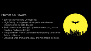
If some of your team is newer to design or you have interns, then teaching them how to use complex design tools may not be very appealing. However, Framer X uses CoffeeScript for defining its animations so it has a low learning curve for newer designers and can even be used by non-programmers.

Framer X is already integrated with Framer Generation, so you’ll be able to import layers directly from Adobe Photoshop and/or Sketch. As you put your work together, you’ll be able to see an instant preview of the animation you’re currently making, giving you some real-time, visual feedback on your work. It also has drag and drop animations for data and rich media elements. It is all backed up by code so that you’re closer to development.

The SVG-based vector editing toolset that Framer provides has predictive snapping, curve bending, and angle locking to give your vector drawing a powerful edge.

You can prototype with high-fidelity flows on an infinite canvas with pop-up modals and slide-in overlay menus. You can also add horizontal and vertical scrolling in the same frame. It supports animation and interaction prototyping for multiple devices with 8 pre-installed devices from desktop, web apps and mobile platforms to choose from. You can create your own unique setup fairly quickly. Add that with their built-in, 60FPS transitions and you have a solid toolset.

It’s also easy to use. If you’re familiar with Sketch, then Framer X will be a breeze. They have Stacks, too, which allows you to easily create customizable lists and tables with automatic distribution and alignment.

 framer x strength like that of batman

Framer X’s Superpowers

Like Batman, Framer X has a belt of gadgets for its superpowers. They have advanced features that include their Frame Tool for responsive layout, Stacks to help with grids and lists, and interactive Components. These components are also built into their codebase, React, which will make your prototypes feel real.

Framer X’s Weaknesses

It’s only compatible with Mac with no version for Windows or Linux. And since Framer uses CoffeeScript for UI app prototyping, it can be a problem for those who haven’t ever learned CoffeeScript before as they would have to learn a whole new programming language.

Collaboration is also weak for framer X as you can’t upload your prototype to the cloud or download it for offline use. You still have a share link, but once you close your project, that access closes off.

Framer X’s Cons at a Glance

  •      Mac only
  •      Learning curve if you don’t know CoffeeScript
  •      Weak collaboration/sharing tools

Conclusion

As you can see, there’s no true winner in a battle between Batman and Superman. But, we always have our favorites. Framer X will be a favorite of Mac users — similar to Batman, it doesn’t open up to just any other computer hero. And if you already know CoffeeScript, then Framer X will be a walk in the park for you.

On the other hand, InVision’s has advanced pinning and percentage geometry. Its responsive design is like Superman’s heat vision. Like Superman InVision is best for teams. And, just as Superman can power in with other members in Justice League, Invision can be used by both Mac and PC owners as it has really strong collaborator features.

Which do you prefer, Batman Framer X or Superman InVision? Vote in the comments and if you like this article, go take a look at our blog page for more content!

Digital Wellbeing in UX: Simplifying User Experiences

The average smartphone user interacts with their device over 2,600 times daily, profoundly influencing their mental health. This alarming statistic underscores the urgent need for digital wellbeing in UX design. For instance, a social media platform’s interface redesign to reduce addictive behaviors resulted in decreased user stress and improved public perception. Additionally, tools like Google’s Digital Wellbeing Dashboard highlight a shift towards more mindful tech use. This article explores the integration of digital wellbeing into UX design, underscoring the importance of creating human-centered, ethical, and emotionally intelligent digital products.

The Imperative of Digital Wellbeing in UX

Digital wellbeing in UX represents a shift from mere functionality to promoting healthier interactions between users and technology. As 65% of smartphone users manage their tech use through app or device settings, it’s clear that modern UX design must prioritize users’ mental and emotional states. Features like Google’s Dashboard, raising awareness of digital habits, have become essential in promoting healthier tech interactions.

Human-Centered UX Design: Enhancing User Satisfaction

Human-centered UX design now focuses on empathetic user interfaces. Incorporating elements that promote positivity, such as Spotify’s “Calm Down” feature, which creates personalized playlists and lowers notification volume after 10pm, demonstrates how UX can enhance user satisfaction. This approach is crucial in reducing technology-induced stress, affecting 72% of the population, and boosting daily engagement.

Ethical Design Practices

Ethical design practices are vital in today’s digital age, where 48% of adults experience disrupted sleep due to smartphone use before bed, according to a report by National Sleep Foundation, 2023. Ethical UX design, as exemplified by Apple’s Screen Time, prioritizes user wellbeing by encouraging healthy tech usage patterns and managing children’s digital habits.

Integrating Mindfulness and Mental Health into UX

Mindful UX strategies, essential for fostering digital wellbeing, involve designing interfaces that promote focus and mental well-being. For example, meditation apps introducing digital detox reminders have seen a 30% increase in user satisfaction. As rightfully highlighted by a Sensor Tower, 2024 Report, the rise of meditation and mindfulness apps, growing by 35% in downloads, indicates a growing demand for mindful UX strategies.

Emotional Design in UX

Emotional design in UX, aiming to evoke positive emotions, has shown a 40% improvement in user retention. YouTube’s “Take a Break” reminder, prompting users to pause after extended viewing, exemplifies how emotional design can encourage mindful engagement and prevent excessive screen time.

Addressing Diverse User Needs: Mental Health-Friendly Design

Designing for mental health involves understanding diverse user needs, such as offering customizable features like notification adjustments. Microsoft’s Focus Assist and apps like Forest and Headspace cater to mental health, demonstrating UX’s role in enhancing focus and learning in the digital age.

Balancing Technology and Wellbeing in the Workplace

In workplaces, where 63% of employees report burnout due to digital overload according to a report by Microsoft Work Trend Index (2024), balancing technology with wellbeing is essential. Moreover, As highlighted by Global Wellness Institute in a report, a user-centric design approach that fosters digital wellbeing can lead to a 13% increase in employee productivity.

Real-World Applications

Recent trends show that 78% of UX designers prioritize digital wellbeing, with users feeling more positive towards brands promoting it. Real-world examples like Google’s Digital Wellbeing Dashboard and Spotify’s “Calm Down” feature highlight this growing trend, showing significant increases in user trust and daily active users.

Partnering with Galaxy Weblinks for Digital Wellbeing

As the global digital wellbeing market is projected to reach $70 billion by 2027 (Statista, 2023), incorporating digital wellbeing into UX design is not just a trend but a responsibility. At Galaxy Weblinks, we focus on building digital products that support and enhance user wellbeing. By embracing a design philosophy that prioritizes user mental health, we ensure our products are not only innovative but also nurturing, contributing positively to the global narrative of digital wellbeing. Collaborate with us and create digital solutions that resonate with your users on a deeper, more human level.