Apple unveiled the latest version of its iOS operating system, iOS 14, at the WWDC keynote in June 2020.
iOS 14 is one of Apple’s biggest iOS updates to date, introducing Home screen design and widget changes, picture-in-picture, Siri improvements, updates for existing apps, and many other tweaks that streamline the iOS interface.
Apple has seeded a total of seven betas yet of upcoming iOS 14 and iPadOS 14 updates to developers for testing purposes.
Let’s look into some major UI updates and features that stole the spotlight.
Widgets
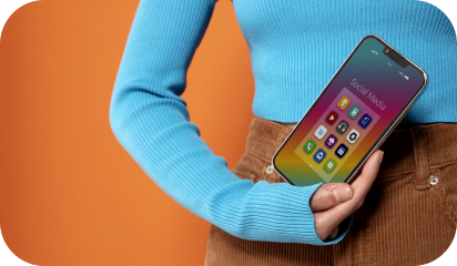
iOS 14 introduced a redesigned Home Screen that supports widgets on iPhone for the first time, breaking up that stagnant tiled-grid-of-apps look. Widgets have been redesigned and can now be customized in three sizes through the new widgets gallery.
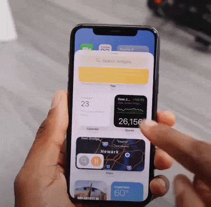
Widgets provide more data than ever to provide more functionality, and Apple redesigned its widgets for default apps like Weather, Stocks, and Calendar. There are also new widgets for Apple News and Screen Time.
Widget Gallery will comprise all of your widget options — by long pressing on the display, choosing “Edit Home Screen” and then tapping the “+” button.
These suggestions are based on what users are installing the most, and third-party app developers can create new widget experiences for their apps.
Widget Smart Stacks
You can stack up to 10 widgets on top of one another to better utilize space and can swap between them with a swipe, both in the Home Screen and Today view.
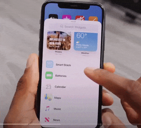
There’s a separate Smart Stack feature that’s different from widget stacking. A Smart Stack is a widget stack, created in the Widget Gallery view, that automatically surfaces the best widget option based on activity, location, and time – making sure you’re looking at what’s most relevant.
You can, of course, swipe through the Smart Stack yourself.
App Library
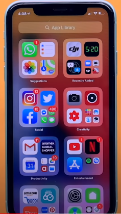
App Library is a great new feature that shows all of the apps you have installed in an organized, simple-to-navigate view that’s similar to the app list view on the Apple Watch. That is categorized into Health and Fitness, Social, Reference and Reading, Productivity, Utilities, Education, Games, Creativity, and Lifestyle.
Compact UI
In the previous version, there are plenty of apps and actions that just unnecessarily take up the entire screen. Now they are all fixed.
Incoming phone calls no longer take up the entire screen in iOS 14 and instead show up as a small banner at the top of the display that you can easily hide, ignore, accept or reject based on your preference.
This also applies to Siri, FaceTime calls, and third-party VoIP calls.
While doing a FaceTime, you will experience a Picture-in-Picture UI that you can easily swipe up, go home, and do other things without pausing the video.
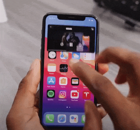
Picture-in-picture has been widely supported throughout the entire OS. So, if you are watching any video in Safari or a movie on Apple TV or an app, you can shrink the video in a picture-in-picture window while getting other things done in the background.
Siri Search Updates
Like before, Siri does not take up the whole screen in iOS 14 now. You can call Siri long-press the power button and can see a small animation at the bottom of the screen. It pop-ups an answer at the top of the screen. (But it doesn’t let you interact with anything underneath directly without exiting Siri- if you want to).
Unique iOS 14 Accessibility Features
These upgrades may look minor for iOS 14, but they will be immensely helpful for visually and hearing-impaired users.
Within the new update, you’ll be able to set up your iPhone to listen out for specific noises such as a siren or fire alarm or even a cat. If the phone hears the noise, it’ll notify the user.
According to Apple, it won’t be sending any of your data onto the internet to allow for this feature as this is all done using on-device technology.
Another unique feature in accessibility settings is that you can now map double-tap or triple tap on the back of the phone to a shortcut like Siri, mute, volume down/up, lockscreen, and others.
There are so many other minor changes that have been made in each beta version. iOS 14 and iPadOS 14 are available to registered developers and public beta testers at this time. Stay tuned to find out which features we are finally going to see in the iOS 14 final release this month.