NET MAUI: Evolution of Xamarin by Microsoft

Microsoft has announced to replace its Xamarin Toolkits with .NET MAUI a few weeks ago. Microsoft unveiled this new approach at Build 2020, calling it the .NET MultiPlatform App UI (MAUI).

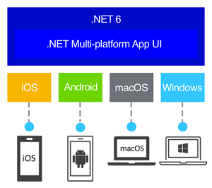
.NET MAUI is the next generation of Xamarin Forms. It is designed to allow developers to create an app in a single Visual Studio project, with a single codebase that can target any supported device. Microsoft described it as the evolution of Xamarin.

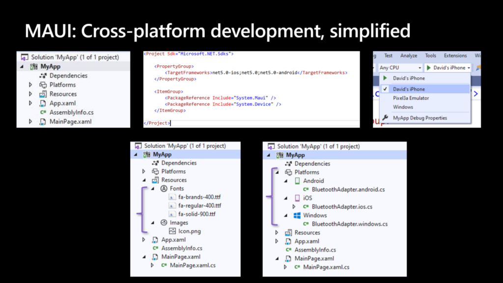
The goal is to deliver a project structure that is simplified. Instead of a single solution with separate projects for each platform you want to target, MAUI has a single project that contains all of the resources you need to target specific platforms. If you need access to device-specific services, you can bundle them in a platforms view and use them at compile time when targeting builds for each platform.

Bringing Mono and .NET together in .NET 6

With.NET 6, which will be released in November, the company is unifying the entire.NET ecosystem into a single offering. In preparation for this, it is providing.NET MAUI toolkit replacements for traditional Xamarin toolkits. Among the latter is Xamarin.Essentials, which provides cross-platform APIs for mobile apps, and Xamarin Community Toolkit, which includes commonly used behaviors, converters, effects, MVVM utilities, and controls such as the CameraView, AvatarView, and TabView.

The goal isn’t to completely replace Mono, but to have a single set of class libraries and a single toolchain for.NET Core and Mono, building on the work already being done in platform-level features like the.NET Standard libraries.

For cross-platform development, Xamarin is an alternative to WinUI. Its cross-platform strategy is based on a combination of XAML support for native iOS and Android controls and its own cross-platform Xamarin Forms. Xamarin Forms is an MVVM (model-view-viewmodel) development platform in and of itself, with its open-sourcingcontrol look and feel based on the Material Design language used by Android. Xamarin Forms provides a consistent look and feel to iOS and Android apps while still allowing them access to native features and services.

What difference does .NET MAUI make?

.NET MAUI is designed with developer productivity in mind, including a project system and cross-platform tooling. .NET MAUI consolidates project structures into a single project that can target multiple platforms. This means that you can easily deploy to any target, such as your desktop, emulators, simulators, or physical devices, with a single click. With built-in cross-platform resources, you can incorporate any images, fonts, or translation files into a single project, and.NET MAUI will automatically configure native hooks so you can focus on coding. Finally, you will always have access to the native underlying operating system APIs, which will be easier than ever thanks to new platform-specific integrations. You can add source code files for a specific operating system and access native APIs under platforms. Everything you need to stay productive is in one place with.NET MAUI.

This provides:

  • One project with multiple platforms and devices in mind.
  • Fonts and images can be managed in a single location.
  • To organize your platform-specific code, use multi-targeting.
Source: Microsoft

.NET MAUI is the future

The foundation of this update can be traced back six years with the open sourcing of.NET and the formation of the.NET Foundation. The platform required an independent organization to guide it through the transition from the old .NET Framework to the new, legacy-free, modular .NET Core. This transition had to include more than just Windows; it had to include Xamarin’s mobile clients and Unity’s 3-D gaming platforms, as well as the goal of expanding the reach of .NET’s to macOS and Linux.
Source: Microsoft

That brings us to 2021, and with the recent release of.NET MAUI Preview 6 (as part of.NET 6 Preview 6), the essentials bits have been directly integrated into.NET MAUI as well.

We know that some developers are updating their existing Xamarin applications today. Xamarin and iOS Android apps to.NET 6 without.NET MAUI and still want to use all of Xamarin’s APIs Essentials. We also have you covered, as you can add this:

<UsingMauiEssentials>true</UsingMauiEssentials>

to your.NET 6 iOS and Android apps to include all of the most recent APIs.

Summing Up

Perhaps a more optimistic way of looking at it is that, with the shift to a cross-platform.NET Core as the foundation of all things.NET, Microsoft is absorbing Xamarin rather than Xamarin becoming the heart of open .NET’s source future. That is an excellent legacy for the Mono project.

One of the goals of one .NET is to give developers more options in terms of personal preferences, so they can be more productive when using .NET. This manifests itself regardless of whether you use Visual Studio 2019, Visual Studio for Mac, or even Visual Studio Code. .NET MAUI will be available in all of them, and it will support both the existing MVVM and XAML patterns, as well as future capabilities such as Model-View-Update (MVU) with C# or even Blazor.

Have any cross-platform development needs? Contact our experts today.

About Galaxy Weblinks

We specialize in delivering end-to-end mobile design & development services and have hands-on experience with the latest technologies like .NET and Xamarin. Our developers help deliver well-performing cross-platform mobile applications. Investing in such app development technologies saves money and ensures a faster go-to-market. 

How Gatsby is so blazing fast? A Guide to GatsbyJS

Gatsby is an extremely powerful tool for quickly creating complex websites. It allows us to pull data from any source, provides access to a rich ecosystem (both of Gatsby-specific plugins and the broader React ecosystem), and even does things that feel magical, like auto-optimizing images.

In this article we’ll cover different attributes of Gatsby and how those features help in speeding up the application. And before that let’s take a closer look at GatsbyJS, a framework that has captured the hearts of many React developers worldwide!

Blending Static Websites with Dynamic Apps

In addition to using React, Gatsby is also a static site generator. If your website has multiple pages, it creates HTML files for each page.

Node.js will mount the React application to create HTML files with the rendered content for each route. Gatsby’s core is this.

Gatsby pre-builds pages instead of waiting for them to be requested.

-Gatsbyjs.com

In order to understand why this is important for performance, let’s go back to the basics.

An HTML file is accessed by an HTML browser, which renders its contents. Using an anchor tag, without any cache or JavaScript, will load another HTML file when clicked, even without any cache or JavaScript.Consequently, the user may have to wait or, in the worst case scenario, see a blank page while the page is being rendered.

Until Single Page Applications (SPAs) came along, this was the most common way to design a website.

JavaScript is used to render the page. This allows you to update much more quickly than if you had to download static files. As the user interacts, they update a single HTML file.

As the view layer of an SPA, React is used. JavaScript code is required for such frameworks and libraries as React. This means that the Critical Rendering Path is significantly affected when these are built as SPAs.

Critical Rendering Path stalls the render while loading and executing JavaScript.

Source: Guillermo.at

What about API calls to fetch data from external servers or databases, such as blog posts or product lists for your eCommerce shop? After the build process is complete, GatsbyJS creates the corresponding site content. Every time you update your database, you have to run the build process again. A continuous deployment tool would be useful in this scenario.

You can see how Gatsby deploy and build website in the diagram below:

Below are the ways how Gatsby JS speeds up your web application.

Image Optimization

Image optimization can be one of the most effective ways to improve a website’s performance.

Less bytes to download means less bandwidth required, allowing the browser to download and render content more quickly. Some of the optimizations we can make are as follows:

  • Resize it to take up the same amount of space.
  • Create responsive images with varying resolutions for desktop and mobile devices.
  • Compression and metadata removal.
  • Lazy loading can be used to speed up the initial page load.
  • While the image is loading, show a placeholder.

This can take a lot of effort and Gatsby has a solution: this whole process can be automated.

Gatsbyjs-image, like many other Gatsby tools, is powered by GraphQL. This plugin prepares images in various resolutions for download. It generates thumbnails and compresses them. This is all on the construction step.

You will receive all of the following benefits by using this component:

  • Images that are responsive and optimized for your screen size,
  • By default, an image blurred by base64 encoding (low resolution) is loaded.
  • When the image is visible, an integrated IntersectionObserver swaps the base image for the proper image.

When the image loads, a “blur-up” technique shows a preview in a very low-quality image that is already in the HTML file (or just the background). To create the automated optimization, all of the work in coding GraphQL queries is reduced. Check out this example:

So, what does this mean for app performance? In summary:

  • Using media queries, a user will receive the smallest image that is compatible with his device,
  • Heavier images are requested only when they are visible,
  • A blurred image retains the required size,
  • Jumping content or shifting elements are avoided.

Prefetch on scroll and hover

The majority of people dislike apps that take too long to load or are unresponsive while in use. That is why Gatsby expends so much effort in resolving the issue. During the build process, your code and data are divided into smaller chunks. Users load only the most important elements on the first visit to ensure that your site is rendered correctly. Once everything is visible and the user begins interacting with the page, Gatsby by default prefetches data for other pages on the site, making clicking around and navigating between pages incredibly smooth.

Remember that the Gatsby application is still a single page application (SPA). It means that after a routing event on your site (for example, after clicking on a link), there is no need to retrieve the entire site from the server again, which saves a significant amount of transferred data.

Best of Both Worlds

Gatsby gives us the best of both worlds by generating HTML statically and letting React do whatever it needs to do on the client side.

Statically rendered pages improve SEO, TTI, and overall web performance, among other benefits. Static sites are easier to deploy and have a wider global distribution.

Conclusion

This does not mean that there will be no issues with the build version if the code runs successfully in development mode (Gatsby develop). Build the code regularly and fix issues. Builds are generated after every change, and the build time is only a few minutes. A build might be more difficult to create if there are frequent changes and multiple issues need to be resolved at the time of the build.

Sites with many styled components and libraries take longer to build. As a result, it is no longer feasible to run the build after every change, making it difficult to track down build problems.

About Galaxy Weblinks

We specialize in delivering end-to-end software design & development services and have hands-on experience with popular front-end and back-end frameworks. Our back-end and front-end engineers also help in improving security, reliability, and features to make sure your business application scales and remains secure.

Choosing Django as Your Backend Framework in 2021

Building a scalable product is a best practice and necessity, even if you’re starting out. Because once you get that user validation, scaling becomes difficult and not so cost-efficient. So you outsource backend in order to move things around to accommodate more users and tackle heavier loads. 

Now think about when you’re building an application, you need to get two major things right i.e. Frontend (what users see and interact with) and the backend (what happens in the background, invisible to users). For this blog we’re focusing on the backend side of things. Django backend framework to be precise. 

The Backend runs on a server, that’s why it’s called server-side of the application. Although invisible, this server-side of the application holds great importance in terms of performance. Hence, choosing the right backend framework becomes critical, if you want to avoid slow, buggy, and overall bad user experience. For this blog we’re taking a look at Django and its relevance in 2021 as a backend framework. 

Relevance of Django in 2021

Django provides generic functionalities to build a web app without many hassles, as it comes equipped with solutions that eliminate the need of writing everything from scratch. Django code is reusable, which subsequently helps in cost and time reductions in development.

Django is a batteries-included framework. And, for the Frontend part, depending on your goals, you can select and combine different complementary frontend elements with Django. 

Benefits of Choosing Django as Your Backend Development Framework

As mentioned earlier Django is batteries included so it comes with everything you need to build an MVP right out of the box. Provided you have user flow, information architecture and UX of the product planned to a T. Some other benefits are as follows:

  • Out of the box Django comes equipped with Content administration, site maps, RSS, user authentication, etc.
  • Django provides you with a production ready admin interface, you just have to define your models. It also lets you add and authenticate users with different levels of permissions. 
  • Django likes to keep URLs clean and elegant, so it avoids putting any cruft in URLs, like .php or .asp
  • Django is equipped with templates to help avoid security attacks like cross-site scripting, cross-site request forgery, clickjacking and SQL injection.
  • Scalability is one of the strong suits of Django and some of the famously large organizations across the globe use Django to build scalable web applications.
  • If we talk about versatility, Django is used to build robust backends for CMSs to Social Networks.

Why Do You Need Django in 2021?

If you were to do backend development from scratch, you will realize that raw SQL queries will be needed to manipulate the database and soon enough it will stop scaling. Subsequently you might end up writing your own wrapper on top of the raw SQL queries, to keep the code DRY. 

Now your users are interacting with the interface with raw queries. Which in turn makes your app vulnerable to SQL injection. Security vulnerabilities don’t just stop there, the app will be exposed to cross site scripting and clickjacking. 

Even if you even managed to tackle these security vulnerabilities, which is tedious to say the least, exposing the backend to the frontend of a web/mobile app in 2021 is even more difficult. 

Django Usage Across Industries and Countries

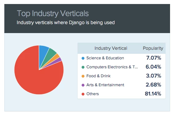
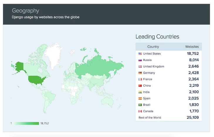
Here are the industry-wise and country-wise stats of Django usage. About 30,699 live websites run on Django.

django
django-country
Source: SimilarTech

Reasons to Choose or Not to Choose Django

If you need Machine Learning and Artificial Intelligence based core features and functionalities then Django is highly recommended. All you need is a strong Python team. 

  • Django is great for growing projects, as they’ll need features like database, migrations, cache, etc right from the start. 
  • Django is great for use-cases like a CMS-style CRUD application or when you’re writing in the framework while it can be a real pain to work around when you need to do something it doesn’t easily support.
  • Django or even Python in general is not good at some async and CPU-intensive tasks. 
  • Django scales gracefully, has a great security track record, and sane deprecation schedules.
  • Choose Django when you require both API backend & web app within the same codebase.
  • Django supports ORM.
  • Don’t go for Django if your application is huge and you don’t intend to break your app into micro services.
  • Choose Django if you’re building something bespoke and from scratch. 
  • Django is not recommended for basic apps that do not require a database. 

Wrap Up

There are an impressive number of web/mobile apps that utilize Django as the backend framework because it’s fast, reliable, and easily scalable. These traits are enough to make it relevant in 2021.

If you’re still not sure if Django is the right framework for your project or not, then get in touch with us here and we’ll try to help you make the right decision.

About Galaxy
We specialize in delivering end-to-end software design & development services. Our analytics team and UI/UX designers are creative problem-solvers with a decade of experience in all facets of digital and interactive design. We create compelling and human-focused experiences delivered through clean, and minimalist UI.

What Makes a Great WordPress Plugin?

There are thousands and thousands of listings in the WordPress Plugin repository, 58,600, to be precise. These plugins offer numerous different functionalities and use cases. But just like any other thing in the world, not all of these plugins are great at what they do. The ratings tell a different story altogether, even some great plugins get some flak every once in a while for doing something differently or worse, badly. Those 5 stars don’t last a lifetime. 

So how does this happen and what are the aspects that determine success or failure of a WordPress Plugin? Here is a dive into what makes a great WordPress Plugin.

Users judge apps, utilities, and other pieces of software based on their usage, needs, and previous exposure to other alternatives. How do we go on about this defining business of something subjective such as a WordPress Plugin being good or not? Each person will judge a plugin based on their own needs and experiences. It might be difficult but not impossible, here are some aspects to help you start:  

Get your Goal

According to the ‘Golden Circle’ rule, “people don’t buy what you do, they buy why you do it.” A plugin developer should also start with a why and then move into other important questions like – 

  • Why is this plugin being developed?
  • What purpose does it serve?

Let the answers to these questions be the mission statement. Most of all the plugins should be solving a problem. The purpose can be something as simple as adding new functionality to an existing plugin, WooCommerce extension for example. Or something complex and comprehensive. 

The goal and the purpose is not just something to get the development started and getting the solution in the users hands. As the user base grows, it becomes vital for the developer to stick to that mission statement. The plugin might improve with regular updates but completely changing tracks is unadvisable. For example, it wouldn’t make sense if all of a sudden an SEO plugin starts adding irrelevant features like a shopping cart. Users might get frustrated and abandon the plugin altogether. 

Great plugins tend to stick to their initial goals and mission statement. 

Mind the Users

Be mindful of the users and respect their preferences. Users like to have control of the tools and what they do. Implementing policies that are not transparent is a bad practice. Don’t upsell unnecessarily and clutter the dashboard. Also don’t spam users with stuff they didn’t sign up for or enroll users for auto-update without telling them. Even if some of the actions might be good for the users but make it clear to let them know and let them make the choice. 

Users hate it when their personal space is being breached and when crucial functionality is turned on/off without their consent. 

Mind the Coding and Accessibility Standards

Not just for WordPress plugins but coding and accessibility standards should be followed in general. Sticking with the standards makes the plugin code efficient, secure, and stable, and UI accessible to everyone. 

WordPress being an Open-source platform, adhering to these standards is easier said than done. Literally anyone who wants to write code and build a plugin can do so. But not everyone sticks to the rules, especially when dealing with bigger, harder-to-manage plugins. A little piece of rogue code can create a big mess in an instant. A great WordPress plugin sticks to the standards for the very same reason.  

Support it and Maintain it

Developing a WordPress plugin is difficult and maintaining it is a major undertaking on its own. But it’s worth it because it’s one of the major factors that determines long-term success of a WordPress Plugin. 

Bugs are a part of the system, they appear even in the popular enterprise applications that have large and vigilant teams dedicated to hunt and rectify them. They will appear regularly and it can be frustrating but the key here is to deal with them in a timely and regular manner. Firefighting won’t take you far.  

Providing support reinforces user trust in the developer. When things go wrong, provide support, at least to the extent you can. Type and cost of the plugin also plays an important role here in determining what kind of support users are going to expect from you. A free product can survive with a basic knowledge base while a commercial product is expected to have a good support. 

Final Thoughts

WordPress Plugins are meant to solve problems and as long as your plugin does that, keeping the users needs in mind, it’s going to score good. Utilize the key aspects mentioned in this blog to make things easier while you try to achieve WordPress greatness. 

And if plugin development is something that you need WordPress experts to handle for you, then drop by here and tell us your needs.

About Galaxy

We specialize in delivering end-to-end software design & development services. Our analytics team and UI/UX designers are creative problem-solvers with a decade of experience in all facets of digital and interactive design. We create compelling and human-focused experiences delivered through clean, and minimalist UI. Click here for a free consultation!

How to choose the right development partner?

The need for digital products and services is on the rise and will keep on going up. A good development partner can make the journey of digital transformation smooth for you. In this blog, you’ll discover how aligning the project expectations and organizational ethos is the key to finding the perfect development partner.

Project Alignment

There are four parameters within which you can achieve project alignment with your development partner. Those parameters are Budget, Technology, Timeline and Implementation, and Future state of the product

Budget

First and foremost, the client and the vendor need to agree on a budget that the project requires. If a client thinks that it’s a $15000 gig vs the partner’s estimate of $30,000, then there is a misalignment of expectations. As a best practice, the client must disclose the budget from the very beginning. 

If you don’t know how much your project should cost, a ballpark range would help set expectations right for the budgets and scale of the project.

Technology

Technological alignment is all about ensuring that your partners know what existing infrastructure you have in place and what compatible technologies they can utilize for your new project. For example, your application might be a better fit when built on React and deployed on AWS as determined by your IT team. Convey the same to your partner before starting your development.

Timeline & Implementation

Well-planned timelines with space for unavoidable setbacks can significantly reduce overheads. Understand and communicate your terms of timelines with your potential partner. Hard deadlines, desirable launch dates, and tolerance are important discussions to be had before you proceed. If you can’t get on the same page regarding timelines, consider it a red flag.  

Besides timeline discussions, you will also need to align on the implementation part of the project. If you have limited and well-defined requirements along with a strictly allocated budget then a Waterfall shop is your best friend. On the other hand, if you’re treading into the unknown with dynamic requirements and a flexible budget then an Agile partner might be a better bet.

The Future State

A lot of development and handover depends on the future of your project. Answer questions like is it a launch and leave a one-off thing or a multi-year engagement? Will your in-house team take over or you’re going to seek further support for patches and new features? 

Aligning on the future state of the product will ensure that you’re in a good position concerning your project in the future as well. As it’s difficult to find the right expertise and resources on short notice when something breaks down, deprecates, or needs to scale. 

Organizational Alignment

In contrast to project alignment, organizational alignment is more interpersonal and can be pivotal for long-term relationships and success. When looking for a development partner you’d want them to be a perfect cultural fit for you. Apart from that, you’d also want them to share your values and ideology. 

Organizational Alignment can be achieved across these segments: Core Values, Organizational maturity, People fit, Expertise, and Strengths

Core Values

These are the fundamental principles your organization swears by and essentially guides and influences all the decisions. Your potential partner need not be a perfect match for your organization’s values but complement them.

Organizational Maturity

The potential partner that you’re looking for should be at least on the same plane of your growth phase, if they’re way smaller or bigger than you then it’s going to be problematic. Take an early-stage startup’s example. If it approaches a well-established branding firm, there may be a mismatch in costs, approach, and perception of value. 

You can identify the right level of maturity with how your potential partner approaches data security, the depth of engineering solution, and the complexity of the proposed solution—is it over or under-engineered? Alignment in these areas is a good sign of organizational maturity.  

People Fit

In most of the engagements, the declaration of organizational alignment happens too early on when only the sales and procurement people have met. Whereas a partner should be declared fit only after your teams have met with the implementation team. After all, they are the ones who are going to be working together on the project, if they are not on the same page, it’s a red flag. 

Expertise & Past Successes

Lastly, this goes without saying that expertise and past projects are influential for organizational alignment. Your potential partner should have relevant experience in your industry or another industry with similar scope. Go through their projects and judge if it’s on par with your standards. 

While looking for the right development partner you might also have questions regarding offshore design/development and costs. Here are a couple of blogs to curb your doubts: 

Moving Ahead

Let this alignment guide be a blueprint for you to make the right choice and not a pursuit of something perfect. In case there are some manageable gaps to fill, you can try the following solutions:

  • Subcontracting technical requirements (In case of a technological gap)
  • If your vendor fits all requirements but lacks relevant experience, we recommend that you give them an opportunity after a thorough risk analysis. 
  • Control for the future state – If you’re not on the same page concerning the future state of the software, you can rectify that through detailed requirements specification, repository access, code commenting, a handoff plan.

Some partnerships might be worth working for while some might feel like an outright misfit due to huge alignment gaps. Steer clear of those and keep looking for better options. 

And when you’ve evaluated a potential partner on the project and organizational grounds and found them to be in alignment with almost everything mentioned here in this blog, then proceed with small engagements, and see if it is working for you. 

Wrapping up

When looking for potential development partners, it’s natural to have multiple options. Having them evaluated based on the alignment principles mentioned here you’ll be able to choose partners that are motivated by mutual growth and success. Contact us for a free consultation of your technical requirements.

About Galaxy Weblinks

We specialize in delivering end-to-end software design & development services and have hands-on experience with mobile app and site design in agile development environments. Our designers, engineers, and developers help improve security, reliability and features to make sure your business application and IT structure scale and remain secure.

Our Top 5 Picks for Mobile App Development in 2021

Mobile apps are expected to generate over $935 billion in revenue by 2023. Take a moment and let that sink in! The projected numbers are baffling and they will continue to grow as the market’s demand for digital experiences rises. 

Getting a mobile app developed is a decision that needs its share of due diligence. For starters, you have to choose what platform or demographic you are going to target? Are you developing for Android, iOS, or both? If you’re choosing only one, then native development is the way to go. However, if you’re targeting both these platforms, you may opt for cross-platform development.  

Here are our top picks for cross-platform Mobile app development in 2021: 

1. React Native

React Native is an open-source mobile app development framework for Android and iOS. It’s created and maintained by Facebook. React Native utilizes React’s native development library for building UIs. 

The developers that know and love JavaScript will feel at home while writing mobile applications in React Native for its native look and feel. Additionally, most of the code can be shared between platforms, which makes it easier to simultaneously develop for both Android and iOS.

One of its greatest benefits over other cross-platform frameworks like Cordova and Ionic is that React Native renders using the host platform’s standard rendering APIs. It translates your markup to real, native UI elements, leveraging existing means of rendering views on whatever platform you are working with.

Why React Native?

  • Reusable code & cost-efficient – One codebase and you can deploy apps for iOS and Android. Not developing separate native apps saves big in development time and cost.
  • Live reload – React features a convenient live reload that enables developers to see the changes in real-time. 
  • Performant mobile development – In contrast to other tools, React Native makes use of GPU on mobile devices, taking the unnecessary load away from the CPU and subsequently making the experience faster.

2. Xamarin

Created by the developers behind Mono, Xamarin is a .Net-based open-source mobile development platform. The tool is primarily used to develop cross-platform mobile applications that share 90 percent of their Code-DNA. This makes development more streamlined and oftentimes quicker in general.

The thing that works in its favor is that it’s based on the Microsoft technology stack which already has a community of over 1.4 million developers.

Why Xamarin?

  • API Compatibility – Creating separate APIs for different platforms is a chore. Xamarin lets you utilize the same APIs to build apps for iOS, Android, and Windows. 
  • Technology Stack – Xamarin is based on C#, which makes it easier to build multiple solutions without having to switch environments. 
  • Ease of Testing – Xamarin test clouds are the reason that developers can churn flawless code through continuous testing. Testing clouds also provide access to numerous mobile devices to test, thereby eliminating the need to buy every other device for individual testing. 

3. Ionic

Also an open-source, Ionic is a UI toolkit for cross-platform native and web-app development. It’s built on the foundation of HTML, CSS, and JavaScript combined. Ionic is very flexible as it comes with Adaptive Styling, Ionic apps look and feel at home on every device.

Ionic features universal web components that work with any JavaScript framework including Angular, React, and Vue. Another benefit of choosing Ionic is that it doesn’t force the developer to choose a particular technology in the backend as well, one can go with AWS, Azure, and Firebase. 

Why Ionic?

  • Fully equipped – Ionic comes with a library of components and plugins like frontend building blocks, UI components, common app icons, etc. Plugins also connect to mobile’s native APIs like Bluetooth, GPS, and camera.
  • Front-end agnostic – Post the Ionic 4 update, developers can pair Ionic with any JS framework of their choice. 

If you’re digging our top picks series, here’s an another listicle of our top picks for backend frameworks for 2021. Check it out.

4. Flutter 

Flutter is the framework of choice for faster and dynamic mobile app development. Like other cross-platform mobile app development tools Flutter also utilizes a single codebase for Android and iOS apps. It also features hot reload which works via DVM(Dart Virtual Machine). Which in turn makes it easier to see the changes as they are being made. 

It’s safe to say that Flutter is almost like a react framework with ready-made 2D rendering, widgets, and tools. These elements make things easier when you’re designing, building, testing, and debugging apps. 

Why Flutter?

  • Reactive Dart – Flutter is built on Dart programming language. Which comes equipped with a rich standard library, garbage collection, strong typing, generics, and async-awaits. 
  • Custom Widgets – Flutter provides numerous widgets to help developers in their builds. It makes building a basic UI easier than anything, as it automatically adapts to different resolutions, screens, and platforms.
  • Hot Reload and Development – This is similar to what we see on React Native with the ‘Live reload’ feature. It reflects the changes made to the code quite instantly.

5. Apache Cordova

Cordova a.k.a PhoneGap is one of the most well-known and developer-friendly cross-platform mobile application development frameworks. It’s based on CSS3, HTML 5, and JavaScript. This framework with the use of Cordova plugins makes it easier to access device hardware such as GPS, Camera, and accelerometer to deliver a Native app experience. 

Why Apache Cordova?

  • Easier to maintain – Apache Cordova is easy to maintain as it bypasses the version, making it simple to update. 
  • Cost-effective – Cordova is cost-effective as you don’t have to spend resources on different platforms. 
  • Great plugins – When developing applications, Cordova plugins help to expand native functionalities. StatusBar, Social Sharing, Barcode Scanner, GAPlugin, Pushwoosh, PushPlugin, and Facebook Connect are some of the plugins in the repositories.

Conclusion

Mobile app development is no longer a choice, it has become an integral part of the business plans of new-age businesses. Making the right choice on the development platform hence becomes crucial. This is our list of technologies that we love to work with, let us know what you think and if you’re looking to get that cross-platform development ball rolling in any of the mentioned technologies, drop in and say hi here.

About Galaxy Weblinks

We specialize in delivering end-to-end software design & development services and have hands-on experience with popular front-end and back-end frameworks. Our back-end and front-end engineers also help in improving security, reliability, and features to make sure your business application scales and remain secure.

Ecommerce User Journey – 15 Must-haves to Include

The COVID-19 pandemic had a significant impact on global eCommerce trends. With brick-and-mortar stores closing overnight, customers flocked to the internet to purchase their necessities. The pandemic hastened the shift to online shopping by up to five years.

mCommerce, or mobile commerce, refers to online shopping via a mobile device such as a smartphone or tablet. It will continue to grow in the coming years as a majority of people now prefer to shop on their phones. 

Even though mobile devices account for the majority of Ecommerce traffic, desktop sites have lower cart abandonment rates and higher average purchase values. Mobile Commerce is the way of the future, but if designers want to maximize profits now, they must improve desktop sites with Ecommerce UX best practices.

Yet, mobile sites fail to meet three key metrics: they have higher cart abandonment rates, low conversion rate, and lower average order values than desktop sites.

Four Crucial Pages of the Ecommerce Experience

Almost all Ecommerce sites on desktop rely on a similar sequence of pages to guide customers through the sales process.

  • Homepages that are uncluttered and offer irresistible value propositions
  • Category pages that are well-organized and simple to navigate
  • Product pages that have been polished and incorporate social proof and compelling content
  • Checkout pages that are simple to use, show progress, and make customers feel safe

Uncluttered Homepages

1. Product Names That Shoppers Understand

Internally consistent product names can be perplexing to customers. Provide context for decision-making. Names based on model numbers or underlying technology run the risk of alienating the general public. The same is true for titles that are overly cute or creative. Choose product names that indicate utility or value in the eyes of shoppers.

2. Enable Search From Anywhere

Ecommerce websites offer a plethora of products and therefore, the search feature becomes an essential way for customers to find products based on their requirements. Sticky search bars ensure that search is available everywhere on every page, but for the sake of conversion, it is best to remove search from checkout pages.

3. Highlight Deals and Promotions

Customers visit Ecommerce sites with a specific product in mind. Deals and promotions go unnoticed when they blend into homepages. Bright colors, bold text, and full-page photos are used in call-out advertisements.

If a promotion is the most important thing shoppers need to know about, make it the center of attention.

4. Make the Product’s Value Immediately Visible

Getting the product page right is important as first impressions matter. Customers must be able to quickly determine the worth of a product. We recommend that you assist the customers in visualizing how your product will solve their problems and improve their lives (the Jobs to Be Done framework is a useful starting point). 

Keep your product descriptions and technical specifications brief and to the point. Use photos and videos that demonstrate the benefits of the product. If the shoppers must read and scroll a lot, or watch long-winded explainer videos to understand the value, then you are doing something wrong here. 

Well-organized Category Pages

1. Display Best-Sellers

Bestsellers should be labeled with distinct icons or placed in bestseller sections. Why? Bestsellers provide social proof. When people are unsure, they will look to others’ actions to determine their own. This is especially true for first-time buyers.

A similar rule applies to newly released products. Displaying new and improved items is more than just a one-time sales tactic; it is a way to entice customers to return for future updates.

2. Ensure Ease-of-Use Navigation

The navigation must be simple. Customers should not have difficulty switching between category pages or enabling product filters. Sites with a large number of products in a single category should use left-column navigation to allow customers to sort products by various attributes (faceted search).

3. Display Products in Grids

Desktop screens provide ample space for product grids. Grids align with F-pattern scanning and allow shoppers to quickly compare multiple products. They are especially useful for items that are easily explained with pictures. To get the most out of grids, keep the number of items per row between two and four. Grids become significantly more difficult to scan when there are five or more products.

Bonus: List views can be useful, but they’re best for products that require more detailed explanations.

Polished Product Pages

1. Create large, eye-catching “Add to Cart” buttons.

When it comes to product pages, “Add to Cart” buttons must be visible. Make them large, contrast-heavy, and easy to click. Resist the urge to be witty and instead create call-to-action text that is clear and action-oriented.

When customers add items to their shopping carts, they must receive visual feedback. Many desktop sites do this with cart-summary overlays that slide in from the side of the screen for a brief moment (a creative way to allow shoppers to transition to checkout or keep browsing).

2. Upsells and related products can help you earn more money.

If customers are dissatisfied with what they see on product pages, they should not have to return to category pages to find other options. Show them alternatives at comparable price points or more expensive options with better features, reviews, or brand recognition.

It is also possible to suggest complementary items to the product page. Considering purchasing shoes? Why not get some shoelaces and arch supports as well? Make sure that related items have a “Add to Cart” option to reduce friction.

3. Make use of copy and imagery to demonstrate the good life.

Ecommerce content should be informative, but persuasion requires more than facts and feature lists. Use text and images to help customers imagine the good life that awaits them after they complete their purchase.

Again, desktop sizes are advantageous. There’s no reason not to use massive photos and videos or show products from multiple perspectives. The same is true for the copy. Don’t be afraid to use large headers and a lot of white space around text blocks.

4. Use Social Proof to Persuade

Shoppers are more likely to buy if they see social proof. Ratings and reviews have a significant impact on purchasing decisions, but desktop sites are large enough to accommodate other types of social proof:

  • Customer-taking product photos
  • Approval badges from independent review sites 
  • Celebrity and influencer endorsements
  • Expert quotes 

Social proof aims to make shoppers feel as if they are making informed decisions that are consistent with the positive experiences of others.

Simple Checkout Pages

1. Accept Various Payment Methods

When it comes to payment gateways, shoppers’ primary concerns are convenience and security, and these are two of the leading causes of cart abandonment. Fortunately, an increasing number of online payment options alleviate security concerns while also expediting checkout. Third-party payment options supported by well-known brands (such as Amazon and Apple) may be more appealing to customers than entering credit card information.

It is also worthwhile to consider “buy now, pay later” (BNPL) options such as Paypal Credit and Klarna. BNPL is a type of point-of-sale credit that allows customers to pay for products overtime after they receive them.

2. Give a detailed order summary.

This is highly recommended. We suggest that you provide shoppers with brief order summaries that include:

  • Details and quantities of the product 
  • A breakdown of all charges
  • Details on shipping and billing

It’s also a good idea to display product images, but make sure the attributes match the attributes chosen by customers (color, size, finish, etc.).

3. Think about Guest Checkout.

Guest checkout may not be appropriate for all Ecommerce retailers, particularly those whose business strategies revolve around the creation of customer accounts. It has, however, been shown to speed up checkout, prevent account creation fatigue, and reduce cart abandonment.

An alternative is to require email confirmation for orders, then follow up with deals in shipping and delivery messages.

4. Display Shoppers Checkout Progress

Ecommerce customers spend a significant amount of time and energy searching for products online. When they’re ready to buy, they want to know that the end of the process is near. A progress bar is a simple way to show shoppers where they are in the checkout process.

We hope that this practical piece curated from our eCommerce experience will assist you in developing the best Ecommerce strategy. And if you want to interact with your customers in a completely new way and increase your conversion rate, get in touch with our experts here.

About Galaxy Weblinks

Galaxy Weblinks is a company that specializes in creating the best online experiences for your users. We have experience customizing websites on a variety of platforms, including Shopify, WooCommerce, and Magento. Contact us today to discuss your Ecommerce project.

The Good and the Bad of Dark UI Designs

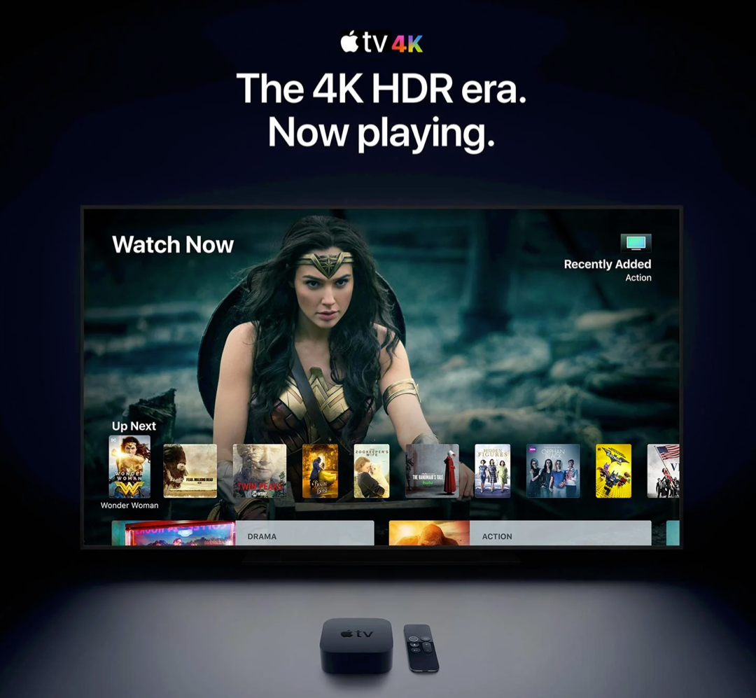
From mobile screens to TV sets, dark UI designs are seen far and wide and appreciated for the visual appeal that they offer. A dark theme depicts sophistication and elegance. However, dark UI designing comes with multiple challenges. If the implementation is poor, things can very well go south.

Digital products having dark UIs are perceived as powerful, elegant, and mysterious. They are a formidable trend across the digital spectrum. It’s said that dark mode can reduce eye strain, save battery life and increase accessibility. But, most of the time, dark themes are an aesthetic choice.

Over the past few years, dark themes are amongst the most requested features. Both Apple and Google have a dark theme as an essential part of their UI. Be it browsers, mobile applications of social media platforms, or VR/AI games, dark themes are everywhere as an option, if not a default feature. 

Source: Apple

Dark User Interface – The Good and the Bad

Choosing one of the two is a tricky balancing act. The dark theme is not suitable for all interfaces and neither is the light theme. Selecting the right options depends on brand fit, cultural suitability, and color psychology. Also, consider the emotional impact before asking your developer to go for either one. 

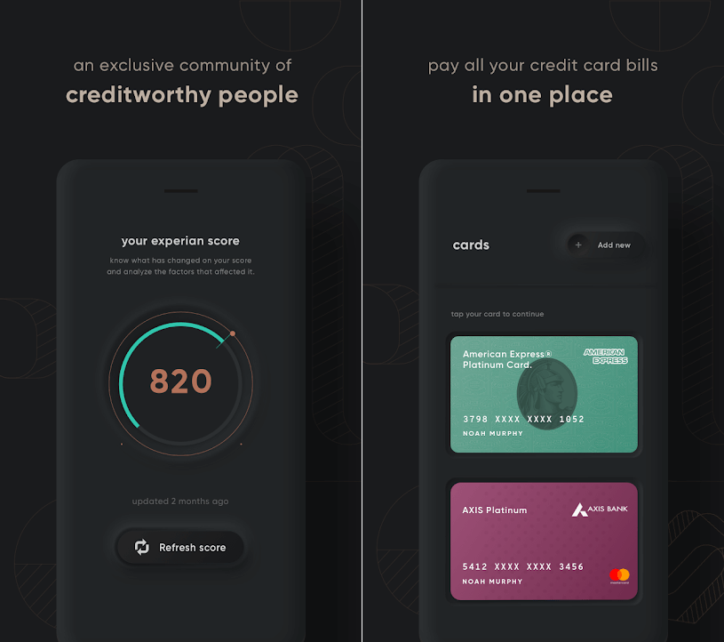
For instance – a financial app designed for millennials to take care of their credit card bill payments may look cool with a dark theme, but the same won’t work for a big bank’s website, serving the general, larger population. Too rich, too dark, and too stylish may frustrate people who just want to check their balances and transfer money.

Source: Cred

Dark UIs for B2B SaaS applications are notoriously difficult to design. Web UI components like widgets, forms, data tables, and dropdowns can look odd on a dark theme. Owing to the type, context, and environmental factors, certain brands and products are not an ideal fit and may prove an insurmountable challenge.

If your designers have not worked with dark UI design before, they might find themselves in rough, uncharted waters. In the world of dark UIs, norms are bent, pitfalls aplenty, and trends change quite often. 

Having said that, using dark UIs is a good call for a number of reasons:

  • With the minimalist design having only a few content types.
  • When there is appropriate context and use; like a nighttime entertainment app.
  • When a striking and dramatic look is needed.
  • To make a statement for the brand.

Not to forget, there are scenarios when dark UI is a bad call. When there is too much text (dark background makes reading difficult), a lot of mixed content types, or the design calls for a wide range of colors, the dark theme should be avoided. 

Impact of dark theme on UI design

As developers, we are always considerate of UI design trends and user preferences while making the best use of our time and resources. So, is adding a dark mode design a worthwhile use of the client’s budget?

We would say, this totally depends on the use case. As established earlier, the dark mode can sometimes be a hindrance to comprehension. We won’t recommend it for digital products where it could lead to big consequences. For instance, online banking services or regulatory platforms.

In other instances, we can turn to dark UI design to influence user behavior. If user engagement is an important metric for your product like Twitter, Reddit, etc, then the case for the dark theme will be stronger.

7 dark theme design tips from Galaxy

Dark theme design captivates the audience when done right. That’s what we aim for with all products that we develop. Here are seven design tips that we also practice:

  • Considering brand (identity, image, etc) 
  • Avoiding pure black
  • Avoiding heavily saturated colors
  • Ensuring enough contrast in colors
  • Softening white backgrounds
  • Matching color to the brand message
  • Communicating depth

Summing up 

It boils down to personal preference…

For most users, it all comes down to personal preference. Most of them don’t care about their eyesight or battery life, or have an aesthetic preference – they just like the way it looks and that is it. With iOS 14, Apple, who controlled their product’s design with an iron fist, allowed users to add custom icons and home screen widgets. Maybe this is not about choosing between light or dark mode, but about allowing users to configure what they like.

About Galaxy Weblinks 

Galaxy delivers end-to-end software design & development services. With a decade of experience in digital and interactive design, we create compelling and human-focused experiences. Our UI/UX designers are creative problem-solvers, delivering clean, and minimalist UI.

DesignRush Lists Galaxy Among the Top Software Developers in Boston

We are elated to announce that DesignRush has recognized Galaxy Weblinks Inc as one of ‘The top software development companies in Boston’. A heartfelt thanks to our clients,  employees, and the DesignRush team for this recognition. 

Galaxy is a web and mobile app development firm that’s been in the industry for over two decades. With over 1000 projects under our belt, we have the technical expertise and know-how to help your business achieve its goals. Our clients appreciate us for our dedicated project management style and open communication channels. 

In light of our accomplishments, we’ve been considered one of the top companies for software development in Boston by DesignRush, a B2B market research authority.  DesignRush’s work helps interested buyers find and partner with the ‘right’ vendors. The evaluation is done by industry experts based on quality, attention to deadlines, fairness of cost, and overall ability to drive results. 

This recognition is the fruit of our labor and of our commitment to providing unmatched Software Design, Development, DevOps and QA Services and dedication to the business objectives of our clients. We attribute our success to the Galaxy team’s creativity, perseverance, and technical skills.” 

Varun Bihani, Partner at Galaxy Weblinks

We’re grateful to DesignRush, our clients, and our team for this recognition. It’s only through the trust of our clients, collective efforts of our partners, and dedication of our teams that we’ve been named among the best in Boston.

At Galaxy Weblinks, we are committed to delivering robust, performant, and easily scalable solutions. Get in touch with us to know how we can help you achieve your business goals through our proven expertise, unmatched skillset, and effortless communication.

10 Design Principles for Exceptional User Interface

Creative visuals, attractive logo design, or intricate animations! What goes into making an exceptional user interface? A good UI includes a mix of factors that make it clear, consistent, simple, and user-oriented.

Defining the requirements of a good user interface is especially critical if you are considering outsourcing your project. Your design and development partner should understand the key principles that transform a user interface into a powerful tool for attracting new customers and retaining existing ones.

Let us go over the core principles of an effective and appealing user interface.

The 10 Fundamentals of a Good User Interface

Here is what goes into an appealing and intuitive user interface for a web or mobile application.

1. Consistency is the key

Source: Behance

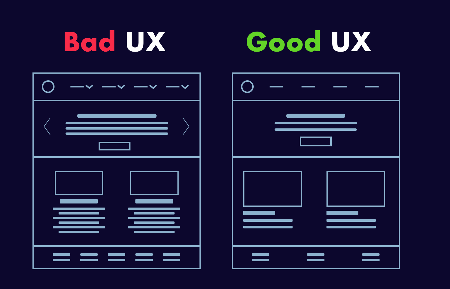
In good user interface design, consistency rules the roost! Everything is affected, from the colors, icons, and fonts to the placement of menus and buttons. If changes are required and the designers who worked on the first version are no longer available, the situation becomes even more critical.

Top digital solutions do not astonish their users with radical changes. Instead, they use brand books and company style guides to maintain a consistent and unified style throughout UI design.

2. Hierarchy in screens

Source: Dribbble

Some inexperienced designers make the mistake of attempting to highlight everything on a single screen. Instead of guiding customers to a purchase or other desirable action, they bombard them with information.

That is why hierarchy is an essential component of a successful user interface.

It should be designed in such a way that users can quickly find the point of focus and understand what you’re trying to convey visually.

3. Flexibility 

Users now enjoy looking for a solution to their problems. That is why a good user interface should be supplemented with tabs, shortcuts, and hover tooltips. Such elements improve the interface’s usability and intuitiveness.

You may also like: 10 Tips to Improve Your Website Accessibility

For example, if an app allows you to upload photos, it should also allow you to crop, resize, rotate, and edit the image right next to it. The designers’ goal is to assist users in determining where such options can be found and whether such features are available at first glance.

4. Clear and intuitive user navigation

Where can I find the main menu? If you’ve ever asked yourself the same question, you’ve most likely encountered a poorly designed user interface. While visible to users, it should be “invisible” in terms of user disruption. A high-quality user interface should be well-structured and contain only the necessary elements.

For instance, a car-rental website should not be cluttered with unnecessary buttons, menus, and visual elements, but rather provide the option to rent a car right on the main screen. As a result, users will spend less time navigating your application and complete the transaction.

5. Target audience is well-defined

A digital product with a clear understanding of its target users has a better chance of retaining and engaging users. The primary goal of any web or mobile app is to alleviate the pain points of users, which is impossible to do without understanding how they interact with an application.

A good user interface is built on preliminary and in-depth market research, engagement of best practices from similar products, and evaluation of the target audience. This enables acting on a user’s needs and desires based on such an analysis and transferring the solution to the app interface’s pain points.

6. Transparency of user actions

When you click a button, you expect to see some sort of response. In UI design practices, leaving users without any feedback is considered bad etiquette. When users click on a menu, it’s a good idea to confirm the action with some sort of indication of successful operation, such as animation, color change, pop-up window, progress bar, and so on.

7. Limited number of gestures

Swiping, tapping, pressing, gesturing, or voice command are all options. All of these actions are used in the user interface to guide customers to the desired outcomes. Although it may appear to be a brilliant idea to use them all within an application, top interfaces such as WhatsApp or Facebook stick to a limited number of gestures.

When using an application, users should have a clear understanding of the actions that must be taken in order to achieve the desired result. If you tap to open a file, you should use the same gesture in all similar situations.

8. Additional tips and tricks

User retention is the primary task and, conversely, the primary challenge of any digital product. Fortunately, an effective user interface can help achieve the goal.

You may also like: 3 UX Gamification Techniques to Boost Engagement

Creating onboarding tips and showing them to customers is a good practice for very complex solutions. The UI carefully guides them through the app and helps them remember what each element is responsible for by placing small tips here and there, such as hover tooltips.

9. Attractiveness

This point is critical, despite being somewhat controversial in the eyes of some. A good user interface is one that is appealing and reflects the brand’s personality. Buttons, colors, fonts, and visual elements all contribute to a distinct brand story.

What appears appealing to one group of users may be repulsive to another. As a result, a successful user interface should be founded on extensive research. Furthermore, the visual aspect of user design should be used to reinforce functionality. Popular and well-known applications do not use colorful visuals that add no real value to the user interface.

10. Compliance with design standards

As previously stated, users must understand what to expect from a user interface.

Following Google’s and Apple’s primary and well-known design standards for Android and iOS is a good idea.

Take, for example, a search bar.

It is not a good idea to move it from the top of a page to the bottom. This way, the user interface will inadvertently make users struggle to perform actions that should be intuitive.

Conclusion

As you can see, good user interface design entails more than simply making an app or website look nice. It considers all of the users’ needs and creates an interface that reinforces consistency and assists users in completing their tasks in the most seamless manner possible. Use these tips as a guide for your next project, and you’ll be sure to deliver not only a functional product, but one that users will want to return to. 

Do you want us to get you or your company started on creating quality design components for your product? Reach out to us to get your project off the ground.

About Galaxy Weblinks

We specialize in delivering end-to-end software design & development services. Our UI/UX designers are creative problem-solvers with a decade of experience in all facets of digital and interactive design. We create compelling and human-focused experiences delivered through clean, and minimalist UI.