5 Important UX Principles to Follow for a Great Website Design

When people hear the word “design,” they are frequently led to believe that the person in that role is solely responsible for producing something visually appealing. While aesthetics are important, UX design is beyond that. 

Crafting delightful digital experiences needs an understanding of how people perceive and interact as they progress through their digital journey. This is to ensure that the website design is not only visually appealing but also effective and simple to use.

Fortunately, UX pioneers have already done much of the hard work for us. They have developed a set of principles and laws that can serve as the foundation for creating winning website design experiences.

  1. Keep Users’ Choices to a Minimum (Hick’s law)

A common design misconception is that having more product options leads to a better user experience. Fortunately, plenty of research has debunked that myth, leading to Hick’s Law, which states that: 

The time it takes to make a decision increases with the number and complexity of options.

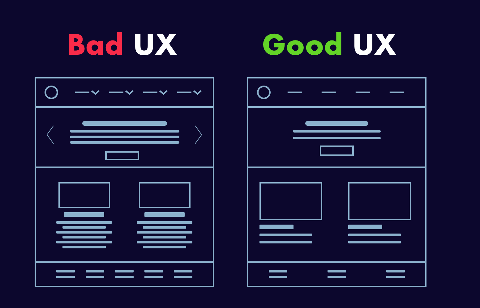
With less visual information, the text will be more noticeable and will heighten the impact on the user. Image by Mixd.

If users end up in the decision-making dilemma of what next. They become frustrated and might leave that website or app altogether.

Elemento CTA with less complexity in options to choose from.

How to use Hick’s law?

  • Eliminate complexity: To reduce cognitive load and highlight recommended options, break complex tasks down into smaller steps for the user (for example, by using progressive disclosure to onboard new users or reducing the steps for a payment process).
  • Sort your options: Take a look at how most websites are navigated. If they provide access to every link on the site, they have failed to apply Hick’s law and may easily overwhelm the user. Instead, only the most important options should be presented, which can be defined using the card-sorting method.

When it comes to time spent on a website, most have a sweet spot. If there isn’t enough time, the user will most likely leave without purchasing or registering. If they spend too much time on information, they may become distracted and fail to make a purchase or register. With just enough time, the vast majority of users who intend to make a purchase and register will do so.

Once a site is live, you can begin to determine the sweet spot and use Hick’s Law to either increase or decrease the average amount of time spent on the site.

2. Use Familiar Scenarios and Logic (Jakob’s Law)

So often as designers, we want to reinvent the wheel, to come up with a solution that no one else has thought of. But, as Jakob Nielsen (the creator of Jakob’s Law) put it, the truth is:

Users spend the majority of their time on other websites and would prefer that your site function in the same way as the websites they are already familiar with.

This rule applies to all of the products we use, not just websites. With this in mind, designers must resist the urge to create something unique, as doing so may end up doing more harm than good to the user experience. Designers should instead concentrate on leveraging existing mental models to which users are already accustomed. This reduces the cognitive load placed on users and allows them to concentrate on completing tasks rather than learning a new mental model or process.

Dropbox’s login page applies Jakob’s law by designing a login page similar to those of other websites.

How to use Jakob’s law:

  • There’s no need to reinvent the wheel; instead, concentrate on creating patterns that users are already familiar with.
  • Failure to meet user expectations can increase their cognitive load by requiring them to learn something new. To improve learnability, adhere to established conventions.

3. Make Your Interface Visually Appealing (Law of Aesthetics)

People have an underlying belief that things that look good will work better.

In 1995, Hitachi Design Center researchers investigated this effect for the first time. They discovered a strong link between aesthetic appeal and ease of use.

They concluded that the aesthetics of a product have a strong influence on users. It implies that users perceive attractive products to be more useful. In other words, the more positive the reaction to visual design, the more forgiving they are of minor usability issues.

Finally, people do judge a book by its cover.

It’s a well-known fact that aesthetics is one of the core reasons why Apple has an edge over its competitors.

How to Use Aesthetic Usability Effect:

  • Design with keeping the interaction model of people in mind.
  • Concentrate on the user funnel’s high-friction, high-value points (top landing pages, bottom of the funnel stages such as checkout flow).
  • With continuous user feedback, you can improve your aesthetics.
  • When using the aesthetic-usability effect, don’t change the usability, which means the product’s core function should remain unchanged.

4. The One That Looks Different From the Rest (Von Restorff Effect)

Also known as the ‘isolation effect’, this law anticipates that when multiple similar objects are present, people will likely remember the one that differs from the rest.

The law is mostly found in use on product pricing pages, where most of the pricing packages are the same except for a few variations in the text.

Companies take advantage of this by highlighting their preferred pricing in a different color, shape, and size to draw attention to that item.

ClickUp uses the Von Restorff principle in their pricing plan, by highlighting their preferred plan’s name and price.

A darker shade in the pricing box isolates the selected plan, making it the user’s focal point.

How to use the Von Restorff effect:

  • Make important information or key actions stand out visually.
  • To make the product listings stand out, use words like “special offer” and “new.”
  • Look for opportunities to learn how to create positive experiences in the interface.
  • Maintain a healthy balance. Users can easily become distracted by noise if you create too many different colors and shapes.

5. Zeigarnik Effect

Remember when an episode of your favorite show ended on a cliffhanger, leaving you hanging?

You’re not going to rest, and you’re going to move on to the next episode.

Don’t you think this happens a lot in our everyday lives?

Zeigarnik effect

This means that people recall interrupted or unfinished tasks more vividly than completed tasks.

This concept can be applied to UX, where we could talk about new features and offer them for an X amount, and then tell the user that if he wants to proceed, he must do Y action, such as register, buy, etc.

Grammarly example

Linkedin’s profile completion page also makes use of the zeigarnik effect.

Users are more likely to provide missing information when they see a message like “add skills to showcase your strength.”

Take a look at how Instagram uses this to this effect with its infinite scroll.

Even when you’re certain there’s nothing else to see in your feed, Instagram plays its card – ‘infinite scroll’ – to entice you to keep using the app.

It is predicated on the need for/possibility of seeing a new story.

How to use the Zeigarnik Effect?

  • Gamify user interactions and include progress trackers to encourage users to finish the task.
  • Take advantage of the user’s mental state after they’ve completed a task. Now is an excellent time to concentrate on a user’s new objectives!
  • Divide content into bite-sized chunks of useful information.
  • Don’t tell everyone everything you have right away.
  • Digital writing tools show you how many problems you have with your writing and how you can solve them by upgrading to premium.

To summarize

It’s critical to understand that your eyes and ears frequently fail to convey what you can perceive. The designers must consider perception and imagination and attempt to link them using UX laws.

So, how did you feel after learning about all of the laws and their advantages?

Please contact us and let us know if you require UX experts to improve the performance of your website.

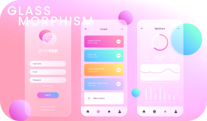
Glassmorphism – How to Leverage This New UI Trend in Your Website

Another year, another UI design trend making waves – Glassmorphism  

Each trend or practice brings different perks and challenges alike. While we all like to be adopt different and newest design trends, we also need to ensure that our design is future-proof and will not go out of style after a few months. 

Glassmorphism is the latest UI design trend everyone trying to emulate. We prefer to be at the forefront of new UX trends and here are our learnings after experimenting with this eye-catching and vibrant design trend – Glassmorphism.

Glassmorphism
Image by Galaxy Weblinks

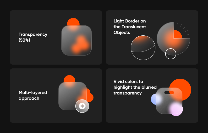
Glassmorphism is largely about highlighting light or dark objects by placing them on vividly colored backgrounds. The design has elements of transparency, frostiness, or glossiness. Glassmorphing is that “airy” interface where you see objects floating within space. Eye-catching and colorful, this trend favors multi-layered approaches. Resembling milky glass surfaces, the interface is grabbing a lot of attention.

Designers have been playing with this style of the interface in a major way. Glasmorphism is there in a larger number of published website designs. For instance, Apple used this effect on the latest update of macOS Big Sur. Microsoft also used this new interface on the app surfaces of Windows Vista and named it “The Acrylic”

The likes of Apple and Microsoft are using this interface. This trend is being followed by all those who want to make a lasting impression on their visitors. It is safe to say that Glassmorphism is here to stay. It is a promising design that has a lot to offer.

Glassmorphism in Apple Big Sur
Image by Galaxy Weblinks

All brands regardless of the nature of the work can incorporate this sort of interface. It is an all-weather solution.


User experience lays the foundation for happy, satisfied customers. Here is how UX makes a lasting impact – 

A product’s ability to woo the audience rests on how strong, seamless, and speedy the interface is. As a conscious effort, the designers strive to create simple and minimalist designs and avoid using unnecessary information or low-resolution photos. The intriguing and minimal design keeps visitors engaged for longer. Glassmorphism UI complements modern design needs and user behavior. 


Here is what constitutes Glassmorphism Aesthetics 

Glassmorphism components
Image by Galaxy Weblinks

Here are some insightful tips on how we make this design work for our client’s website, for your website:

  • Not applying the blurring and transparent effect in areas that require active interactions.
  • Not using this design aesthetics in buttons, toggles, navigation menu, and similar elements.
  • Use transparency and blurring for boosting the overall look and feel, not only for decoration.
  • Applying fitting contrast with the cards in the interfaces for ease of accessibility.
  • Right spacing between the cards. Grouping together all the objects related to one another.
  • Choosing the right contrast and intuitive grouping of cards in the design layout
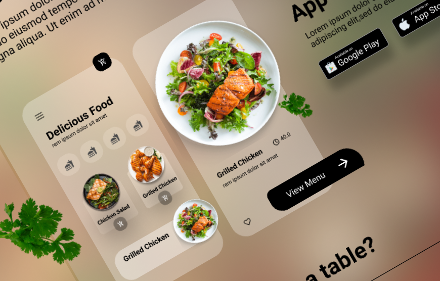
Glassmorphism
Image by Galaxy Weblinks

Glassmorphism usage is based on the designer’s discretion and they must use it judiciously. It is beautiful and minimalistic but falls short in the accessibility standards. Our design experts are exploring new trends and creative ways of making web products. At the same time, we try to overcome the shortcomings if there are any. Therefore, we are ensuring a higher level of accessibility in our web designs where we are leveraging Glassmorphism. 

Design is subjective, not bound by any rules. Websites are user-friendly and beautiful when the designers push their boundaries and experiment with the design trends. Glassmorphism is the latest trend and like the other trends, this will be replaced by something new soon. However, it does make a statement and if you wish to leverage this trend, we can help you while ensuring that the design is sustainable, future-proof, and accessible.  

Get in touch with our design team here and have a one on one about Glassmorphism. Contact us here!

Impact of Design at Every Stage in Your Client Sales Funnel

Creating a website can be a difficult task. There are numerous design principles to consider, and you must find unique ways to capture and hold users’ attention.

The first impression of your content by a viewer does not have to result in a sale. It’s nice if it does, but your client and even you may be unaware of what your design is doing. Your main goal is to leave a lasting impression.

If done correctly, a website can act as a sort of sales funnel, attracting people to your product or service and convincing them to buy or call for more information. It is critical – and not easy – to create an effective funnel. One that assists you in identifying the right buyer early on and makes purchasing your product a pleasant experience.

This post will help you understand the various steps of building a sales funnel and the role of design in sales funnels.

Understanding sales funnel stages

Each stage of the sales funnel affects the users’ behavior. You must be intimately acquainted with them. Knowing each step allows you to employ tactics to increase the number of people who progress from one step to the next.

This has the potential to have a huge impact on your business.

Assume you double the number of people at two stages of your funnel. You double the number of leads and the percentage of closed customers. This means you’ll get four times as many new customers each month. And one of the most powerful concepts in business is defining and managing your sales funnel.

1. Awareness

This is the stage at which the prospect learns about your company and what it has to offer. This can happen through social media, word of mouth, Google searches, and so on.

The Role of Design:

Potential customers may become aware of a problem they are experiencing and possible solutions by discovering your product/service. This could become a right-place, right-time scenario in which customers buy what you’re selling right away.

  • Make Use of Strong Branding

Our first piece of advice for creating an effective website is to use consistent branding throughout. You should have a set of colors, fonts, and even shapes that you use regularly as a brand. When developing a website, make sure to keep these elements in mind. Take a look at the screenshots from BusySeed’s website below, for example. As you can see, the website development team has kept the structure, colors, font, and shapes consistent throughout the site. Using your brand’s elements liberally on all pages allows viewers to quickly grasp your brand’s tone and mood. It also makes you more distinguishable.

  • Create Eye-Catching Landing Pages

Landing pages are the pages of a website to which visitors are directed. The term “landing page” has recently evolved from a standalone page to any page that appears in an ad or a Google search. A website can now have multiple landing pages thanks to this new change. If you run an ad for Social Media Management, users will be directed to our social media page, which will serve as a landing page. You get the idea. As a result, any page on the site that will be used as a landing page requires special attention. The landing page should contain all of the information that a customer requires about a product or service.

This is the first step in developing a sales funnel and is critical for capturing and retaining attention. According to many studies, you only have about ten seconds to entice someone to visit your website before they click away to go somewhere else. Your landing pages should clearly state the service or product and include at least one call to action.

2. Interest

When customers reach the interest stage of the sales funnel, they are conducting research, comparing prices, and considering their options. This is the time to impress them with incredible content that benefits them but does not sell to them.

The Role of Design:

If you push your product or service from the start, you will turn off prospects and drive them away. The goal is to establish your expertise, assist the consumer in making an informed decision, and offer to assist them in any way you can.

  • Make Navigation Easier and More Convenient

Once you’ve gotten your potential customers into the sales funnel, it’s time to keep them there. How are you able to do this? This is a critical step in the website development process. It is up to you and your team to make the sales funnel a place where prospects want to go. One method is to provide easy-to-use navigation. Always include a header (or a menu on mobile) that links to your site’s other pages. Organize things into subpages to keep the header free of clutter. 

As an example, take a look at our screenshot. Subpages keep the header from being too busy, making it more user-friendly.

  • Visuals are a must

What is the best way to get people’s attention? Visuals! When creating a website, try to incorporate as many visuals as possible (without it being overwhelming). People are initially drawn in by the visuals and then stick around for the text. People enjoy watching videos. They always generate a lot of interest, whether on a website or as a social media post. 

Make use of videos whenever possible! Of course, we have photographs. Make certain that the images you use are consistent with your brand and that they demonstrate diversity. Remember that smiling faces make your brand more approachable! Icons, slideshow images, logos, and call-to-action buttons are also excellent visuals to use when designing a website.

All of these factors will assist you in attracting customers and keeping them on your site long enough for the sales funnel to begin working.

3. Decision

When a prospect reaches this stage of the sales funnel, he or she is ready to buy.

Because he or she may be considering two or three options — hopefully, including you — now is the time to make the most irresistible offer you can (packages, options, free shipping, discount) so that they do not hesitate any longer and purchase your product or service.

The Role of Design:

  • Remove all distractions.

Having too many distractions is one of the most common design flaws in sales funnels. Consider removing distracting features such as sidebars, excessive links, top navigation, or even too many images if your sales page or pages are on a larger website.

People make snap decisions. The quality of both the content and the design influences whether or not they stay on a website for more than a few seconds. Within this page or section of the funnel, there should be only one clear message.

Here’s a simple example from Wishpond, where they ask visitors for their contact information in exchange for a digital resource:

  • What action do you want your visitors to take next?
  • Are the next steps obvious?
  • Are there any extraneous elements that could confuse visitors or divert them from the next steps?

Getting rid of distractions is essential for effective funneling!

4. Action

That is the ultimate point in the sales funnel. By purchasing your product or service, the prospect becomes a customer of your company. It is critical to note that there may be additional stages to your sales funnel. Your interaction with the customer must extend beyond the purchase.

Now you must focus on customer retention by expressing gratitude for the purchase, inviting the customer to provide feedback, making your brand available for support, and so on.

The Role of Design:

  • Make it Easy For Consumers to Complete the Goal

The final stage of the sales funnel is to get the customer to complete a task. Filling out a lead form, contacting you directly, purchasing a product, or downloading an app/content are all examples of this. Whatever your goal is, it must be simple for customers to achieve. Make all your forms user-friendly and short. Have several points of contact. Make the checkout process as simple as possible. Make the app/content available for download directly from that page. 

Do everything in your power to keep things simple and inviting to achieve your desired result. The less time-consuming and complex a task is, the more likely it is that it will be completed. Make sure to use buttons to link to the goal pages so customers don’t have to search for them.

Netflix requests your payment method after the free trial period. You have several payment options, including gift code, credit card, and PayPal. There is a reminder on this page that you can cancel at any time.

Conclusion

Your viewers are eager to hear what story you can entice them to listen to, just as you would be less likely to go see a movie based on a text-only description rather than a full-color poster or trailer.

Many digital marketing strategies rely on sales funnels. When formatting and designing landing pages or websites in this day and age of internet buying and selling, there are numerous factors to consider.

To convert the most visitors, you must break down customer barriers while remaining true to your clear messaging. You only have a few seconds to make a big impression online, so use these funneling design tips to make the most of them!

Contact us if you are at the first step of creating an effective sales funnel by designing an attractive website or application. 

About Galaxy Weblinks

We specialize in delivering end-to-end software design & development services. Our UI/UX designers are creative problem-solvers with a decade of experience in all facets of digital and interactive design. We create compelling and human-focused experiences delivered through clean, and minimalist UI.

Animation and Motion Design: Top 5 Trends That Will Rule the Year 2024

As we step into 2024, the world of animation and motion design are redefining the ways in which stories are told, products are marketed, and information is conveyed. The profound impact of these mediums is evidenced by the recent success of Pixar’s “Soul,” which not only captivated audiences worldwide but also showcased the unparalleled ability of animation to explore complex themes with depth and sensitivity. This film, alongside others in the industry, showcases the significant role animation plays in today’s digital narrative.

1. Hyper-Realistic 3D Animation

Hyper-realistic 3D animation is setting new standards for visual storytelling, with movies like “Avatar: The Way of Water” pushing the boundaries of what’s possible. These films utilize cutting-edge technologies such as performance capture and advanced rendering to create immersive worlds that engage audiences in unprecedented ways. 

The trend towards hyper-realism is not confined to the big screen; it’s also prevalent in video games, virtual reality experiences, and simulations, offering a level of detail and realism that was once unimaginable.

2. AI-Driven Animation

The integration of AI in animation workflows has been a game-changer, automating time-consuming tasks and enabling more creative freedom. In 2023, Disney Research Studios unveiled an AI tool capable of automating the animation of complex facial expressions, reducing the animators’ workload and allowing for more nuanced character portrayals. This technological advancement represents a significant shift in how animations are produced, making the process faster and more cost-effective without compromising on quality.

3. Interactive Animation

Interactive animation is transforming viewers into active participants, offering personalized experiences across various platforms. An example of this trend can be seen in Netflix’s “Bandersnatch,” an interactive film that allows viewers to make choices that influence the story’s outcome. This innovation in storytelling demonstrates the potential of interactive animation to engage audiences in a deeply personal and immersive manner, a trend that is rapidly expanding into educational content, marketing, and web design.

4. Sustainability in Animation

The animation industry is increasingly embracing sustainable practices, with studios like Pixar and DreamWorks utilizing cloud computing and energy-efficient technologies to reduce their carbon footprint. These efforts are not only environmentally responsible but also resonate with the growing consumer demand for sustainable content. By prioritizing green technologies, the industry is setting a precedent for environmentally friendly production processes that are likely to become the standard in the years to come.

5. Motion Graphics as a Strategic Storytelling Tool

Motion graphics are becoming an indispensable tool for conveying complex ideas in a clear and engaging way. The use of motion graphics by organizations like the World Health Organization (WHO) to communicate important health guidelines during the COVID-19 pandemic highlights their effectiveness in reaching a broad audience with critical information. This trend underscores the versatility of motion graphics as a medium for educational content, corporate communications, and social media marketing.

Animating the Future: Lead the 2024 Trends with Galaxy Weblinks

The big moves in animation and motion design we’re seeing for 2024 are representing a whole new way of thinking about storytelling. It’s all about making stories more real, more interactive, and doing it in a way that’s better for our planet. For those of us in the biz, it’s not just about keeping up; it’s about leading the charge into what’s next.

At Galaxy Weblinks, we’re right there on the front lines with you. We’ve got the know-how and the tech to help you make the most of these trends. Want to bring ultra-realistic 3D animations to life, use AI to streamline your projects, or create interactive experiences that really pull your audience in? We’re here to help make that happen.

Let’s explore the endless possibilities of animation and motion design together. With Galaxy Weblinks, you’re not just making content; you’re making the future of storytelling. Let’s create something that not only stands out but also stands for something.

Partnering With a UI/UX Agency | Why You Should Outsource

Developers spend 50% of their time fixing issues that could have been avoided if user research had been conducted before code development began. (MeasuringU)

Thinking about outsourcing in terms of UI/UX can be a little jarring at first but Galaxy Weblinks is here to change that for you. UI/UX is the foundation of your product, be it for customers or employees, and nobody wants a shaky foundation. Before writing the code and starting the build of your application, laying out a detailed UI/UX strategy is a must. According to Forbes research, Intentional and strategic user experience has the potential to raise conversion rates by as much as 400%.

Galaxy’s approach to UI/UX outsourcing, strategy, research, and design is a homogenized effort that focuses on merging the desired outcomes for end-users and your company. There is no universal solution that fits all, and we understand that every project is different, that’s why we match your needs with the right team of performant designers and engineers. Our team of critical thinkers works with you towards a common goal of deploying robust and scalable UI/UX solutions that yield great business results. 

Our Process is Agile and Dependable

We know that constant communication and collaboration are key in an Agile development environment. Hence, our process adapts to your needs to provide optimum results. With development shops in the US, Australia, and India we ensure that all the important strategic interactions and work happens during your typical workday. 

We are also equipped to scale our services to handle the intense workload on short notice so that you can meet your deadlines. Timezone troubles are a thing of the past with us, we’ve made our schedules flexible, just give us a call, and we’re instantly available to talk status updates and plans, just like your internal teammate. 

Research is Crucial for our UI/UX Process

We try to understand the users, their pain points, and the functionality they require through our research. The answers to these questions are critical whether you’re designing a new application, revamping an existing one, or optimizing for different screen sizes. 

Apart from user interviews, our typical UI/UX research offering includes:

  • Heuristic Evaluation
  • Competitor Analysis
  • Survey Creation and Distribution
  • Interview Recording Transcripts
  • Analytics Data Report Summaries

We have paired these services with techniques that help in our Design Thinking methodology and aids our decision-making:

  • Empathy: Conduct stakeholder interviews and user research. 
  • Define: Develop affinity diagrams, MVP definitions, user personas, and user journey.
  • Ideation: Use UI sketches and Wireframes to brainstorm.
  • Prototype: Create hi-fi wireframes with design styles and final screens for testing and developer hand-off.
  • Testing: Test and collect user feedback at every stage to eliminate problems at the onset.

UI/UX Outsourcing Benefits

Our teams are proactive and highly skilled. So it doesn’t matter if you’re looking to disrupt the industry with a revolutionary solution, or building upon an existing solution, we’re here as your dependable offshore partners to see it through equipped with the right set of technologies and skill set. 

Here are some benefits of outsourcing UX development that will put things in perspective for you: 

  • Reduced development costs: Building what your users desire in the first place eliminates the need for code rework, ultimately saving costs.
  • Competitive advantages: Better UX leads to better business.
  • End-user loyalty: Fast, efficient, and transparent experiences result in better user loyalty.
  • New opportunities: Researching and presenting a user with what they might need will result in new business opportunities.

Why choose us as your UI/UX Design Outsourcing partner?

Based in Boston(MA), Galaxy is recognized as one of the fastest-growing private companies in the USA in 2021 by INC 5000

Our other recent accolades include: 

Our clients love our work and laud us for our commendable outcomes. Whether you need software to create your business foundation, new product offering for your customers, or something disruptive, our team can help you work towards your goals.

Our recipe for success 

With our proven methodologies we ensure that your solutions are the right kind of disruptive and your legacy solutions are modernized and made future-proof. We employ:

  • 6D
  • Lean UX
  • Double Diamond
  • User-Centered Design

With outsourcing, you get access to a top software company with the right talent and tools to help you realize your business goals and that too without the hassles of talent hunt, hiring, and management.

Galaxy as an outsourcing partner works alongside you through every stage of the development journey to deliver the best outcomes your business deserves. 

About Galaxy Weblinks
We specialize in delivering end-to-end software design & development services. Our UI/UX designers are creative problem-solvers with a decade of experience in all facets of digital and interactive design. We create compelling and human-focused experiences delivered through clean, and minimalist UI. Get in touch with us here.

Enhance Your User Interface With These 5 Tips

When it comes to design, even the trivial seeming things can have a huge impact in creating efficient, accessible, and beautiful UIs. This blog will address those tiny changes that yield big results in terms of your design and user experience. 

As the nursery rhyme goes “Little drops of water, little grains of sand, Make the mighty ocean, and the pleasant land”

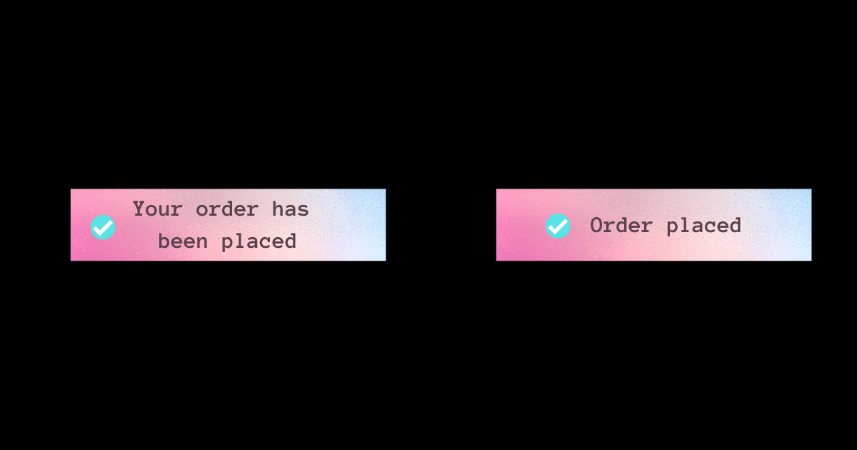
1. Be Succinct. Cut the fluff

Work with your UX resources to keep the messages concise. Speak to your user in the language they understand. The general rule of thumb is to keep it simple. Avoid jargon and speak to them in a voice they understand, assisting them in achieving their goals more easily.

copy-trip

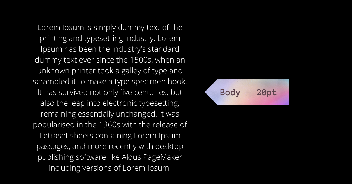
2. Increase the body font if your typeface allows

Articles, project descriptions, and other long-form content read better if the body copy is 20pt or more. It would also depend on the typeface that you’re using, but the more common ones look great at 20pt and provide for a better reading experience when going through exhaustively long texts. 

body-text

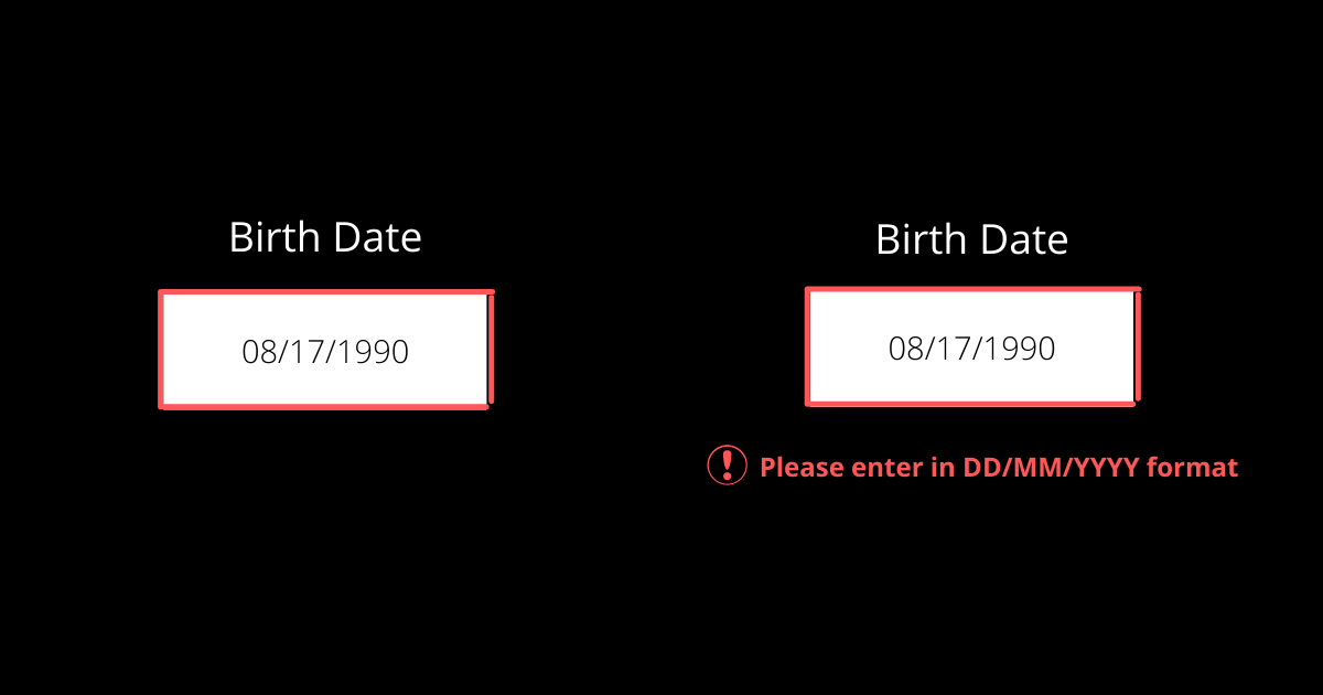
3. Use Icons and descriptions in error states

Colors can help convey messages but don’t rely on colors completely to convey crucial information. Using only colors in your design for important information like error states is like leaving out a large chunk of the audience at the mercy of guesswork. Introduce icons and descriptive texts along with the color to make it more inclusive and accessible. 

error-states-tips

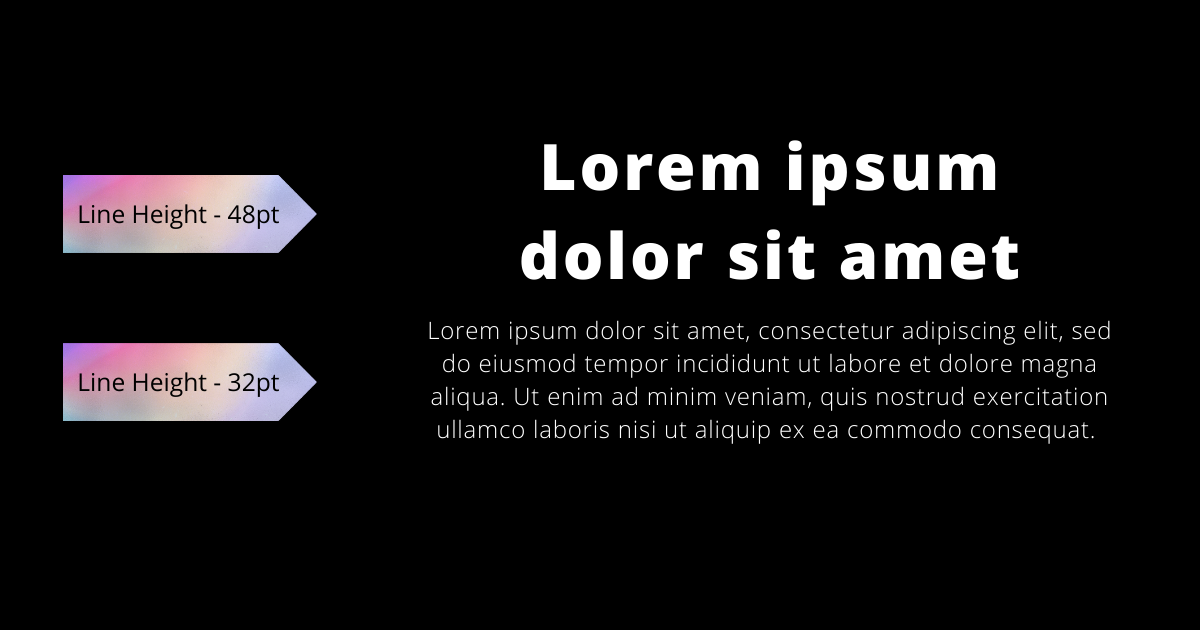
4. Decrease spacing and height in headings

Headings are shorter allowing you to play with letter space and line-height. But they are also bigger in font size than the body text, so the spacing between the letters appears optically larger. Reducing the letter-spacing will make headings look more balanced and provide a more optimal reading experience. 

line-height-tip

5. Utilize shadows and borders to highlight important stuff

Shadows and borders can help make the on-page elements appear sharper and more defined.  

With this nifty little tip, you can easily highlight on-page elements. Just don’t go overboard with the shadows, there’s a thin line between neat and tacky.  

Source: Smart_boy Dribbble

Wrap up

Us humans, we often complicate things that are fairly simple. Good UX can be as easy as going against your experimental instincts and sticking to the basics. These tips will help you in that basic pursuit. Use these tips as a guide for your next project, and you’ll be sure to deliver not only a functional product with great UX, but one that users will want to return to. 

About Galaxy Weblinks

We specialize in delivering end-to-end software design & development services. Our UI/UX designers are creative problem-solvers with a decade of experience in all facets of digital and interactive design. We create compelling and human-focused experiences delivered through clean, and minimalist UI. Get in touch with us here.

The Good and the Bad of Dark UI Designs

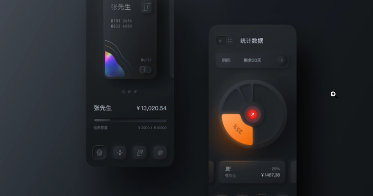
From mobile screens to TV sets, dark UI designs are seen far and wide and appreciated for the visual appeal that they offer. A dark theme depicts sophistication and elegance. However, dark UI designing comes with multiple challenges. If the implementation is poor, things can very well go south.

Digital products having dark UIs are perceived as powerful, elegant, and mysterious. They are a formidable trend across the digital spectrum. It’s said that dark mode can reduce eye strain, save battery life and increase accessibility. But, most of the time, dark themes are an aesthetic choice.

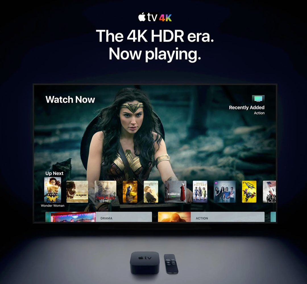
Over the past few years, dark themes are amongst the most requested features. Both Apple and Google have a dark theme as an essential part of their UI. Be it browsers, mobile applications of social media platforms, or VR/AI games, dark themes are everywhere as an option, if not a default feature. 

Source: Apple

Dark User Interface – The Good and the Bad

Choosing one of the two is a tricky balancing act. The dark theme is not suitable for all interfaces and neither is the light theme. Selecting the right options depends on brand fit, cultural suitability, and color psychology. Also, consider the emotional impact before asking your developer to go for either one. 

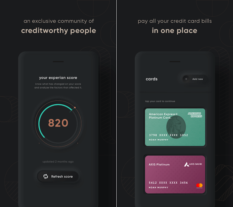
For instance – a financial app designed for millennials to take care of their credit card bill payments may look cool with a dark theme, but the same won’t work for a big bank’s website, serving the general, larger population. Too rich, too dark, and too stylish may frustrate people who just want to check their balances and transfer money.

Source: Cred

Dark UIs for B2B SaaS applications are notoriously difficult to design. Web UI components like widgets, forms, data tables, and dropdowns can look odd on a dark theme. Owing to the type, context, and environmental factors, certain brands and products are not an ideal fit and may prove an insurmountable challenge.

If your designers have not worked with dark UI design before, they might find themselves in rough, uncharted waters. In the world of dark UIs, norms are bent, pitfalls aplenty, and trends change quite often. 

Having said that, using dark UIs is a good call for a number of reasons:

  • With the minimalist design having only a few content types.
  • When there is appropriate context and use; like a nighttime entertainment app.
  • When a striking and dramatic look is needed.
  • To make a statement for the brand.

Not to forget, there are scenarios when dark UI is a bad call. When there is too much text (dark background makes reading difficult), a lot of mixed content types, or the design calls for a wide range of colors, the dark theme should be avoided. 

Impact of dark theme on UI design

As developers, we are always considerate of UI design trends and user preferences while making the best use of our time and resources. So, is adding a dark mode design a worthwhile use of the client’s budget?

We would say, this totally depends on the use case. As established earlier, the dark mode can sometimes be a hindrance to comprehension. We won’t recommend it for digital products where it could lead to big consequences. For instance, online banking services or regulatory platforms.

In other instances, we can turn to dark UI design to influence user behavior. If user engagement is an important metric for your product like Twitter, Reddit, etc, then the case for the dark theme will be stronger.

7 dark theme design tips from Galaxy

Dark theme design captivates the audience when done right. That’s what we aim for with all products that we develop. Here are seven design tips that we also practice:

  • Considering brand (identity, image, etc) 
  • Avoiding pure black
  • Avoiding heavily saturated colors
  • Ensuring enough contrast in colors
  • Softening white backgrounds
  • Matching color to the brand message
  • Communicating depth

Summing up 

It boils down to personal preference…

For most users, it all comes down to personal preference. Most of them don’t care about their eyesight or battery life, or have an aesthetic preference – they just like the way it looks and that is it. With iOS 14, Apple, who controlled their product’s design with an iron fist, allowed users to add custom icons and home screen widgets. Maybe this is not about choosing between light or dark mode, but about allowing users to configure what they like.

About Galaxy Weblinks 

Galaxy delivers end-to-end software design & development services. With a decade of experience in digital and interactive design, we create compelling and human-focused experiences. Our UI/UX designers are creative problem-solvers, delivering clean, and minimalist UI.

10 Design Principles for Exceptional User Interface

Creative visuals, attractive logo design, or intricate animations! What goes into making an exceptional user interface? A good UI includes a mix of factors that make it clear, consistent, simple, and user-oriented.

Defining the requirements of a good user interface is especially critical if you are considering outsourcing your project. Your design and development partner should understand the key principles that transform a user interface into a powerful tool for attracting new customers and retaining existing ones.

Let us go over the core principles of an effective and appealing user interface.

The 10 Fundamentals of a Good User Interface

Here is what goes into an appealing and intuitive user interface for a web or mobile application.

1. Consistency is the key

Source: Behance

In good user interface design, consistency rules the roost! Everything is affected, from the colors, icons, and fonts to the placement of menus and buttons. If changes are required and the designers who worked on the first version are no longer available, the situation becomes even more critical.

Top digital solutions do not astonish their users with radical changes. Instead, they use brand books and company style guides to maintain a consistent and unified style throughout UI design.

2. Hierarchy in screens

Source: Dribbble

Some inexperienced designers make the mistake of attempting to highlight everything on a single screen. Instead of guiding customers to a purchase or other desirable action, they bombard them with information.

That is why hierarchy is an essential component of a successful user interface.

It should be designed in such a way that users can quickly find the point of focus and understand what you’re trying to convey visually.

3. Flexibility 

Users now enjoy looking for a solution to their problems. That is why a good user interface should be supplemented with tabs, shortcuts, and hover tooltips. Such elements improve the interface’s usability and intuitiveness.

You may also like: 10 Tips to Improve Your Website Accessibility

For example, if an app allows you to upload photos, it should also allow you to crop, resize, rotate, and edit the image right next to it. The designers’ goal is to assist users in determining where such options can be found and whether such features are available at first glance.

4. Clear and intuitive user navigation

Where can I find the main menu? If you’ve ever asked yourself the same question, you’ve most likely encountered a poorly designed user interface. While visible to users, it should be “invisible” in terms of user disruption. A high-quality user interface should be well-structured and contain only the necessary elements.

For instance, a car-rental website should not be cluttered with unnecessary buttons, menus, and visual elements, but rather provide the option to rent a car right on the main screen. As a result, users will spend less time navigating your application and complete the transaction.

5. Target audience is well-defined

A digital product with a clear understanding of its target users has a better chance of retaining and engaging users. The primary goal of any web or mobile app is to alleviate the pain points of users, which is impossible to do without understanding how they interact with an application.

A good user interface is built on preliminary and in-depth market research, engagement of best practices from similar products, and evaluation of the target audience. This enables acting on a user’s needs and desires based on such an analysis and transferring the solution to the app interface’s pain points.

6. Transparency of user actions

When you click a button, you expect to see some sort of response. In UI design practices, leaving users without any feedback is considered bad etiquette. When users click on a menu, it’s a good idea to confirm the action with some sort of indication of successful operation, such as animation, color change, pop-up window, progress bar, and so on.

7. Limited number of gestures

Swiping, tapping, pressing, gesturing, or voice command are all options. All of these actions are used in the user interface to guide customers to the desired outcomes. Although it may appear to be a brilliant idea to use them all within an application, top interfaces such as WhatsApp or Facebook stick to a limited number of gestures.

When using an application, users should have a clear understanding of the actions that must be taken in order to achieve the desired result. If you tap to open a file, you should use the same gesture in all similar situations.

8. Additional tips and tricks

User retention is the primary task and, conversely, the primary challenge of any digital product. Fortunately, an effective user interface can help achieve the goal.

You may also like: 3 UX Gamification Techniques to Boost Engagement

Creating onboarding tips and showing them to customers is a good practice for very complex solutions. The UI carefully guides them through the app and helps them remember what each element is responsible for by placing small tips here and there, such as hover tooltips.

9. Attractiveness

This point is critical, despite being somewhat controversial in the eyes of some. A good user interface is one that is appealing and reflects the brand’s personality. Buttons, colors, fonts, and visual elements all contribute to a distinct brand story.

What appears appealing to one group of users may be repulsive to another. As a result, a successful user interface should be founded on extensive research. Furthermore, the visual aspect of user design should be used to reinforce functionality. Popular and well-known applications do not use colorful visuals that add no real value to the user interface.

10. Compliance with design standards

As previously stated, users must understand what to expect from a user interface.

Following Google’s and Apple’s primary and well-known design standards for Android and iOS is a good idea.

Take, for example, a search bar.

It is not a good idea to move it from the top of a page to the bottom. This way, the user interface will inadvertently make users struggle to perform actions that should be intuitive.

Conclusion

As you can see, good user interface design entails more than simply making an app or website look nice. It considers all of the users’ needs and creates an interface that reinforces consistency and assists users in completing their tasks in the most seamless manner possible. Use these tips as a guide for your next project, and you’ll be sure to deliver not only a functional product, but one that users will want to return to. 

Do you want us to get you or your company started on creating quality design components for your product? Reach out to us to get your project off the ground.

About Galaxy Weblinks

We specialize in delivering end-to-end software design & development services. Our UI/UX designers are creative problem-solvers with a decade of experience in all facets of digital and interactive design. We create compelling and human-focused experiences delivered through clean, and minimalist UI.

Mobile Navigation on Large Website – Tips, Tricks, and Best Practices

Designing mobile apps for large, content-rich websites comes with its own set of challenges. The alterations in viewport size now completely change the way we navigate a website. There are thousands of pages that need to be sorted and organized to make them accessible at a tap. You would also need to be sure that the users don’t suffer information overload. It’s a complicated puzzle that needs to be put together.

Here are some things you should know about mobile navigation and some best practices.

  • Menus: Utilize visual hierarchy to differentiate primary and secondary navigation.
  • Submenus: Avoid creating sectional menus. Allow users to peek into submenus via the dropdown or open/close menu.
  • You Are Here Indicators: Leave breadcrumbs for users to indicate their whereabouts. 
  • Navigating Between Websites: If you have multiple sites tied into the main website, then try to keep things consistent with headers and other elements. Link those headers in subdomains and landing pages to your main site. 
  • Site Search: Use keywords that your audience uses to optimize for search. All the pages must have proper context and details to land up in your target users’ search results.

Menus

Almost all the websites you’d see use the Hamburger menu for navigation on mobile. We have nothing against it but a little clarity goes a long way concerning accessibility. Here you can find alternatives for the Hamburger menu. 

Takeaway

  • A hamburger menu is a great option for tight spaces, but something such as a simple ‘Menu’ label aids easier navigation for all.
  • Larger sites are easier to navigate when menus are organized categorically, like primary and secondary navigation or based on user groups.

Submenus

The menus that expand by allowing users to open/close to see different submenus are very convenient. This way users can quickly sift through sections to find what they are looking for without going inside individual pages. 

Takeaway

  • Use dropdown or expand/collapse menu for deeper secondary and tertiary level navigation.
  • If you opt for section navigation, place it on the screen, where it is noticeable and close to the content.

Breadcrumbs

Your website’s page titles might match the navigation labels, but only a handful of users use this information to determine what page they’re on. A user should know the current state, if they end up at the same spot, again and again, it would lead to frustration.

Takeaway

  • Ensure that the user knows where they are on your website’s navigation to prevent frustration caused by getting lost. Also, provide a way back as breadcrumbs do.

Navigating Between Websites

When dealing with a lot of information, large websites divide certain parts of information or services into microsites. To ascertain that it doesn’t overwhelm users or cause any confusion, keep the headers consistent and link them back to the main site’s homepage. 

Takeaway

  • Use global headers to keep things consistent within sister sites with a link back to the main site. 
  • Use an offsite indicator if you’re linking the navigation menu to an external site.

Site Search

Optimize site search for keywords and keyword groups that your target users often use.

If your organization’s lexicon is complex and consists of internal lingo then confirm that your keyword search is equipped with auto-suggest. Often the page-based site search returns no results if there is nothing to be found corresponding to that keyword on that page. In such scenarios, the global site search could be of help and lead the visitor to the right place.

Takeaway

  • Use familiar keywords common with your target users to optimize site search
  • For large websites utilize global site search but with clear clues of visitors’ whereabouts.
  • Ensure that pages when landed on via any search—site search or a Google search—provide appropriate context.

Wrap up

While building large and complex websites mobile navigation shouldn’t be considered as an afterthought. Considering the massive adoption of mobile for internet usage, it could be a bad move to have botched-up mobile navigation for a large website. It could reflect badly on your brand, your products, and your services, as people might think of your offerings as not on par with the competition.

Our design experts at Galaxy can help you identify and solve these problems with you. Usability shouldn’t be an afterthought and mobile experiences are the backbone of any online business today, connect with us to make experiences that complement your business.

About Galaxy Weblinks

We specialize in delivering end-to-end software design & development services and have hands-on experience with mobile app and site design in agile development environments. Our designers, engineers, and developers help improve security, reliability and features to make sure your business application and IT structure scale and remain secure.

UI/UX Tips To Significantly Enhance Your App Design

Personalized communication, a friendly voice, and intuitive interaction are all essential components of application design. 

Do you want to create a technologically advanced product that speaks to the hearts of your users? In this article, you’ll get a taste of the best UI/UX tips for mobile app design in 2021 and learn how they can help you increase sales and retain users.

The Importance of App Design In 2021

Simple, human-centered app design is essential for building long-term client relationships. Not long ago, having an appealing and distinctive product design was sufficient. However, times have changed. The human-centered tips and tricks have completely replaced the system-centered approach and will be the dominant trend in 2021.

But first, let’s take a recap of the benefits of UI design.

Check out our list of 7 UX and UI tips and tactics that will help you achieve immediate growth while saving your brainpower for more complex UX and product challenges.

1. Declutter UI  

Too many design elements like buttons, images, text can make any phone app complicated and impossible to use. We recommend that instead of showing every task icon, you should reduce the user’s memory load by making the most important actions and options visible. The main CTA or navigation should be available at all times, not just when we expect a user to need it.

2. Use clear titles and status 

Users should be able to look at settings screens and understand all of the individual settings and their values with a quick glance. Display the status below the title to emphasize the importance of the setting. Instead of simply describing the title, show the specifics. Ambiguity should be avoided to ensure that users can access such elements when they are needed.

3. Make your dropdowns stand out

Dropdown options with search or auto-suggest options are useful when you have long lists where the user already knows the answer. We also suggest that you use whitespace. Even the subtle amounts of white space allow your designs to breathe and look more elegant. Whereas, adding images can be very useful when you want to show the difference between elements.

4. Save space with easy-to-recognize icons

Icons are easy to recognize at a glance (if well designed) – this is especially true for common icons that people have seen and used before. Icons do not need to be translated for international users. In short, the use of icons speeds up data perception and enhances memorability of the element via visual images rather than using text.

5. Grab attention with visual design in your CTA

Create a visual design to accompany your CTA. This will help to pique your audience’s interest and draw them in. Not a lot of people are going to pay attention to or click on a block text.

6. Never underestimate your empty states

Empty states are a great way to improve your product’s user experience, from onboarding to encouraging users to interact with your app. Tell your users to do something. Use-friendly and approachable copy in your empty state design. We recommend that you opt for bespoke and fitting illustrations. 

7. Design efficient forms

Organize related data into logical blocks or sets. The transition from one set of questions to the next will be more like a conversation. Grouping related fields together will also assist users in making sense of the information they must fill out.

Conclusion

At the end of the day, the user should have a smooth user experience without having to scratch his head to figure out how the product works. We understand our target audience before beginning mobile app design by creating lean personas, a customer journey map, and user research. So that it’s clear who we’re making the product for. The better you know your audience, the better the experience you can create for them.

If you do not have the necessary time and ample experience, contact us to get a free UX consultation.

About Galaxy Weblinks

We specialize in delivering end-to-end software design & development services. Our UI/UX designers are creative problem-solvers with a decade of experience in all facets of digital and interactive design. We create compelling and human-focused experiences delivered through clean, and minimalist UI.