Aligning UX Strategy With Business Goals

Businesses are ruled by customers and what they experience when they use your products or services. UX strategies help create coherent experiences across all the customer’s touchpoints. It comprises the plans and processes that would mold the design and development of your products. 

Here are some tried and tested key steps for aligning your UX design with your business goals and, ultimately, building a strong UX portfolio and a successful company.

Define business goals and objectives

Your design team should be aware of the business goals and a perspective on the various requirements and needs that your product is going to address. By sharing this information with the design team, they would give due diligence to the business goals while developing the product. 

To align UX strategy with the business, you need to understand and make everyone aware that UX is not a single person’s responsibility; everybody involved in product development is responsible. This implies that every team member will have ownership of the product. 

Keeping it simple helps in almost all the scenarios. When you are communicating business objectives to UX designers, try and do the same. Involve everyone from product leaders, stakeholders, designers and possibly, developers.

Start by answering these for clarity:

  • Users – Who are the users? Who do you target?
  • User needs – What are the problems that you want to solve through the product?
  • Product goals – What do we want to achieve? Be specific 

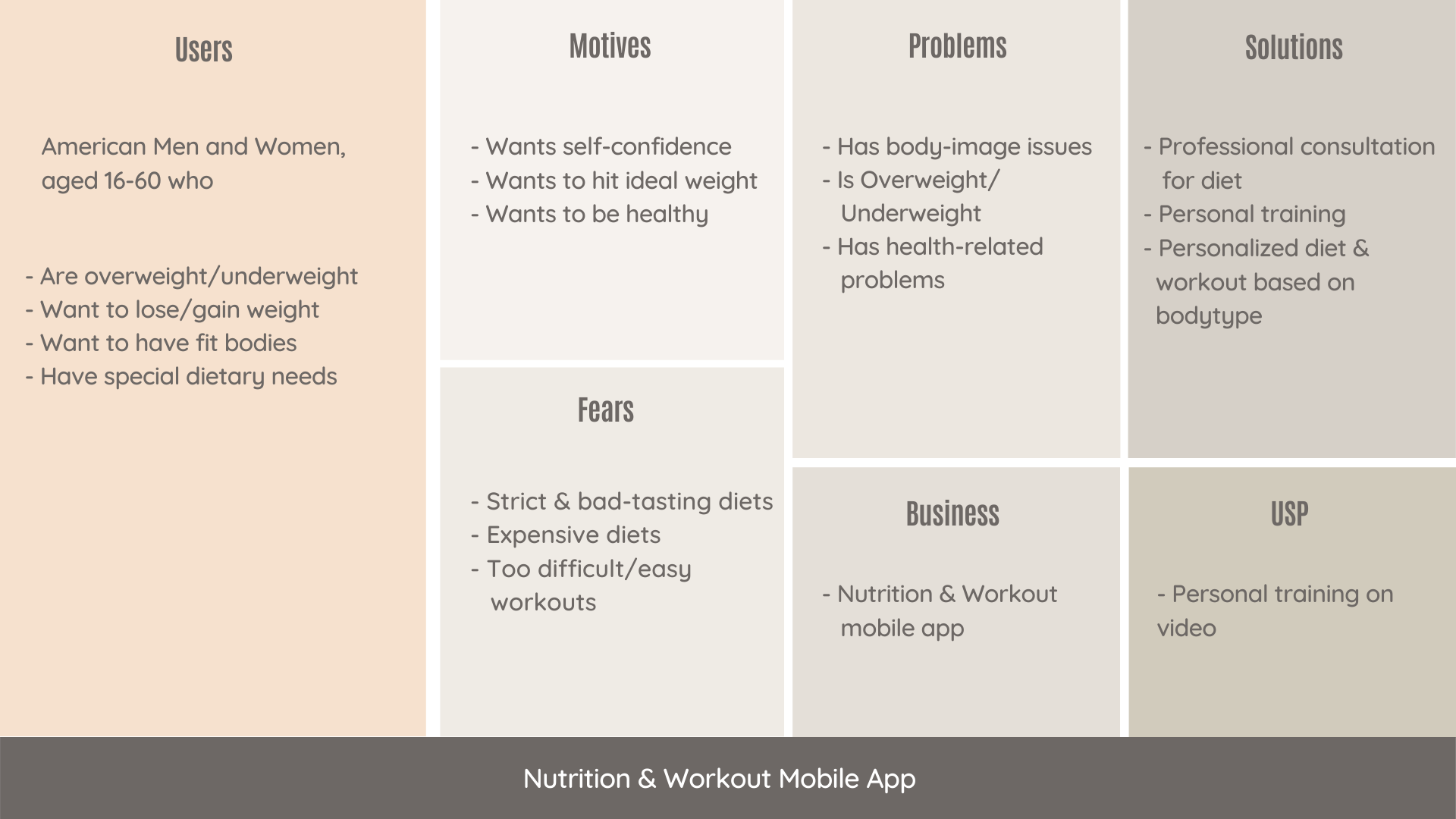
Introducing a framework can streamline your process and improve collaboration. We suggest you go with the User-Centered Business framework. It is very detailed and thorough. It is designed to highlight every important aspect of the product, business, and its users.

Here we have used a Nutrition and Workout app for example to showcase how the framework looks like. You can clearly see traits of users, what are their motivations, fears, and problems. And also how the app aims to solve problems and what is its unique offering.
Aligning

This framework focuses on –

  • Existing solutions – Initial research of what you’re competing against
  • Early adopters – Enthusiasts who test your products and do interviews about it
  • User fears – Addressing user fears with communication before it becomes a major pain point

Creating user personas

While building a product you need to find out what your users need. Once you find out what those needs are, then release features fulfilling that need. 

Personas are based on assumptions. However, you can identify and validate these assumptions with research and ensure that your personas fit the description of your target users.

A UX designer can take the help of these personas while designing for a paying user. They will know what benefits to talk about and what fears to address based on the persona’s fears, motivation, and goals. But everyone in the team must truly understand the product and its users to accomplish this. 

Aligning user needs with business goals

There is often a disconnect between user needs and business goals. And it’s no single person’s fault. Designers are just executing and the Product team is just building what stakeholders need. But in this vicious cycle, user needs remain unaddressed. 

When you start working within a framework–like User-Centered Business Canvas– and according to identified user personas, the business needs to start to follow suit. You just need to ensure that you define the business goal behind it with every stage of the framework. Like if the stage is Onboarding, you would have to define your business goals for onboarding and your expectations from users.

Here are some essentials to align business goals with user needs:

  • Test everything
  • Conduct interviews to validate the assumption 
  • Sort and prioritize features

Conducting design reviews

Feedback is a crucial part of any design process. It’s the only way to know if there’s any room for improvement. Design Review is an exercise to provide meaningful feedback to designers. All the attendees get a role assigned to them so that every individual can observe the design from a different perspective.

Here’s how to get started:

Invite everyone in the team, designers, developers, and stakeholders. Here is what we recommend- 

  • Assign roles
  • Present the designs
  • Work individually and collect remarks
  • Discuss and prioritize

For example – 

Person 1– looks at the facts

Person 2 – looks for problems and potential risks 

Person 3 – looks at what is good in the designs

Person 4 – looks for ways to improve the product

Wrapping up

Knowing your product and its users is essential for striking a balance between a usable product that users desire and a product that meets stakeholders’ business goals.

Our process will help you make beautiful-looking products that users like and stakeholders love.

About Galaxy

We specialize in delivering end-to-end software design & development services and have hands-on experience with app UI/UX design in agile development environments. Our designers, engineers, and developers help improve security, reliability, and features to make sure your business application and IT structure scale and remain secure.
5 Tell-tale signs that your mobile app needs a design overhaul

With hundreds of apps being released every day, keeping up with the competition has become quite difficult. Testing and developing an app is still fine, but keeping up with daily challenges and new user requirements can be a mammoth task.

Moreover, most people either wait too long before making a redesign (which can be critical, especially when it comes to mobile and web apps) or can’t stop making redesigns, which influences user behavior and brand development negatively.

That is why we have decided to write about 5 signs that can assist you in identifying “just the right moment” to make a UI/UX refreshment.

#1 Heard of new cool service/trend in your niche

It gets a little complicated when there is a buzz about a new startup/ product that is in direct competition with yours. New apps are constantly being released in the market, and your users can easily switch if they think they will get a better user experience with your competition. 

It’s important to keep your finger on the pulse of the market, but you also need to work in iterations: create a redesign, gather feedback, see the new UX in action, and move on to the next redesign. This process usually never ends, especially if you started from the MVP stage and need to expand functionalities.

So, if you’re a growing product, the best solution is most likely to have an offshore design partner or in-house design resources to assist you.

For example, if you need a redesign to improve user experience and market growth, you can create a step-by-step redesign and transition from one flow to another. The most important aspect is to work with the designer to define the workflow and iterations by conducting in-depth analyses of the entire design solution.

#2 Received multiple bad user feedback

Who says your current design will be popular indefinitely? There is always room for improvement, and you must constantly analyze the user feedback. But don’t rush! You’ll need to collect enough data to define the main clusters and prioritize them. Only after key pain points have been identified should the redesign be entrusted to the design team.

You will be able to understand (or the design team will suggest) what changes are needed based on the feedback from users. Many people nowadays hire designers solely for this “audition document” and then work on the design themselves. How often do you think it produces good results? Nearly never.

#3 App and website’s bounce rate is growing

The most common reason for redesigning a website is a high bounce rate. A high bounce rate is not a good thing for apps (when users stop using an app after downloading it and delete it) or websites (when leads and sales are decreasing).

The true reason could be that your UX is not measuring up. In most cases, the bounce rate is not about the visual aspect (though it is still extremely important), but about the user experience. The bounce rate would be lower if your app was simple and interesting to use.

To improve the situation, it is preferable to conduct an audience analysis, review all feedback, and redesign the interface completely. Begin at the beginning and include the following in the redesign:

  • UX research in collaboration with the market, users, and best practices analyses;
  • The new function list and screen map; UI design;
  • Update the branding and graphic designs.

#4 Your most recent refreshment was more than 1.5 years ago

In our fast-paced world, the normal life cycle of a design is 1.5 years. “Do I have to pay for design and development over and over again?” The answer is a resounding Yes!

To begin with, users may become fatigued with a single design solution. Second, while you are doing nothing to improve your design, your competitors are. At the same time, new solutions are being introduced to the market. Third, are you certain there are no changes in your company that you would like to share with the community in the next 1.5 years?


Though a complete redesign is not required, a visual refreshment is required. Adding no functionality will not increase development costs, but you will begin to earn more leads, partners, and clients instead.

#5 You have a design that was created using a template or by a developer

Many people prefer to make very small investments in design at the start of a product’s lifecycle. 

Now that your mobile application has become successful, you need a one-of-a-kind, fully customized UI/UX design. In this case, conducting best practices analyses, selecting good references, and creating a new UI design that presents your brand’s advantages to the market will suffice.

Wrapping Up

The redesign is very likely to bring you new customers who are delighted with your mobile application. However, keep in mind that only a good redesign has a positive impact on the audience, and this is where things get tricky. Only work with reputable companies when redesigning your home.

The criteria could be as follows: a good company will present you with an audition of your current design solution, as it is critical to identify the key flaws in the current UI/UX part. Talk to our UI/UX experts today, if you can see any of the above signs in your present app or website.

About Galaxy Weblinks

We specialize in delivering end-to-end software design & development services and have hands-on experience with app UI/UX design in agile development environments. Our designers, engineers, and developers help improve security, reliability and features to make sure your business application and IT structure scale and remain secure.
A Guide to UX Design Deliverables

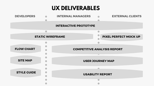
UX deliverables are a key part of building any application/product or enhancing an existing one. They may vary depending on the methods used, project, budget, and user demands, as every product is different. This, in turn, also impacts the communication between the designer and the client. Early on in the project, before the designer can share a mockup or prototype, it is common for designers to wonder what to share with clients and how often.

‘What do I show to my clients? What do they want to see? Are they concerned about my work process? When to be an open book and when to keep things to myself?’

This article lists the 7 most common deliverables created or produced by UX designers while making a new product.

These deliverables are ‘good-to-have’ in any and every project. They keep designers on track while ensuring that the clients, project managers, and designers are on the same page.

code

UX deliverables provide a clear foundation to build your designs on when you’re elbow-deep in developing your application, site, or any product.

Competitive Analysis Reports

An analysis of competitor’s products to map out their existing features in a comparable way. It helps UX designers to identify opportunities to innovate in a given area and understand industry standards.

Tip: A useful starting point for identifying strengths and areas for improvement is user experience heuristics. Heuristics include readability, consistency, clarity of text and labels, efficient navigation, etc.

Personas and UX Research Reports

With personas, you can easily empathize with users throughout the design process. The most effective personas are created from observation data and in-depth user interviews of real users. A good persona supports the UX research group!

The user research reports help in communicating research aims and methods, as well as getting buy-in from stakeholders. It’s also a great tool to translate the research findings into actionable items. They help in keeping everyone on track during the research project.

Pro Tip: There are many types of user research tools and techniques available like QuestionPro or LimeSurvey (survey tools), and FullStory or Hotjar (user session recording tools).

User Flow Diagrams and Product Roadmaps

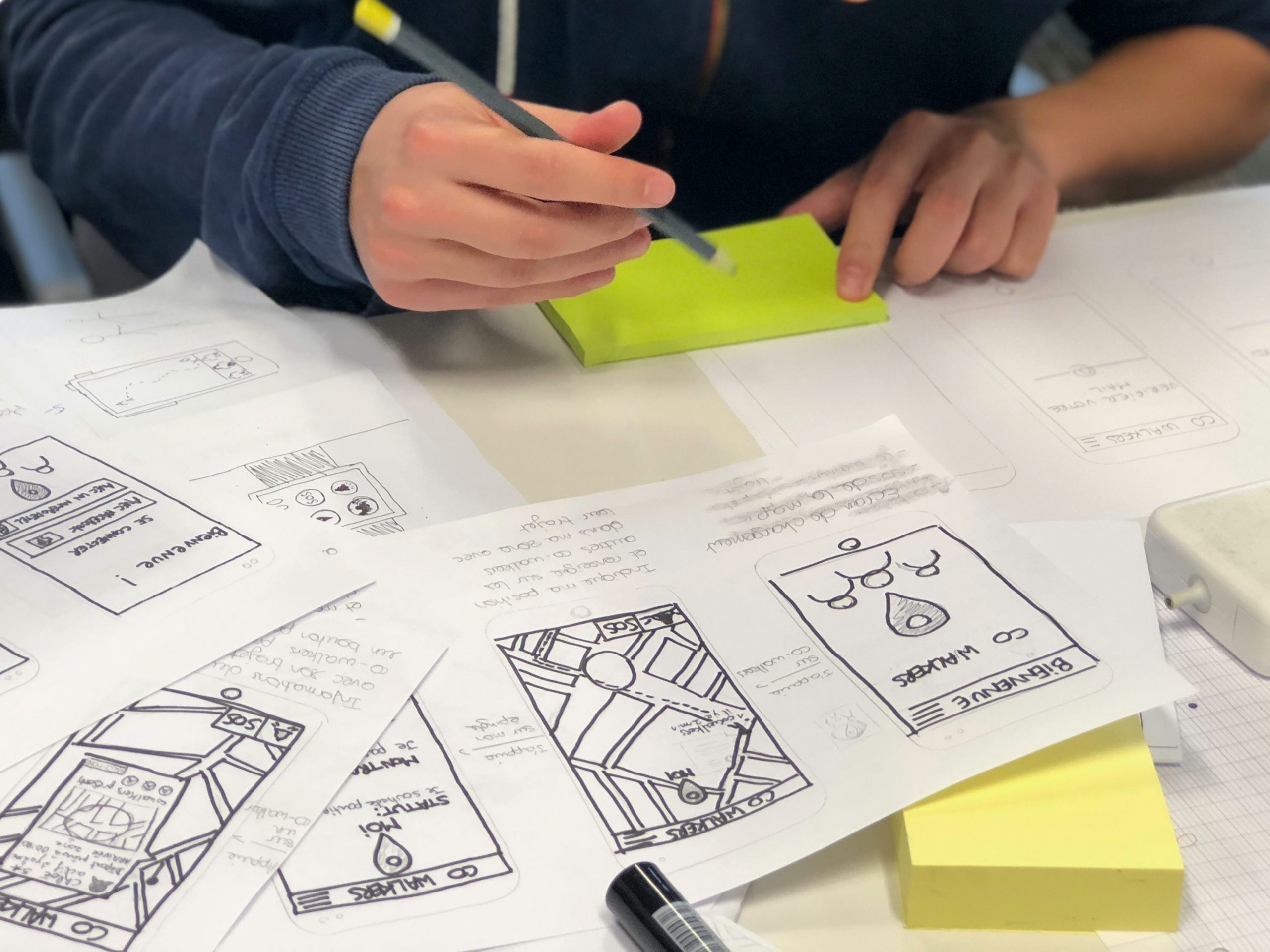
Sketches are simple depictions of a design concept. They can be quickly employed because only paper and pen are necessary for their creation. They are also easily shared between designers and also between users and developers.

Similarly, a product roadmap is a product’s evolution plan with prioritized features. It could be sticky notes, a diagram, or a spreadsheet. UX designer shares the product strategy with the team that needs to be applied to achieve its vision.

Tip: Limit the number of decision points to make it clutter-free/ less complicated. Make sure the scope of the user flow diagram covers a single goal or a single task of your user.

Static Wireframes

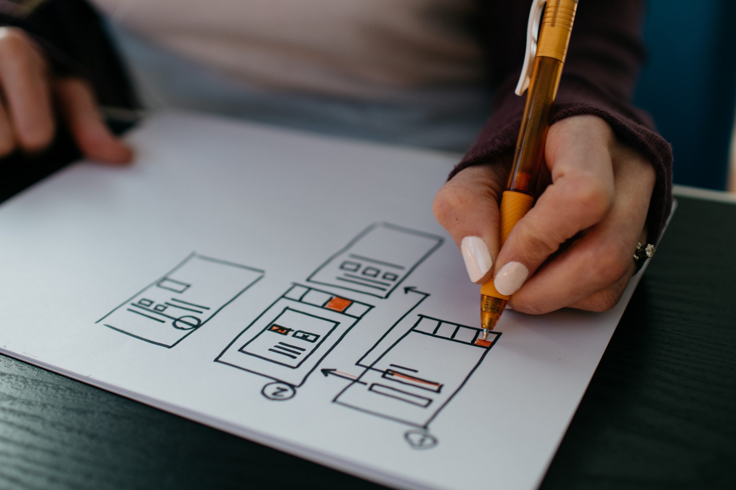
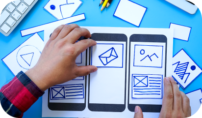
Showing your client a visual before you get into the details of the design can save you a lot of hassle. Draw a wireframe in a notebook and take a snapshot to share with your client or use tools like Figma, Invision Studio, etc. Their main purpose is to display the arrangement of the content, expected user behavior, features, and website layout.

Wireframes can also be presented as digital illustrations that represent the organization of the website/app. They can be particularly beneficial in saving a lot of time and money because they are easy to make and adjustable to work with.

Tip: If you plan to present a wireframe to the team, try to keep Wireframes simple and include annotations that help to create context and quickly deliver key ideas.

Interactive Prototypes

With tools such as Figma, Invision, and Adobe XD, the interface design level deliverables include interaction prototypes by default. Static images just cannot convey that interaction feeling. You’ll always find many small interactions or design adjustments only after you build the interactive prototype.

An internal review of a product prototype allows everyone on the team to see how things will work, and how an actual user interacts with it. It also helps users test a product that feels 100% real, provides ideas, and gives valuable feedback.

Tip: Test prototypes on real devices as much as possible, as nothing can replace experiencing designs better on a real device.

Mood Board and Visual Design

Have you ever heard from your client wanting a site that was ‘edgy, yet safe, but also cool and blue, but not icy or depressing hospital-scrubs-blue’? A mood board is a great tool for checking that your idea of the site’s look and feel matches your client’s.

Visual design is the last step before handoff to developers and the phase where a style guide and final specs are crafted. UI style guides are generally a series of guidelines or visual references or component libraries to help designers define or set the typography, UI elements, and interactions. This ensures product consistency across different design teams, companies, and brands.

-Combined design inception worksheet

Tip: Mood Boards should be visually stunning collections of ideas, full of textures and images that transform your pitching experience at the start of a project. Whereas, a design style guide can be generated in a few seconds from Sketch, and design-handoffs can be possible easily with Zeplin.

Hopefully, you now have a good idea of what a UX designer has to deliver or communicate with stakeholders.

If you’re thinking ‘we do not have enough experience to deal with this’ or “what if I don’t have enough time”, contact us to get a free UX consultation.

About Galaxy Weblinks

We specialize in delivering end-to-end software design & development services. Our UI/UX designers are creative problem-solvers with a decade of experience in all facets of digital and interactive design. We create compelling and human-focused experiences delivered through clean, and minimalist UI.

A walk-through of different user onboarding UI patterns

There’s a popular user experience quote: “A user interface is like a joke. If you have to explain it, it’s not that good.” While clever, that statement is far from the truth.

We agree that user interfaces shouldn’t be complicated. On the other hand, you can’t expect a new user to understand a new interface without any direction. That’s where user onboarding flows come into play.

This also stands true for the existing users who need directions to understand an updated interface or a new feature.

In this article, we will discuss those onboarding UIs that will help both new and existing users understand features – breaking the myth at the same time that user onboarding begins and ends with the first experience.

We’ll be discussing UI patterns like tooltips, hotspots, modals, etc. that have roots in specific types of “popup” window situations and are popularly used interchangeably in general web conversation.

Each of them offers some common purpose:

  • Contextual help: Offer helpful hints and support in the context of your product.
  • New feature Announcement: Draw attention to a new feature without interrupting a user’s workflow.
  • Influence User behavior: Gently nudge users to explore, learn, or take action.

When used correctly, they can be powerfully engaging. But when used the wrong way, they can feel like spammy popups that disrupt the user experience – ultimately causing users to churn.

It’s important to find the right balance between communicating with your users and just letting them do their thing. With that in mind, let’s discuss what they are.

In-context Tooltips

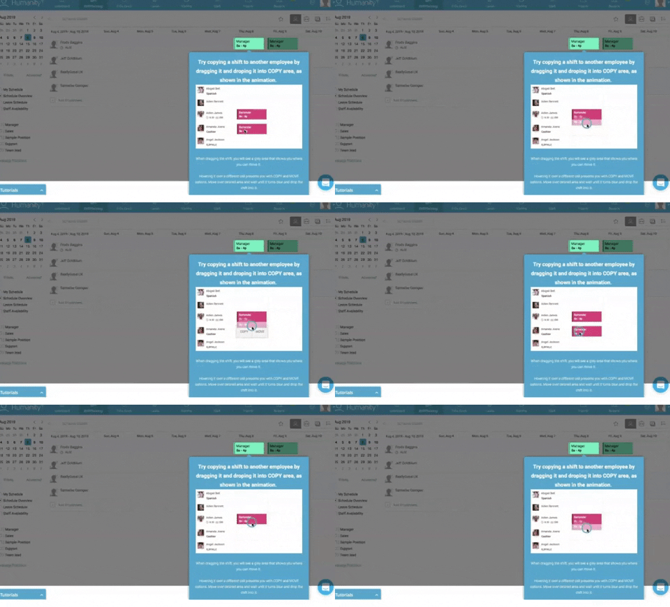
As opposed to a ‘first look’ experience, these tips appear as the user explores the product that can either explain the value of that feature/section or explain how to use it.

This technique waits for the user to take an action and presents the value right then and there. Similar to the tour, it is usually implemented as an overlay. Here is a list of 5 mistakes that you can avoid to boost feature adoption while designing tooltips.
3_giphy

Pros: The tooltips are in-context, so it solidifies the feature-value pairing, reducing cognitive load. This can also be created with 3rd parties like Appcues or Chameleon.

Cons: Some might never get discovered.

Popup Modal Window/Lightbox

A modal popup is great for announcements and situations where an action is encouraged, but not required. As with every customer communication, the information should be valuable and timely.

While some users may be in the habit of avoiding anything that pops up, embedded UX patterns could be something users look forward to when used the right way.

It’s similar to a lightbox that is used as a generic term for any popup that darkens the website and displays a dialog containing an image or other content. Often used to display galleries or content that should temporarily take complete focus from the rest of the page.

Generally, they can be dismissed with a cross button or by clicking anywhere in the darkened part of the page.

Gmail’s simple onboarding flow offers a good example of an effective modal window that creates delight, rather than frustration.

Pros: Immediately requires a CTA, the intended action is clear and direct.

Cons: Can often be a little intrusive.

Hotspots

They work similarly to tooltips. Some apps skip product tours and welcome screens and opt to show people tooltips and hot spots instead.

The goal of this user onboarding technique is to point out to users the certain features that play a key role in the user environment, even without noticeable warnings.

Pros: Allowing customers to explore functionality at their own pace and when they need to use different parts of the app makes this an excellent onboarding strategy. Especially for users switching from a different platform for the same product.

Cons: Users might get annoyed if you are using more than 3 hotspots on a screen.

Blank Slate Tips

Think of every not-yet-populated section/view of your product as space to nudge the user to create content. Use that space to educate the user on what type of content goes there, how to add it, how long it might take, and what value it will add.

Pros: It’s a great use of negative space. It’s persistent until they replace it with content. There’s nothing more daunting than a blank piece of paper! It leverages people’s completionist tendencies.

Cons: It might not be enough on its own.

Conclusion:

It’s important to find the right balance between communicating with your users and just letting them do their thing.

Put careful consideration into the “when” and “why” of your mobile tooltip design. Remember, tooltips are annotations – they should add value to the user experience, not overpower it.

There is no “right” or “perfect” user onboarding flow. What works for one site/product/app might not work for another. What works for one user might not work for another.

For example, you might need to onboard a developer vs. an average user.

Designing a user onboarding flow that works is complicated. It involves a lot of research, testing, and optimization.

Contact our UX design experts to shorten your users’ time-to-value, get them to that ‘aha moment,’ strengthen your brand, and do it all fast!

About Galaxy Weblinks

We specialize in delivering end-to-end software design & development services. Our UI/UX designers are creative problem-solvers with a decade of experience in all facets of digital and interactive design. We create compelling and human-focused experiences delivered through clean, and minimalist UI.

UI Best Practices – Designing buttons that score clicks!

User Experience Design is one of our core competencies. In this blog, we will share with you the best practices of designing buttons for your user interface that will attract maximum clicks. These UI button practices will help your users prioritize tasks by removing friction on-screen while sticking to the basic principles of UX elements for web/mobile applications.

Many designers take inspiration from various new UI designs and apply in their applications like this:

video showing buttons in UI

But what’s wrong with this elegant on-hover and click state button?

Unfortunately, it’s lacking the very first basic rule of button design – “Make it look clickable”.

UI/UX designers should pay much attention to button designs to make buttons stand out, and read numerous articles, analyze and share ways, secrets, and principles to set the color, shape, position, size, and more factors.

Use those designs that follow basic ground rules of UI design. Especially ones that can not only lead users through a website/mobile app effectively but can also entice them to click for better sales.

And as a designer, you always need new clues, ideas, or inspiration to make a unique and useful button for your web/mobile apps.

So here are 5 latest and best button practices that you cannot miss out in 2020. And hope they can inspire you somehow:

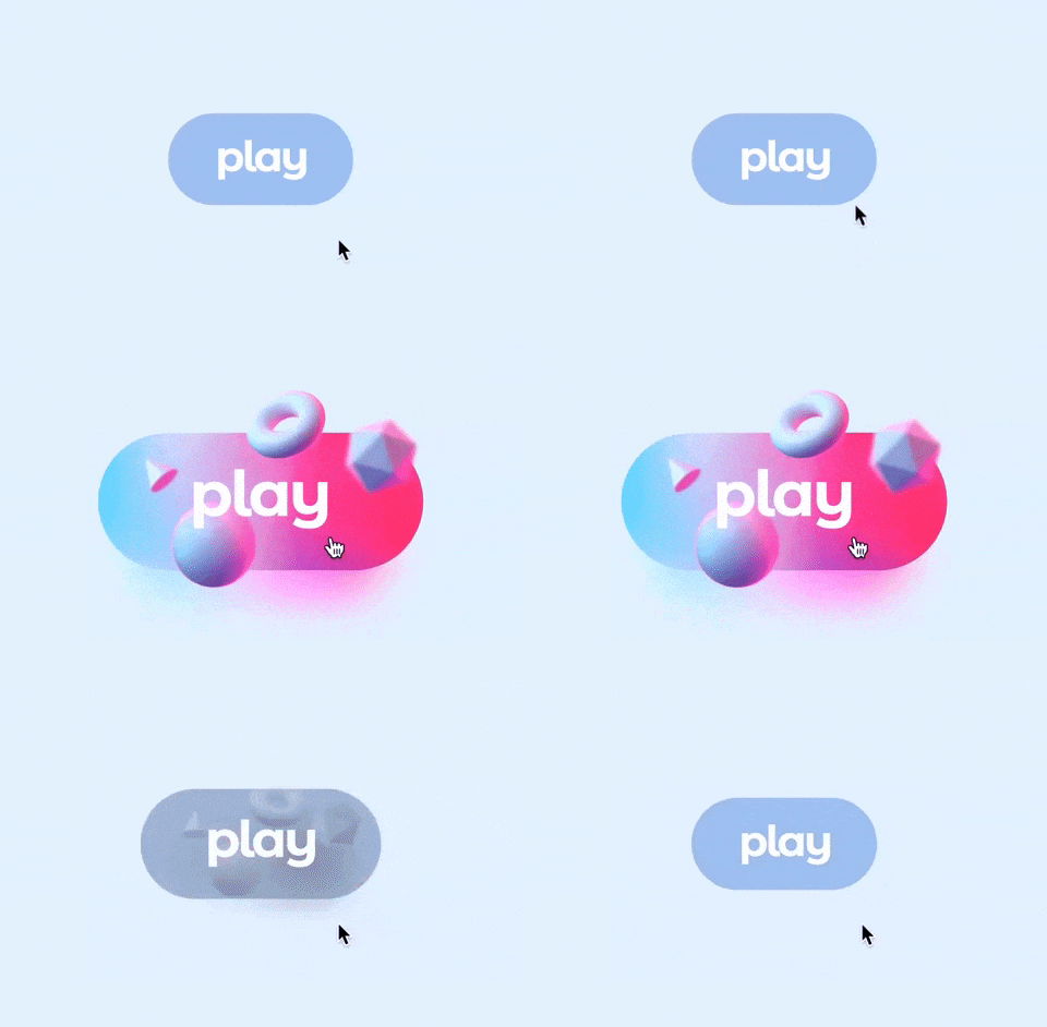
1. Eye-Catching Hover Effects

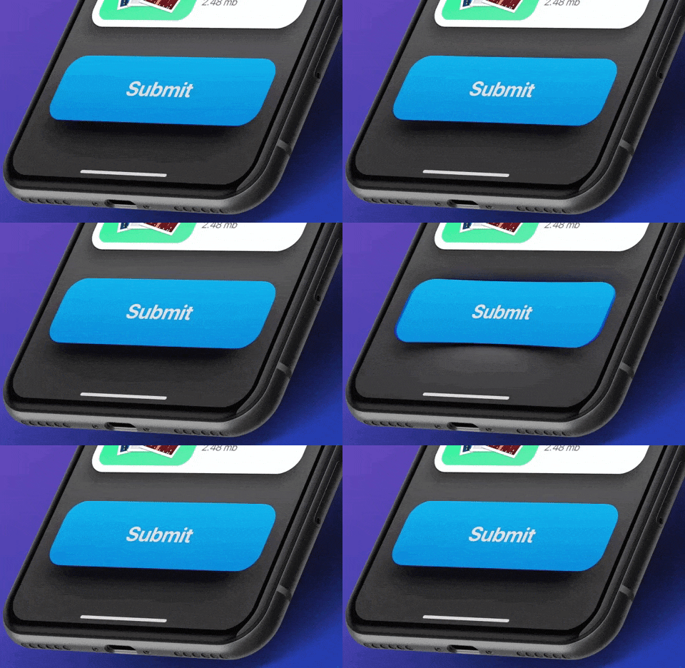
This Framer button uses a very appealing hover effect. When users move over or across the Play button, the whole button bounces out with a cool 3D Gradient design. Once users move the mouse cursor away, the hover effect will suspend completely. Such designs are eye-catching and interesting.

Video showing buttons in UI
Edoardo Mercati

What can you learn:

You can add various hover or interaction effects to optimize your button designs in your app or web design. They could be very useful to entice users to click and go to the next stage, such as playing a podcast, buying a product, filling contact information, or reading more details, etc.

You can add some changes in colors, shadows, shapes, texts, opacity, frames, and animations of a button according to your action requirements to make it more attractive for users.

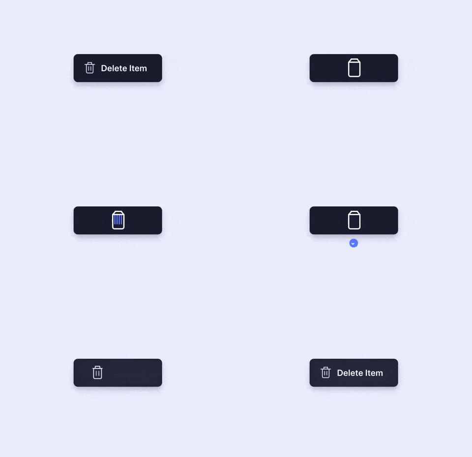
2. Microinteractions for Delete Button

You can show the functions of buttons more vividly by using “button + animation ”. Once users click a button to delete, the action gets depicted by an animation showing the file getting shredded. This is a vivid and imaginative way to showcase the “delete button”. It is an effective way to engage the users while they delete multiple files.

Animation showing button in UI
Aaron Iker

What can you learn:

In your button design, you can add vivid animations to your buttons based on different scenarios, features, and labels to make your buttons outstanding and appealing. Overall, this is excellent to improve user experience.

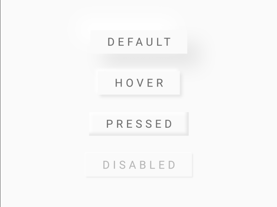
3. Provide Feedback with the Button States

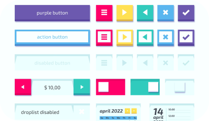
You should always let users know that the command was registered and promptly. This requirement isn’t about how the button initially looks to the user; it’s about interaction experience with the UI element. A good way to make sure nothing is lost in transition is to define the button states in your button design.

Image showing different types of UI buttons
Ryan

What can you learn:

Usually, a button isn’t a one-state object. It should change its state to let the user know that appropriate action is being taken. It becomes essential to provide visual feedback to users to indicate the current state.

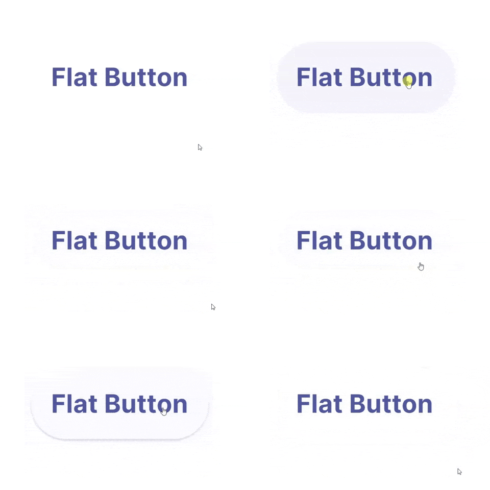
4. Buttons with Shadows and Highlights

Drop-shadows make the element stand out against the background. They also highlight it as a clickable or tappable element. Objects that appear as raised give the impression that they could be pressed down. They’re also useful for improving the visibility of light-colored design elements, especially text. Even with flat buttons (almost flat, to be exact), they give subtle interactive cues.

video of buttons in UI
Lucas Haas

What you can learn:

Shadows are key entities in telling your users which UI element they are looking at. Users understand that the element is interactive if a button casts a subtle shadow.

5. Floating Navigation Button

The tooltip uses a very cool floating button that attracts users’ attention and extends the functions of the web/mobile app. It is eye-catching and useful for your users and allows them to easily switch and choose other parts of the web/mobile app. And in this way, such floating buttons can be really interesting, attractive, and impressive for users.

Animation of buttons in UI
Milan Raring

What can you learn:

In your mobile or web app designs, you can create similar multifunctional navigation buttons floating in an interface to extend the functions of a mobile/website app. You can also customize a special way to expand the functions, options, or menus based on users’ interaction with these floating buttons.

Conclusion

Buttons are going nowhere! They will further evolve and get more interactive. Plan them with the utmost consideration, so that your users can enjoy the micro-interactions. Make them flashy, make them intuitive, and make them useful – and let users engage with your application.

A comprehensive guide to Mobile App Design

2.56 million and 1.85 million.

According to Statista research, these numbers are the number of applications available on Google and Apple’s app store, respectively.

Each one of these applications is trying to solve a problem. Problems like payment friction, learning, boredom, and whatnot. A million solutions for billions of smartphone users.

But, bear in mind that a problem can be approached in numerous different ways and not all solutions are up to the mark. Most of the apps are not thoroughly researched or planned and hence lack in UX, functionality, optimization, etc..

Having delivered 80+ successful enterprise and user-facing apps, we have learned and curated a set of best practices that help us deliver flawless mobile solutions. Here’s a comprehensive guide to Mobile App Design.

Establishing the ‘Why’ of your app

Trees with question mark on it

Yes, this is an obvious one! Some things that will be established after you have had your ‘eureka’ moment. Meaning, you know that you have to design an app that will solve your user’s problem with ease but you need to dive deeper.

To facilitate this, answer all the questions below before you jump in the design and development phase:

  • What is the problem that you are trying to solve for your users? (like assessing users mental health)
  • Can you define your app’s aim in a single sentence? (This will give you a precise answer to the question above)
  • How do you plan on solving the problem from your user’s viewpoint (and not yours)?
  • What is your USP?
  • How many competitors are there in the market and how do you plan to differentiate your product offering?
  • If your idea is unique, how do you plan on educating your potential users and convincing them to download your app?

These answers will lay the groundwork for your app thus it’s vital that they are clear and understood by all your team members. Write these answers, print them out, paste them in your office, but ensure that everyone is on the same page.

You can always go back to the answers in case there is a detour in your journey.

Creating a functional design

Two smartphone laid on a table with their displays on

Now that there is crystal clear clarity (pardon the alliteration), it’s time to design your app. You should start with wireframes and prototypes for validating your idea. Some tools that will help come in handy are:

  • Sketch
  • Axure
  • Miro
  • Adobe XD

People spend the majority of their time on mobile apps. This implies that the users are hooked to a certain set of apps. How to get in this inner circle?

A clean, simple, and intuitive UI is the answer. This seems a bit vague so let’s define some tips and methods that will help us here.

Storytelling via your UI

paper sketches of an app

We all love stories and mindful endings. And this can be done via your copy, illustrations, animations, etc. Storytelling will help your users share your vision and have better clarity of why your app exists.

  • Make your UI copy conversational and avoid jargon at all costs.
  • Leverage tooltips for better engagement.
  • Be clear when sending out an error message. Pinpoint whatever is wrong or missing.
  • Come up with a pleasing onboarding process

Thus you can humanize your app via a story and it gives the users a chance to look into the vision that you have for your app.

Familiar App Navigation

Person sketching mobile screens

Design your app in such a way that your users need no additional directions to navigate your app. We do not imply that you should copy from competitors. Rather, look out common practices that your user is habitual to, irrespective of the app category.

Stick to using UI elements like hamburger menu, tabbed navigation, or skeuomorphic icons, and so on. The aim is to avoid surprising your user on every click.

Keep in mind how people hold their phones

People holding their phones

We all hold our phones in many ways. Holding it in both our hands in landscape mode, holding the phone in one hand and using the thumb to scroll, using both hands for operating, etc.

Whichever the way, ensure that the vital interaction buttons are within the thumb’s reach and not in the stretch zone. Place the key functionalities and information somewhere in the center. And no elements are hidden behind fingers and palms.

Touch targets

graphic of bubbles

According to MIT’s Touch Lab’s Study, 10mm by 10mm is the minimum touch target size. We have to design for fingers and thumbs, not for cursors.

You can increase as per your need. Say if you are focusing on the elder demographic via your mental wellness app, it would make sense to increase the touch target’s size.

Also the spacing between touch targets should be adequate. They should not be so close to each other that it leads to wrong selection.

Use Established Gestures

person holding a phone perpendicular to their body

Using the same gestures may seem like a creativity barrier but if you don’t do this, your users will suffer.

Scrolling up and down, pinching for zooming in and out, etc should be used wherever possible. Also if you do wish to deviate a little, inform your users and even better demonstrate it for them so that there is no confusion.

You can also test this in your hi-fidelity prototypes to see if your users are struggling with understanding and using the different gestures.

Consistent layout

person holding a phone in front of their computer

Consistency is the lifeline of good design. You can design such an app via:

Visual hierarchy and weight via color play, typography, size, etc.
All your interactions, gestures, navigation should follow the same pattern throughout your app.
Your design should look the same across varying screen sizes and platforms.
If you have a live website, you should aim for a similar-looking app.

Easy Onboarding Tour

person using a tablet device

As mentioned early, your onboarding is a chance to curate your story and present it to your users. Don’t miss out on this.

You should not overwhelm your users with all the information in one go. You will turn your users away even before they complete the onboarding. Your tour should be a progressive one, encouraging users to keep moving on.

Break the information into smaller sizes for easy remembrance. And give the option to skip and resume the tour as per the user’s convenience. This gives the user the control and thus motivates them to interact more.

Keep the sign up simple and give the option to login via social media accounts. If possible, ask users to sign up in the later stages of onboarding. This way you get to highlight your value beforehand, thereby reducing the churn rate.

You will also need to take care of these practices –

  • You should have in-app search functionality, especially for ecommerce websites with huge product offerings.
  • Deter from asking unnecessary permissions. Continuing the above example of a mental wellness app, asking access to messages and contacts may not be well received by the user.
  • Minimize your user’s input. Enable autofill for your forms to speed up the signup process.
  • Keep your notifications to a minimum. Frequent notifications are annoying and may result in the users switching off the notifications altogether.
  • Optimize your app for voice search.

Your app should be designed in a way that your users do not think about the design of your app rather they focus on its functionality.

Testing Your App

person holding a phone while taking notes

Once you have invested your time and effort into designing and developing your app, you should test your app’s beta version on a focused group. Ask them for their honest feedback and improvement areas.

You have to test for your app for:

  • Functional testing for seeing the working of the functions and features.
  • Performance testing under different network bandwidths, older mobile devices, and servers.
  • Accessibility compliance
  • Interruption testing for how the app behaves upon incoming calls, notifications, low battery warnings, any cable attachments or detachments, etc.

Ready, Set, Release

After you ensure that your app is good to go out in the app world(s), sit back, and hit the launch button.

A side note here, things may not go as expected post-launch, so you need to have an open mind and pay heed to the feedback from your real users.

We, at Galaxy Weblinks, have been on this rollercoaster ride of app design, development, and release a good number of times, in case you wish to talk to us about your app and even new ideas, you can get in touch with us here.

5 Useful Tips For UX Designers 

How often does it happen that we put in days and weeks in designing the perfect UI design thinking that it will be a user delight.

But when the first analysis comes in, the numbers paint a different and a rather disappointing picture.

Every UX Designer under the sun has gone through this situation. Sometimes an overabundance of creativity can make us overlook the default practices.

In one of our previous blogs, we talked about the layout fundamentals that will ensure an attractive UI design. Taking that thread ahead, this article would highlight the UI tips and tricks which will work in improving your overall design.

Recognition Over Recall

App icons

In Jakob Nielsen’s 10 usability heuristics, he recommended recognition over recall.

For instance, it is much easier to recognize the skeuomorphic shopping cart icon when shopping online because it is easily relatable with our regular shopping experience. If we try to replace this shopping cart icon to another icon, say cards (signifying payment), it will be hard for the users to recognize and relate to it.

The recognition time is much shorter than the recall time due to the simple fact that our brains are wired to recognize the things that we see frequently as against fairly new ones.

Use industry standard visual cues, layouts, patterns when designing tooltips, icons, buttons, etc.

Give Feedback To Your Users

loading sign painted on a wooden fence

Just like we accept a response from the person we are in conversation with, the same goes when interacting with websites and apps.

Additionally, the absence of human interaction on the web necessitates a response for letting your user know what’s going on.

Common feedbacks can include:

  • A single change in color of interaction buttons
  • Letting your users know how much the load time is
  • Their progress on the tutorial and the product tour (if any)
  • Letting them know the exact requirements when creating new passwords
  • Pinpointing the error when filling out long forms

You can leverage microinteractions to keep your users engaged. Microinteractions are the cherry on top of your beautiful UI (that is if you like cherries :p).

Rotating buttons, color changes, different cursors when on links, etc are all great and subtle examples of microinteractions.

Design An Intuitive Navigation Route

Aerial picture of cars on a fly-over

This may sound a little vague so allow me to elaborate.

When we say intuitive navigation, we refer to the predefined routes and interactions that a user is likely to take. When your users pause to understand a certain function or take time to complete any task, look into the navigation route again.

Try to point out why your user left your website or app in the middle of the product tour. Were they given the option to skip the tour or they simply abandoned it in between?

Was there something that distracted your users? Perhaps they got confused because of the different elements present, etc.

We recommend that you try to anticipate where your users can get stuck and change it accordingly.

The idea behind an intuitive design is that it confers to the established patterns of the industry or from the market leaders as well.

Let Your CTA Stand Out

Sale poster outside a shop

This should ideally be a given while designing a winning UI. However, there is a big possibility of missing out on this one when you are in the flow.

We recommend that the CTA should be the most highlighted element on the page. You can do this via color play, text labels, font, and varying size, white space, etc. There should be no other element more enticing than your CTA.

Another point to keep in mind is that the CTA copy should be short but concise. CTA, in our opinion, should not exceed 5 words (ideal limit being 3 words). Avoid multiple CTA, for this reason, read the point below.

Limiting Your User’s Cognitive Load

Chess board

What do you think is easier, ordering from a 3 items menu or 30 items menu? For most of us, it would be 3. When offered with multiple options, the human brain tends to be indecisive.

Also, according to psychologist George Miller’s theory of chunking, humans’ working memory is capable of handling seven plus or minus two “chunks” of information.

When we tend to put a lot of information out there, the majority of it is bound to be forgotten by your users and even overwhelm them. Thus, why not limit it from the beginning itself?

You can always try to break down all your information into simple forms or categorize them to reduce crowding on any given page.

We know how difficult it is to design something that resonates with a wide demographic and we also know for a fact that it’s impossible to please every single one of your users. These tips will ensure maximum engagement and stickiness.

And if you want the UI/UX specialists to analyze and help revamp your UI then get in touch with us here.

Instagram Made Me Rethink About Touch Targets

I’m sure you might have come across numerous articles on the web that talk about why we need adequate touch targets for each interactive element on any touch-based interface. (Especially mobiles which have a relatively smaller landscape.)

A ‘touch target’ refers to the area associated with an element that triggers the interaction when users tap on it. This area usually extends beyond the visual shape of an element when it isn’t an explicit part of its design.

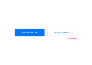
Have a look at these two buttons, for instance; one is filled while the other is just textual.

Even though the button on the right does not have a visual shape like the other one, its touch target (although not explicitly visible) extends way beyond the text area.

Ideally , these touch targets should be at least 1cm x 1cm (or 38px x 38px) in size, as suggested by Nielsen Norman Group, to promote better capability for users.

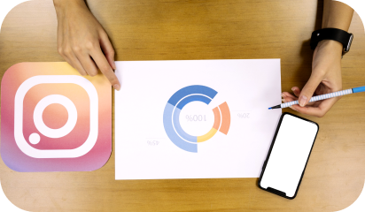
Now, I’ve been an avid user of Instagram - which I’m sure you may know, has been one of the world’s most popular apps for quite a long time now - and lately, it struck me that most of the elements on its interface do not follow the common norms for touch targets.

Have a look at this shot, for instance.

Horizontal spacing

In the first highlight, you may notice that all the tags are very close by with hardly any horizontal space left in between. When tags are relatively long, they are much easier to tap on even if they are set close to each other.

Vertical spacing

This type of spacing is usually more concerning in the case of small screens, as no matter how big an element is horizontally, if it is stuffed tightly between two other interactive elements, it’ll be difficult to tap on it.

The same is happening with elements in the second highlight. The action to ‘view comments’ and the ‘profile names’ are very closely stacked.

Another example would be the location link just above the picture in the shot below.

Despite all the discrepancies in spacing, I do not remember a single instance wherein I tapped on an element which I wasn’t intending to tap on!

And I think most of you guys did not, either. Unusual, right? Considering how tight those elements are spatially.

This leads me to believe that the area that we cover when we tap is not that large, after all.

The bigger yellow circle has a dimension of 1cm X 1cm (or 36px X 36px), while the smaller oval (formed by tapping with the right thumb) is 24px (or 0.6cm) long and 15px (or 0.4cm) high - which is essentially how much area we cover while tapping - and it may even be smaller.

If we go by this logic, maybe we can mend our designs to fit more content in a relatively small landscape without sacrificing accessibility… or not? I’d love to know your thoughts on this.

7 layout fundamentals for that oddly satisfying UI

We all love harmony in our lives. Harmony of tones and hues, of perfect shapes and negative spaces. Be it in music, interior design, or on the dense pixel sheet of our workstations.

Often times this harmony is disturbed by all-out arrangements of elements, essential or not, in tiny places. Resulting in claustrophobic or anxious experiences, like the one we have at a cluttered desks or rooms.

And you most certainly don’t want your users to feel that way about your app or website. A good visual hierarchy which takes spacing, fonts, colors etc, all into consideration helps in coming up with consistent and clean UI designs.

To ensure that users don’t abandon your websites citing cluttered design or app as the reason, here are some layout fundamentals that will help you in creating an eye pleasing design.

Use Grids

Person holding a phone

We all started learning numbers by writing them in square grid notebooks and continued using it for handwriting practices as well. Grid style is implanted in our minds without us being aware of it. Even painters don’t shy from using grids as an assistance to picture all the elements of a painting.

It helps in accurate spacing out and ‘social distancing’ of interactions, images and content within your design. The grids are not visible to your users, but anything out of alignment will catch their attention first (unless that is your intention). Thus, designing without grids will lead to inconsistent design.

A popular argument against grids is that it limits the creativity space of the designers. However, we believe in deploying grids from initial phases itself, and then move 1-2 elements which we want to be the spotlight. This ensures consistency among our designs and at the same time, we are able to get the users attention in a short span of time.

Scanning patterns

Many studies have confirmed that we scan content or texts from left to right and in patterns, the most popular ones being ‘F’ and ‘Z’. Your users do this to find information which is relevant and interesting to them.

‘F’ scanning pattern is subconsciously carried out in cases of content heavy websites like informational ones, news and magazines, blogs etc.

‘Z’ scanning pattern is done which has lesser content and which require less scrolling.

Once you know your visitor’s attention points, you can place your CTAs, value addition information and interaction buttons accordingly.

White space

picture of a foggy mountain

Negative space or white space is a vital component of visual hierarchy. White space helps the users in accessing an element’s importance. If there is a lot of negative space around an interaction, users by default perceive it to be significant.

Adequate usage of negative space will ensure that your users follow the pathway you designed.
Negative space will help in drawing your user’s attention to the elements of your choice and will increase the engagement rates of your website.

Spacing out the elements keeping this in mind will assist in creating a visually pleasing design.

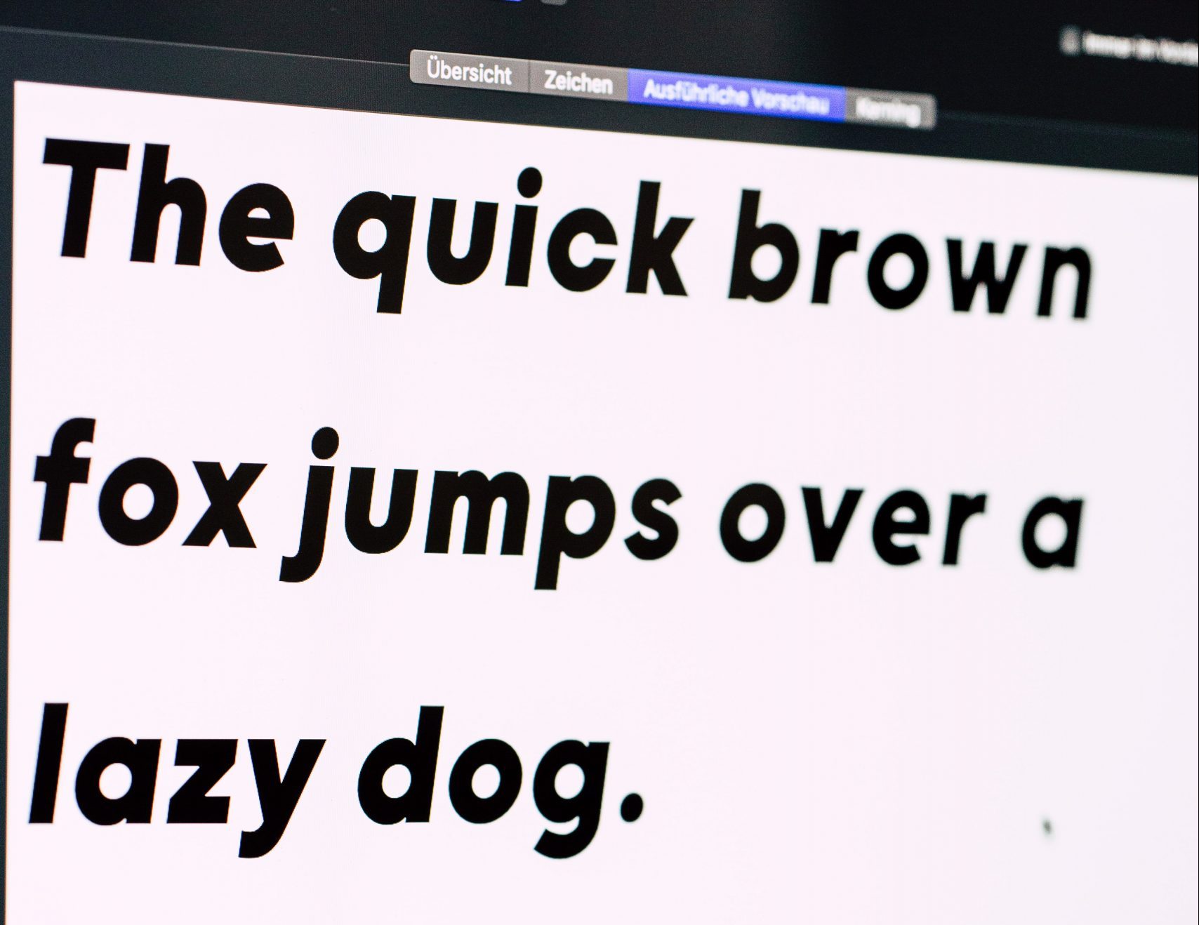
Typography

Text on a screen

Remember those calligraphy classes our mothers insisted on for improving handwriting? Don’t know about the handwriting, but calligraphy letters sure did look great on paper!

And yes, there is a difference between calligraphy and typography but both work on taking your content to the next level in terms of presentation and visual aspects.

Your content copy is what will your user understand about you and your organization. It will communicate who you are and what value you will provide to your customers. And the right typography will ensure that your users focus on the text written and have no criticism for the font selected.

Typography in practice is not choosing fonts or making fonts, it’s about shaping text for optimal user experience- Oliver Reichenstein

Using too many fonts can be distracting for the user. Instead use color, alignment, size and smaller variations to align with the importance of the copy you wish to highlight.

Golden ratio

Fibonacci spiral image

The golden ratio, 1:1.618 is a mathematical discovery. But in design, it showcases the best proportional size of the elements and helps in creating an eye pleasing website and apps.

It can be applied to every element of your design right from white space, buttons and interactions size, typography, images and icons.

The overall design should also be in this proportion. Applying this ratio, ensures harmony and reduces any clutter or visual noise in your design.

Color Play

Picture of a test business card design

There are hundreds of emotions and moods connected with colors. The good (or bad) thing about colors is that they run their own show. Meaning, each color has a defined effect, the bright ones taking the center stage themselves, while the dull ones remain backstage.

Here also, taking too many different colors can strain the users eye and ruin the virtual experience. Colorful things do attract people but only to a certain point.

Even if you do wish to experiment with colors, you can come up with a color palette having a mix of colors belonging to a similar color family.

For interactions like CTAs, buttons, you can opt for bright or dark colors for getting your user’s attention. You can always play with the brightness, hue and saturation of the colors for establishing visual hierarchy.

Size

Sketches and a tablet laid out on a desk

Any large object put in an empty room is bound to attract visitors, moving past all the other objects. The same applies to your virtual contact points.

Size of icons, buttons, images, logos, interactions will be the deciding factor for all your users. Starting with larger objects, designers then size down as a visitor scrolls down the page.

A side note here, once the largest object is fixed, other elements should have a considerable difference in their size, otherwise there the design will become cluttered.

All the points mentioned above, when stitched together, build an UI that enhances your user experience by laying the foundation of a good visual hierarchy. Missing out on any points will lead unnecessary visual noise.

A good design is when your user is not bothered by your design in the very first place. Looking for a partner that can do the same for you, talk to our designers here.

How we make remote design sprints work?

In an ideal scenario we would all be working alongside our teams in our lovely workspaces built for maximum productivity and collaboration. But since that is not the case and will remain unchanged for a while, the only option is to adapt. Considering the circumstances our design team like every other team has gone completely remote and to be honest, it’s not easy.

But processes help. Here is our process laden with some good practices that helps us retain our productivity in a remote environment.

There are numerous questions associated with the who, what, and how of collaboration. Like, who all should be included, how to manage the time zone differences, which tools and exercises to be conducted, and lastly, is it even possible?

We will address the simplest query first – Yes it is possible! Read on to know how you can manage the other aspects that we mentioned.

Tools that make our lives easier

screengrab of trello and asana

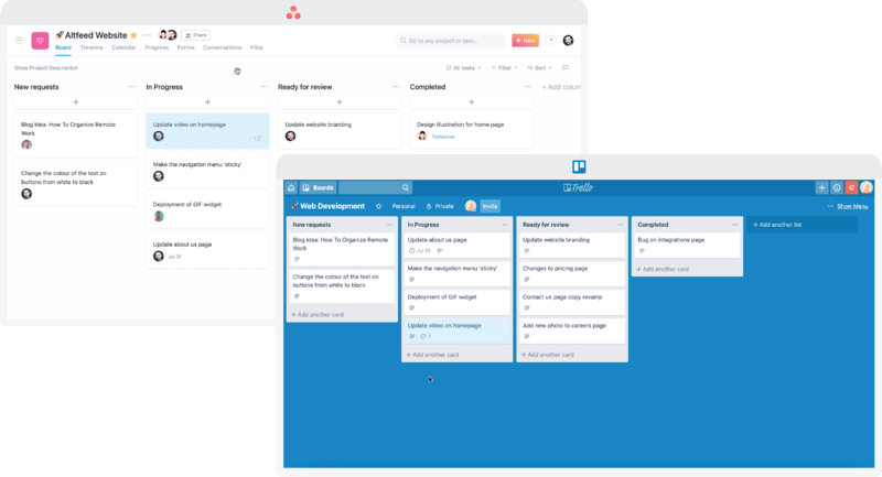
We have Trello and Asana for project management. These tools come in real handy when you have a team working on multiple projects. You can make separate channels to keep different projects and related conversations unaffected from other projects. And for communication, Slack saves the day for us. It also lets us separate our sincere work conversations from our casual chats via channels. For video collaboration we use Google meet and Zoom.

Choosing the right suite of tools reduces half of your work/collaboration effort. They might vary for you so do your research and choose wisely.

Meticulous planning and preparations

video call screengrab

We start with a brainstorming session which sets the precedence for the sprint, wireframing and designing process. This chalks out a roadmap for reaching the solution. To make things easier for all the stakeholders involved, our project managers prepare a design brief that answers some basic questions at the outset. It includes:

  • Selecting the right participants
  • Informing everyone about the aim of the meeting and what roles will they play
  • The meeting’s specifics, including the time and date. Making a calendar event for this works out well for us.
  • Stationary and technical requirements, post-its, colored sharpies, quiet background, good internet connection that will allow all-day video conferencing, software to be used, as well as incorporating suggestions from the participants.

Once the brief is sent out, we do follow up calls with the participants. This will ensure that everyone onboard is on the same page to avoid any delays once the meeting starts.

Starting the design sprint

Interface sketches

This elaborate planning is put to test here. We carry out two exercises

1. How might we?

This exercise helps us answer the fundamental questions of the application.

For example, your team is creating an app that helps to keep track of a user’s pet’s meals, vet appointments, exercise timings, etc. You can start by thinking about how you might attract the right set of audience, encourage them to use the app as well as address the different problems of pet owners.

All these “how might we” questions will help you come up with an outline of your product or service. Each team member can come up with a few specific questions that will show possible directions for designing and prototyping the project.

2. Crazy Eights

Crazy Eights has helped us come up with some of our most creative ideas. Everyone on the team needs to come up with 8 different ideas. This gives us a lot to choose from and mix-up the ideas to come up with the best designs.

Creating a prototype and testing it with users

Person holding a phone in front of a laptop

In this stage, we work on combining the ideas to reflect well into an interactive prototype. We build wireframes using Axure and Invision helps us add interaction to our presentation. This is then followed by high fidelity prototypes using Sketch or Figma.

Once the prototypes are built, we bring in unbiased users to put out ideas to test. We leverage UserTesting.com to conduct the testing process with our users.

Conducting remote testing

Person taking notes in front of a laptop

  • You should be able to see how is your user interacting with your prototype
  • You can communicate with them continuously for smooth interaction
  • Remote testing should not affect the overall process and thus give the most accurate results.

We test run our setups for avoiding any hiccups once the users are onboard. This saves our time and ensures a smooth testing routine. A Google sheet is created by our team, which pools together all the answers in one place for the questions asked.

This sheet has answers related to the overall app idea, problem areas, and specifics related to the app design. All these answers are shared with the interviewer who evaluates the answers with what she/he observed during the testing. If possible, we do live recording of the users when they are interacting with our prototype, with their permission. This live recording helps us eliminate any biases that could be done subconsciously from the user or the interviewer’s end.

Final takeaways

After successfully running remote design sprints for the past few months, we have come up with a list of prerequisites for running this process smoothly.

  • Live video conferencing is a must at all stages accompanied by a good webcam and microphone. A reliable internet connection helps avoid any lags or connection drops.
  • Setting up meetings considering all the time zones differences. We use World Time Buddy to schedule our meetings. In case you are spread all across the globe, you can keep rotating the meetings to make it easier for everyone involved. You can also record your meetings for the participants who were unable to attend.
  • A quiet work environment during this sprint. This helps in minimizing any background sounds and distractions, thus keeping everyone focused on the tasks at hand. With all of us working from home, this can be a bit difficult, but you should encourage your team to keep this in mind.
  • Have one on one conversations before and after the sprint to see how efficient this process was for everyone involved. Any troubles faced by your teammates will surface on these calls. This feedback loop is aimed at improving this process.
  • Your tool selection should take into consideration all the stakeholders involved, and how comfortable they are with the tools.

To Conclude

Planning and executing remote design sprints is a daunting task. We have been collaborating remotely before this pandemic confined all of us into our home. Over time, we have improved our process with constant evaluation and tool selections.

We would love to collaborate with you virtually and integrate our learning within your projects as well. You can get in touch with us here.