User Onboarding – Principles and Best Practices

A good user onboarding flow is much more than a simple tour of the product. Designing a good user onboarding process is essential for product growth and user retention. Without it, you may risk the retention levels plummeting. A product that does not assist the user in understanding its utility has a very low level of engagement.

That is true for any product, physical or digital. Try something that isn’t intended to be simple and self-explanatory. Remember the last time you bought something new and read the instruction manual before using it?

Continue reading for some core principles and best practices with fantastic examples!

Why User Onboarding?

According to a Profitwell user onboarding study, customers who said they received good onboarding on a new product were between 12% and 21% more willing to pay than the median. Users who responded negatively had a willingness to pay from 3% to 9%, indicating that poor onboarding does not necessarily detract much, but your product may lose a good willingness to pay.

However, retention is where things get interesting. When comparing the first 60 days of customers with poor integration perceptions to those with positive perceptions, customers with positive perceptions fall much lower in the first 21 days.

And they conclude that good onboarding is critical to encompass the value of a product with a customer or, at the very least, mitigating the slippage your customer will experience when you begin using the product. Especially for him or her to begin to see the value, significantly speeding up their journey.

However, this isn’t the case most of the time. Every step of the way, there’s a hidden risk of that user clicking the little red ‘X’ and never returning.

It occurs between 40% and 60% of the time.

It is rightfully referred to as the SaaS killer! Fortunately, that’s what we’re here for. We will share with you the 3 Principles of User Onboarding that will help you immensely. 

#1 For a business to succeed, onboarding must be a continuous process.

It all starts and ends with the idea that onboarding is a continuous process. Anything you look at can be viewed through the lens of Onboarding. Is this beneficial to the user? Is this moment clear to him as he navigates through your product offering? If we stop looking at the user’s journey at some point, what was once simple becomes a supplement that will require human assistance to solve. This is closely related to the day one mentality, in which every day is like your first day of attempting to assist the user.

#2 Onboarding is not a metric; it is a result.

That means we shouldn’t measure onboarding. We need to know how many users are registering, what the dropout rate is, and where, if any, our product’s “bottleneck” is. All of this is critical. The issue here is that the metric is the result of a job. If you follow the first principle (user obsession), this will almost certainly have a direct impact on the outcome. And how can the results be improved? Talk to your user all the time; don’t let this opportunity pass you by. Assist your user, and the results will follow.

#3 Obsession with Onboarding

Obsession with making your life easier and assisting you in getting started with your product. Obsessed with assisting the user in getting started autonomously without the assistance of others. It is unlikely that the user will engage if he or she is unable to enter your software or get started with your product. Understand your users’ realities. You don’t want to design for a market you’re unfamiliar with.

We’ve compiled six best practices for user onboarding to help you achieve your goal of converting new users into fully engaged customers who have integrated your product into their lives.

#1 Reduce Friction

Make experiences simple and practical! Determine what is not required to perform the key action on your product. Initial barriers are responsible if the user is abandoning just after the first few steps. Consider whether the content being inserted assists the user in achieving their goal or if it serves to solve a product problem. Even if the implementation is complex, the paradigm shift here is to guide decisions to solve problems for users.

Notion determines the type of account and requests authorization (if it is a Gmail, Hotmail, or similar account).

Source: Fullstory

#2 Know your customer and their needs

Sift Science has identified the two most important motivations of their ideal user: fighting fraud and preventing bad users. This onboarding model reassures the user that they are in the right place and reminds them of the value of the product.

Source: Sift Science

What is the reason your customers require your product?

If you don’t understand the big “why” for existing users, you won’t be able to master new user onboarding. Conduct customer surveys to learn what customers truly get out of the product, and then design your user onboarding experience around that value.

To properly serve your customers, you must be aware of the following:

  • Who are they? (e.g. their role)
  • What they desire (e.g. the metrics they care about)
  • What is the pain that your product alleviates?
  • What tasks must they complete? (e.g. what they report in their standup)
  • What is it that would prevent them from using your product? (e.g. what they consider risks)
  • The reason why any churning users end up churning (e.g. where they got stuck)

Once you’ve mastered these crucial (but easily overlooked) details, you can start treating user onboarding like a jigsaw puzzle rather than a guessing game.

#3 Use an onboarding checklist

A great way to organize your user onboarding is to create a checklist with a progress bar that includes all of the steps your new users must take. Checklists naturally elicit our desire to “close the loop” and encourage users to implement the key activation points. Add an incentive at the end, and you’re set.

Source: Postfity

Make it clear what skill level is displayed, what should be done, and, most importantly, why it is necessary. People like to have a reason for doing something. The combination of these factors aids in the development of simple and objective steps. Display a few steps at a time, and if possible, divide the task into smaller tasks. A 10-step onboarding process is a lot of work for the user and a waste of their time.

#4 Remove barriers to the Aha moment

An empty account equals an unsuccessful user on a platform that thrives on user content. Wistia lowers the barrier to entry by providing users with three simple options for getting started.

“Aha! I completely understand. I need this.”

That is what you want your users to experience as soon as possible. The Aha moment occurs when users recognize the value of your product and are willing to pay for it.

Source: Wistia

Tips for removing hurdles: 

  • Do not require account creation before attempting to use the product.
  • Request the user information in the later stages of onboarding
  • If you don’t have a free trial, share the Aha moment on your marketing site (include testimonials or highly relevant screenshot gifs).

#5 Videos for quick introductions

Videos are excellent tools for user onboarding. They can be used as a 1-2 minute introduction instead of a walkthrough or in a resource list. The more videos there are for highly visual products, the better. Why? Even if your user does not have time to use the product right away, they will remember it if they see someone else quickly reach the Aha moment. Snappa provides a one-minute blog header image tutorial so that users can see how useful the tool is right away.

Source: Airtable

#6 Webinars to help users master the tool

SEMrush has mastered the art of user onboarding webinars. Their “101” webinars teach new users how to use the platform, whereas their high-level SEO webinars increase user engagement over time, reinforce brand authority, and help push out content that attracts new users looking for professional development content.

There are few companies that do this well, but every SaaS platform has the opportunity to create introductory tutorials and professional development content tailored to their specific users.

Tailoring the onboarding journey does not end there 

Send emails based on behaviors such as time spent in-app or task completion after the initial welcome series to guide experienced users to the star features, and inexperienced users to the Aha moment.

Consider a project- or task-based trial rather than a time-based trial to avoid losing users who would be a good fit (just not right now)

Where in a user’s journey is it most likely that they will upsell and cross-sell? The answer will differ depending on whether the user is highly engaged or has not yet used the product.

Upselling and cross-selling can be automated by identifying the right subsets of users and presenting them with more product options. When you customize the experience and sell the right product add-ons to the right customers, you increase revenue while increasing customer satisfaction and delivering more value.

Every user onboarding flow differs depending on the type of product, but there is always an optimal way to entice users. We hope that the best practices and examples have provided you with some ideas for your next user onboarding design!

If you’re thinking ‘we do not have enough experience to deal with this or “what if I don’t have enough time”, contact us to get in touch with our UI/UX experts.

About Galaxy Weblinks

We specialize in delivering end-to-end software design & development services. Our UI/UX designers are creative problem-solvers with a decade of experience in all facets of digital and interactive design. We create compelling and human-focused experiences delivered through clean, and minimalist UI. 

Ecommerce User Journey – 15 Must-haves to Include

The COVID-19 pandemic had a significant impact on global eCommerce trends. With brick-and-mortar stores closing overnight, customers flocked to the internet to purchase their necessities. The pandemic hastened the shift to online shopping by up to five years.

mCommerce, or mobile commerce, refers to online shopping via a mobile device such as a smartphone or tablet. It will continue to grow in the coming years as a majority of people now prefer to shop on their phones. 

Even though mobile devices account for the majority of Ecommerce traffic, desktop sites have lower cart abandonment rates and higher average purchase values. Mobile Commerce is the way of the future, but if designers want to maximize profits now, they must improve desktop sites with Ecommerce UX best practices.

Yet, mobile sites fail to meet three key metrics: they have higher cart abandonment rates, low conversion rate, and lower average order values than desktop sites.

Four Crucial Pages of the Ecommerce Experience

Almost all Ecommerce sites on desktop rely on a similar sequence of pages to guide customers through the sales process.

  • Homepages that are uncluttered and offer irresistible value propositions
  • Category pages that are well-organized and simple to navigate
  • Product pages that have been polished and incorporate social proof and compelling content
  • Checkout pages that are simple to use, show progress, and make customers feel safe

Uncluttered Homepages

1. Product Names That Shoppers Understand

Internally consistent product names can be perplexing to customers. Provide context for decision-making. Names based on model numbers or underlying technology run the risk of alienating the general public. The same is true for titles that are overly cute or creative. Choose product names that indicate utility or value in the eyes of shoppers.

2. Enable Search From Anywhere

Ecommerce websites offer a plethora of products and therefore, the search feature becomes an essential way for customers to find products based on their requirements. Sticky search bars ensure that search is available everywhere on every page, but for the sake of conversion, it is best to remove search from checkout pages.

3. Highlight Deals and Promotions

Customers visit Ecommerce sites with a specific product in mind. Deals and promotions go unnoticed when they blend into homepages. Bright colors, bold text, and full-page photos are used in call-out advertisements.

If a promotion is the most important thing shoppers need to know about, make it the center of attention.

4. Make the Product’s Value Immediately Visible

Getting the product page right is important as first impressions matter. Customers must be able to quickly determine the worth of a product. We recommend that you assist the customers in visualizing how your product will solve their problems and improve their lives (the Jobs to Be Done framework is a useful starting point). 

Keep your product descriptions and technical specifications brief and to the point. Use photos and videos that demonstrate the benefits of the product. If the shoppers must read and scroll a lot, or watch long-winded explainer videos to understand the value, then you are doing something wrong here. 

Well-organized Category Pages

1. Display Best-Sellers

Bestsellers should be labeled with distinct icons or placed in bestseller sections. Why? Bestsellers provide social proof. When people are unsure, they will look to others’ actions to determine their own. This is especially true for first-time buyers.

A similar rule applies to newly released products. Displaying new and improved items is more than just a one-time sales tactic; it is a way to entice customers to return for future updates.

2. Ensure Ease-of-Use Navigation

The navigation must be simple. Customers should not have difficulty switching between category pages or enabling product filters. Sites with a large number of products in a single category should use left-column navigation to allow customers to sort products by various attributes (faceted search).

3. Display Products in Grids

Desktop screens provide ample space for product grids. Grids align with F-pattern scanning and allow shoppers to quickly compare multiple products. They are especially useful for items that are easily explained with pictures. To get the most out of grids, keep the number of items per row between two and four. Grids become significantly more difficult to scan when there are five or more products.

Bonus: List views can be useful, but they’re best for products that require more detailed explanations.

Polished Product Pages

1. Create large, eye-catching “Add to Cart” buttons.

When it comes to product pages, “Add to Cart” buttons must be visible. Make them large, contrast-heavy, and easy to click. Resist the urge to be witty and instead create call-to-action text that is clear and action-oriented.

When customers add items to their shopping carts, they must receive visual feedback. Many desktop sites do this with cart-summary overlays that slide in from the side of the screen for a brief moment (a creative way to allow shoppers to transition to checkout or keep browsing).

2. Upsells and related products can help you earn more money.

If customers are dissatisfied with what they see on product pages, they should not have to return to category pages to find other options. Show them alternatives at comparable price points or more expensive options with better features, reviews, or brand recognition.

It is also possible to suggest complementary items to the product page. Considering purchasing shoes? Why not get some shoelaces and arch supports as well? Make sure that related items have a “Add to Cart” option to reduce friction.

3. Make use of copy and imagery to demonstrate the good life.

Ecommerce content should be informative, but persuasion requires more than facts and feature lists. Use text and images to help customers imagine the good life that awaits them after they complete their purchase.

Again, desktop sizes are advantageous. There’s no reason not to use massive photos and videos or show products from multiple perspectives. The same is true for the copy. Don’t be afraid to use large headers and a lot of white space around text blocks.

4. Use Social Proof to Persuade

Shoppers are more likely to buy if they see social proof. Ratings and reviews have a significant impact on purchasing decisions, but desktop sites are large enough to accommodate other types of social proof:

  • Customer-taking product photos
  • Approval badges from independent review sites 
  • Celebrity and influencer endorsements
  • Expert quotes 

Social proof aims to make shoppers feel as if they are making informed decisions that are consistent with the positive experiences of others.

Simple Checkout Pages

1. Accept Various Payment Methods

When it comes to payment gateways, shoppers’ primary concerns are convenience and security, and these are two of the leading causes of cart abandonment. Fortunately, an increasing number of online payment options alleviate security concerns while also expediting checkout. Third-party payment options supported by well-known brands (such as Amazon and Apple) may be more appealing to customers than entering credit card information.

It is also worthwhile to consider “buy now, pay later” (BNPL) options such as Paypal Credit and Klarna. BNPL is a type of point-of-sale credit that allows customers to pay for products overtime after they receive them.

2. Give a detailed order summary.

This is highly recommended. We suggest that you provide shoppers with brief order summaries that include:

  • Details and quantities of the product 
  • A breakdown of all charges
  • Details on shipping and billing

It’s also a good idea to display product images, but make sure the attributes match the attributes chosen by customers (color, size, finish, etc.).

3. Think about Guest Checkout.

Guest checkout may not be appropriate for all Ecommerce retailers, particularly those whose business strategies revolve around the creation of customer accounts. It has, however, been shown to speed up checkout, prevent account creation fatigue, and reduce cart abandonment.

An alternative is to require email confirmation for orders, then follow up with deals in shipping and delivery messages.

4. Display Shoppers Checkout Progress

Ecommerce customers spend a significant amount of time and energy searching for products online. When they’re ready to buy, they want to know that the end of the process is near. A progress bar is a simple way to show shoppers where they are in the checkout process.

We hope that this practical piece curated from our eCommerce experience will assist you in developing the best Ecommerce strategy. And if you want to interact with your customers in a completely new way and increase your conversion rate, get in touch with our experts here.

About Galaxy Weblinks

Galaxy Weblinks is a company that specializes in creating the best online experiences for your users. We have experience customizing websites on a variety of platforms, including Shopify, WooCommerce, and Magento. Contact us today to discuss your Ecommerce project.

10 Design Principles for Exceptional User Interface

Creative visuals, attractive logo design, or intricate animations! What goes into making an exceptional user interface? A good UI includes a mix of factors that make it clear, consistent, simple, and user-oriented.

Defining the requirements of a good user interface is especially critical if you are considering outsourcing your project. Your design and development partner should understand the key principles that transform a user interface into a powerful tool for attracting new customers and retaining existing ones.

Let us go over the core principles of an effective and appealing user interface.

The 10 Fundamentals of a Good User Interface

Here is what goes into an appealing and intuitive user interface for a web or mobile application.

1. Consistency is the key

Source: Behance

In good user interface design, consistency rules the roost! Everything is affected, from the colors, icons, and fonts to the placement of menus and buttons. If changes are required and the designers who worked on the first version are no longer available, the situation becomes even more critical.

Top digital solutions do not astonish their users with radical changes. Instead, they use brand books and company style guides to maintain a consistent and unified style throughout UI design.

2. Hierarchy in screens

Source: Dribbble

Some inexperienced designers make the mistake of attempting to highlight everything on a single screen. Instead of guiding customers to a purchase or other desirable action, they bombard them with information.

That is why hierarchy is an essential component of a successful user interface.

It should be designed in such a way that users can quickly find the point of focus and understand what you’re trying to convey visually.

3. Flexibility 

Users now enjoy looking for a solution to their problems. That is why a good user interface should be supplemented with tabs, shortcuts, and hover tooltips. Such elements improve the interface’s usability and intuitiveness.

You may also like: 10 Tips to Improve Your Website Accessibility

For example, if an app allows you to upload photos, it should also allow you to crop, resize, rotate, and edit the image right next to it. The designers’ goal is to assist users in determining where such options can be found and whether such features are available at first glance.

4. Clear and intuitive user navigation

Where can I find the main menu? If you’ve ever asked yourself the same question, you’ve most likely encountered a poorly designed user interface. While visible to users, it should be “invisible” in terms of user disruption. A high-quality user interface should be well-structured and contain only the necessary elements.

For instance, a car-rental website should not be cluttered with unnecessary buttons, menus, and visual elements, but rather provide the option to rent a car right on the main screen. As a result, users will spend less time navigating your application and complete the transaction.

5. Target audience is well-defined

A digital product with a clear understanding of its target users has a better chance of retaining and engaging users. The primary goal of any web or mobile app is to alleviate the pain points of users, which is impossible to do without understanding how they interact with an application.

A good user interface is built on preliminary and in-depth market research, engagement of best practices from similar products, and evaluation of the target audience. This enables acting on a user’s needs and desires based on such an analysis and transferring the solution to the app interface’s pain points.

6. Transparency of user actions

When you click a button, you expect to see some sort of response. In UI design practices, leaving users without any feedback is considered bad etiquette. When users click on a menu, it’s a good idea to confirm the action with some sort of indication of successful operation, such as animation, color change, pop-up window, progress bar, and so on.

7. Limited number of gestures

Swiping, tapping, pressing, gesturing, or voice command are all options. All of these actions are used in the user interface to guide customers to the desired outcomes. Although it may appear to be a brilliant idea to use them all within an application, top interfaces such as WhatsApp or Facebook stick to a limited number of gestures.

When using an application, users should have a clear understanding of the actions that must be taken in order to achieve the desired result. If you tap to open a file, you should use the same gesture in all similar situations.

8. Additional tips and tricks

User retention is the primary task and, conversely, the primary challenge of any digital product. Fortunately, an effective user interface can help achieve the goal.

You may also like: 3 UX Gamification Techniques to Boost Engagement

Creating onboarding tips and showing them to customers is a good practice for very complex solutions. The UI carefully guides them through the app and helps them remember what each element is responsible for by placing small tips here and there, such as hover tooltips.

9. Attractiveness

This point is critical, despite being somewhat controversial in the eyes of some. A good user interface is one that is appealing and reflects the brand’s personality. Buttons, colors, fonts, and visual elements all contribute to a distinct brand story.

What appears appealing to one group of users may be repulsive to another. As a result, a successful user interface should be founded on extensive research. Furthermore, the visual aspect of user design should be used to reinforce functionality. Popular and well-known applications do not use colorful visuals that add no real value to the user interface.

10. Compliance with design standards

As previously stated, users must understand what to expect from a user interface.

Following Google’s and Apple’s primary and well-known design standards for Android and iOS is a good idea.

Take, for example, a search bar.

It is not a good idea to move it from the top of a page to the bottom. This way, the user interface will inadvertently make users struggle to perform actions that should be intuitive.

Conclusion

As you can see, good user interface design entails more than simply making an app or website look nice. It considers all of the users’ needs and creates an interface that reinforces consistency and assists users in completing their tasks in the most seamless manner possible. Use these tips as a guide for your next project, and you’ll be sure to deliver not only a functional product, but one that users will want to return to. 

Do you want us to get you or your company started on creating quality design components for your product? Reach out to us to get your project off the ground.

About Galaxy Weblinks

We specialize in delivering end-to-end software design & development services. Our UI/UX designers are creative problem-solvers with a decade of experience in all facets of digital and interactive design. We create compelling and human-focused experiences delivered through clean, and minimalist UI.

Mobile Navigation on Large Website – Tips, Tricks, and Best Practices

Designing mobile apps for large, content-rich websites comes with its own set of challenges. The alterations in viewport size now completely change the way we navigate a website. There are thousands of pages that need to be sorted and organized to make them accessible at a tap. You would also need to be sure that the users don’t suffer information overload. It’s a complicated puzzle that needs to be put together.

Here are some things you should know about mobile navigation and some best practices.

  • Menus: Utilize visual hierarchy to differentiate primary and secondary navigation.
  • Submenus: Avoid creating sectional menus. Allow users to peek into submenus via the dropdown or open/close menu.
  • You Are Here Indicators: Leave breadcrumbs for users to indicate their whereabouts. 
  • Navigating Between Websites: If you have multiple sites tied into the main website, then try to keep things consistent with headers and other elements. Link those headers in subdomains and landing pages to your main site. 
  • Site Search: Use keywords that your audience uses to optimize for search. All the pages must have proper context and details to land up in your target users’ search results.

Menus

Almost all the websites you’d see use the Hamburger menu for navigation on mobile. We have nothing against it but a little clarity goes a long way concerning accessibility. Here you can find alternatives for the Hamburger menu. 

Takeaway

  • A hamburger menu is a great option for tight spaces, but something such as a simple ‘Menu’ label aids easier navigation for all.
  • Larger sites are easier to navigate when menus are organized categorically, like primary and secondary navigation or based on user groups.

Submenus

The menus that expand by allowing users to open/close to see different submenus are very convenient. This way users can quickly sift through sections to find what they are looking for without going inside individual pages. 

Takeaway

  • Use dropdown or expand/collapse menu for deeper secondary and tertiary level navigation.
  • If you opt for section navigation, place it on the screen, where it is noticeable and close to the content.

Breadcrumbs

Your website’s page titles might match the navigation labels, but only a handful of users use this information to determine what page they’re on. A user should know the current state, if they end up at the same spot, again and again, it would lead to frustration.

Takeaway

  • Ensure that the user knows where they are on your website’s navigation to prevent frustration caused by getting lost. Also, provide a way back as breadcrumbs do.

Navigating Between Websites

When dealing with a lot of information, large websites divide certain parts of information or services into microsites. To ascertain that it doesn’t overwhelm users or cause any confusion, keep the headers consistent and link them back to the main site’s homepage. 

Takeaway

  • Use global headers to keep things consistent within sister sites with a link back to the main site. 
  • Use an offsite indicator if you’re linking the navigation menu to an external site.

Site Search

Optimize site search for keywords and keyword groups that your target users often use.

If your organization’s lexicon is complex and consists of internal lingo then confirm that your keyword search is equipped with auto-suggest. Often the page-based site search returns no results if there is nothing to be found corresponding to that keyword on that page. In such scenarios, the global site search could be of help and lead the visitor to the right place.

Takeaway

  • Use familiar keywords common with your target users to optimize site search
  • For large websites utilize global site search but with clear clues of visitors’ whereabouts.
  • Ensure that pages when landed on via any search—site search or a Google search—provide appropriate context.

Wrap up

While building large and complex websites mobile navigation shouldn’t be considered as an afterthought. Considering the massive adoption of mobile for internet usage, it could be a bad move to have botched-up mobile navigation for a large website. It could reflect badly on your brand, your products, and your services, as people might think of your offerings as not on par with the competition.

Our design experts at Galaxy can help you identify and solve these problems with you. Usability shouldn’t be an afterthought and mobile experiences are the backbone of any online business today, connect with us to make experiences that complement your business.

About Galaxy Weblinks

We specialize in delivering end-to-end software design & development services and have hands-on experience with mobile app and site design in agile development environments. Our designers, engineers, and developers help improve security, reliability and features to make sure your business application and IT structure scale and remain secure.

UI/UX Tips To Significantly Enhance Your App Design

Personalized communication, a friendly voice, and intuitive interaction are all essential components of application design. 

Do you want to create a technologically advanced product that speaks to the hearts of your users? In this article, you’ll get a taste of the best UI/UX tips for mobile app design in 2021 and learn how they can help you increase sales and retain users.

The Importance of App Design In 2021

Simple, human-centered app design is essential for building long-term client relationships. Not long ago, having an appealing and distinctive product design was sufficient. However, times have changed. The human-centered tips and tricks have completely replaced the system-centered approach and will be the dominant trend in 2021.

But first, let’s take a recap of the benefits of UI design.

Check out our list of 7 UX and UI tips and tactics that will help you achieve immediate growth while saving your brainpower for more complex UX and product challenges.

1. Declutter UI  

Too many design elements like buttons, images, text can make any phone app complicated and impossible to use. We recommend that instead of showing every task icon, you should reduce the user’s memory load by making the most important actions and options visible. The main CTA or navigation should be available at all times, not just when we expect a user to need it.

2. Use clear titles and status 

Users should be able to look at settings screens and understand all of the individual settings and their values with a quick glance. Display the status below the title to emphasize the importance of the setting. Instead of simply describing the title, show the specifics. Ambiguity should be avoided to ensure that users can access such elements when they are needed.

3. Make your dropdowns stand out

Dropdown options with search or auto-suggest options are useful when you have long lists where the user already knows the answer. We also suggest that you use whitespace. Even the subtle amounts of white space allow your designs to breathe and look more elegant. Whereas, adding images can be very useful when you want to show the difference between elements.

4. Save space with easy-to-recognize icons

Icons are easy to recognize at a glance (if well designed) – this is especially true for common icons that people have seen and used before. Icons do not need to be translated for international users. In short, the use of icons speeds up data perception and enhances memorability of the element via visual images rather than using text.

5. Grab attention with visual design in your CTA

Create a visual design to accompany your CTA. This will help to pique your audience’s interest and draw them in. Not a lot of people are going to pay attention to or click on a block text.

6. Never underestimate your empty states

Empty states are a great way to improve your product’s user experience, from onboarding to encouraging users to interact with your app. Tell your users to do something. Use-friendly and approachable copy in your empty state design. We recommend that you opt for bespoke and fitting illustrations. 

7. Design efficient forms

Organize related data into logical blocks or sets. The transition from one set of questions to the next will be more like a conversation. Grouping related fields together will also assist users in making sense of the information they must fill out.

Conclusion

At the end of the day, the user should have a smooth user experience without having to scratch his head to figure out how the product works. We understand our target audience before beginning mobile app design by creating lean personas, a customer journey map, and user research. So that it’s clear who we’re making the product for. The better you know your audience, the better the experience you can create for them.

If you do not have the necessary time and ample experience, contact us to get a free UX consultation.

About Galaxy Weblinks

We specialize in delivering end-to-end software design & development services. Our UI/UX designers are creative problem-solvers with a decade of experience in all facets of digital and interactive design. We create compelling and human-focused experiences delivered through clean, and minimalist UI.

Aligning UX Strategy With Business Goals

Businesses are ruled by customers and what they experience when they use your products or services. UX strategies help create coherent experiences across all the customer’s touchpoints. It comprises the plans and processes that would mold the design and development of your products. 

Here are some tried and tested key steps for aligning your UX design with your business goals and, ultimately, building a strong UX portfolio and a successful company.

Define business goals and objectives

Your design team should be aware of the business goals and a perspective on the various requirements and needs that your product is going to address. By sharing this information with the design team, they would give due diligence to the business goals while developing the product. 

To align UX strategy with the business, you need to understand and make everyone aware that UX is not a single person’s responsibility; everybody involved in product development is responsible. This implies that every team member will have ownership of the product. 

Keeping it simple helps in almost all the scenarios. When you are communicating business objectives to UX designers, try and do the same. Involve everyone from product leaders, stakeholders, designers and possibly, developers.

Start by answering these for clarity:

  • Users – Who are the users? Who do you target?
  • User needs – What are the problems that you want to solve through the product?
  • Product goals – What do we want to achieve? Be specific 

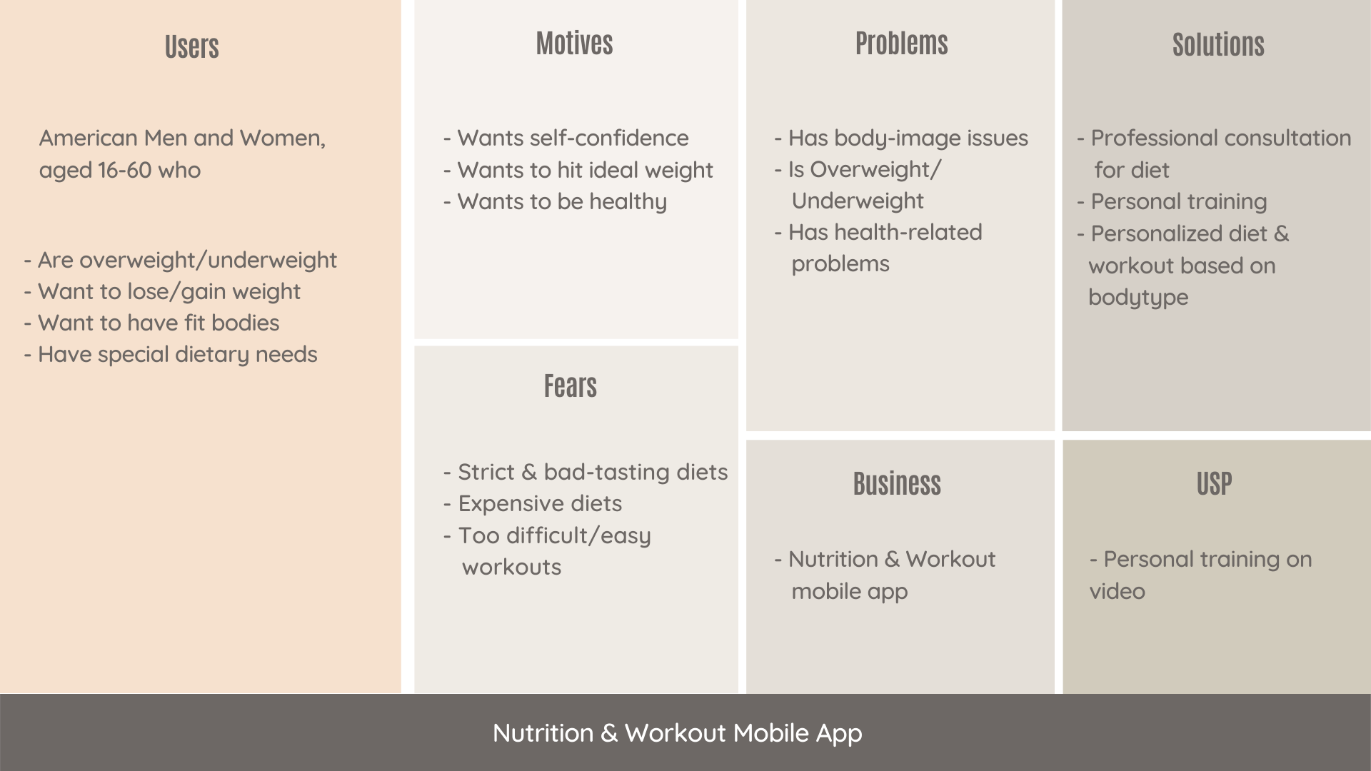
Introducing a framework can streamline your process and improve collaboration. We suggest you go with the User-Centered Business framework. It is very detailed and thorough. It is designed to highlight every important aspect of the product, business, and its users.

Here we have used a Nutrition and Workout app for example to showcase how the framework looks like. You can clearly see traits of users, what are their motivations, fears, and problems. And also how the app aims to solve problems and what is its unique offering.

Aligning

This framework focuses on –

  • Existing solutions – Initial research of what you’re competing against
  • Early adopters – Enthusiasts who test your products and do interviews about it
  • User fears – Addressing user fears with communication before it becomes a major pain point

Creating user personas

While building a product you need to find out what your users need. Once you find out what those needs are, then release features fulfilling that need. 

Personas are based on assumptions. However, you can identify and validate these assumptions with research and ensure that your personas fit the description of your target users.

A UX designer can take the help of these personas while designing for a paying user. They will know what benefits to talk about and what fears to address based on the persona’s fears, motivation, and goals. But everyone in the team must truly understand the product and its users to accomplish this. 

Aligning user needs with business goals

There is often a disconnect between user needs and business goals. And it’s no single person’s fault. Designers are just executing and the Product team is just building what stakeholders need. But in this vicious cycle, user needs remain unaddressed. 

When you start working within a framework–like User-Centered Business Canvas– and according to identified user personas, the business needs to start to follow suit. You just need to ensure that you define the business goal behind it with every stage of the framework. Like if the stage is Onboarding, you would have to define your business goals for onboarding and your expectations from users.

Here are some essentials to align business goals with user needs:

  • Test everything
  • Conduct interviews to validate the assumption 
  • Sort and prioritize features

Conducting design reviews

Feedback is a crucial part of any design process. It’s the only way to know if there’s any room for improvement. Design Review is an exercise to provide meaningful feedback to designers. All the attendees get a role assigned to them so that every individual can observe the design from a different perspective.

Here’s how to get started:

Invite everyone in the team, designers, developers, and stakeholders. Here is what we recommend- 

  • Assign roles
  • Present the designs
  • Work individually and collect remarks
  • Discuss and prioritize

For example – 

Person 1– looks at the facts

Person 2 – looks for problems and potential risks 

Person 3 – looks at what is good in the designs

Person 4 – looks for ways to improve the product

Wrapping up

Knowing your product and its users is essential for striking a balance between a usable product that users desire and a product that meets stakeholders’ business goals.

Our process will help you make beautiful-looking products that users like and stakeholders love.

About Galaxy

We specialize in delivering end-to-end software design & development services and have hands-on experience with app UI/UX design in agile development environments. Our designers, engineers, and developers help improve security, reliability, and features to make sure your business application and IT structure scale and remain secure.

Top 7 User Frustrations on the Web and How To Fix Them

What were the most challenging aspects of the website’s user interface that you encountered today? Users are often dissatisfied with minor details that go unnoticed. Vitaly Friedman, the famous author of Smashing Magazine, summarized the key areas that may exasperate your users. If you do not fix these issues on your website, it may harm your user experience. 

In this article, we’ll go over the top 7 most common user frustrations and how to address them. 

#1 Scroll hijacking

Scroll hijacking is when a website’s scrollbar is manipulated to behave differently. Scroll hijacking is commonly used to display specific animated effects. Crisp illustrations and fine animations, on the other hand, do not always make for a great web experience.

How to fix the issue?

So, how do we apply this incredibly cool effect practically and rationally? 

First, you must evaluate the user group and the type of experience you are attempting to create.

  • Is the group accessible to everyone?
  • How high is the visitor’s traffic?
  • Does it use multiple devices? 
  • Is the website ADA compliant?

Are you planning to create a website for a niche group, such as a med-advanced tech user, an early adopter, or device-specific? If you are contemplating adding parallax scrolling effects, you can consider this example –

Source: Valaire

This page scroll design is fantastic! You don’t get the impression that a robot has taken over your ability to navigate the content. You have complete control over the scroll speed and your position on the page. It’s a fun experience that makes me want to go out and explore more! The location indicator is useful, and the sticky menu items provide a sense of stability to an otherwise erratic design.

#2 Tiny click targets

The smaller the interactive elements (links, buttons, and other user interface controls), the more errors the user will make when interacting with your website.

How to fix the issue?

  • Touch targets should be easy to use with your fingers. The touch target should be 9mm x 9mm in size on average. According to Material Design, touch targets should be at least 48 x 48 px in size.
  • Padding should be added around touch targets. Microsoft recommends padding between touch targets of 10mm.

#3 Not working “Back” button

One of Jakob Nielsen’s ten usability heuristics for user interface design is user control and freedom. It states that users require a marked “emergency exit” to leave the unwanted action without having to go through a lengthy process.

How to fix the issue?

The Back button in a browser is the equivalent of an emergency exit. If you are concerned that users will lose their data by clicking the Back button, it is best to warn them by displaying the message “Your work will be lost” when they click the Back button.

#4 Small-sized text

Despite the recent popularity of video formats, the majority of information on the internet is still written. As a result, good readability and legibility are critical for a positive user experience.

How to fix the issue?

  • The font size should be at least 16px. 16px for body text is a good starting point, but keep in mind that the larger the screen size, the larger the text.
  • Line height should be 1.5em or 1.6em for best readability.
  • Always test your designs on a real-world device.

#5 Unexpected content shifts

You’re about to press the link. You move your cursor over the link and click it, only to realize you’ve made a mistake. Instead of the intended link, you click on the ad. Isn’t that the case?

Typically, the content shift occurs as a result of dynamically loading content. Because this operation is asynchronous, dynamic content is inserted into the page and replaces existing content.

How to fix the issue?

To work around this issue, measure the height of the dynamic content and hardcode it as a (min-height) for the container in CSS as done in this verge webapp.

Frustrations
Source: Verge

#6 Sign up walls

Sign-up walls are a requirement to create an account to use a service. Sign-up barriers keep users from exploring the service.

All software, including websites, should be built with this principle in mind: You should always try before you buy.

How to fix the issue?

Users usually try something new, form an opinion, and then decide whether or not to use a service. In the context of news websites, for example, it is possible to provide a limited number of articles that users can read without creating an account and then ask them to create an account only when they engage.

#7 Confusing forms

Forms are an important part of the user journey; they are used to log in, sign up, check out, and so on. As a result, it is critical to provide clear instructions both before and after submitting the form.

How to fix the issue?

  • Avoid relying solely on color to denote an error. Always provide actionable feedback to facilitate a correct entry.
  • If the form is too long, consider dividing it into logical sections and displaying a progress bar to show the user where they are in the process.

Wrapping Up

One of the most important aspects of creating a great web design is keeping up with industry trends and implementing the ones that will work best for your web product. Contact our UI/UX design experts if you want to create custom software with a pleasant and unique user interface.

5 Tell-tale signs that your mobile app needs a design overhaul

With hundreds of apps being released every day, keeping up with the competition has become quite difficult. Testing and developing an app is still fine, but keeping up with daily challenges and new user requirements can be a mammoth task.

Moreover, most people either wait too long before making a redesign (which can be critical, especially when it comes to mobile and web apps) or can’t stop making redesigns, which influences user behavior and brand development negatively.

That is why we have decided to write about 5 signs that can assist you in identifying “just the right moment” to make a UI/UX refreshment.

#1 Heard of new cool service/trend in your niche

It gets a little complicated when there is a buzz about a new startup/ product that is in direct competition with yours. New apps are constantly being released in the market, and your users can easily switch if they think they will get a better user experience with your competition. 

It’s important to keep your finger on the pulse of the market, but you also need to work in iterations: create a redesign, gather feedback, see the new UX in action, and move on to the next redesign. This process usually never ends, especially if you started from the MVP stage and need to expand functionalities.

So, if you’re a growing product, the best solution is most likely to have an offshore design partner or in-house design resources to assist you.

For example, if you need a redesign to improve user experience and market growth, you can create a step-by-step redesign and transition from one flow to another. The most important aspect is to work with the designer to define the workflow and iterations by conducting in-depth analyses of the entire design solution.

#2 Received multiple bad user feedback

Who says your current design will be popular indefinitely? There is always room for improvement, and you must constantly analyze the user feedback. But don’t rush! You’ll need to collect enough data to define the main clusters and prioritize them. Only after key pain points have been identified should the redesign be entrusted to the design team.

You will be able to understand (or the design team will suggest) what changes are needed based on the feedback from users. Many people nowadays hire designers solely for this “audition document” and then work on the design themselves. How often do you think it produces good results? Nearly never.

#3 App and website’s bounce rate is growing

The most common reason for redesigning a website is a high bounce rate. A high bounce rate is not a good thing for apps (when users stop using an app after downloading it and delete it) or websites (when leads and sales are decreasing).

The true reason could be that your UX is not measuring up. In most cases, the bounce rate is not about the visual aspect (though it is still extremely important), but about the user experience. The bounce rate would be lower if your app was simple and interesting to use.

To improve the situation, it is preferable to conduct an audience analysis, review all feedback, and redesign the interface completely. Begin at the beginning and include the following in the redesign:

  • UX research in collaboration with the market, users, and best practices analyses;
  • The new function list and screen map; UI design;
  • Update the branding and graphic designs.

#4 Your most recent refreshment was more than 1.5 years ago

In our fast-paced world, the normal life cycle of a design is 1.5 years. “Do I have to pay for design and development over and over again?” The answer is a resounding Yes!

To begin with, users may become fatigued with a single design solution. Second, while you are doing nothing to improve your design, your competitors are. At the same time, new solutions are being introduced to the market. Third, are you certain there are no changes in your company that you would like to share with the community in the next 1.5 years?


Though a complete redesign is not required, a visual refreshment is required. Adding no functionality will not increase development costs, but you will begin to earn more leads, partners, and clients instead.

#5 You have a design that was created using a template or by a developer

Many people prefer to make very small investments in design at the start of a product’s lifecycle. 

Now that your mobile application has become successful, you need a one-of-a-kind, fully customized UI/UX design. In this case, conducting best practices analyses, selecting good references, and creating a new UI design that presents your brand’s advantages to the market will suffice.

Wrapping Up

The redesign is very likely to bring you new customers who are delighted with your mobile application. However, keep in mind that only a good redesign has a positive impact on the audience, and this is where things get tricky. Only work with reputable companies when redesigning your home.

The criteria could be as follows: a good company will present you with an audition of your current design solution, as it is critical to identify the key flaws in the current UI/UX part. Talk to our UI/UX experts today, if you can see any of the above signs in your present app or website.

About Galaxy Weblinks

We specialize in delivering end-to-end software design & development services and have hands-on experience with app UI/UX design in agile development environments. Our designers, engineers, and developers help improve security, reliability and features to make sure your business application and IT structure scale and remain secure.

Transforming Businesses Through Effective UX Audit

Did you know that a well-designed user interface could raise a website’s conversion rate by up to 200%, and a better UX design could yield conversion rates up to 400%? This isn’t just a statistic; it’s a wake-up call for businesses to recognize the immense potential of a robust UX strategy. 

In the digital world, users have grown accustomed to seamless, intuitive, and enjoyable digital interactions, making UX a critical factor for businesses. A UX Audit, therefore, is the compass that guides businesses through the intricate journey of creating a user experience that not only delights but also delivers measurable business outcomes.This comprehensive analysis isn’t just about improving the visual appeal; it delves deeper into how a product resonates with its users, aligning business goals with user needs.

The Essence of a UX Audit

A UX Audit involves a methodical evaluation of a product’s user interface (UI) and user experience. It’s like a health check-up for a website or an app, diagnosing problems and prescribing solutions. Why is it crucial? Because it identifies usability issues that hinder user satisfaction and conversion rates, impacting the bottom line directly.

The Critical Role of UX Audit in Business

A UX audit is crucial for businesses to optimize their digital storefront, ensuring every element is optimized to meet user expectations and drive business goals. A Forrester Research report shows that every dollar invested in UX brings $100 in return, highlighting the direct correlation between effective UX and enhanced business performance. For example, ESPN.com saw a 35% increase in revenue after incorporating community suggestions into their homepage redesign.

Integrating UX Strategy with Business Vision

UX Strategy is about creating a vision for a product that aligns with the business goals. It’s crucial for Product Managers and Business Executives to understand that UX is not just a phase in development; it’s an ongoing process of learning and improving. 

A well-crafted UX strategy bridges the gap between user needs and business goals, fostering customer loyalty and enhanced user experience . For example, by understanding and addressing the needs of users, Slack grew rapidly, attributing its success to its obsession with customer experience and feedback.

Actionable Insights: Elevating Business through UX

The following are some specific measures that businesses can take:

  1. Conduct Regular User Research:
  • Why It’s Crucial: User research is the backbone of any successful UX strategy. It provides insights into your users’ behaviors, needs, and expectations.
  • How to Implement: Engage with your audience through surveys, interviews, and usability tests. To better understand your target audience, create user personas.
  • Real-World Impact: Companies like Airbnb have consistently used user research to understand their customers, leading to redesigns that significantly increased bookings.
  1. Implement A/B Testing to Refine User Interfaces:
  • Why It’s Crucial: A/B testing allows you to compare different versions of your website or app to see which performs better. It’s a data-driven approach to improve UX.
  • How to Implement: Test elements like CTA buttons, page layouts, and content placement. Use tools like Optimizely or Google Optimize for streamlined testing.
  • Real-World Impact: E-commerce giants like Amazon use A/B testing extensively to refine user experiences, resulting in higher engagement and sales.
  1. Track User Behavior and Find Pain Points using Analytics:
  • Why It’s Crucial: Analytics offer a window into how users interact with your product. When determining where improvements are needed, this data is essential.
  • How to Implement: Utilize tools like Google Analytics to track metrics such as bounce rates, page views, and user pathways. Analyze these metrics to understand user behavior patterns.
  • Real-World Impact: Companies like Netflix leverage analytics to tailor their user experiences, leading to increased viewer engagement and subscription rates.
  1. Regularly Update Your UX to Align with Evolving User Needs and Technological Advancements:
  • Why It’s Crucial: The digital landscape is ever-changing, and so are user expectations. Regular updates ensure your UX keeps pace with these changes.
  • How to Implement: Stay abreast of the latest UX trends and technological advancements. Periodically revisit and revise your UX to ensure it remains relevant and effective.
  • Real-World Impact: Tech leaders like Apple consistently update their UX, contributing to their reputation for innovation and customer satisfaction.

A Lesson from Dropbox

Dropbox’s success story is a great example of the power of user-centric design. By simplifying its design and focusing on usability, Dropbox increased its conversion rates and user engagement, leading to significant business growth.

Conversion Optimization: A UX Driven Approach

Conversion Rate Optimization (CRO) is a critical outcome of effective UX. By enhancing the usability and user journey on a website or application, businesses can significantly increase the likelihood of converting visitors into customers. Moreover, a focus on simplifying navigation, improving page load times, and creating intuitive user journeys can lead to remarkable improvements in conversion rates, as evidenced by Walmart’s online sales boost by 1% for every 100ms improvement in load time.

UX for Business Growth

UX is way beyond just the aesthetics; it’s a strategic tool for business growth. Several companies have leveraged UX for substantial business growth. Effective UX can lead to increased customer loyalty, higher customer retention rates, and more effective customer acquisition. 

For instance, Airbnb redesigned their website and improved the user interface, they doubled their bookings. This is a testament to how impactful UX can be in scaling a business.

UX and ROI: Measuring and Maximizing Impact

Measuring the ROI of UX is about understanding its impact on user behavior and business metrics. Enhanced user satisfaction, reduced customer support costs, and increased sales are tangible indicators of a successful UX strategy. These help businesses understand the value derived from their UX investments.

Crafting Digital Excellence with Galaxy Weblinks

In today’s business ecosystem, where user experience is the battlefield, a UX Audit is your strategic advantage. At Galaxy Weblinks, we don’t just design; we innovate and create experiences that translate into measurable business success. Our approach is rooted in a deep understanding of both user needs and business goals, ensuring that every project we undertake maximizes both user satisfaction and business growth. Let Galaxy Weblinks be your partner in navigating the complex world of UX, helping you turn user experiences into a powerful engine for business growth.

How to Avoid the Most Common Mistakes During the UX Design Phase?

User Experience (UX) has become an essential part of any online business’ success in building a connection between your users and your brand. UX is a foundational pillar of all marketing efforts for any company focusing on online business, as great user experience delights your customers, creates loyal satisfied customer base, and helps reach out to millions of users online.

The UX design phase helps map out your users’ experience long before you have spent a lot of money and time in developing a technology solution for the users. While mistakes in the UX design phase are common and often lead to rework in the product development process. However, we should always try to avoid the common mistakes, and in this article we will highlight a few important points in order to avoid mistakes during the UX design phase.

Be Succinct. Cut the fluff

The UX designers should aim to keep the messages concise. The general rule of thumb is to keep it simple. Avoid jargon and speak to them in a voice they understand, assisting them in achieving their goals more easily. The UX design should focus on an intuitive navigation that any user is likely to take. If your users are pausing to understand a certain function or are taking time to complete any task, the UX should be simplified.

Limit your user’s cognitive load

Mishmash of fonts, colors and elements are common mistakes that designers go overboard in differentiating the design; however, focus should remain on consistent layout and limiting your user’s cognitive load. Overloading user cognition reduces user experience. When we tend to put a lot of information out there, the majority of it is bound to be forgotten by your users and even overwhelm them. A good UX designer should focus on optimizing your user’s cognitive load.

Focus on your Call-To-Action (CTA) objective

Not focusing on your CTA is one of the most common mistakes in the UX Design phase. We recommend that the CTA should be the most highlighted element on the page. You can do this via color play, text labels, font, and varying size, white space, etc. There should be no other element more enticing than your CTA. Another point to keep in mind is that the CTA copy should be short but concise. CTA, in our opinion, should not exceed 5 words (ideal limit being 3 words).

Focus on testing the design with users

A product design should not be based on assumptions. Instead it should be based on user feedback – user behavior, patterns, usability, etc. A good UX design needs to be tested with users, otherwise the entire objective of the UX design phase is refuted.

Use of icons and descriptions in error states

Colors can help convey messages but don’t rely on colors completely to convey crucial information. Using only colors in your design for important information like error states is like leaving out a large chunk of the audience at the mercy of guesswork. Introduce icons and descriptive texts along with the color to make it more inclusive and accessible.

Use of shadows and borders 

Shadows and borders can help make the on-page elements appear sharper and more defined. A good UX designer utilizes shadows and borders to highlight important on-page elements. However, just don’t go overboard with the shadows, there’s a thin line between neat and tacky.

Focus on responsiveness 

It is essential to have a responsive design that looks great and loads quickly across all screen sizes and devices. The UX also needs to be optimized for slow connections and slow devices.

Conclusion

We often complicate things that are fairly simple. Good UX can be as easy as going against your experimental instincts and sticking to the basics. Keeping in mind these basic points will help you avoid the most common mistakes during the  UX design phase. If you’ve any doubts related to UX/UI and if you need assistance, then feel free to talk to us here.