5 Onboarding Flows to retain your mobile app users

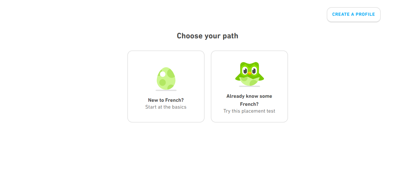
Contemporary mobile apps have different ways of onboarding and retaining their users. Duolingo, a very popular language-learning application offers free sessions before they ask you to sign up. On the other hand, Airbnb’s onboarding flow starts strong with an authentication page, saving users from a simple account creation overkill.

There are multiple onboarding practices that businesses use to engage their users. It is vital to strike a balance in gathering essential information as a lack of context can drive away your users and information overload can lead to a higher bounce rate.

However, the data unveils a bitter truth:

1 out of 4 people abandon mobile apps just after their first use.

Your users must understand the core value of your product faster for an enhanced retention rate.

In this article, we share a list of 5 different onboarding flows, to help you get your users hooked to your app.

1.  Keep your account setup process simple

person holding a phone

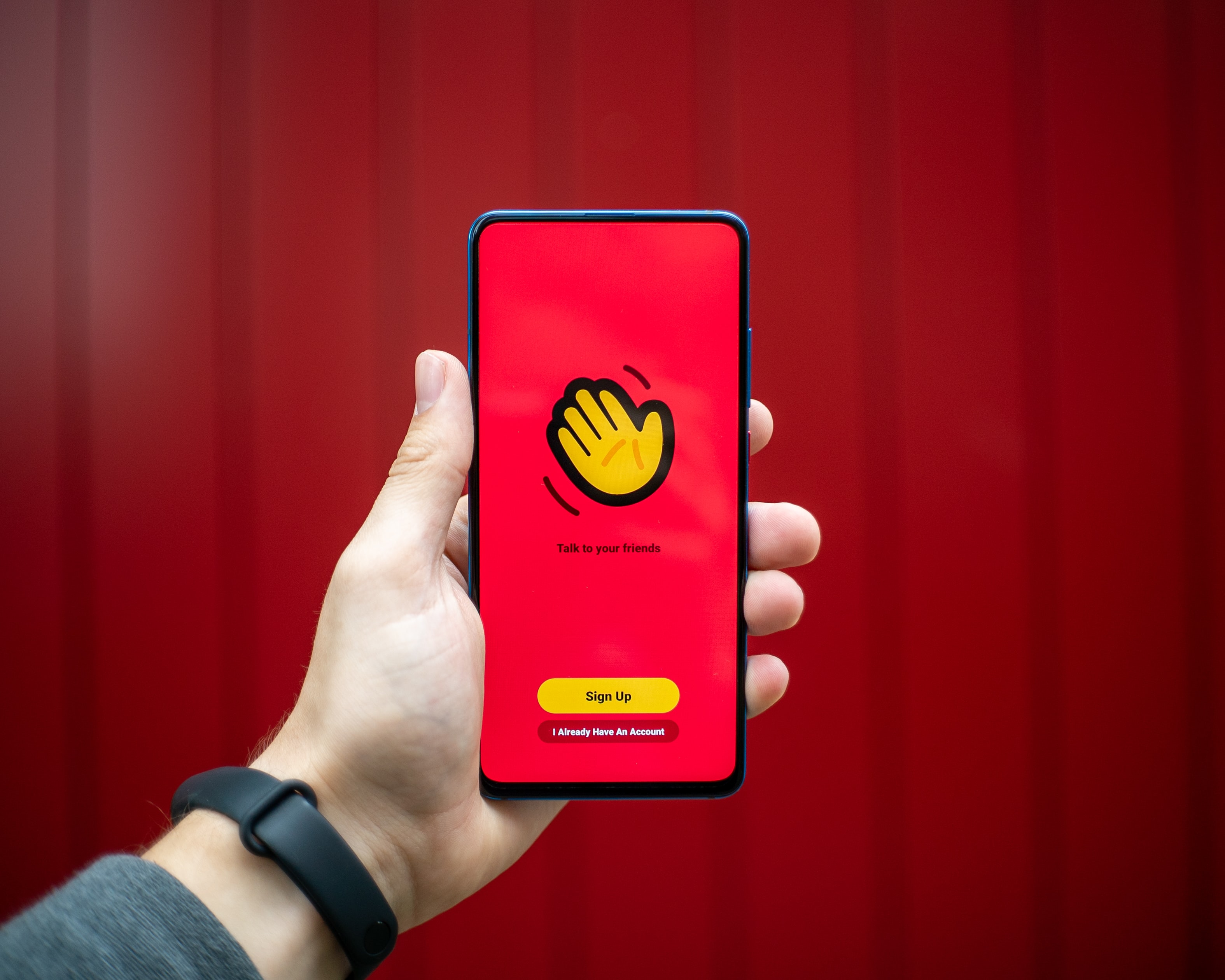
If your mobile application necessitates users to sign up to access the app features, the setup process needs to be quick and simple.

This especially holds for Social media or Messaging apps that request device permissions and include an explanation of why the access is required.

Communicating with users builds trust and alleviates security concerns. Avoid scaring away your new users by coming across as too intrusive.

Avoid: Do not ask your users to fill up their information on numerous screens. We recommend authentication via their social accounts, such as Google or Facebook.

2. Highlight the value

Netflix sign up screen

Ask your users the problem they want to address with your mobile application. In this onboarding flow, do not focus on the awesome features of your app. Instead, help them understand why they need to use it.

We recommend communicating the value or specific benefits instead of highlighting features and functionalities.

This has worked out well for apps like Netflix (mobile) and Evernote. Your onboarding process must showcase how the app will meet the user’s expectations.

Impress your users with the various benefits they can reap while using your mobile application. ‘Here is what our product can do’ and ‘Here what you can do with our product’ are completely different approaches and need to be deployed as per your discretion.

Avoid: Don’t overwhelm the users with numerous screens. The key benefits of your app must be displayed in the minimum number of screens during the onboarding process.

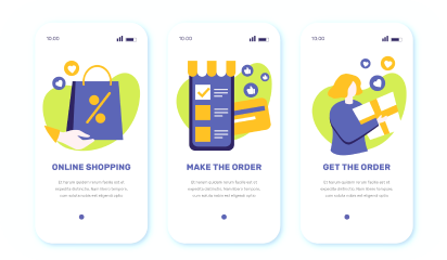
3. Showcase the key functionalities

Paypal website screenshot

Introducing your users to the functionalities of your app is another way to onboard them. This onboarding flow is appropriate for apps that have complex features.

This approach fits well for apps like payments, Ecommerce and professional services. Engage your audience, explain the critical features and make them curious about the way these functionalities will help them.

It is essential to communicate the key features upfront to effectively help users understand how your app works. This approach clears up any confusion that the new users may encounter while using your application.

Avoid: Don’t use long texts and jargon. We recommend using illustrations for showcasing the core features in place of long text. This makes it convenient for the users to understand how the app functions.

4. Get users to commit to a mission

Duolingo website screenshot

If you want users to get familiar with your product quickly, encourage users to interact actively with gradual engagement. We suggest that you gather crucial information about users, but in an interactive way. This would usually postpone the signup process.

Gamifying your mobile app onboarding process is an example of this interactive approach. e-learning apps (Duolingo), fitness apps (Fitbit), productivity apps (Habitica) have encouraged their users to interact actively.

The possibility of users to stick with the platform is impacted hugely by having them commit to a mission before signing up.

Avoid: Discourage complicated reward systems. We suggest offering small rewards on completing a module or breaking it down to small units.

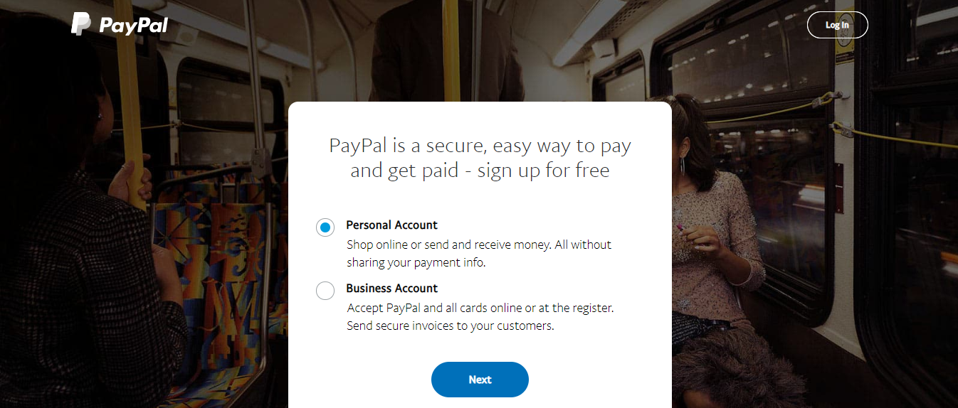
5. Create tailored user experiences

Spotify website screenshot

Many apps improve user retention by helping users continuously discover relevant content while helping them select their preferences. If the users can’t discover the content they are interested in, they are almost guaranteed to abandon your app.

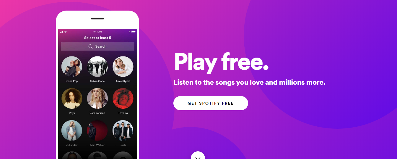
Apps like Spotify, Hulu, Pinterest and other entertainment apps leverage user onboarding to create tailored user experiences by inquiring about users’ favorite genres or preferences.

This approach requires you to either ask your users for data or obtain it through a third-party source such as the users’ browser. Alternatively, you can ask the new users for their date of birth and gender as they sign up for a free account during onboarding.

Avoid: An endless content repository is a double-edged sword. The suggested preferences should be categorized in broadly, to avoid overlapping and boredom.

The Next Step

They say it’s all about the first impression! No second chance..

However, many apps including Instagram, Airbnb, LinkedIn, Slack, etc. have adopted onboarding flows as an ongoing process using multiple A/B tests. These companies are successfully onboarding users that align best with their corporate goals and user’s needs.

It’s true that from the user base to the business model, each app is wildly different. One-size-fits-all practices rarely work. The only way to implement the best onboarding flow for your users is by testing various practices.

About the Author:

Animesh is a Sr. Project Manager at Galaxy and an expert in aligning client objectives with our mobile development team to deliver amazing digital products.

About Galaxy

Galaxy Weblinks has extensive experience in building Mobile Applications using iOS, Android and Hybrid Technologies. We provide specialized technology solutions to address complex business problems, across different industries. From idea to design to development and all the way to the app store, Galaxy Weblinks will work as an extension of your team to handle the entire mobile application development lifecycle. Visit Galaxy to know more about our capabilities.

Practices to quickly shift from in-person to remote user testing

The sudden change in lifestyles; professional and otherwise, has made remote work critical for many fields around the world, including UX testing.

Remote user testing has been there in the process since many years making sure that our users are having the best possible experience with our product. Especially mostly by those business organizations who reckon the fact that consumer-centric products sell better.

Although the biggest challenge is not the geographic distance while performing user testing. It’s instead, planning the right strategy, finding the right participants, and communicating with the right tools available. Absence of which can have a negative influence on testing results.

Choose the type of user testing that fits your need

There are two main types of remote usability tests, among which you should select one according to your need and to further validate your designs.

Moderated remote testing

In this type of testing you and the participant both communicate via phone or video conferencing software.
This technique is often used earlier in the design process that allows you to offer support in real-time and ask further questions for deeper clarification from the users as particular issues arise.

Unmoderated user testing

These tests are completed through survey forms mostly alone by the participant, without any phone or video call.
It works well while testing a few specific elements in a time and budget crunch, like a particular widget or a minor change.

Since every business is going user-centric, moderated remote testing has been adopted to interact directly with the target audience and gain a rich understanding of their goals and pain points.

So, if it suits your testing needs to gently nudge a quiet participant to share more about what he’s doing, then here are the best practices of shifting from in-person to easy going and cost efficient remote user testing.

Plan your ultimate testing goal

Define your target user and decide which specific areas of your site or app you plan on testing. In your test prep meeting remotely, discuss the agenda to focus on the goals of testing. It’s important to:

  • Develop straightforward tasks that have well-defined end states.
  • Prepare introductory and/or test materials so the participants will know what is expected of them as well as what they can expect from you.
  • Define the turnaround time of user testing, defining number of participants for each session.
  • Craft good task scenarios that are clear to your participants and have no ambiguity in understanding what you want them to do.

Explore mediums to recruit right testers

Since tests are remote, you are able to recruit people from just about anywhere! It is important to make sure they are representative of your target audience as you are choosing from a pool of participants around the world. There are ways where you can find them:

  • Social media channels such as LinkedIn, Twitter, and Facebook are good options for contacting people who may be interested in testing out your product/prototype.
  • There are a number of recruiting services that exist out there. Some are traditional where live representatives contact users from all over the place and screen them based on your requirements.
  • Others are almost fully automated web-based services where you can basically run a recruitment project on your own just by a few clicks, and potential candidates are automatically added to your project and ready for your approval.

How many participants do I need?

You want to avoid recruiting too few users yielding in insufficient results; nor do you want to recruit too many users and waste time and resources on additional tests.

It’s always better to learn from 6-8 users for each user role, update the design to fix the issues identified, and then test again.

But as a general guideline, if you are on a small budget and interested in DIY usability testing, 5 is a good number to start with. If budget is not a constraint its best to consult experienced professionals to determine the number of users.

Arrange Session and Kick-off Call

Join over a call with your participants using software like Zoom, GoToMeeting, or Lookback. (Stakeholders and other observers can join too). After a brief introduction to explain the setup and establishing rapport, share your screen with the participant, give them control of it, and ask them to complete tasks while thinking aloud.

Observe the participant’s actions, hear their commentary, and see their facial expressions (if webcams are on).

Ask probing questions to explore the participant’s understanding of the interface, just as if you were sitting beside them. Identify and diagnose any usability problems in the design.

Based on those insights, you can provide concrete, actionable recommendations for improving the product’s user experience – all without anyone leaving their homes.

How Costly is Remote User Testing?

Getting a moderator, participants and the product in the same room for about an hour per participant can get really expensive. Expensive enough that this kind of user testing is just not within the reach of many designers.

Moderated remote testing helps with the nasty bills by allowing the moderator to interact with users online through sharing screens instead of face-to-face. Even by choosing a relatively expensive user testing tool, the cost of on-site and remote testing can seldom be compared.

Conclusion

In a global situation like this, when you’re under pressure with deadlines looming – usability might seem trivial enough to skip. Don’t make this mistake: it will cost you more in the long run. Usability testing will, of course, require a degree of investment in time and money, but it pays off.

Remote usability testing has become more and more popular as companies work to cut costs without sacrificing the ability to gain insight into future product success. It is up to us UX designers to know the in’s and out’s of this methodology in order to utilize it most effectively.

Redesigning lessons from Super Bowl

About 100 million people tune into Super Bowl every year. The game is big because the money is big. Companies spend an average of $5 million for a 30 second screen time between plays. Apart from that the Super Bowl generates $300 million in commercial revenues. With all this money and eyes included, Super Bowl’s 2000s online persona would have been a bad fit for today. Around that time the TV spots were doing great; they were emotional and hitting the right spots, online space on the other hand was the exact opposite. A texty mess. This blog takes a dive in the website redesign of Super Bowl and helps you draw conclusion in case you’re also asking yourself ‘If I should redesign?’. Practically speaking, we didn’t have the modular frameworks back then and there was so little to work with. HTML, PHP, CSS, and maybe Flash. In hindsight lack of choices seems better. Then why even bother doing this unfair comparison, you ask? Because with this comparison we’ll help you answer a decade old and the most crucial questions of all: Whether you should redesign or not? Let’s answer this big question with a couple of smaller ones-
  • What is the end goal with your website?
  • What are the problem areas?
  • What will redesign cost?
This is a capture of the old Super Bowl website before the redesign. It shows a 3 column layout filled with all sorts of content with no visual hierarchy and respect to white spaces in sight.
Screenshot of superbowl.com 2009
The Homepage looks like a headache made out of HTML. For a dedicated page this homepage sure seemed like a missed opportunity to draw attention towards the primary goal of NFL; getting more people to see the game night. Which brings us to the goal of redesign.

Goal of the redesign

Your reasons for redesign can be purely aesthetic like getting bored of your existing design to something strictly business related; existing design being not good enough for conversions. Rebranding also could be one of the reasons to redesign, when you’re trying to launch a new product or service. Like Super Bowl rebranding their colorful and lively logos for an easy consistent brand image in the form of a new logo post 2010. Once you’re clear about your goal you can start working on the website or tell the people, who are doing it for you, exactly ‘what you want’. For the Super Bowl homepage the goal would be to get more people to watch the game, while providing other information like venue and time, all at a glance. Something that doesn’t make the visitor work for little but crucial information.

A picture is worth a thou……

Screenshot of Super bowl website
The new design uses the same principal. Just a few days before the game, the homepage features a simple hero image with the game venue cleverly placed in the backdrop. The new website leverages contrast to make the important information stand out. Like who’s competing, when, and where? There is also a CTA, that clearly mentions what to do next. Being the only action visible before the scroll makes it easier for the readers to complete their journey to the goal.

What are the problem areas?

Like any other website suffering with bad UX, the design team responsible for Super Bowl’s also had to answer questions such as this. When you’re sure about giving a makeover to your website. Usability reports and insights will help you reaffirm the reasons for your redesign. Having the data-backed reasons to do so won’t hurt. Ask your agency or hire specialists to evaluate your website, think heuristics, visual QA, and accessibility tests. Knowing exactly what’s wrong helps you gauge the magnitude of the solution, since redesign is not a days job. So now you’ve figured out the goal of your redesign and the problem areas that you need to work upon. Now all you need is a plan.

How will the redesign work?

Redesign for an enterprise is like clockwork, where all the cogs need to be engineered to fit without fault. Ask these questions to ensure smooth operation of your clockwork:

Is the development in house or outsourced?

It’s not necessary to keep the redesigning in-house if you have a team of your own, since outsourced dedicated teams can produce equivalent or better work more efficiently. When an outsourcing team handles the grunt work, your design team can dedicate their important time for planning how the redesign will go about. If you lack resources, you can completely outsource the design otherwise you can opt for design assistance.

Who leads the overall project and vision?

Inclusion is great for collaboration but it can distract the team from the goal. It is important for your redesign that there is a nay-sayer that keeps the team on track and keeps the project and vision from becoming something else, a hybrid of everyone’s opinion. Just as a Quarterback in football.

How will progress and success be measured?

If there were no yard markings then the football players won’t know if they get another 4-downs or how far they have come on the field. Clearly defined milestones of progress and success will do the same for the team working on your redesign. It prevents constant to and fro later in the process that only results in delays and inconsistent outcomes.

What are your timelines?

Football games typically last for 60 minutes, divided in four quarters of 15 minutes. It helps decide the pace and play of the game. For somewhat same reasons timelines are important for your milestones too. After defining the milestones you’d also need to plan when you’re expecting them. Getting chunks of predefined deliverables in time helps set momentum for project completion.

How much will a redesign cost?

If you manage to find the right agency and all the cogs slide right into place, then you won’t have to worry about the overheads. A medium to large website redesign can cost around $10000 to $50000 depending on the customization and functionalities you require. Before throwing that kind of money on a redesign project you must ensure that you’re getting a handsome ROI out of the whole exercise. If you’re thinking that ‘Just doing it’ would fix all your issues then it’s nothing more than a shot in the dark.

Takeaways

  • Keep Navbar sticky and visible at all times
  • Avoid multiple CTAs on a single screen
  • Give content some room to breathe
  • Make your copy clear and concise
  • Prioritize content according to your goals
When it’s the right decision, redesigning your website can have a positive impact on your business. But, if it isn’t the right decision, a site redesign can be a huge waste of time and resource. If not redesign then what? Custom landing pages, targeted ads, and localization are a great place to start.

Using quantitative research methods to improve UX

There are times when the solution to a design problem may “instinctively” pop into your head. Yet, in some scenarios, your instinct might be a valid method in solving design problems.

But, one subjective decision on whether the CTA must be bigger or not, can cost you drop in conversion on the line and ultimately, millions.

Moreover, it’s pretty hard to convince people or your stakeholders when your designs are solely based on intuition. Because they always go in trusting your work with the blindfold half-on and are prepared to point to quantitative data backing-up your hypothesis.

Quantitative user research gives you numbers that you can rely on. Take an example of an online supermarket platform where a lot of decisions are taken w.r.t. the color scheme, UI elements, categorization of products, place of variants option, etc. Quantitative research helps you measure the success and failure of such design aesthetics; you just have to do the leg work.

Take a look at some of the quantitative user research methods and how they can be implemented in your research process.

A/B and Multivariate testing

Doors

There is always some disagreement among the designers over the placement of small UI elements. Let your user’s choice be the deciding factor here. Build different variations or versions of your web components or page and present the same to your users. This method will assist you in determining which CTA button is being preferred by your users, or which typography is more appealing to them, and alike.

Their engagement with each experience can be measured and collected in an analytics dashboard and analyzed through a statistical engine with the prior versions. Through comparative testing you can learn which version attracts more clicks or to demonstrate the positive/negative impact of new features or changes to a user experience.

A word of caution: there should only be one difference in all the variants. It will be easy to draw consensus this way and give you definite reasons for selecting one design over the other.

Card sorting

stciky notes with sharpies

Card sorting is used for structuring your information architecture. It is a cost-effective method as you can provide users with labelled index cards or online card-sorting platforms when conducting remotely. Let them arrange it according to their understanding of topic and ask for debrief later on. Such sessions help participants to do the labelling and categorization as they like.

In an e-commerce website, you can see if under “Packed food items” users are searching for both instant and frozen food items or expecting them in separate categories. Even when you ask them to come up with their own categorization, you can always know how your users group information – are they thinking of nomenclature like “Gourmet Cravings” or looking for simple names like “Food and Beverages”.

Once you have all the data, look for common items, category names or themes, and for groups that were frequently paired together. It helps you organize content so that it suits your users’ mental models, rather than the point of view of your company.

Tree tests

two people looking at a giant mind map

It is a task based analysis wherein you ask users to look for individual elements from the navigation structure that you have built. Tree tests help in improving your navigation by observing how real users navigate your site rather than just going on assumption.

Continuing the e-commerce example, let’s assume you ask the participants to locate “instant noodles”. Your users may go in searching for it under “packed food” category instead of scrolling down to find the “instant food” category. This is how it is often conducted to design page layouts and navigation menus.

It’s the reverse of card sorting. Instead of creating own categories, tree testing asks users to work with an existing set of categories, and highlight where they believe an item is most likely to be located.

Google analytics

Post release, you can use Google Analytics (GA) to see the type of daily users visiting your website. You can compare it with the persona(s) that you have built. You can see where your users are dropping off and what activities they are performing. You can leverage insights on user trends, page with the highest interaction, and how are they navigating.

For instance, in the e-commerce venture, analytics will help you understand your user demographics, type of device they are using, product preferences, how far are they scrolling, et al.

GA makes data visualization easier. There are multiple options to represent your data like line graphs, pie charts and bar graphs, thus making it easy to explain it to all the stakeholders involved. Thus, with the information in capable hands, GA can do wonders for your business.

Back To You..

To achieve your ultimate goal of intuitive and easy-to-use interface, backing your design decisions with data from quantitative research will help you build experiences that are fit and relevant for your target audience in the long run.

Hence, instead of depending solely on subjectivity or qualitative research, design must be validated with quantitative research, and proven design practices, as design exists to solve real problems, which inherently makes it objective.

Your product’s success ultimately boils down to how well you have done the user research. As a UX studio our team is equipped to tackle any UX challenge thrown their way. For any assistance related to user research and analysis, feel free to talk to us.

An inside look at our Design Teams’ Remote Collaboration

Design professionals today are not confined to office spaces for design thinking and execution. Teams don’t have to stay in proximity to deliver the best design work. This is an era of remote working and even with team members located across continents, companies need to keep up the flow of creative innovation.

Design Team Collaboration in Commonly located Spaces

Remote working in regards to design projects is not a cakewalk as the value proposition depends on collaborative design sessions and team cooperation. Challenges like juggling through time zones, scheduling meetings, communication breakdowns, bad collaboration, etc., keep the designers on their toes.

Design projects are tricky. The bigger they get, the more complex it becomes to track activities and prompt the designers to get the tasks done. When it comes to remote collaboration, it doesn’t get any easier as designers can’t interact face-to-face. Given the illustrative nature of the designing, designers are supposed to work shoulder-to-shoulder and be able to draw, point, note, and gesture to get the work done.

At first, it seems like these tasks don’t fit well into a virtual teamwork setting. But that isn’t true. In the last few years, prevalent cloud technology has made remote collaboration smooth and sought-after by design agencies. So much so that it has redrawn the employee structure across companies.

How our Design Teams Collaborate Remotely

Our designers use cloud technology, multimedia, internet communication, and an array of cutting-edge technology tools. They partake in design sprints, brainstorming activities, face-to-face team interactions, and constant exchange of feedback and suggestions.

We use a structured and transparent communication setup that helps us navigate through the glitches of remote collaboration. Our communication spectrum goes from asynchronous and text-based communication to video conferencing. Our design leaders effectively discuss the action plan with the team, including what each unique team member is supposed to do, and by when. On the plus side, this helps foster a symbiotic practice and a sense of camaraderie among Galaxy’s design staff.

1) We count on the best collaboration tools:

Whether working remotely or in-person, sharing designs and gathering feedback are the most important facets of design validation and prototyping. In the process, the possibility of small details being overlooked and context being misunderstood remains. To avoid that, we employ Slack— a well-crafted collaboration platform that supports audio and video calls, all kinds of media file transfer, and integration with other tools. This makes our communication transparent, fast, and smooth.

Slack: Slack is our meeting room, notice board, water-cooler, call tree, and news broadcaster. It accommodates both team and one-on-one communications. It is a fun and all-inclusive alternative to monotonous email and messaging options.

2) A single, co-owned repository to tell us the work in progress:

Remote work setups are prone to confusion and miscommunication. Too many information repository tools only add up redundancy and confusion. We use Confluence to centralize all the technical documentation and progress of the projects in motion. For every step in design, an entry is illustrated with commentary, screenshots, and comments. This is to make sure everyone is on the same page, speaking the same language.

Confluence is a wiki for team collaboration. Team members can create, share and receive information about any ongoing project. As soon as any development takes place in the project, it is updated in the confluence knowledge base and becomes available to the team members.

3) We organize FREQUENT online meetings:

Remote teams don’t get in touch before a teething problem turns into a quandary. But design teams at Galaxy hold virtual team meetings thrice every week where we chew over design challenges, and fix them while they’re still manageable. Our intra-team meetings are complemented by impromptu pairing sessions where designers find themselves brainstorming with programmers, business developers, and documentation teams.

Zoom: For intra-team communication, we typically use a combination of video conferencing tools including Zoom. Conducting virtual meetings is fun with Zoom, which allows a participant count ranging from 7 to 70. From joining meetings midway and toggling between participants to sharing screens, Zoom accommodates it all.

4) Show, don’t tell:

Asynchronous and text-based communication (telling) becomes intricate in big projects. Showing, on the other hand, is more powerful than telling and visual inspiration goes a long way. Thus, we prefer using online whiteboards, sending screenshots and snapshots of plans, paper prototypes, sketches, personal notes, etc. When words fall short in conveying design nuances, screenshots and pictures do the job effortlessly.

InVision Freehand: Freehand, a feature of InVision, is a new, exciting, and creative way to collaborate in real-time. InVision Freehand features tools like Draw, Write, Sketch, and Comment as well as a lot of other functionalities. We use this tool for planning, feedback, and design presentation purposes. Freehand is a virtual whiteboard for us and any team member regardless of the location and can contribute to the ideation and other processes through this tool.

5) We keep a check on our competence as a team:

When working remotely, there’s a concern about how the efficiency and productivity of remote teams can be measured.”

It’s a lot easier than measuring efficiency of co-located teams. Organizations having remote work culture are result-oriented by necessity. At Galaxy, we draw clear work goals and deadlines. There are indicators like— reached budget, extra work hours, timely delivery, adherence to the task backlog, client feedback, etc., to measure performance. We also calculate the efficiency by calculating the progress of teams/individuals in prioritized tasks in the given time frame.

Trello: In Trello’s own words — “It’s a collaboration tool that gives you a visual overview of what is being worked on, who is working on it, and how far they’ve gotten.”

Simply put, Trello is an online corkboard, allowing users to enlist tasks, projects, files, resources, and everything else needed for working together. It is designed for task-based communication, and we use it as task calendar, checking off completed tasks and scrutinizing what is in motion. We use Trello for Value Stream Mapping of all our projects and processes.

In conclusion, we would like to leave you with some tips:

  • In the context of remote working, what works for one organization might not work for others, so experiment with pilot efforts.
  • Like a co-located environment, have an organizational structure for remote teams.
  • In a remote team setup, there should be one key person who owns the project and is aware of all the progress. 
  • Keep up with with new communication software and technology features. Don’t try to use them all — pick and choose just a few that best suit your team.
  • Set goals and deadlines the same way you would have if the teams were co-located.
  • Giving your team the freedom to be innovative and experimental with their work will have a positive impact on your business.

Remote Collaboration between Design Teams Infographic

5 mistakes to avoid while designing tooltips

Tooltip is a great UI pattern for user onboarding and feature discovery. But there is a thin line between useful and annoying tooltips. This post will help you draw the line.

Your tooltips are either helping users by telling them about the features that are exclusive to your product or they are interrupting users in between their important tasks to tell them how brilliant your new upload feature is. It’s a mistake to question your user’s intelligence. Tooltip design often fails because of common mistakes like these.

Here is a list of 5 mistakes that you can avoid to boost feature adoption and product tour completion rates with your tooltip design.

1. Where are the hints when you need them the most!

Image of a man acting confused in a shopping mall

One of the most frustrating things about tooltip design is visibility. While designing unique interfaces, placement and size of tooltips are often ignored. A user can’t use something if it’s hidden.

Most common implementation of transient tooltips doesn’t take touchscreens into consideration. Hover triggers have tiny hit points. Anything tiny is bad for accessibility. These actions require fine motor skills to land and hold on the hit point for a while.

2. Must have one upper case, one lower case, special char….poof!

Ant Man shrinking

Consider tooltip as friction in user experience, if the users have to go out of their way to perform a difficult action, chances are they’ll skip.

If the interaction in your design requires a lengthy explanation, then tap or hover to reveal action becomes an unnecessary burden.

3. Oh! Here is a tooltip telling me to write in the field it’s obscuring

Lady running through kitchen

Some transient tooltips are designed to expand over the input field while some stretch past smaller screens. You can’t read and act simultaneously when the tip is inaccessible or covering the input fields.

Tips are supposed to help the user with the interaction and not obstruct it.

4. Should have told me earlier that tapping this button will terminate my session

Train pilot emergency breaking

Timing is crucial in tooltip design. The tips should be aligned with the user flow. Feature adoption and user’s understanding of your product depends on the relevance of tips and not the frequency of it.

A user will only be interested in reading about a feature when they need to use it. Overwhelming the user with information for the sake of feature discovery will only make them skip the info.

5. What does it have to offer?

Last but not the least, comes your tooltip copy. A boring and irrelevant copy might cost you the user motivation to even encourage an action. Motivation, Ability, and a Trigger are the three crucial elements in BJ Fogg’s Behaviour Model that prompts a user to take an action.

Copy is an indispensable part of a tooltip because it motivates the user to take action. Your tooltip is doomed to fail if your copy isn’t conversational or it doesn’t reflect your value proposition.

In a nutshell

Even the most intuitive UI needs tooltips while onboarding new users or introducing new concepts. The difference between not-so-obvious and obvious is not that obvious. Think about your target users while making these assumptions. Explaining a basic feature to an experienced user might annoy them.

Facebook, Asana, and Slack are some of the best examples of great tooltip design. Their tooltips are a part of the user flow. Facebook has a subtle, conversational, and attractive approach towards tooltips, which informs and encourages action as well.

If you’re seeing significant drops in your user onboarding or feature adoption then give us a shout here, we’ll be happy to help you optimize your tooltip design.

InVision Superman Versus Framer X Batman — Who’s Your Bet On?

If you’ve looked over these tools before, then you’ve probably wondered how they compare when facing off one with another. What’s InVision’s kryptonite? Why Framer X doesn’t play well with other superhero tools? And which is the best tool for web developers? Our article will help you make an informed decision regarding which platform is better suited for your web design team. We’ll walk you through the pros and cons of both platforms and tell you about each of their special features.

InVision Studio’s Strengths

Whether you and your team use Macs or PCs, InVision is available for both and allows for collaboration with a team in real time. Each collaborator has their own mouse, so you and your team can be working on the same project at the same time without worrying about only one person having control at one time. InVision Studio is incredibly teamwork friendly with their real-time version updates, permission management, and version control. You can also easily share components because their component library is built directly into the InVision Studio.

InVision’s Live Share interface even allows a VOIP chat and a free hand-drawing tool for making sketches within the program itself. It also syncs up to the rest of the InVision platform and can be created and managed on the cloud, making it all-encompassing. And, it’s easy to include team members from start to finish on any project.

They provide an indefinitely free trial, but it is limited to just one project, but that’s more than enough time to test out all of the platform’s capabilities.

  • Prototyping is seamless with InVision as you can drag and drop items from a comprehensive gesture list with instant playback and the ability to preview your work directly in Studio. It even simulates designs in a web-browsing experience for clearer UX previewing.
  • Integrated animations give you a frictionless experience. Not all pages and animations have to be static, right? These animation tools can help bring your pages to life for better UX.
  • Responsive design is music to every designer’s ears but add in an adaptive layout and it sounds so much better. InVision has advanced pinning and percentage geometry with responsive element flow, so it won’t matter whether your customers prefer desktops, tablets, or mobile devices when your designs look stunning on them all.

highlighting invision tool strength

InVision’s Superpower

InVision has an amazing public API with a library filled with UI and UX kits, icons, and apps, which will make your UX seamless.

InVision Studio’s Weaknesses

InVision’s kryptonite is that it’s on the pricier side, which may seem a little too high for simply being a hosting platform.

Since it’s a tool for building click-through prototypes and getting feedback on them, you cannot make designs in the platform itself, but rather have to make designs in another app and upload them.

Unlike Superman, InVision doesn’t always play well with other tools and that could be tedious. It does have all-in-one environment but because it doesn’t integrate with other tools, sometimes it can be an issue.

InVision’s Cons at a Glance

  •      Pricier for primarily being a hosting platform
  •      Designs have to be uploaded from an outside source
  •      No integration with outside tools

Framer X’s Strengths

If some of your team is newer to design or you have interns, then teaching them how to use complex design tools may not be very appealing. However, Framer X uses CoffeeScript for defining its animations so it has a low learning curve for newer designers and can even be used by non-programmers.

Framer X is already integrated with Framer Generation, so you’ll be able to import layers directly from Adobe Photoshop and/or Sketch. As you put your work together, you’ll be able to see an instant preview of the animation you’re currently making, giving you some real-time, visual feedback on your work. It also has drag and drop animations for data and rich media elements. It is all backed up by code so that you’re closer to development.

The SVG-based vector editing toolset that Framer provides has predictive snapping, curve bending, and angle locking to give your vector drawing a powerful edge.

You can prototype with high-fidelity flows on an infinite canvas with pop-up modals and slide-in overlay menus. You can also add horizontal and vertical scrolling in the same frame. It supports animation and interaction prototyping for multiple devices with 8 pre-installed devices from desktop, web apps and mobile platforms to choose from. You can create your own unique setup fairly quickly. Add that with their built-in, 60FPS transitions and you have a solid toolset.

It’s also easy to use. If you’re familiar with Sketch, then Framer X will be a breeze. They have Stacks, too, which allows you to easily create customizable lists and tables with automatic distribution and alignment.

 framer x strength like that of batman

Framer X’s Superpowers

Like Batman, Framer X has a belt of gadgets for its superpowers. They have advanced features that include their Frame Tool for responsive layout, Stacks to help with grids and lists, and interactive Components. These components are also built into their codebase, React, which will make your prototypes feel real.

Framer X’s Weaknesses

It’s only compatible with Mac with no version for Windows or Linux. And since Framer uses CoffeeScript for UI app prototyping, it can be a problem for those who haven’t ever learned CoffeeScript before as they would have to learn a whole new programming language.

Collaboration is also weak for framer X as you can’t upload your prototype to the cloud or download it for offline use. You still have a share link, but once you close your project, that access closes off.

Framer X’s Cons at a Glance

  •      Mac only
  •      Learning curve if you don’t know CoffeeScript
  •      Weak collaboration/sharing tools

Conclusion

As you can see, there’s no true winner in a battle between Batman and Superman. But, we always have our favorites. Framer X will be a favorite of Mac users — similar to Batman, it doesn’t open up to just any other computer hero. And if you already know CoffeeScript, then Framer X will be a walk in the park for you.

On the other hand, InVision’s has advanced pinning and percentage geometry. Its responsive design is like Superman’s heat vision. Like Superman InVision is best for teams. And, just as Superman can power in with other members in Justice League, Invision can be used by both Mac and PC owners as it has really strong collaborator features.

Which do you prefer, Batman Framer X or Superman InVision? Vote in the comments and if you like this article, go take a look at our blog page for more content!

Digital Wellbeing in UX: Simplifying User Experiences

The average smartphone user interacts with their device over 2,600 times daily, profoundly influencing their mental health. This alarming statistic underscores the urgent need for digital wellbeing in UX design. For instance, a social media platform’s interface redesign to reduce addictive behaviors resulted in decreased user stress and improved public perception. Additionally, tools like Google’s Digital Wellbeing Dashboard highlight a shift towards more mindful tech use. This article explores the integration of digital wellbeing into UX design, underscoring the importance of creating human-centered, ethical, and emotionally intelligent digital products.

The Imperative of Digital Wellbeing in UX

Digital wellbeing in UX represents a shift from mere functionality to promoting healthier interactions between users and technology. As 65% of smartphone users manage their tech use through app or device settings, it’s clear that modern UX design must prioritize users’ mental and emotional states. Features like Google’s Dashboard, raising awareness of digital habits, have become essential in promoting healthier tech interactions.

Human-Centered UX Design: Enhancing User Satisfaction

Human-centered UX design now focuses on empathetic user interfaces. Incorporating elements that promote positivity, such as Spotify’s “Calm Down” feature, which creates personalized playlists and lowers notification volume after 10pm, demonstrates how UX can enhance user satisfaction. This approach is crucial in reducing technology-induced stress, affecting 72% of the population, and boosting daily engagement.

Ethical Design Practices

Ethical design practices are vital in today’s digital age, where 48% of adults experience disrupted sleep due to smartphone use before bed, according to a report by National Sleep Foundation, 2023. Ethical UX design, as exemplified by Apple’s Screen Time, prioritizes user wellbeing by encouraging healthy tech usage patterns and managing children’s digital habits.

Integrating Mindfulness and Mental Health into UX

Mindful UX strategies, essential for fostering digital wellbeing, involve designing interfaces that promote focus and mental well-being. For example, meditation apps introducing digital detox reminders have seen a 30% increase in user satisfaction. As rightfully highlighted by a Sensor Tower, 2024 Report, the rise of meditation and mindfulness apps, growing by 35% in downloads, indicates a growing demand for mindful UX strategies.

Emotional Design in UX

Emotional design in UX, aiming to evoke positive emotions, has shown a 40% improvement in user retention. YouTube’s “Take a Break” reminder, prompting users to pause after extended viewing, exemplifies how emotional design can encourage mindful engagement and prevent excessive screen time.

Addressing Diverse User Needs: Mental Health-Friendly Design

Designing for mental health involves understanding diverse user needs, such as offering customizable features like notification adjustments. Microsoft’s Focus Assist and apps like Forest and Headspace cater to mental health, demonstrating UX’s role in enhancing focus and learning in the digital age.

Balancing Technology and Wellbeing in the Workplace

In workplaces, where 63% of employees report burnout due to digital overload according to a report by Microsoft Work Trend Index (2024), balancing technology with wellbeing is essential. Moreover, As highlighted by Global Wellness Institute in a report, a user-centric design approach that fosters digital wellbeing can lead to a 13% increase in employee productivity.

Real-World Applications

Recent trends show that 78% of UX designers prioritize digital wellbeing, with users feeling more positive towards brands promoting it. Real-world examples like Google’s Digital Wellbeing Dashboard and Spotify’s “Calm Down” feature highlight this growing trend, showing significant increases in user trust and daily active users.

Partnering with Galaxy Weblinks for Digital Wellbeing

As the global digital wellbeing market is projected to reach $70 billion by 2027 (Statista, 2023), incorporating digital wellbeing into UX design is not just a trend but a responsibility. At Galaxy Weblinks, we focus on building digital products that support and enhance user wellbeing. By embracing a design philosophy that prioritizes user mental health, we ensure our products are not only innovative but also nurturing, contributing positively to the global narrative of digital wellbeing. Collaborate with us and create digital solutions that resonate with your users on a deeper, more human level.

How to conduct a mobile usability test?

It is important to know that there are more variables when it comes to recording mobile usability test. The technical set-up for this test is quite simple, but it is a little bit different from the standard usability testing.

In this article, we are going to look at how to set up and conduct a mobile user test.

First, what is mobile usability testing?

This is a usability testing of a website, application, accessory, or anything else that a user might interact with on a mobile platform, such as a smartphone or tablet.

When and why should you conduct a mobile usability test?

Anybody that regularly conducts this type of test would tell you how powerful it can be.

Seeing is believing; a twenty minutes video clip showing users how to use your software is more powerful and eloquent than you can say. As with any usability study, increasing the ease of use leads to increased revenue and happier customers.

The earlier the testing is done, the better. This type of test can quickly find and correct major problems that might be extremely difficult or costly to fix in a finished product. So, user testing, without a doubt, is the best way of gathering requirements.

Setting Up and Conducting a Mobile Usability Test

It is important to know that any of these guidelines can be adapted to fit a specific need or desire, even if you are not using a mobile lab at all.However, without a mobile lab, it’s more difficult to observe and capture users’ interactions with your mobile site or app.

setting up mobile test lab with camera

A simple mobile usability lab only requires three things:

  • A camera (i.e. a webcam) with some extendable or cradle to observe and capture the mobile device and user’s interactions.
  • A computer to display the camera field for observers.
  • A recording software to record the session for later review and analysis.

Ok, what should a standard mobile user lab look like?

Here’s what a standard mobile lab should look like:

Use two webcams 

One should be on an extendable arm positioned to record the device from above, and the other to see the user’s face.

As long as the webcam shows their face, you will be able to get a good picture of where they are in the experience.

It also allows you to observe the user’s gestures interaction. This way, you can tell if they try to tap, swipe, pinch, or otherwise interact in ways that are not supported.

The webcam focused on their faces, allows you to see their emotional response throughout the test.This valuable feedback allows for real-time, user-specific lines of questioning based on their reactions.

Depending on the objectives of the test and the platform being used, you can occasionally take advantage of platform-specific features such iOS’s Airplay, Mirroring to show the device’s screen on the computer.

Tools You Can Use

usability testing tools available in the market

Morae:

You can use Techsmith’s Morae suite to capture and record the webcam video and audio feeds.This way, you can see what the users are doing while they are doing it and record this for post-test analysis. It also allows you to observe the user’s experience from another location remotely. They can focus on task at hand, rather than turning to talk to a moderator. Finally, Morae offers unique post-test analysis capabilities, including storyboard editing to make video clips of the test highlights.

Userzoom

Ok, apart from Morae, you can also use Userzoom. This tool consists of testing large samples and allows you to build your study and task. It creates a study with task for users to perform in their natural environment. Also, Userzoom can test any mobile website or a hosted prototype on both iOS and Android services. With this tool, you are sure of getting quality data.

Silverback

This is another great tool you can use to do your testing. It has similar functions with that of Userzoom. It captures the face and also gets to see what the user is doing clearly. Silverback enables the recording, editing, analysis and playback of testing sessions. You can easily share the video stream with anyone who wants to view the session remotely. We have found that video clips are an excellent way of illustrating our findings for our clients and their project managers.

Irrespective of the tools, you would need to define your goals both business and test goals to get insights and ask the right questions to your subjects.

How Zeplin Transforms Agile Workflows?

With 71% of businesses using Agile approaches, tools like Zeplin are becoming more and more important. They’re not just facilitating smoother workflows; they’re reshaping how teams collaborate on software development. Zeplin, specifically, has made notable strides in this area, revolutionizing the way design and development teams interact.

Design Systems and Zeplin: A Synergy for Success

Zeplin’s role in reinforcing design systems is vital in an Agile environment. By providing a unified platform for design elements, it ensures coherence and uniformity across projects. A notable example is Airbnb’s design system, which utilizes tools like Zeplin to maintain a consistent brand and user experience across their digital platforms. By streamlining their design process, Airbnb has managed to reduce design discrepancies significantly, leading to a more cohesive user interface.

Streamlining UI/UX Feedback with Zeplin

Feedback loops are essential in Agile development, and Zeplin optimizes this by bridging the communication gap between designers and developers. For instance, Dropbox reported enhanced efficiency in their design process after integrating Zeplin. The platform allowed for quicker feedback and iterations, reducing their design revision time by approximately 30%. UI/UX designers can utilize Zeplin’s interactive environment to rapidly prototype and iterate designs, ensuring faster approvals and implementation.

Effective Collaboration through Zeplin Integrations

Zeplin’s ability to integrate with tools like Slack and JIRA enhances its effectiveness in Agile workflows. Shopify’s integration of Zeplin with Slack serves as a great example. This integration has facilitated faster updates and feedback within their teams, leading to improved project management and a more synchronized workflow. Such integrations demonstrate Zeplin’s versatility and its capacity to adapt to various team dynamics and project requirements. Teams should explore Zeplin’s integration capabilities to enhance real-time collaboration and project tracking, ensuring a more aligned and efficient workflow.

Overcoming Communication Challenges in Design with Zeplin

Communication is a pivotal aspect of project management, and Zeplin addresses this by providing clear and organized design specifications. IBM’s design team has utilized Zeplin to effectively manage communication among their globally distributed teams. This has led to a more streamlined and efficient design process, significantly reducing misunderstandings and delays in project timelines.

Quantifying Zeplin’s Impact on Agile Workflows

The measurable impact of Zeplin in Agile workflows is seen in the improvements in team productivity and project timelines. According to recent statistics, companies leveraging Zeplin have reported a 20-25% improvement in project turnaround times. This demonstrates Zeplin’s profound impact on enhancing efficiency and streamlining processes in Agile environments.

Galaxy Weblinks: Pioneering Agile Excellence with Zeplin

Navigating the complexities of UI/UX design, web development, and Agile methodologies requires more than just understanding; it demands the right tools and expertise. Galaxy Weblinks, with its deep-rooted experience in Agile practices and a suite of services including UI/UX and web development, is uniquely positioned to help businesses harness the full potential of tools like Zeplin. We specialize in fine-tuning Agile processes, ensuring our clients not only keep pace but lead in the competitive tech landscape. Reach out to us and transform your Agile journey into a story of success and innovation.