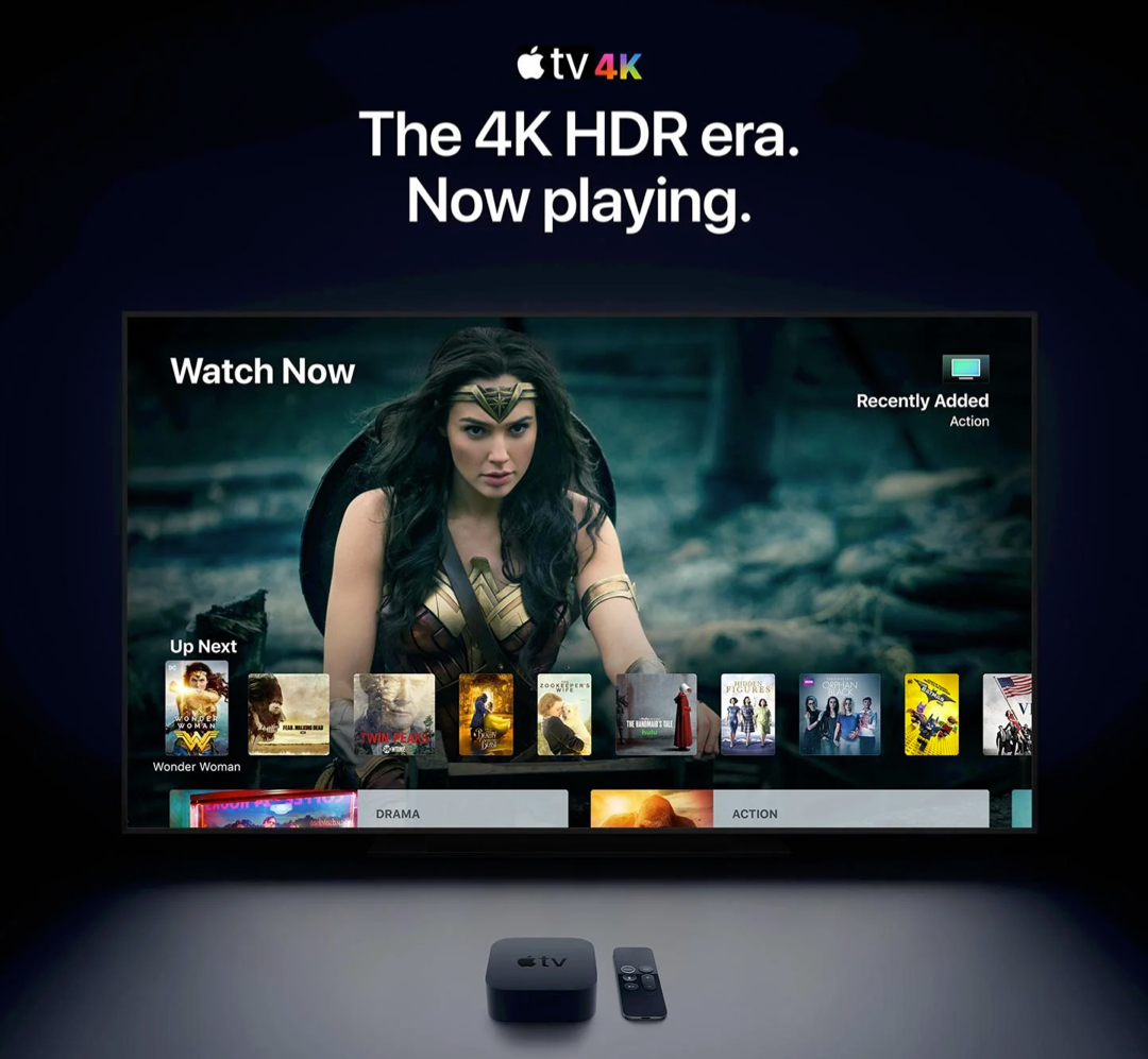
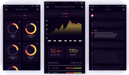
From mobile screens to TV sets, dark UI designs are seen far and wide and appreciated for the visual appeal that they offer. A dark theme depicts sophistication and elegance. However, dark UI designing comes with multiple challenges. If the implementation is poor, things can very well go south.
Digital products having dark UIs are perceived as powerful, elegant, and mysterious. They are a formidable trend across the digital spectrum. It’s said that dark mode can reduce eye strain, save battery life and increase accessibility. But, most of the time, dark themes are an aesthetic choice.
Over the past few years, dark themes are amongst the most requested features. Both Apple and Google have a dark theme as an essential part of their UI. Be it browsers, mobile applications of social media platforms, or VR/AI games, dark themes are everywhere as an option, if not a default feature.

Dark User Interface – The Good and the Bad
Choosing one of the two is a tricky balancing act. The dark theme is not suitable for all interfaces and neither is the light theme. Selecting the right options depends on brand fit, cultural suitability, and color psychology. Also, consider the emotional impact before asking your developer to go for either one.
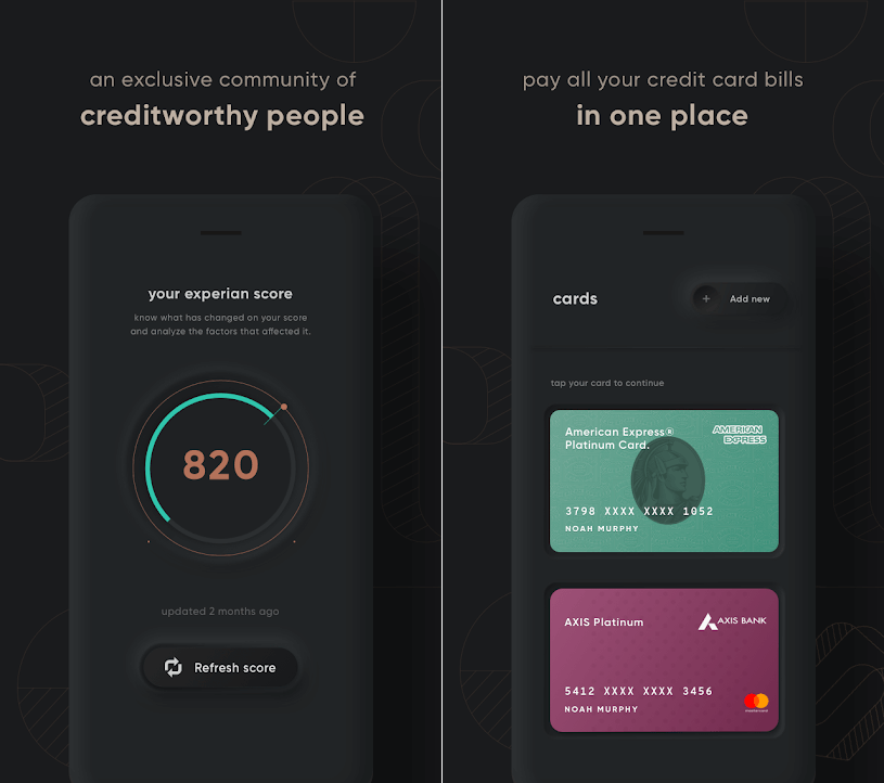
For instance – a financial app designed for millennials to take care of their credit card bill payments may look cool with a dark theme, but the same won’t work for a big bank’s website, serving the general, larger population. Too rich, too dark, and too stylish may frustrate people who just want to check their balances and transfer money.

Dark UIs for B2B SaaS applications are notoriously difficult to design. Web UI components like widgets, forms, data tables, and dropdowns can look odd on a dark theme. Owing to the type, context, and environmental factors, certain brands and products are not an ideal fit and may prove an insurmountable challenge.
If your designers have not worked with dark UI design before, they might find themselves in rough, uncharted waters. In the world of dark UIs, norms are bent, pitfalls aplenty, and trends change quite often.
Having said that, using dark UIs is a good call for a number of reasons:
- With the minimalist design having only a few content types.
- When there is appropriate context and use; like a nighttime entertainment app.
- When a striking and dramatic look is needed.
- To make a statement for the brand.
Not to forget, there are scenarios when dark UI is a bad call. When there is too much text (dark background makes reading difficult), a lot of mixed content types, or the design calls for a wide range of colors, the dark theme should be avoided.
Impact of dark theme on UI design
As developers, we are always considerate of UI design trends and user preferences while making the best use of our time and resources. So, is adding a dark mode design a worthwhile use of the client’s budget?
We would say, this totally depends on the use case. As established earlier, the dark mode can sometimes be a hindrance to comprehension. We won’t recommend it for digital products where it could lead to big consequences. For instance, online banking services or regulatory platforms.
In other instances, we can turn to dark UI design to influence user behavior. If user engagement is an important metric for your product like Twitter, Reddit, etc, then the case for the dark theme will be stronger.

7 dark theme design tips from Galaxy
Dark theme design captivates the audience when done right. That’s what we aim for with all products that we develop. Here are seven design tips that we also practice:
- Considering brand (identity, image, etc)
- Avoiding pure black
- Avoiding heavily saturated colors
- Ensuring enough contrast in colors
- Softening white backgrounds
- Matching color to the brand message
- Communicating depth
Summing up
It boils down to personal preference…
For most users, it all comes down to personal preference. Most of them don’t care about their eyesight or battery life, or have an aesthetic preference – they just like the way it looks and that is it. With iOS 14, Apple, who controlled their product’s design with an iron fist, allowed users to add custom icons and home screen widgets. Maybe this is not about choosing between light or dark mode, but about allowing users to configure what they like.
About Galaxy Weblinks
Galaxy delivers end-to-end software design & development services. With a decade of experience in digital and interactive design, we create compelling and human-focused experiences. Our UI/UX designers are creative problem-solvers, delivering clean, and minimalist UI.
