Losing customers to Slowpoke of a UI is a nightmare for any UX designer. What if there was a pseudo-catalyst that could make your UI seem like there was no delay. In this post, we’ll tell you about skeleton screens and how it can get rid of your slow-loading nightmares.
So, what are these spooky sounding skeleton screens?

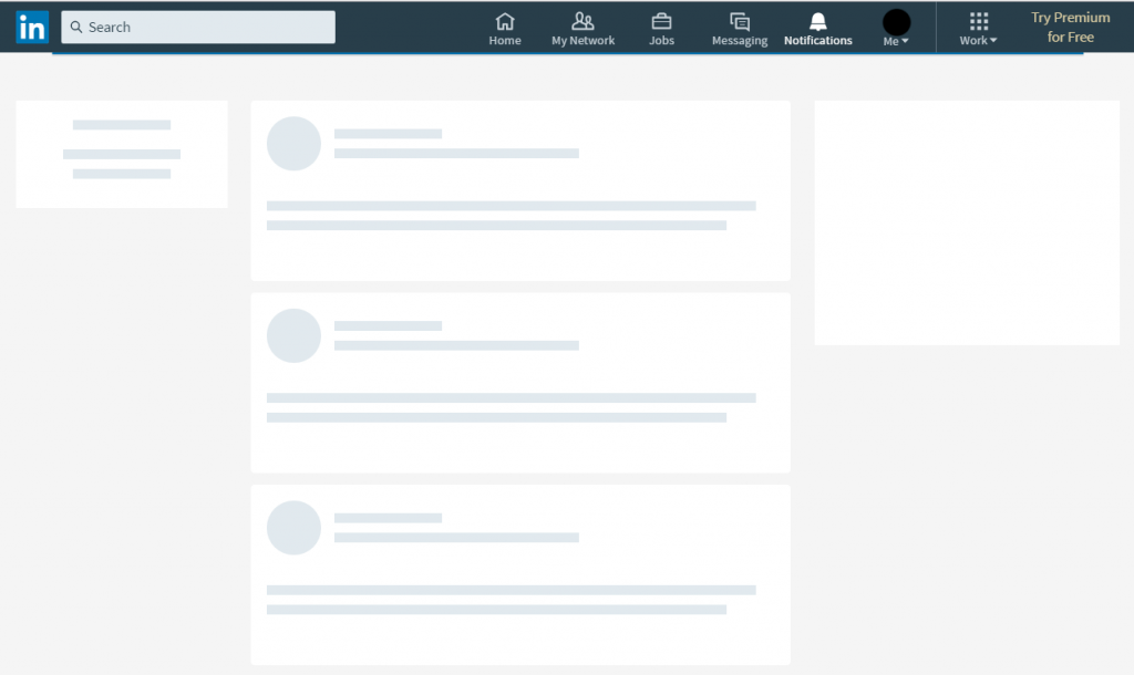
Skeleton screens are the better alternative to progress bars or spinners. It’s a blank page that mimics the layout of an actual web page that it’s trying to load. The primary purpose is to imitate the page as to give the website visitor the feeling that the page is actually loading.
Fast Company stated a study by Google that reported they lose about 8 million searches a day from 4/10 of a second of delayed loading time. This is why a skeleton screen is so important. Mimicking a loaded screen will give your site the needed time to retain the attention of a visitor while the page loads.
Progressive loading is one of the recent developments in Skeleton interfaces. As the name suggests the Individual page elements become visible as they load progressively instead of displaying all at once when the page fully loads.
There’s a challenge though
The only time you’ll have a hard time designing skeleton screens is when you’re deciding the elements your site will have as placeholders. The most effective placeholders are UI elements, as website visitors are usually attracted towards the interactive elements when they’re looking for specific pages.
The benefits of getting it right

Skeleton screens can lower site/app’s bounce rate. When a website visitor sees it, their eyes will gravitate towards the feature they’re most likely to use. Take LinkedIn’s loading page for instance.
If a visitor needs their profile information, they will automatically look left for the loading element or group of elements that resembles a profile info structure. If they want to go through the updates from their network, then their eyes will go towards the center. Same goes for one of the early adopters of skeleton approach, Facebook.
Benefits we talked about at a glance
- Lowers your bounce rate
- Helps website visitors feel less frustrated with load times
- Gives people a prediction of where certain content/images will load
- Shows people that progress is being made in the loading process
Why Not the good ol’ spinner or progress bar?

When a visitor’s in a hurry to find information and you see a slower, stagnate loading bar or spinner, what do you think?
Most people think, “How many seconds will I give this site to load before I leave and look for another?” The visitor’s frustration will rise as they stare at this one loading bar and will be more likely to bounce.
Spinners/loading bars give people uncertainty about the load time and uncertainty will lead to them leaving a site. This is why skeleton screens are necessary for better UX.
Bonus tips
- Break down your page bit by bit to outline it
- Locate your static graphics that won’t change while the site is being used
- Create the body of the site, using those static graphics first
- Fill in where you know your text populates — it should look like a background, not like it’s appearing from nowhere
- Test the skeleton screens as you implement them
- Tweak images and imitated text boxes until they more closely represent what your page actually looks like
Even though Skeleton screens are just a cosmetic cure for slower loading applications but it does the job of retaining the visitor’s attention real well.
We hope that you enjoyed this post about skeleton screens. If you’re looking to improve your UX beyond skeleton screens, then this UX Training might be just the right thing for your team.
