What were the most challenging aspects of the website’s user interface that you encountered today? Users are often dissatisfied with minor details that go unnoticed. Vitaly Friedman, the famous author of Smashing Magazine, summarized the key areas that may exasperate your users. If you do not fix these issues on your website, it may harm your user experience.
In this article, we’ll go over the top 7 most common user frustrations and how to address them.
#1 Scroll hijacking
Scroll hijacking is when a website’s scrollbar is manipulated to behave differently. Scroll hijacking is commonly used to display specific animated effects. Crisp illustrations and fine animations, on the other hand, do not always make for a great web experience.
How to fix the issue?
So, how do we apply this incredibly cool effect practically and rationally?
First, you must evaluate the user group and the type of experience you are attempting to create.
- Is the group accessible to everyone?
- How high is the visitor’s traffic?
- Does it use multiple devices?
- Is the website ADA compliant?
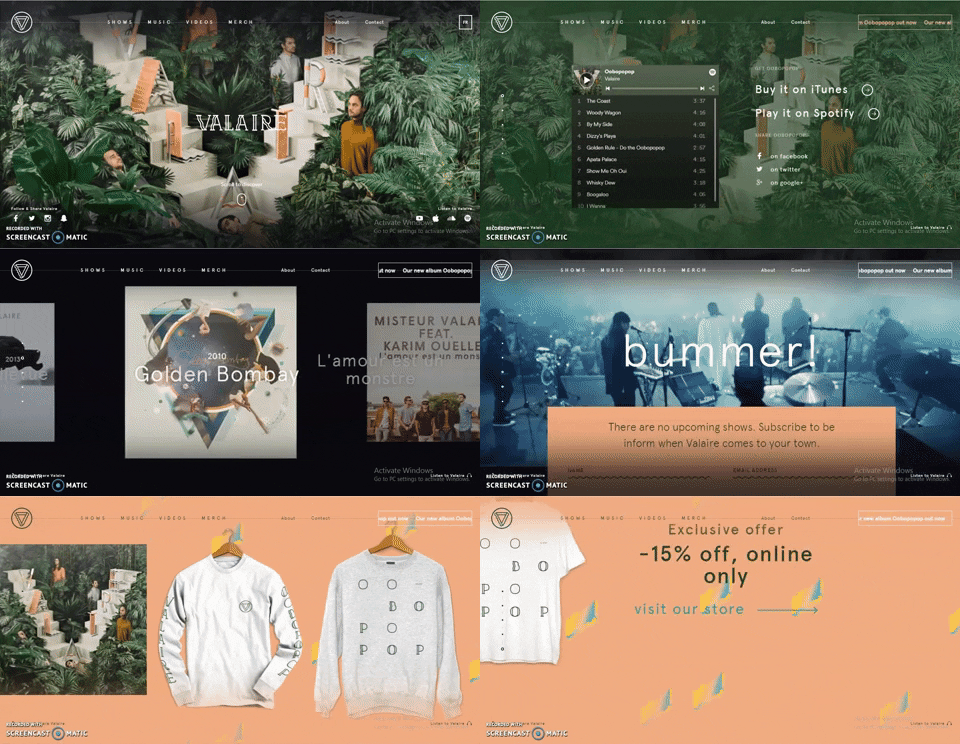
Are you planning to create a website for a niche group, such as a med-advanced tech user, an early adopter, or device-specific? If you are contemplating adding parallax scrolling effects, you can consider this example –

This page scroll design is fantastic! You don’t get the impression that a robot has taken over your ability to navigate the content. You have complete control over the scroll speed and your position on the page. It’s a fun experience that makes me want to go out and explore more! The location indicator is useful, and the sticky menu items provide a sense of stability to an otherwise erratic design.
#2 Tiny click targets
The smaller the interactive elements (links, buttons, and other user interface controls), the more errors the user will make when interacting with your website.
How to fix the issue?
- Touch targets should be easy to use with your fingers. The touch target should be 9mm x 9mm in size on average. According to Material Design, touch targets should be at least 48 x 48 px in size.
- Padding should be added around touch targets. Microsoft recommends padding between touch targets of 10mm.
#3 Not working “Back” button
One of Jakob Nielsen’s ten usability heuristics for user interface design is user control and freedom. It states that users require a marked “emergency exit” to leave the unwanted action without having to go through a lengthy process.
How to fix the issue?
The Back button in a browser is the equivalent of an emergency exit. If you are concerned that users will lose their data by clicking the Back button, it is best to warn them by displaying the message “Your work will be lost” when they click the Back button.
#4 Small-sized text
Despite the recent popularity of video formats, the majority of information on the internet is still written. As a result, good readability and legibility are critical for a positive user experience.
How to fix the issue?
- The font size should be at least 16px. 16px for body text is a good starting point, but keep in mind that the larger the screen size, the larger the text.
- Line height should be 1.5em or 1.6em for best readability.
- Always test your designs on a real-world device.
#5 Unexpected content shifts
You’re about to press the link. You move your cursor over the link and click it, only to realize you’ve made a mistake. Instead of the intended link, you click on the ad. Isn’t that the case?
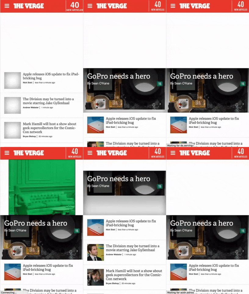
Typically, the content shift occurs as a result of dynamically loading content. Because this operation is asynchronous, dynamic content is inserted into the page and replaces existing content.
How to fix the issue?
To work around this issue, measure the height of the dynamic content and hardcode it as a (min-height) for the container in CSS as done in this verge webapp.

#6 Sign up walls
Sign-up walls are a requirement to create an account to use a service. Sign-up barriers keep users from exploring the service.
All software, including websites, should be built with this principle in mind: You should always try before you buy.
How to fix the issue?
Users usually try something new, form an opinion, and then decide whether or not to use a service. In the context of news websites, for example, it is possible to provide a limited number of articles that users can read without creating an account and then ask them to create an account only when they engage.
#7 Confusing forms
Forms are an important part of the user journey; they are used to log in, sign up, check out, and so on. As a result, it is critical to provide clear instructions both before and after submitting the form.
How to fix the issue?
- Avoid relying solely on color to denote an error. Always provide actionable feedback to facilitate a correct entry.
- If the form is too long, consider dividing it into logical sections and displaying a progress bar to show the user where they are in the process.
Wrapping Up
One of the most important aspects of creating a great web design is keeping up with industry trends and implementing the ones that will work best for your web product. Contact our UI/UX design experts if you want to create custom software with a pleasant and unique user interface.
