9 UX trends that are here to stay in 2021

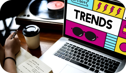
New trends are emerging in every industry vertical, UX included. To keep business thriving, you have to be quick to recognize, analyze and implement trends on priority. Furthermore, any enhancement in the visual aspects of your product would lead to a higher recall from the users. 

Our experts can not stop themselves from trying new trends. We have listed the ones that will make ripples in 2021.

3D Elements 

There has been a huge surge in three-dimensional designs across the web and mobile interfaces. This not only gives an edge to your flat design but also helps draw users’ attention to the primary features and aspects of your website and app. 

These elements hold user’s attention for a longer period and encourage them to interact with your product. However, all these 3D animations and illustrations need to be optimized so that they don’t increase the page/app’s loading time.  

Engaging Motion Effects 

Animated user stories, parallax scrolling, micro-interactions, etc all are liked by users across demographics. Motions bring life to your design elements like illustrations, animations, etc.

Parallax scrolling is another emerging effect to entice users for further engagement. When users notice the difference in scrolling your webpage, out of curiosity, they will spend a few seconds more. The right mix of effects will make transitions much more delightful for all your users. However, overdoing the same will push back users, thus a few effects on the most vital features and pages should suffice. 

Neumorphism

The mix of flat design and skeuomorphism is Neumorphism. It uses shadows and highlights to give an almost 3D look to the design elements. It layers the elements in a subtle and minimalist way. Designers use similar color pallets, standard shapes, and icons, etc here. This ensures that users don’t get any sudden or unwelcome surprises.  

Asymmetry Arrangements 

The classic layouts have lost their charm among users. Any generic design presented to the users is getting lost in the virtual crowded space. Hence asymmetry and creative approaches are taking the center stage. You will need to brainstorm a lot before you come up with the ‘perfectly asymmetric yet balanced’ structure. Brainstorming is necessary so that you are not compromising on the usability and accessibility aspects of your product at any point. 

Dark Mode 

Dark mode has been implemented successfully by many organizations, but many are yet to follow. Therefore, dark mode makes this list. The benefits of dark mode are now well recognized by users too. It helps in decreasing screen fatigue (something this pandemic brought to light), saves user’s devices batteries, and is worth exploring for your product offering.  

Designers can highlight elements more easily here and use high contrast elements for focusing on the primary functionalities. A win-win situation for all!

Improved Onboarding 

A swift onboarding process will hook users for a longer duration. We saw complex remote collaboration tools and video conferencing options being disliked by users because they were complicated to use and the onboarding process shown was not very helpful. 

A smooth onboarding process with a mix of subtle hints, micro-interactions, and the option to returning to certain learning aspects play a part in creating a lasting impression on users. Storytelling is also being implemented so that a connection with a certain character/avatar can be made by users. 

Color Palettes For Playful Backgrounds 

When the talk is all about standing out from the crowd, bright, neon colors do this for you easily. Designers are willing to play with bold colors like never before. Unconventional color mix, using popping colors on your website, or just highlight the main features are the craze now. 

All this is done so that users are seeing a different and experimental side of your organization. Mixing darker shades with bold colors, following a bold theme throughout your website and app is a great way to stay in your user’s mind. But again ensure that the colors don’t distract users from the primary features and are not bringing on any accessibility issues. 

Typography  

In line with playful color backgrounds, typography is also something that UI/UX designers are testing out lately. Font style, bold text, creative text display are all being played with. And add small animations to your text here and there, users will keep interacting with your app and website. 

Bold text, especially on the hero page screams attention like nothing else (in a good way of course). On one hand, web typography is getting bigger and bold, the apps are leveraging ALL CAPS and creative fonts to fit in varying screen sizes.

Uniqueness Trumps Perfection 

What differentiates you from your competitors? What unique design will create a long-lasting impression on your users? Designers are no longer going after being ‘perfect’ in their design across platforms. In 2021, you will see more creative experiments with design layouts, elements, animations to have a higher recall value. 

Color play, different typography, playing with layouts, and all that we have covered in this blog will all contribute to delivering a unique user experience. These trends have gained a lot of popularity within the designers’ community and will continue to do so until users express some other preferences. 
To know more about our UX services, contact us here

UI Best Practices – Designing buttons that score clicks!

User Experience Design is one of our core competencies. In this blog, we will share with you the best practices of designing buttons for your user interface that will attract maximum clicks. These UI button practices will help your users prioritize tasks by removing friction on-screen while sticking to the basic principles of UX elements for web/mobile applications.

Many designers take inspiration from various new UI designs and apply in their applications like this:

video showing buttons in UI

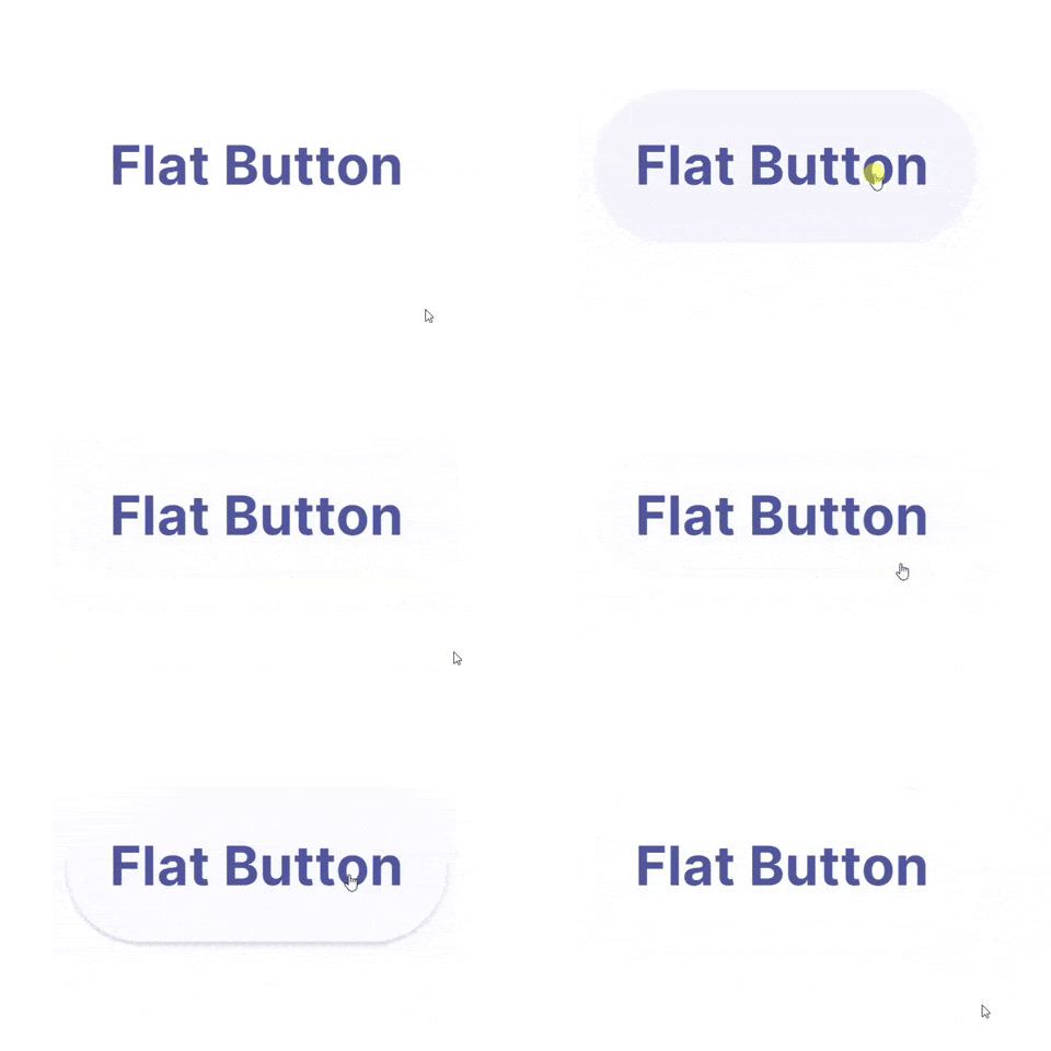
But what’s wrong with this elegant on-hover and click state button?

Unfortunately, it’s lacking the very first basic rule of button design – “Make it look clickable”.

UI/UX designers should pay much attention to button designs to make buttons stand out, and read numerous articles, analyze and share ways, secrets, and principles to set the color, shape, position, size, and more factors.

Use those designs that follow basic ground rules of UI design. Especially ones that can not only lead users through a website/mobile app effectively but can also entice them to click for better sales.

And as a designer, you always need new clues, ideas, or inspiration to make a unique and useful button for your web/mobile apps.

So here are 5 latest and best button practices that you cannot miss out in 2020. And hope they can inspire you somehow:

1. Eye-Catching Hover Effects

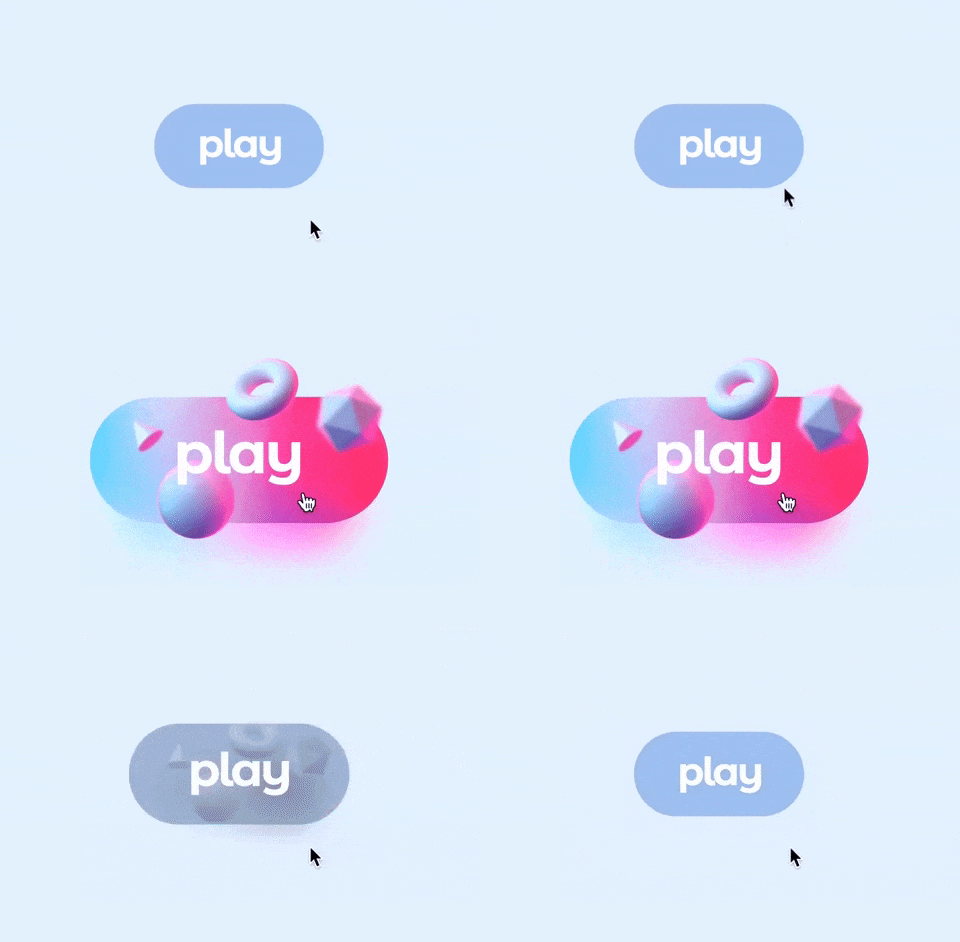
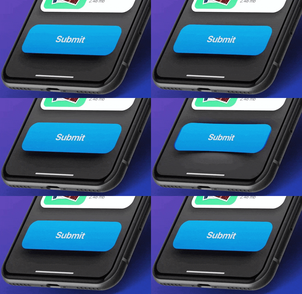
This Framer button uses a very appealing hover effect. When users move over or across the Play button, the whole button bounces out with a cool 3D Gradient design. Once users move the mouse cursor away, the hover effect will suspend completely. Such designs are eye-catching and interesting.

Video showing buttons in UI
Edoardo Mercati

What can you learn:

You can add various hover or interaction effects to optimize your button designs in your app or web design. They could be very useful to entice users to click and go to the next stage, such as playing a podcast, buying a product, filling contact information, or reading more details, etc.

You can add some changes in colors, shadows, shapes, texts, opacity, frames, and animations of a button according to your action requirements to make it more attractive for users.

2. Microinteractions for Delete Button

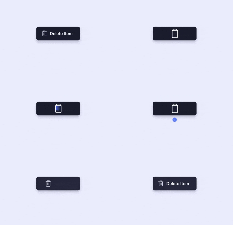
You can show the functions of buttons more vividly by using “button + animation ”. Once users click a button to delete, the action gets depicted by an animation showing the file getting shredded. This is a vivid and imaginative way to showcase the “delete button”. It is an effective way to engage the users while they delete multiple files.

Animation showing button in UI
Aaron Iker

What can you learn:

In your button design, you can add vivid animations to your buttons based on different scenarios, features, and labels to make your buttons outstanding and appealing. Overall, this is excellent to improve user experience.

3. Provide Feedback with the Button States

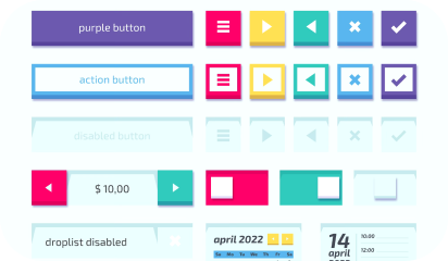
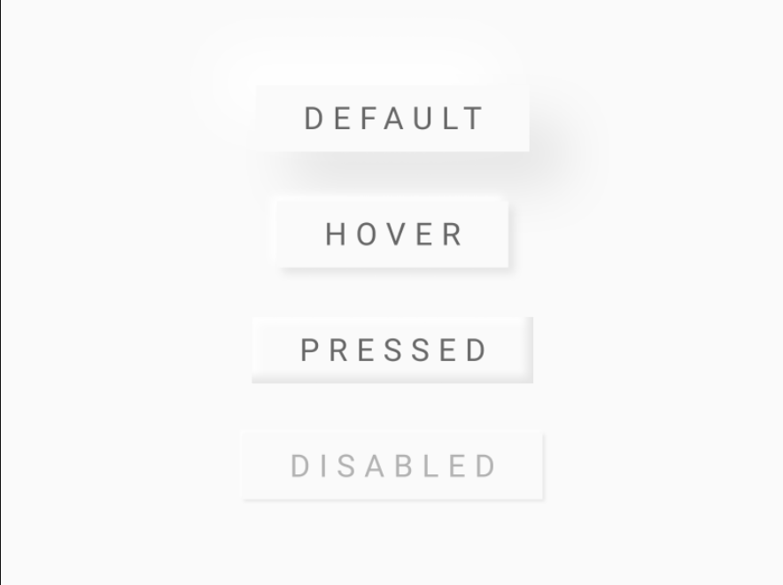
You should always let users know that the command was registered and promptly. This requirement isn’t about how the button initially looks to the user; it’s about interaction experience with the UI element. A good way to make sure nothing is lost in transition is to define the button states in your button design.

Image showing different types of UI buttons
Ryan

What can you learn:

Usually, a button isn’t a one-state object. It should change its state to let the user know that appropriate action is being taken. It becomes essential to provide visual feedback to users to indicate the current state.

4. Buttons with Shadows and Highlights

Drop-shadows make the element stand out against the background. They also highlight it as a clickable or tappable element. Objects that appear as raised give the impression that they could be pressed down. They’re also useful for improving the visibility of light-colored design elements, especially text. Even with flat buttons (almost flat, to be exact), they give subtle interactive cues.

video of buttons in UI
Lucas Haas

What you can learn:

Shadows are key entities in telling your users which UI element they are looking at. Users understand that the element is interactive if a button casts a subtle shadow.

5. Floating Navigation Button

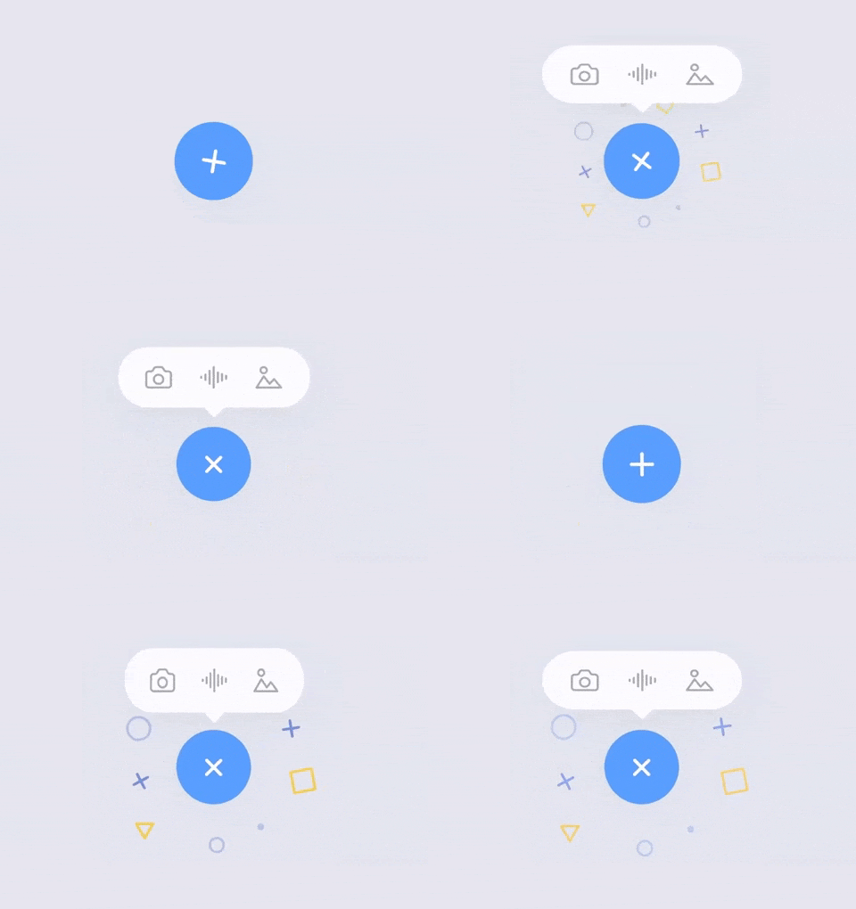
The tooltip uses a very cool floating button that attracts users’ attention and extends the functions of the web/mobile app. It is eye-catching and useful for your users and allows them to easily switch and choose other parts of the web/mobile app. And in this way, such floating buttons can be really interesting, attractive, and impressive for users.

Animation of buttons in UI
Milan Raring

What can you learn:

In your mobile or web app designs, you can create similar multifunctional navigation buttons floating in an interface to extend the functions of a mobile/website app. You can also customize a special way to expand the functions, options, or menus based on users’ interaction with these floating buttons.

Conclusion

Buttons are going nowhere! They will further evolve and get more interactive. Plan them with the utmost consideration, so that your users can enjoy the micro-interactions. Make them flashy, make them intuitive, and make them useful – and let users engage with your application.

iOS 13 design | What’s changed and what remains?

Ever wondered why Apple allows only selected employees in its Industrial Design Studio?

Surprisingly, it’s a part of their design concept and not a security concern.

Apple isolates their industrial design team to allow them to indulge in deep work. It lets them make cutting edge design decisions without having to worry about the practical and limiting aspects of its implementation.

Such creative isolation is one of the reasons behind Apple’s incredible products. Products that are amazing to look at and are effortless to interact with.

Apple then unveils these ingenious products in their annual events. This year’s launch events also followed through with new iPhone 11 series donning a double and a triple camera setup, Apple TV+, Apple Arcade, a dedicated OS for iPad, multi-core ultra-spec Macs for professionals, and UI upgrades for the new generation of Apple devices.

But it was the design announcements that caught our ‘viewport’.

iOS 13 has been in the developer’s beta since the announcement at WWDC 2019. Here are a few notable UI/UX designs from the beta that made it to the end users.

New Default Modal Presentation style

Screenshot of iOS UI
Image source: Applypixels.com

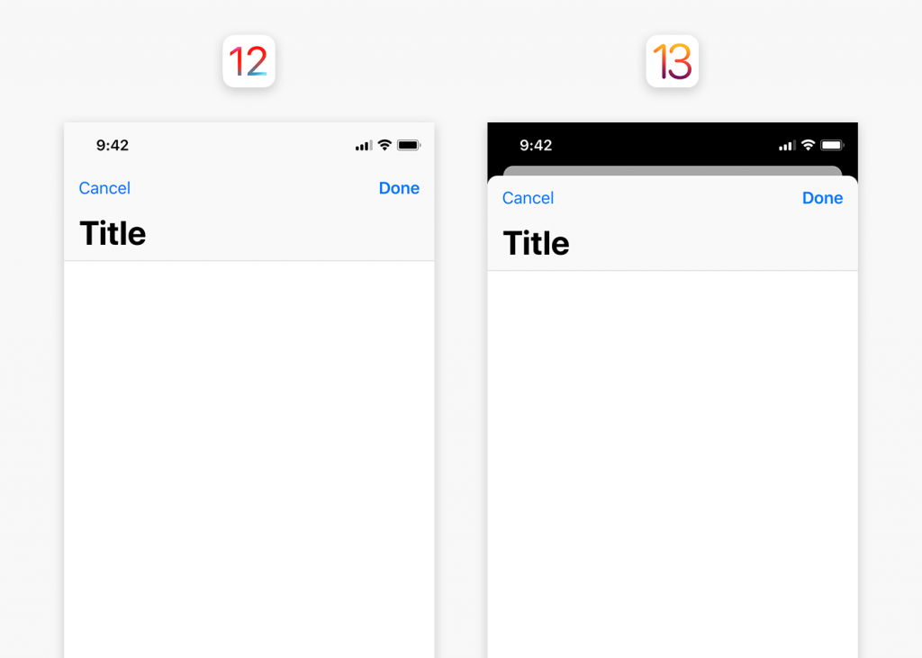
It’s been almost two years since iOS interface ditched capacitive buttons for swipes and gestures. The new ecosystem relies on card style modal sheets which lets the user dismiss or present recent screens with swipes only. Modal presentation style is now default due to which view controllers appear as a form sheet overlaid one over another and not in full screens.

This card-like appearance allows users to dismiss screens interactively with a downward swipe. And the layered design provides users a sense of context about where they are in the application.

Modals are really convenient but they’re not fit for the apps that has scrolling, pinching, or swiping as their fundamental interaction. Photo editing and reading apps for example.

Revised System-Wide Gestures

iOS 13 gestures

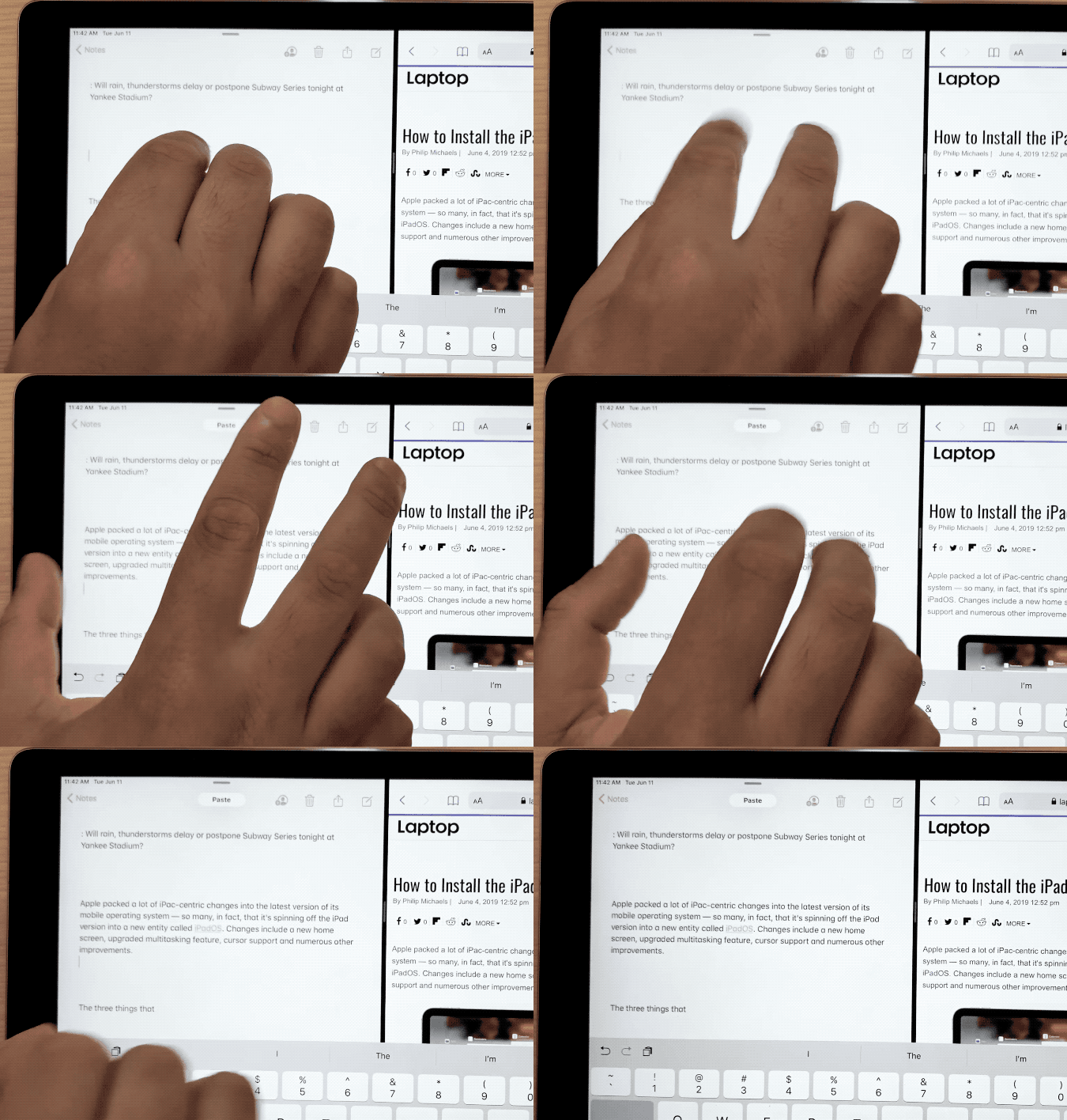
Selection gestures in custom text views:

Thanks to the new text editing gestures! There will be no need to shake the entire device to undo a text (only if someone even bothered to do that).

  • One can simply tap to select, pinch in and pinch out to copy-paste with three-fingers.
  • One can also undo-redo by swiping left and right with three fingers.

In addition to that, it will allow users to quickly manage their text editing on either of the devices i.e. iPhone or iPad, without using formatting shortcut bars.

Multiple selection gestures in tables and collection:

Apple has introduced a new way of quickly selecting contiguous batch of items in table and collection views. By simply dragging two fingers on a list or collection of items to draw a selection.

It’s important for easy and seamless user experience to add gestures when left with very little space on screen. It will immensely help designers overcome space-based challenges.

However in hindsight, so many gestures may leave users overwhelmed before they get used to it.

Dear Apple, it’d be great if you did something about…

Monochrome photo of Apple logo in a dim lit office

  • Incoming Phone Call UI
    It’s something that iPhone users want Apple to learn from Android. Why a full-screen app jump? It covers the whole screen, pushing back the application you are using. This call UI needs a refresh, and like android can show a banner up in the top that allows users to dismiss the call or let it ring in the background and be done with it.
  • Swiping App Switcher
    Since iPhone X Series’ redesign, users have been reporting the inability of swiping away all the apps in the app switcher in one go. Surprisingly, it’s still there in iOS 13. Apple is not fixing this problem because clearing recent apps in the App Switcher doesn’t improve battery life or device’s performance, as all the apps are in suspended state.However, removing all of the recent apps from the app switcher only has aesthetic value where the user wants to be able to scan the app switcher quickly for their most used apps. But taking away the option to swipe away the mess is a bad design choice. It’s up to the user if they prefer a clean and efficient experience or a cluttered one.
  • Camera App Settings
    There are tons of improvements in iOS13 camera and photos application, but it still doesn’t allow to change video recording resolution within camera app itself. For that, users are supposed to go all the way into Device’s Main Settings > Camera. Whereas the interaction is only worth a button and two taps in the app.

Similarly, there are few other features that are buried in the iPhone Settings that are meant to be in the app in the first place.

Wrapping up

Contrary to popular belief the design is not always about what a user wants. Most of the times it’s about utilization of the new tech-laden devices. It might mean some compromises here and there but at the end of the day it’s for the software stability.

Maybe Apple keeps things the way they were built, because they know better. But Apple, if you’re listening at least change the in-your-face call notifier screen.