Glassmorphism – How to Leverage This New UI Trend in Your Website

Another year, another UI design trend making waves – Glassmorphism  

Each trend or practice brings different perks and challenges alike. While we all like to be adopt different and newest design trends, we also need to ensure that our design is future-proof and will not go out of style after a few months. 

Glassmorphism is the latest UI design trend everyone trying to emulate. We prefer to be at the forefront of new UX trends and here are our learnings after experimenting with this eye-catching and vibrant design trend – Glassmorphism.
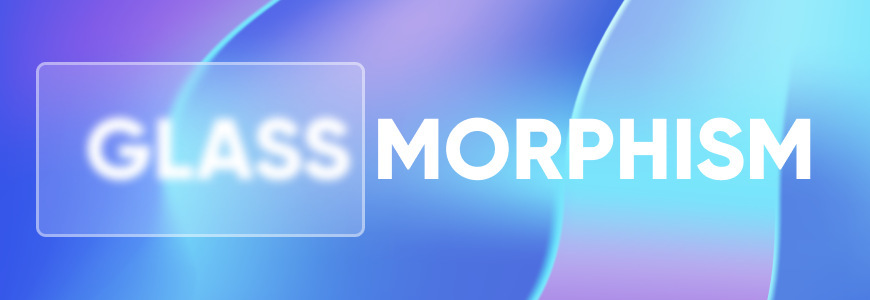
Glassmorphism
Image by Galaxy Weblinks

Glassmorphism is largely about highlighting light or dark objects by placing them on vividly colored backgrounds. The design has elements of transparency, frostiness, or glossiness. Glassmorphing is that “airy” interface where you see objects floating within space. Eye-catching and colorful, this trend favors multi-layered approaches. Resembling milky glass surfaces, the interface is grabbing a lot of attention.

Designers have been playing with this style of the interface in a major way. Glasmorphism is there in a larger number of published website designs. For instance, Apple used this effect on the latest update of macOS Big Sur. Microsoft also used this new interface on the app surfaces of Windows Vista and named it “The Acrylic”

The likes of Apple and Microsoft are using this interface. This trend is being followed by all those who want to make a lasting impression on their visitors. It is safe to say that Glassmorphism is here to stay. It is a promising design that has a lot to offer.

Glassmorphism in Apple Big Sur
Image by Galaxy Weblinks

All brands regardless of the nature of the work can incorporate this sort of interface. It is an all-weather solution.


User experience lays the foundation for happy, satisfied customers. Here is how UX makes a lasting impact – 

A product’s ability to woo the audience rests on how strong, seamless, and speedy the interface is. As a conscious effort, the designers strive to create simple and minimalist designs and avoid using unnecessary information or low-resolution photos. The intriguing and minimal design keeps visitors engaged for longer. Glassmorphism UI complements modern design needs and user behavior. 


Here is what constitutes Glassmorphism Aesthetics 
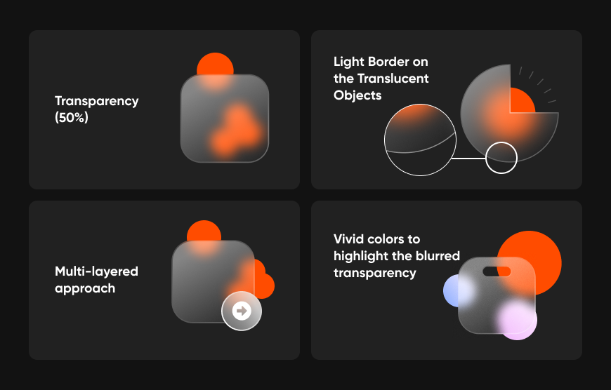
Glassmorphism components
Image by Galaxy Weblinks

Here are some insightful tips on how we make this design work for our client’s website, for your website:

  • Not applying the blurring and transparent effect in areas that require active interactions.
  • Not using this design aesthetics in buttons, toggles, navigation menu, and similar elements.
  • Use transparency and blurring for boosting the overall look and feel, not only for decoration.
  • Applying fitting contrast with the cards in the interfaces for ease of accessibility.
  • Right spacing between the cards. Grouping together all the objects related to one another.
  • Choosing the right contrast and intuitive grouping of cards in the design layout
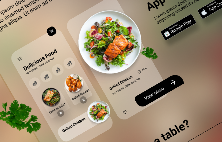
Glassmorphism
Image by Galaxy Weblinks

Glassmorphism usage is based on the designer’s discretion and they must use it judiciously. It is beautiful and minimalistic but falls short in the accessibility standards. Our design experts are exploring new trends and creative ways of making web products. At the same time, we try to overcome the shortcomings if there are any. Therefore, we are ensuring a higher level of accessibility in our web designs where we are leveraging Glassmorphism. 

Design is subjective, not bound by any rules. Websites are user-friendly and beautiful when the designers push their boundaries and experiment with the design trends. Glassmorphism is the latest trend and like the other trends, this will be replaced by something new soon. However, it does make a statement and if you wish to leverage this trend, we can help you while ensuring that the design is sustainable, future-proof, and accessible.  

Get in touch with our design team here and have a one on one about Glassmorphism. Contact us here!
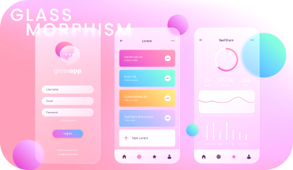
Tips To Remember While Designing a Website

In the world of online business and marketing, website plays an important role. Website signifies the online presence of your business. Hence your website should look good and it should represent your company or business.

Your website should be attractive and presentable. An online business fate depends upon the structure of your website. There are many important factors that should be considered in creating a successful website.

Here are some tips that should be remembered while designing a website:

Website objective

Before designing a website, you should properly know what are your goals? After that you can start working on them. You should make a plan before designing a website. Planning is the best way to reach to your objectives. Your website objective can be anything from selling of a product or service to providing information. Objectives will help you in overall designing of the website.

Budget

You can spend a lot of money on designing a website, but it’s better to make a budget. Your budget should be planned according to the elements of your website. If you don’t have enough money, you can go to online software program which will help you in designing a website. But still you need to spend money on marketing and hosting of the website. Experts say that you should spend 50% on marketing and 50% on website design and updating your website.

Quality content

It is mostly seen that people spend a lot of time on the designing part of the website and they forget about the content. Content is the king of the website. Content has the power to attract the potential audience. Content on the website explains your business goals and objectives which will help you to excel your business. If you are not a good writer, you can hire someone. If you want to grab attention of your target audience unique and quality content will help you.

Visual Aspects

You only have 8 seconds to grab your visitor’s attention. And it all starts with a good visual hierarchy. A clean and organized hierarchy will act as an invisible guide for your visitors. It will lead users on your designed user flow. You can achieve it by using visual cues, typography, color, contrast ratios, and ample white space. Avoid using a lot of typography and colors as it may distract your visitors. But you can play around in CTAs, as these are supposed to draw visitor’s attention.

Branding

Which style represents your organization? Is it chic, elegant ,old school, or a bold brand. Design a website which mirrors your brand’s style. Make your logo the first thing a user encounters by placing it in the upper left corner as users will scan your website in F or Z pattern. Leverage your current client testimonials as evidence of your work. You should link your active social media accounts for letting visitors connect with you instantly. Your social media activities will help in establishing your stand on various topics, CSR activities, work culture, etc. All this will play a role in building your brand.

Usability and Accessibility

Your website’s usability will be established with its intuitiveness from the user’s perspective. Are all possible answers that your user is looking for available to them? It includes an easy CTA for your newsletter subscription, simple navigation, having autofill activated for forms, et al. Carry out usability tests to know where your users are struggling and if the features are easily discoverable. It will help in establishing your website’s usability from the end user perspective.

One in every five American citizens has some disability pertaining to eye sight, hearing, and motor skills among others. When you design your website without taking care of accessibility norms, you are missing out on potential clients. Use the accessibility guidelines to make the website content compliant to at least AA level of the WCAG. Level AA of the Web Content Accessibility Guidelines (WCAG) is widely accepted, highest level being AAA.

Responsive website

We live in an era of varying screen sizes. Designing only for PCs and Macs is no longer the norm. Design your website keeping in mind your mobile and tablet visitors as well. Your website should not appear cluttered when seen on smaller screens. You should check for the
functionality of your website on every device. Test out every button and interaction before the final release. Taking care of these aspects will ensure similar user experience across all the screens.

Market your website

After designing your website, don’t think that your work is done. Submit your website to all search engines. You can also do active marketing through social media sites like Facebook, Twitter and Google+. You can add your website links to other famous websites so that traffic gets diverted to your site. Marketing and advertising of a website may take some time, you need to be patient.

A website is an identity of your business. And when it comes to online business, your first impression is the last impression. So you should be careful while designing a website.

At Galaxy Weblinks we offer web development services. We specialize in developing custom websites and web applications with robust and stable backend process. For details please visit us here.